Page MenuHomePhabricator

Define and unify text input placeholder style
Closed, ResolvedPublic

Description

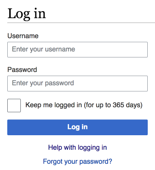
After feedback received and incorporated, our current design of placeholders is set to #72777d as color, but it also features italics text.
OOjs UI doesn't implement italics, partly due to T147541, mediawiki.UI still does.

Let's decide if we want to:

  1. Stay with italics in all languages aside of CJK languages, which is a bit of a hack as a pretty huge CSS selector with all those language codes is needed (:lang( zh ), :lang( ko )…), but doable.
  2. Remove the italics placeholder

I personally like the italics as it sets an action emphasis on the field.

Option with italic textOption without
T147808 Placeholder styling italics - Log in - Wikipedia 2016-10-10.png (355×320 px, 31 KB)
T147808 Placeholder styling normal - Log in - Wikipedia 2016-10-10.png (352×320 px, 30 KB)

Event Timeline

FF and Chrome don't emphasize the placeholder text by default, and I don't see equal returns on effort for doing it in a consistent way for all languages. Are we considering doing this so that the placeholder doesn't look like content, or do we have other reasons too?

We also don't use italics in the site-search widget. Given that we are split on the aesthetic argument (I also prefer non-italics), I would suggest sticking with normal text due to the non-trivial technical issues with CJK.

Change 338783 had a related patch set uploaded (by Esanders):
De-italicise placeholder text

https://gerrit.wikimedia.org/r/338783

@Pginer-WMF was already sharing some thoughts on this issue elsewhere, it'd be useful to have designers giving a call before moving one.

My 2c is for removing the italics.
However, I would urge using a lighter color so it doesn't look as though the input has already been filled, so Base50 (#A2A9B1) seems the most likely candidate. I realize this was discussed in T145676 already, but would like to raise concerns again.

Arguments against using placeholder text entirely are encapsulated fairly well in a Nielsen article "Placeholders in Form Fields Are Harmful" [1]. It mostly discusses how hints are harmful especially when fields do not have labels, but there's a couple of pertinent problems with using hint text even when used on fields with labels:

  • Fields with text inside are less noticeable than blank fields
  • Users can mistake hint text for data already filled in

By using a lighter hint text color we can help reduce the above issues. And while Base70 is not AA accessible on white, this text is really not meant to be vital to the user's correct input–this should be via the *always* visible field label, per W3C recommendation [2] "The placeholder attribute should not be used as a replacement for a label".
Since we would recommend usage only as an additional help indicator, it is not strictly necessary to be AA color contrast.

[1] https://www.nngroup.com/articles/form-design-placeholders/
[2] https://www.w3.org/TR/html/sec-forms.html#element-attrdef-input-placeholder

I'm also in favour of not using italics here. I see utility in placeholders in some cases, although it would be good to define more clear rules in the guidelines to avoid those cases where they just repeat the label.

Our palette color Base50 (#A2A9B1) seems quite close to browser default color used for placeholders. I don't think there is a wider range of shades to pick if we want placeholders not to be confused with user content and don't make the element look as disable or demand an effort on the user eyes to read them (users don't know if it is important until they read them).

One thing we can try is to increase contrast once the focus is already in the input element, I created an example to check how this looks.

Change 338783 merged by jenkins-bot:
De-italicise placeholder text

https://gerrit.wikimedia.org/r/338783

Volker_E moved this task from Doing… to Done on the UI-Standardization-Kanban board.
Volker_E removed a subscriber: gerritbot.