Page MenuHomePhabricator

OOjs UI TextInputWidget placeholder is too dark, looks almost like content
Closed, ResolvedPublic

Description

In T85853#2596550, @Tgr wrote:
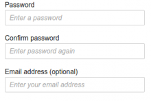
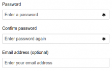
vformooui
textfields-vform.png (210×313 px, 16 KB)
textfields-ooui.png (233×366 px, 16 KB)
  • the placeholder text is way too aggressive, barely different from the label. Again, hard to scan.

Current color is #54595d. The default varies per-browser, but for example my Chromium uses #a9a9a9. The Vector skin uses #999999 for the placeholder in the search field (but doesn't override the default in browsers that support placeholders natively).

It's been made darker fairly recently in rGOJUb3380e8b70a3: MediaWiki theme: Normalize [placeholder] appearance x-browser and ensure a11y for consistency and accessibility. I'm not sure if the accessibility argument convinces me; the placeholders should never be necessary to instruct the user how to fill out the form, rather the labels should provide the necessary information and placeholders should be only for convenience.
Related Objects

StatusSubtypeAssignedTask
OpenNone
OpenNone
OpenNone
ResolvedMarkTraceur
Resolvedmatmarex
Resolvedmatmarex
Resolvedmatmarex
OpenNone
DuplicateNone
OpenNone
ResolvedJdlrobson
ResolvedBUG REPORTmatmarex
Resolvedmatmarex
OpenFeatureNone
OpenNone
ResolvedEsanders
DuplicateNone
ResolvedTTO
ResolvedJayprakash12345
DuplicateNone
OpenNone
ResolvedVolker_E

Event Timeline

WCAG seems to be ignored by pretty much everyone on this (Chrome default, Firefox default, google.com, facebook.com, twitter.com, linkedin.com are the fist things that came to mind and they all use light-grey placeholders). Specifically for the login/signup page we could just get rid of the placeholders (they just repeat the labels mostly) but it would still be nice to get this fixed generally.

cc @Volker_E . Maybe we should have separate classes for placeholders which just repeat the label and placeholders with essential information? The latter should generally be avoided, but when it isn't, applying WCAG AAA is a reasonable thing to do. For the former we could at least relax to AA.

(Minimum for AA compliance would be #767676, apparently. But I'm not sure if we should hold placeholders even to this standard.)

@matmarex Why do you think we shouldn't hold placeholders to level AA in an official library? Developers aren't consistently following best practice to make use of labels. In that case people with visual disabilities (targeted by the WCAG color guidelines) have no chance to complete their tasks.

That was actually the point taken to making placeholders follow even AAA. As stated in T139034 the interface in the specific case is not self-sufficient explaining what the input below the Categories headline is here for without the placeholder.

But after discussing with @Tgr how to succeed on both requests – his about resolving the “wall of text” and the shortcomings in the VE dialog, I've filed T146966: Add label to Options dialog > Categories input fields instead.
And propose a patch with placeholders following just level AA.

Change 313365 had a related patch set uploaded (by VolkerE):
MediaWiki theme: Make placeholder follow WCAG 2.0 level AA contrast ratio

https://gerrit.wikimedia.org/r/313365

@Pginer-WMF After repeatedly looking at this interface, I have to say, that I seriously question the usefulness of the placeholders in this specific form. The only input where it makes kinda sense for me is the “Enter your password again” message. Any thoughts?

@Pginer-WMF After repeatedly looking at this interface, I have to say, that I seriously question the usefulness of the placeholders in this specific form. The only input where it makes kinda sense for me is the “Enter your password again” message. Any thoughts?

Placeholders can be useful but they can be also misused. I'd not remove the possibility from the components since that would limit their good uses in all contexts.

I agree in defining guidelines that prevent placeholders to be just a repetition of labels. I think they are good to provide meaningful examples or clarifications (e.g., indicating that you can type your "username or email" in a "user" field is helpful to inform of the possibilities of flexible input), and it should encouraged to not provide them if that is not the case (e.g., avoiding random examples, or information that you may actually need as you type when it is no longer visible).

cc @Volker_E . Maybe we should have separate classes for placeholders which just repeat the label and placeholders with essential information? The latter should generally be avoided, but when it isn't, applying WCAG AAA is a reasonable thing to do. For the former we could at least relax to AA.

I mostly agree with this. Except that, if we are going to go on a case-by-case basis here to get make the 'repetition placeholders' lighter, then we'd rather get rid of them. It might be better to remove the repetitive placeholder than cluttering the UI with lighter placeholder labels.

After the change:

BeforeAfter
pasted_file (237×371 px, 13 KB)

@matmarex Why do you think we shouldn't hold placeholders to level AA in an official library? Developers aren't consistently following best practice to make use of labels. In that case people with visual disabilities (targeted by the WCAG color guidelines) have no chance to complete their tasks.

Fair enough. My opinion is that we're kind of encouraging bad placeholders by making them too readable. Ideally, the placeholder should be entirely optional and users should be able to complete their tasks even if they didn't have placeholders. (And hey, HTML and forms existed for years before someone implemented the placeholder attribute, and somehow everyone managed.) And I think browser vendor probably had some rationale when making their default styles for placeholders less contrastive than ours. But WCAG AA seems to be a good-enough balance between the two.

@Pginer-WMF I agree with finding generalized guidelines on when and how to use placeholders. Not quite sure, if I understand your take on this specific one (which is a prominent and good example) and the usefulness of them here.
As I said, I'd suggest removing them if their text is not altered.

@Pginer-WMF Not quite sure, if I understand your take on this specific one (which is a prominent and good example) and the usefulness of them here.

I thought by the ticket title and description, the discussion was about placeholders in general, not a specific one.

Change 313365 merged by jenkins-bot:
MediaWiki theme: Make placeholder follow WCAG 2.0 level AA contrast ratio

https://gerrit.wikimedia.org/r/313365

Jdforrester-WMF assigned this task to Volker_E.
Jdforrester-WMF triaged this task as Medium priority.
Jdforrester-WMF moved this task from Reviewing to OOjs-UI-0.18.0 on the OOUI board.
Jdforrester-WMF edited projects, added OOUI (OOjs-UI-0.18.0); removed OOUI.
Jdforrester-WMF removed a project: Patch-For-Review.

@Pginer-WMF You're right. I filed T147808 for a further question on unifying appearance of placeholders and sub-task T147820 on my specific question above.