Page MenuHomePhabricator

Remove tocnumbers from TOC layout in print mode as they display incorrectly with numbers > 10 and their usefulness is debatable
Closed, ResolvedPublic1 Estimated Story Points

Description

This task is about MediaWiki's Vector skin.

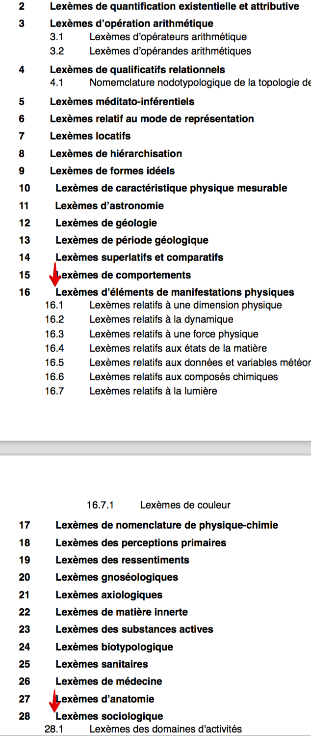
Coming from mathieu stumpf guntz's praise for the new print styles on Wikitech and looking at an article mentioned by him, the Table of Contents (TOC) layout is incorrect with numbers higher than 10 when compared with layouts at https://app.zeplin.io/project/58b5f95e7b103f89913c25de/screen/5971579e3ec2ea33c89bf2c1

T179363 TOC print - Recherche-Lexèmes français relatifs aux structures — Wikiversité.pdf (page 1 of 57) 2017-10-30.png (1×634 px, 362 KB)

This is demonstrated when printing https://fr.wikiversity.org/wiki/Recherche:Lex%C3%A8mes_fran%C3%A7ais_relatifs_aux_structures

Expected: Left edge of 16.1 should align with left edge of 'L' in "Lexèmes"

Developer notes

As @phuedx points out, this is caused by .tocnumber using margin-right: 30px to set its width. Unfortunately, this means that the width of the element (the list item number container) varies with the width of its content.

To address this problem we plan to remove the numbers entirely from the output. This can easily be achieved by the css rule:

.tocnumber { display: none;}

Given the table of contents does not map to page numbers, the usefulness is debatable.
After @Nirzar spoke to @TheDJ and @Jan_Dittrich a decision was made to remove them to save paper.

testing criteria

Print a page using the browser's print function (DO NOT use "printable version" in the side bar).
The table of contents should appear in the printed result but the numbers should not be visible.
Event Timeline

This is caused by .tocnumber using margin-right: 30px to set its width. Unfortunately, this means that the width of the element (the list item number container) varies with the width of its content.

Jdlrobson updated the task description. (Show Details)
Jdlrobson moved this task from Incoming to Needs Prioritization on the Web-Team-Backlog board.

What possible solutions have we got here?

Looks like we've identified the cause of the issue. Let's leave it to the developer to find the best solution. Moving the task along board.

I'd like to talk a little more about options here. Right now I worry we'd estimate this an an 8 because of the ambiguity. If we can come up with a proposal before working on this, implementing this becomes very mechanical and more like a 1 or 2.

How we have that conversation and when is important to have that conversation however I'm not sure (ping @phuedx in case you have any ideas).
In the meantime if anyone has a spare cycle it would be great to look into whether display table-cell is a viable option I'd like that to happen before pulling into triaged but future.

ovasileva triaged this task as Medium priority.Nov 2 2017, 9:12 AM

display: table-cell is actually the default style, which the new print styles override with

display: inline-block;
margin-right: 30px;

The problem is that .tocnumbers don't have a width specified. Obviously, we could/should give them a width but it'd have to cover the general case of N levels of subheadings. For example: On the page in the description, the TOC gets to 4 levels deep; setting a width of 30px, say, for all .tocnumbers wouldn't cover this case. One way to fix this would be to hand-code increments to the base for nested .tocnumbers:

@tocNumberBaseWidth: 30px;
@tocNumberWidthInc: 10px;

.tocnumber { width: @tocNumberBaseWidth }
.toclevel-2 .tocnumber { width: @tocNumberBaseWidth + 1 * @tocNumberWidthInc }
.toclevel-3 .tocnumber { width: @tocNumberBaseWidth + 2 * @tocNumberWidthInc }
.toclevel-4 .tocnumber { width: @tocNumberBaseWidth + 3 * @tocNumberWidthInc }

This solution isn't elegant but is performant and all selectors are low specificity. We'd have to rely on editors architecting their information appropriately and not nesting sections arbitrarily deeply but I think that's reasonable.

I haven't looked into it but we might be able to use CSS counters to solve this problem too but their support doesn't reach to all Grace C browsers.

I'm not sure this can be done via table cell
The structure looks like this:

ul li > 
	a >
		span.tocnumber
		span.toctext
	ul >
		...

We want

  • a and ul to behave like rows
  • span.tocnumber to behave like column 1
  • span.toctext to behave like column 2
  • ul to behave like column 2 row 2

It's worth pointing out that although non-print styles use table cell they do not align numbers with the title in the desired way:

Screen Shot 2017-11-01 at 4.14.16 PM.png (250×683 px, 52 KB)

Taking a step back, I have to ask, how serious a problem is this given the problem is present on the non-printed medium?

Wasn't there talk about removing the table of contents from print styles @Nirzar ? Might we do that instead? If so can't we decline this and hide the table of contents and save all the analysis?

Wasn't there talk about removing the table of contents from print styles @Nirzar ? Might we do that instead? If so can't we decline this and hide the table of contents and save all the analysis?

It's bit tricky. After speaking about it with the design group, I feel like I need to talk to few people in the community.

what we can do here though is to remove the numbers all together when printing single articles.

the number zeplin @Volker_E is refering to book index which requires numbers. for article toc, we can get rid of numbers.

@Volker_E what you think?

@Nirzar We are not repeating the numbers in the article, so removing them in printed TOC makes sense. Apart from that, the issue would sustain with books and more than 9 headlines.

Books index rendering I guess is whole another piece of software?

for book index we are capping the toc to only H2s and individual articles won't have TOCs

Wasn't there talk about removing the table of contents from print styles @Nirzar ? Might we do that instead? If so can't we decline this and hide the table of contents and save all the analysis?

Surely, the table of contents is even more important when printing, since you can't press Ctrl+F to search through a printed article?

Surely, the table of contents is even more important when printing, since you can't press Ctrl+F to search through a printed article?

the table of contents don't map to page numbers, so the usefulness is debatable. after talking to @TheDJ and @Jan_Dittrich I was inclined on removing them to save paper.

Hmm, indeed.

Also, this issue affects the normal non-print view in the same way, although it's less glaring because there is no 30px gap between the number and the text:

image.png (548×690 px, 49 KB)

Using display: table-cell/table-row/table is not possible here, as noted by @Jdlrobson, at least not without changes to the HTML structure. (And even if we allow that, it might be impossible, I don't see any way to do this because of the <a> wrapping the number and text.) Currently display: table-cell is used only to improve line-wrapping of long entries in the table (see T92481), not to actually align things like table cells.

I would either try @phuedx's idea above, or remove/lessen the 30px gap to make this less glaring and make it look more like intentional design ;), or just decline this.

@Nirzar - do you have a preferred solution and/or do we want to fix this?

Preferred solution is getting rid of the numbers in front of sections

Jdlrobson renamed this task from TOC layout incorrect with numbers > 10 to Remove tocnumbers from TOC layout in print mode as they display incorrectly with numbers > 10 and their usefulness is debatable.Nov 7 2017, 8:03 PM
Jdlrobson assigned this task to ovasileva.
Jdlrobson updated the task description. (Show Details)

I've updated the description. This is ready to be worked on. over to you @ovasileva to schedule.

During this task, can we also verify that very long TOC labels (longer than one line) are rendered correctly?

bmansurov set the point value for this task to 1.Nov 8 2017, 5:51 PM

We can debug this issue using Chrome's CSS media emulator:

image.png (103×368 px, 4 KB)

I couldn't find a simple and browser-compatible way to fix this issue, so I'm just pushing a change to display: none it.

Change 396932 had a related patch set uploaded (by Albert221; owner: Albert221):
[mediawiki/skins/Vector@master] Fix incorrect indentation of TOC on print preview

https://gerrit.wikimedia.org/r/396932

I'm seeing a few issues in print mode:

Screen Shot 2017-12-11 at 10.49.04 AM.png (239×241 px, 13 KB)

  • There should not be any whitespace to the left of A, B, C and D.
  • The whitespace to the left of D11 should be consistent with the whitespace from D to D1.

Ok, so when I do wikitext

`
==A==
==B==
==C==
==D==
===D1===
====D11===
===D2===

The indentation of D1 is 29 pixels (Lets say 30 because I'm probably off by one in my measurement). The indentation of D11 is 96 pixels. I would expect the indentation to only be 60 pixels.

@ovasileva @Nirzar the table of contents numbers have been removed in print mode thanks to a Google Code in student (@Albert221). Adding to kanban board to allow you to verify on the beta cluster.

@Jdlrobson - do we have a good test article (one with numbers > 10) Currently, for https://en.wikipedia.beta.wmflabs.org/wiki/Dog, I'm seeing this:

Screen Shot 2017-12-12 at 12.47.39 PM.png (239×265 px, 23 KB)

Change 396932 merged by jenkins-bot:
[mediawiki/skins/Vector@master] Fix incorrect indentation of TOC on print preview

https://gerrit.wikimedia.org/r/396932

ah, cleared the cache. Looks great now. Thanks @Albert221!

Looks good on Beta. I tried the Dog and Carnivore articles on Safari, IE, Edge, Chrome and Firefox. No numbers are present in the TOC.