Value proposition (why do we need to do this)?
As a user, I want to be able to add translations for a file so I can use the file in my local language.
This follows up from T204596: Search image component for SVG Translate tool and T204849: SVG Translate tool: Language settings dialog.
Functionality/software changes
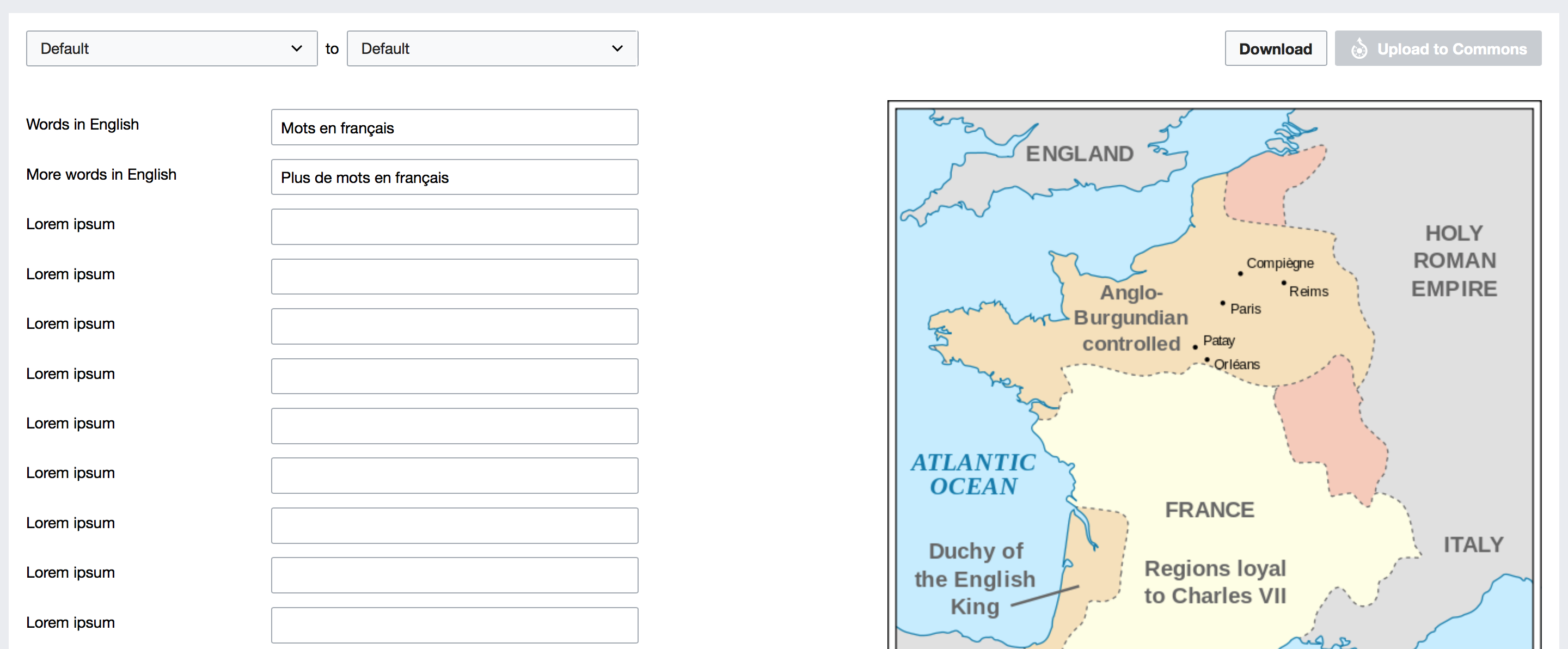
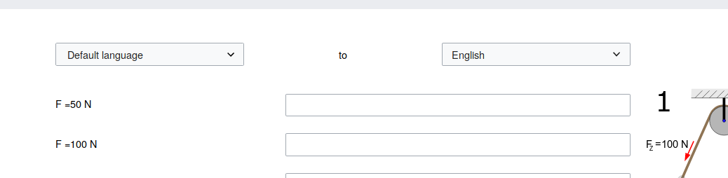
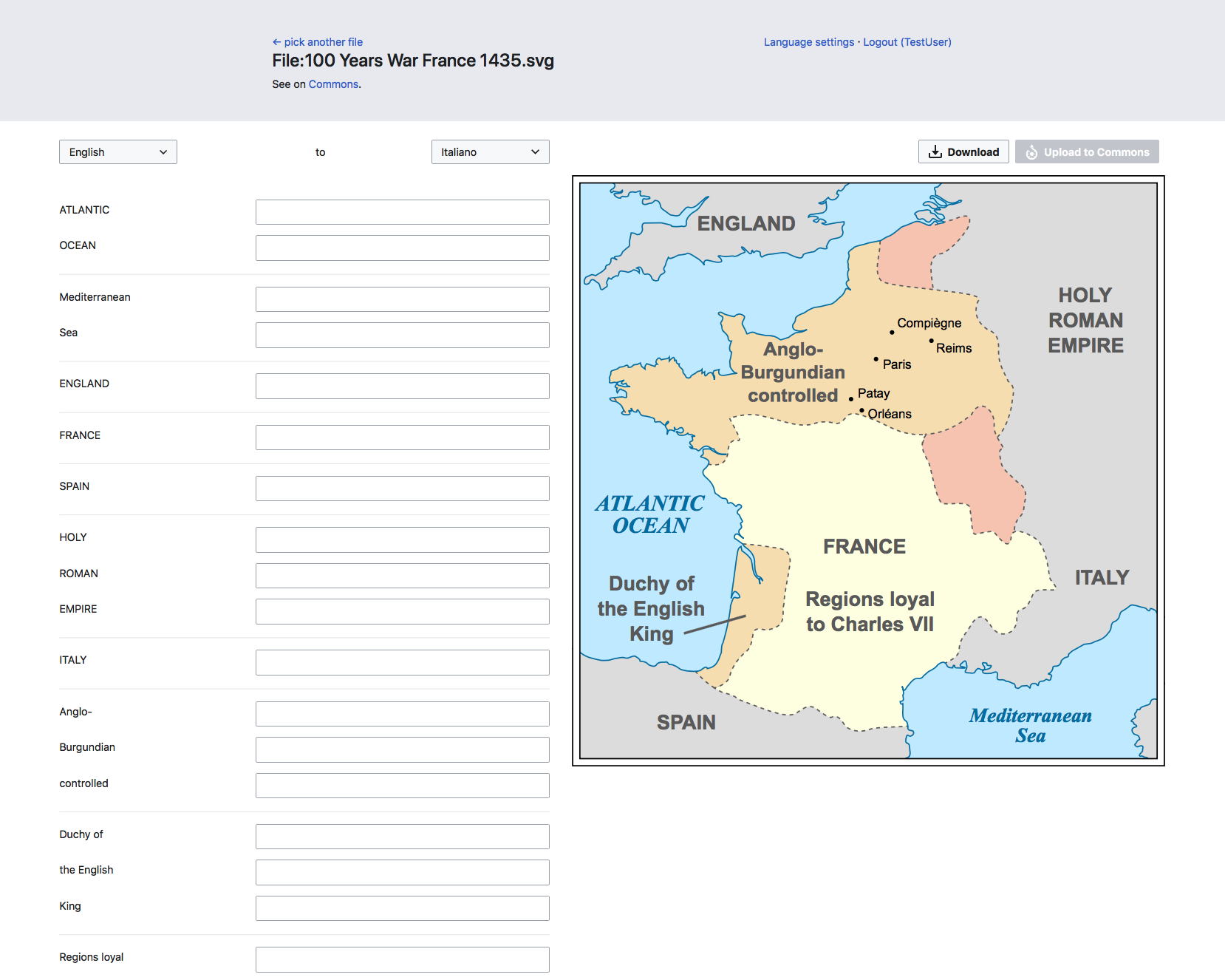
- Once the user has picked an image, they land up in the Translate view.
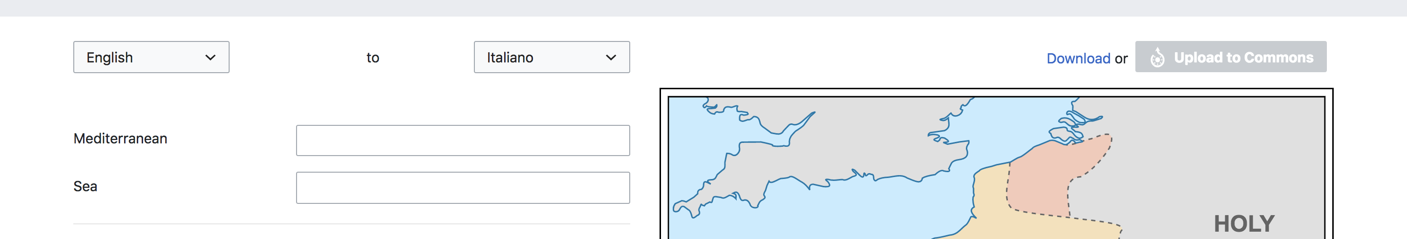
- Header:
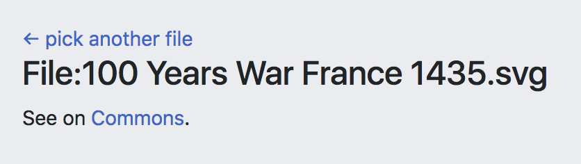
- Button to go back and pick another file
- File title and link to see image on Commons
- Language settings dialog link
- Login button (non-functional)
- Translation panel:
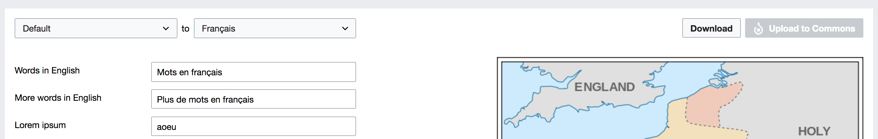
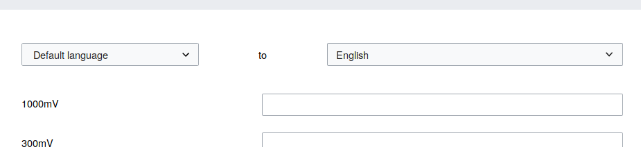
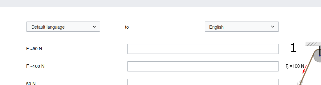
- In the 'from' language dropdown show 'Default'. No working dropdown for this one - parsing the SVG is not part of this ticket.
- From language switching is not part of this ticket!
- The 'to' language dropdown should show 'Select a language'.**
- To language switching is not part of this ticket!
- Language labels on left -- we can have a placeholder string for this because parsing the SVG is not part of this ticket
- Translation inputs on right
- In the 'from' language dropdown show 'Default'. No working dropdown for this one - parsing the SVG is not part of this ticket.
- Image appears on the right (no preview functionality so far) - follows from T204596. This can be an empty box if the image fetching part is not complete yet.
- Image is sticky on scroll
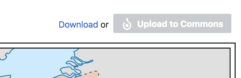
- Buttons to upload image to Commons and download image above the image (both are non-functional for this ticket)
What this ticket does not include:
- Preview functionality T207203
- Upload/download functionality
- Mobile compatibility (it's great if we get that for free but let's not include additional work for that in this ticket, it should be estimated separately)
- From/to language switching behavior T207199
- Parsing the SVG
- Divider lines for clustering labels which fall under the same 'text' tag
User interface changes
Screenshots/mockups:
Mockup: https://prtksxna.github.io/svgtranslate-prototype/translate.html
Does this need QA?
Yes