The preview of the mobile start module has gone through a couple iterations. At first, the four elements in the start module were all in a horizontal row, but the problem was that many languages ended up with text that was too long:

So in T227109, we changed it to be a 2x2 grid:
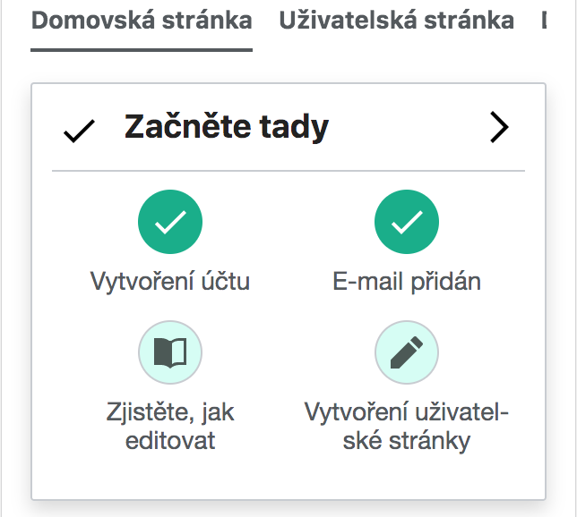
The problems with the 2x2 setup are that it (a) does not convey a sense of continuity and progress, and (b) takes up too much space above the fold on the mobile screen.
Here is a mockup of the new design.
Specifically:
- The icons are in a single row with line segments connecting them.
- The text is listed in two rows with bullet points before each item.
- When an item is complete, the text turns green and the bullet point becomes a green checkmark.
- There is an exception for the "Start editing" call to action. When suggested edits is initialized, its item remains in the start module preview, but goes from being called "Start editing" to being called "See suggested edits". That is already explained in T232513, but repeated here for completeness.