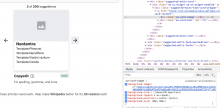
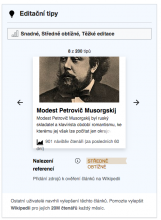
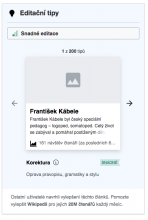
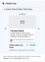
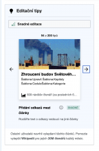
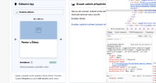
Below are a set of styling issues discovered by @RHo in the desktop version of the suggested edits module.
- Height of the module is taller than expected, mainly due to a taller image, larger font-size of the article title, and an extra (4th) line in the text extract.
- Space between filter and number of suggestions should be increased.
- Article image should be flush to the left and right edges of the card.
- Space between task type and bottom of the article card should be increased.
- Space between bottom of the task type description and card footer should be decreased.

