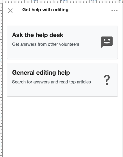
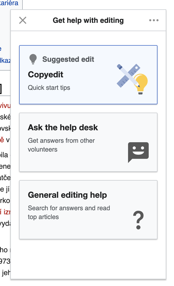
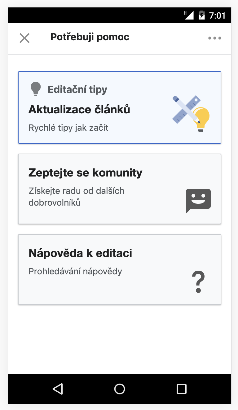
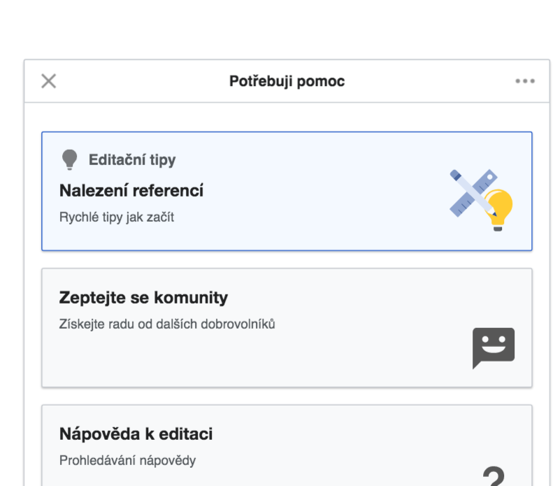
Once the user is in edit mode, the help panel will display the "root screen". This term refers to the fact that the screen consists of buttons that let the user navigate to the main functions of the panel, and to which the user returns after backing out of those functions.
The specifications here follow along with the corresponding prototypes. Where they differ, the written specifications take precedent:
Header
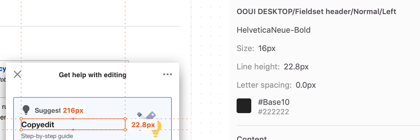
The root screen should have the same header as the help panel has by default, "Get help with editing".
Buttons
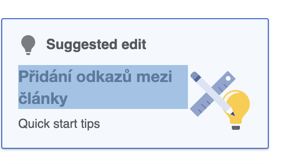
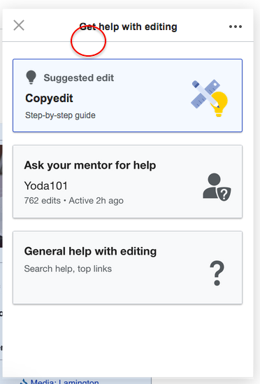
The screen should have three big rectangular buttons (more may be added in the future). The first button, for "Suggested edit" should have higher affordance with an outline.
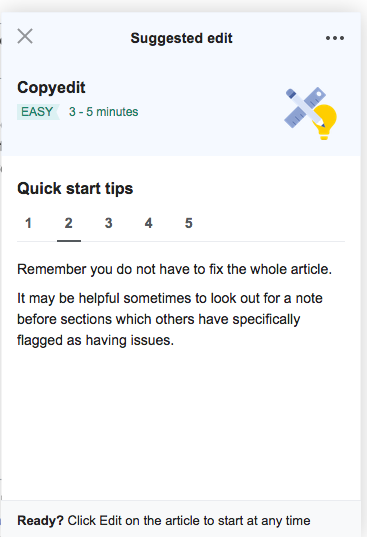
- Suggested edit
- This button should contain a lightbulb icon with the text "Suggested edit" next to it.
- Below that, the header should say the task type, e.g. "Copy edit" or "Find references".
- Below that should say "Quick start tips".
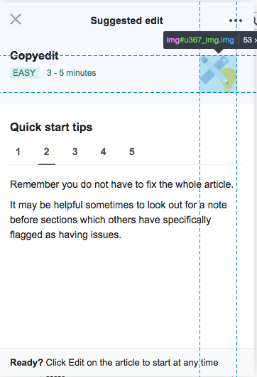
- It should contain the suggested edit graphic (pencil/ruler/lightbulb).
- This button should lead to the "suggested edit screen" (see T244541: Newcomer tasks: suggested edit screen in guidance).
- On mobile, in place of an "X" in the upper left, this screen should have a back arrow that leads back to the root screen via a swipe animation. There should be no "Back" or "Cancel" button.
- On desktop, it should have the "X" in the upper left and the "Back" button in the lower left.
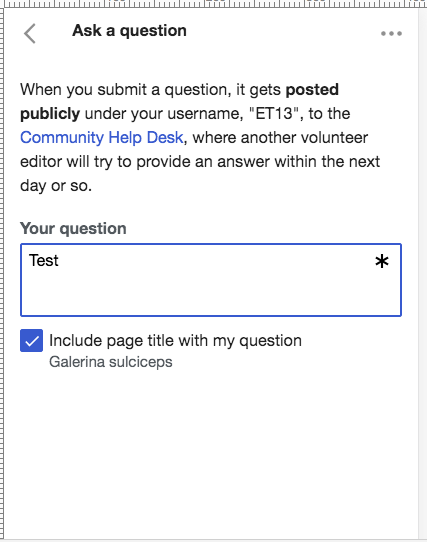
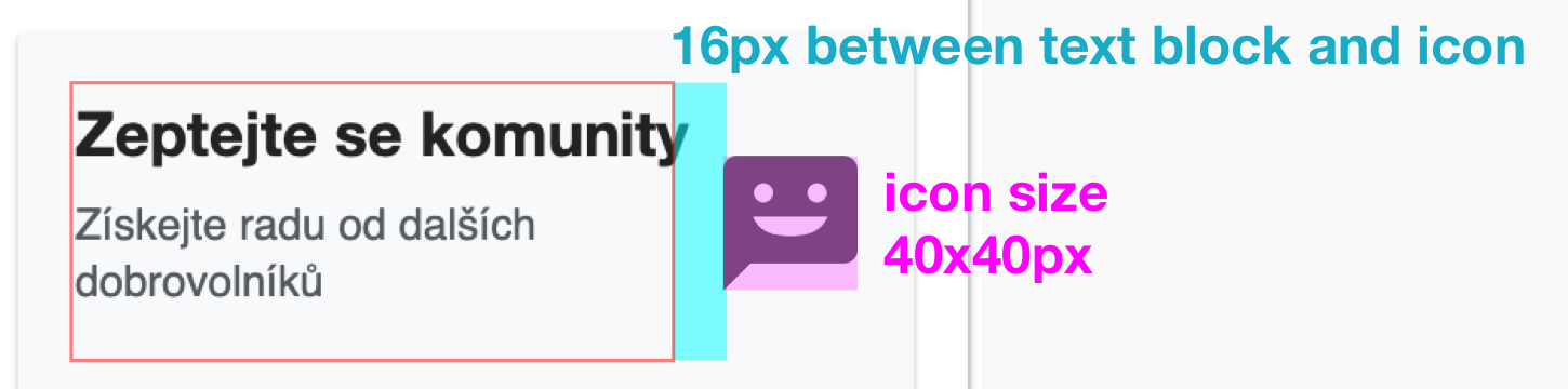
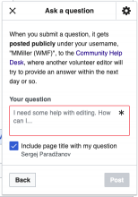
- Ask for help
- Although the prototypes show what this would look like if we switched from directing questions to the help desk, and instead directed them to mentors, for this version of guidance, we should direct questions to the help desk.
- This button should contain a header that says, "Ask the help desk".
- Below that should say, "Get answers from other volunteers".
- The icon should be the smiling word bubble icon that is in the mentorship module:

- This button should lead to the submission screen of the question-asking workflow:
- On mobile, in place of an "X" in the upper left, this screen should have a back arrow that leads back to the root screen via a swipe animation. Even though it has the back arrow, it should still have the "Back" button in the lower left.
- On desktop, it should have the "X" in the upper left and the "Back" button.
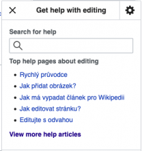
- General editing help
- This button should say contain a header that says, "General editing help".
- Below that should say, "Search for answers and read top articles".
- The icon should be a big question mark, like this:

- This button should lead to a screen that is just the top part of the help panel, excluding the "ask a question" part:
- On mobile, in place of an "X" in the upper left, this screen should have a back arrow that leads back to the root screen via a swipe animation. There should be no "Back" or "Cancel" button.
- On desktop, it should have the "X" in the upper left and the "Back" button in the lower left.


Instrumentation
Below are the portions of our instrumentation plan that relate to this component. See T246919: Newcomer tasks: guidance instrumentation for the full plan.
- impression: we want to record whether the user saw the help panel in edit mode.
- root screen button click: the new design of the “root screen” will contain several buttons. We want to record an event indicating which one the user clicks.
- Once the user has clicked one of the buttons, normal help panel logging ensues.