Page MenuHomePhabricator

ULS IME icon partially obscures Reply button
Closed, ResolvedPublic

Description

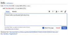
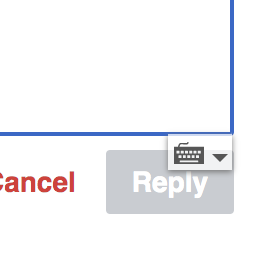
The keyboard icon obscures the Reply button and makes it challenging for users to access the functionality. This also is an issue in Flow, as documented in T78348

Screenshot

Screen Shot 2020-06-11 at 3.35.32 PM.png (262×264 px, 11 KB)

Proposed Solution

Temporarily disable the functionality with the noime class while this issue gets troubleshooted upstream
Event Timeline

Is this in "ready for development" to implement the proposed solution above ("disable the functionality with the noime class")?

Is this in "ready for development" to implement the proposed solution above ("disable the functionality with the noime class")?

Eek. No. This is my mistake. Will bring up in today's stand up meeting.

Is this in "ready for development" to implement the proposed solution above ("disable the functionality with the noime class")?

Eek. No. This is my mistake. Will bring up in today's stand up meeting.

Per today's stand, we need to have a conversation with the Language team to discuss the following:

  • Who uses the ULS IME component used? What do they use it for? In what contexts do they use it? With what frequency do they use it?
  • Assuming it is important to keep the ULS IME component, how might we – the Editing Team – affect where it is presented with the Reply tool and other DiscussionTool interfaces (e.g. T233446).?

Is this in "ready for development" to implement the proposed solution above ("disable the functionality with the noime class")?

Why not move the "reply" button a few pixels down?

Per today's stand, we need to have a conversation with the Language team to discuss the following:

  • Who uses the ULS IME component used? What do they use it for? In what contexts do they use it? With what frequency do they use it?

Briefly, it is used especially frequently in languages of India and Africa, and also in many others. But we can talk in more detail.

  • Assuming it is important to keep the ULS IME component, how might we – the Editing Team – affect where it is presented with the Reply tool and other DiscussionTool interfaces (e.g. T233446).?

See above.

  • Who uses the ULS IME component used? What do they use it for? In what contexts do they use it? With what frequency do they use it?

Briefly, it is used especially frequently in languages of India and Africa, and also in many others. But we can talk in more detail.

Thank you, @Amire80 and understood; I've proposed a meeting for us to talk about this next Thursday, 9-July.

Proposal:

  • Users can add a specific class on an input, e.g. ime-position-inside (which extends the noime class API)
  • Doing so would position the button just inside the text input, instead of outside, so only moving it by a few pixels
    • The button would still appear in the bottom right, except when that position is off screen, when it appears in the top right

9-July meeting notes: Editing <> Language:

  • @Amire80: share screenshots of how the ULS selector is presented in other contexts. Goal: what successful treatment might we be able to replicate in the Reply tool?
  • @Amire80: confirm where and how (e..g default on?) the ULS selector is available for at Wikipedias that are not en.wiki
  • Editing design + engineering: decide on an initial approach (e.g. T255191#6294643) and submit to Language for review (code and design)
  • @Amire80: to share consented upon approach with volunteers to validate usability
This comment was removed by Esanders.

I've gone with the simplified approach, I think avoiding any visual clash with any type of border would require a fix that's beyond the scope of the task. Here's how it looks in the ReplyWidget:

image.png (253×277 px, 6 KB)

Change 612400 had a related patch set uploaded (by Esanders; owner: Esanders):
[mediawiki/extensions/DiscussionTools@master] Add ime-position-inside ULS class to reply widgets

https://gerrit.wikimedia.org/r/612400

I've gone with the simplified approach, I think avoiding any visual clash with any type of border would require a fix that's beyond the scope of the task. Here's how it looks in the ReplyWidget:

image.png (253×277 px, 6 KB)

@Esanders, the screenshot looks good.

Question: is there a way to try this out? I'd like to see how the drop-down interacts with the "Reply" button.

...I spun up a PatchDemo wiki, but the ULS is not present. I suspect this because it's disabled by default [ii] and I have yet to find the preference to enable it.


i.

Screen Shot 2020-07-13 at 5.15.45 PM.png (816×1 px, 136 KB)

ii. "For English Wikipedia, the input method contextual menu will be disabled by default. Regardless of the initial state of input methods, users can always enable or disable them for any wiki." via https://www.mediawiki.org/wiki/Universal_Language_Selector.

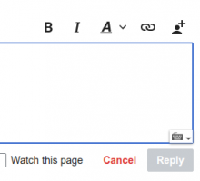
Not easily, but here is a screenshot:

image.png (405×367 px, 15 KB)

@santhosh has merged the patch on GH, so this is back with the Editing team. Thanks.

@santhosh has merged the patch on GH, so this is back with the Editing team. Thanks.

Great. Assigning this over to @iamjessklein for a quick review.[i]

In the meantime, here is the ticket for the ULS component not staying in place as the text input area grows: T258840.


i. http://patchdemo.wmflabs.org/wikis/0cca3b07ef648601bf156eb142edaf47/w/index.php/Talk:Main_Page

Change 612400 merged by jenkins-bot:
[mediawiki/extensions/DiscussionTools@master] Add ime-position-inside ULS class to reply widgets

https://gerrit.wikimedia.org/r/612400

It looks overall good when it's pinned to the corner but when adding a bunch of text it does a weird jump.

ime.gif (359×922 px, 149 KB)

I'd make sure that this gets tested with a user who actually uses this tool to see if there are any other disruptive/unexpected interactions happening.

Peter filed the resize issue as T258840. As this was merged last week it will be deployed this week unless reverted.

9-July meeting notes: Editing <> Language:

  • @Amire80: to share consented upon approach with volunteers to validate usability

@Amire80, are you able to share the approach we've come up [i] with the volunteers you mentioned knowing who are familiar with/use the ULS IME?

Note: the above will not block the deployment that's already scheduled. Should the volunteers who Amir shares the above with raise any issues, we can address those in follow up tasks.


i. http://patchdemo.wmflabs.org/wikis/0cca3b07ef648601bf156eb142edaf47/w/index.php/Talk:Main_Page

Now that we have added an "Advanced" button creating space under the text box, we could revert back to the IME-outside approach. We may want to wait a bit for the design to stabilise before we do that though, and we still need to use IME-inside in Flow.

Now that we have added an "Advanced" button creating space under the text box, we could revert back to the IME-outside approach. We may want to wait a bit for the design to stabilise before we do that though, and we still need to use IME-inside in Flow.

+1 to the bolded bit above, @Esanders.

9-July meeting notes: Editing <> Language:

  • @Amire80: to share consented upon approach with volunteers to validate usability

@Amire80, are you able to share the approach we've come up [i] with the volunteers you mentioned knowing who are familiar with/use the ULS IME?

In the meantime, @Amire80 heard back from volunteers who are familiar with/use the ULS component. They shared the following feedback about the experiences they had using the ULS component within the Reply Tool...

  • One Wikipedian who writes in the Santali language said, "Yes, it [ULS component] is working in reply box too and this new process of replying also very much user friendly."
  • Another Wikipedian tested the Reply Tool in the Odia language (also known as Oriya, language code or) and said, "Yes, it works fine for me."

Note: Amir also tested the tool on Hebrew and noted the ULS component works well there too.