Page MenuHomePhabricator

Conduct pre-deployment design review
Closed, ResolvedPublic

Description

This task involves the work with reviewing the Reply Tool before it is deployed as an opt-out preference at the Arabic, Czech and Hungarian Wikipedias.

Background

T249394 will make the Reply Tool available to all contributors at the Arabic, Czech and Hungarian Wikipedias by default. [i] This task should include a holistic review of the Reply Tool to:

  • Ensure the tool has been implemented in the ways we expect and
  • Identify design issues that ought to be addressed, either before or after the deployment happens

It is important to be mindful this will be the first time people who have not explicitly turned on the Reply Tool will be seeing it. [ii] As such, we should pay particular attention to areas of the experience that people who have never used or heard about it before could be confused by.

Review details

The Reply Tool can be reviewed on any page on the en.wiki beta cluster (e.g. https://en.wikipedia.beta.wmflabs.org/wiki/Talk:Cats).

All of the features/components of the Reply Tool that need reviewing can be found in the "T261477" sheet of this workbook: Reply Tool QA.

Done

  • Design reviews the Reply Tool in its entirety, from how people will turned the tool on/off in Special:Preferences#mw-prefsection-editing to how people who are logged in and out experience publishing comments.
  • Tasks are created for new issues that surface during the review

i. People will be able to turn the feature off using the setting T259943 implements
ii. Caveat: some people who have the Automatically enable most beta features setting enabled will have seen [ reply ] links without ever having turned the feature on.
Event Timeline

Some observations:

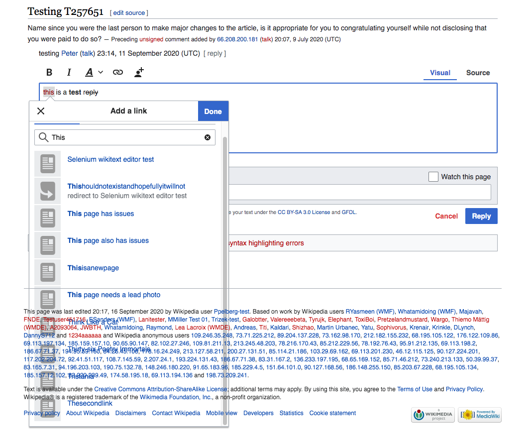
  • When I'm in Visual Mode, and I highlight text to add a link, the text box becomes transparent at a certain point and becomes challenging to read:

Screen Shot 2020-09-21 at 9.12.47 AM.png (890×1 px, 257 KB)

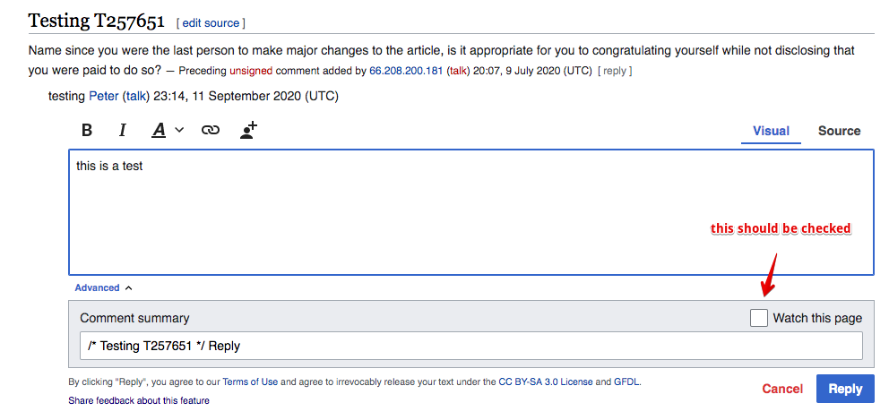
  • In Visual and Source modes, the "Watch this Page" checkbox should be checked by default once someone starts to draft a Reply.

checkbox.png (469×992 px, 80 KB)

  • When I delete the default summary, I also make it so that the revision history doesn't include section titles - this seems wrong.

rev.png (189×1 px, 94 KB)

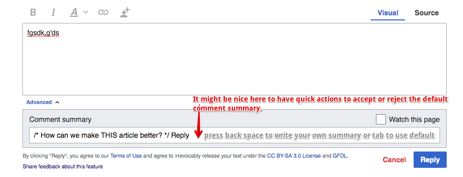
  • When I see a default comment summary, it might be nice to have some quick actions here to expedite the process - (maybe for future release)

quickactions.png (347×909 px, 57 KB)

*In Preferences, the "Restore to Default Settings" shouldn't be a red text link that directs to a separate page. It should be a checkbox that autofills the default fields and users can still customize their preferences.

restore.png (207×814 px, 40 KB)

*In Preferences, adjust the language to say "Enable quick replying by default"

quickreplybyd.png (140×849 px, 24 KB)

Some observations:

  • When I'm in Visual Mode, and I highlight text to add a link, the text box becomes transparent at a certain point and becomes challenging to read:

This looks like a regression, possible with the desktop improvements project. We should file a separate task.

  • In Visual and Source modes, the "Watch this Page" checkbox should be checked by default once someone starts to draft a Reply.

This default state is based on wiki- and user-preferences which we respect.

  • When I delete the default summary, I also make it so that the revision history doesn't include section titles - this seems wrong.

If the user goes the length of entering advanced mode and clearing the edit summary, we should respect that. Probably if we "fixed" this users would complain that they can't clear the edit summary.

  • When I see a default comment summary, it might be nice to have some quick actions here to expedite the process - (maybe for future release)

I think we should assume senior contributors are already comfortable with modifying edit summaries.

*In Preferences, the "Restore to Default Settings" shouldn't be a red text link that directs to a separate page. It should be a checkbox that autofills the default fields and users can still customize their preferences.

You should check with Volker as he worked on OOUI-ification of Special:Preference, but this is beyond the scope of our project.

*In Preferences, adjust the language to say "Enable quick replying by default"

The preference enables the feature completely, and it doesn't change the behaviour of any existing workflows, so I don't think we want to add "by default".

Some observations:

Thank you for pulling these together, Jess and keeping a special eye out for how Junior Contributors might experience the tool.

Per the conversation you, @Esanders and I had today, none of the below ought to block T249394. With this said, it looks like one ticket needs to be filed as a result. I've marked which tickets needs to be filed and added some comments I had in response to the feedback you and Ed shared in line below.

Note: the annotations you've added to the screenshots are helpful in understanding what you are describing.


Some observations:

  • When I'm in Visual Mode, and I highlight text to add a link, the text box becomes transparent at a certain point and becomes challenging to read:

This looks like a regression, possible with the desktop improvements project. We should file a separate task.

+1.

Resulting action


  • In Visual and Source modes, the "Watch this Page" checkbox should be checked by default once someone starts to draft a Reply.

This default state is based on wiki- and user-preferences which we respect.

+1. Context: T245222#6012991.
During the conversation @Esanders, @iamjessklein and I had today, we came to understand the root of this comment to be the fact that Junior Contributors expect to automatically be made aware when someone responds to something they say (See: T247485#6089355).

This is a need we plan to address in the work we have planned to increase the likelihood people know when someone is talking to them. This work will happen in T233447. As such, we are not going to revise how the Watch this page checkbox behaves at this moment.


  • When I see a default comment summary, it might be nice to have some quick actions here to expedite the process - (maybe for future release)

I think we should assume senior contributors are already comfortable with modifying edit summaries.

Mmm, yes. I think it would be worthwhile to think about the edit summary as a "first rate object."

Said another way, maybe if the edit summary was able to contain "richer" information (e.g. links as T263314 and T54174 propose) people would use them to be more "expressive" (e.g. link to the talk page conversation an edit stemmed from) and as a result, people who are new would have an easier time visualizing/understanding what "edits look like" and how they are made. Some additional thinking in T263508.


*In Preferences, adjust the language to say "Enable quick replying by default"

The preference enables the feature completely, and it doesn't change the behaviour of any existing workflows, so I don't think we want to add "by default".

No action needed at this time. If it turn out that the location and language of this setting is unclear, we are likely to hear as much from people wanting to run the Reply Tool off.

! In T262988#6480123, @Esanders wrote:

! In T262988#6479851, @iamjessklein wrote:

Some observations:

  • When I'm in Visual Mode, and I highlight text to add a link, the text box becomes transparent at a certain point and becomes challenging to read:

This looks like a regression, possible with the desktop improvements project. We should file a separate task.

+1.

Resulting action

I believe this issue was captured in this task: T264679