Page MenuHomePhabricator

DiscussionTools mobile: Always collapse sections by default, even on a wide screen
Closed, ResolvedPublic

Description

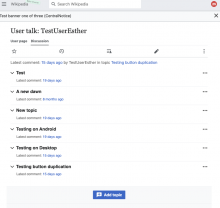
On mobile we hide the table of contents in favour of collapsing all sections. On wider screens (e.g. tablets) we let MobileFrontend expand all sections by default. With the ToC still hidden this makes navigation the page hard.

Per our offline discussion, we should collapse sections on wider screens too, like the MobileFrontend talk overlay does.

Event Timeline

What about doing the same as on content pages – displaying the TOC? I don’t think hiding the TOC is a meaningful way to distinguish content and talk pages, while the difference could be confusing.

What about doing the same as on content pages – displaying the TOC? I don’t think hiding the TOC is a meaningful way to distinguish content and talk pages, while the difference could be confusing.

@Tacsipacsi: we've opted not to display the ToC on talk pages as a way for people to get an overview of what topics are being discussed on a given talk page because we designed the mobile Topic Containers (T311612) to fulfill that purpose.

Please let me know if anything above brings new questions to mind.

I see, thanks for the explanation! However, couldn’t this information appear in the TOC, similarly to new Vector? Or would that be too crowded?

Change 865702 had a related patch set uploaded (by Esanders; author: Esanders):

[mediawiki/extensions/MobileFrontend@master] Always collapse sections when 'collapsible-headings-collapsed' body class present

https://gerrit.wikimedia.org/r/865702

Change 865703 had a related patch set uploaded (by Esanders; author: Esanders):

[mediawiki/extensions/DiscussionTools@master] Add 'collapsible-headings-collapsed' body class

https://gerrit.wikimedia.org/r/865703

I see, thanks for the explanation! However, couldn’t this information appear in the TOC, similarly to new Vector? Or would that be too crowded?

I think for now we just want the experience to match mobile, and how the previous MobileFrontend experience worked.

Change 865702 merged by jenkins-bot:

[mediawiki/extensions/MobileFrontend@master] Always collapse sections when 'collapsible-headings-collapsed' body class present

https://gerrit.wikimedia.org/r/865702

Change 865703 merged by jenkins-bot:

[mediawiki/extensions/DiscussionTools@master] Add 'collapsible-headings-collapsed' body class

https://gerrit.wikimedia.org/r/865703

✅ Always collapse sections by default, even on a wide screen

Tested on iPad Pro 12.9 inch

IMG_4C2FA3383E37-1.jpeg (2×2 px, 771 KB)

IMG_5C67130DA979-1.jpeg (1×2 px, 644 KB)

IMG_1BB5DE8E33D5-1.jpeg (2×2 px, 658 KB)

Surface Pro 7
Screenshot 2022-12-14 at 19.16.59.png (798×844 px, 90 KB)

I see the Expand all sections on the iPhone but not the iPad even though they are both treated as mobile screens. Is this the expected behaviour?

Also, the DT sections remain collapsed even when Expand all sections is toggled on based on the fix in T322628. Just checking to see that I am getting the expected behaviour.

IMG_1125.jpg (2×1 px, 276 KB)

IMG_5BBB6EDA0B44-1.jpeg (2×2 px, 397 KB)

@Esanders
Cc: @matmarex

Looks like the expected behavior.

ppelberg claimed this task.