Page MenuHomePhabricator

[M] Survey view for Image Recs
Open, MediumPublic

Assigned To
None
Authored By
HNordeenWMF
Mar 1 2024, 10:34 PM
Referenced Files
F43059309: RPReplay_Final1711124982.MP4
Mar 22 2024, 4:44 PM
F43059272: Group 25.png
Mar 22 2024, 4:44 PM
F42986750: survey_ios.jpeg
Mar 22 2024, 12:47 AM
F42306971: image.png
Mar 1 2024, 10:34 PM
F42306956: image.png
Mar 1 2024, 10:34 PM
F42307048: image.png
Mar 1 2024, 10:34 PM

Description

Background

If someone rejects an image suggestion using the "No" option, it's important to understand why so we can improve our model. One of our guardrail metrics is that Less than 5% of users report NSFW or offensive content being suggested through the tool.
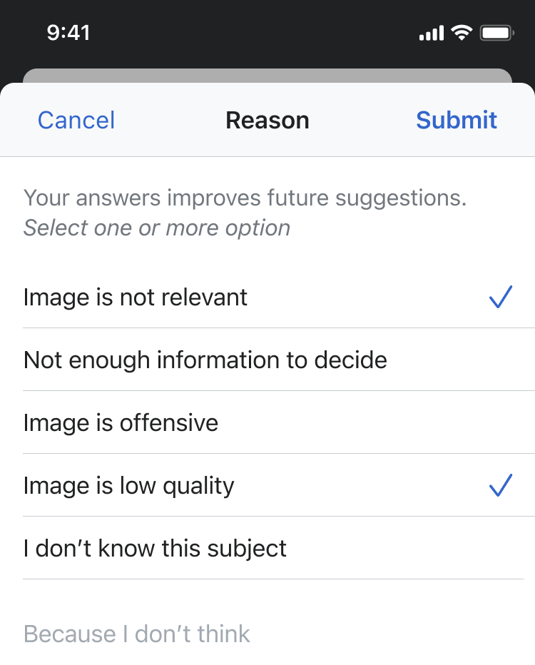
Requirements
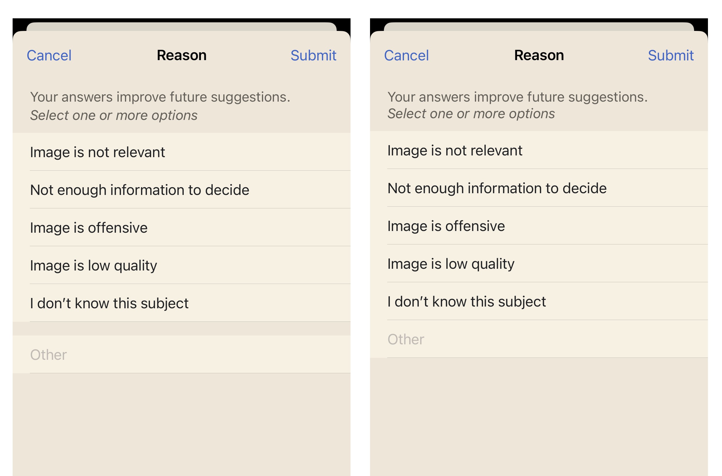
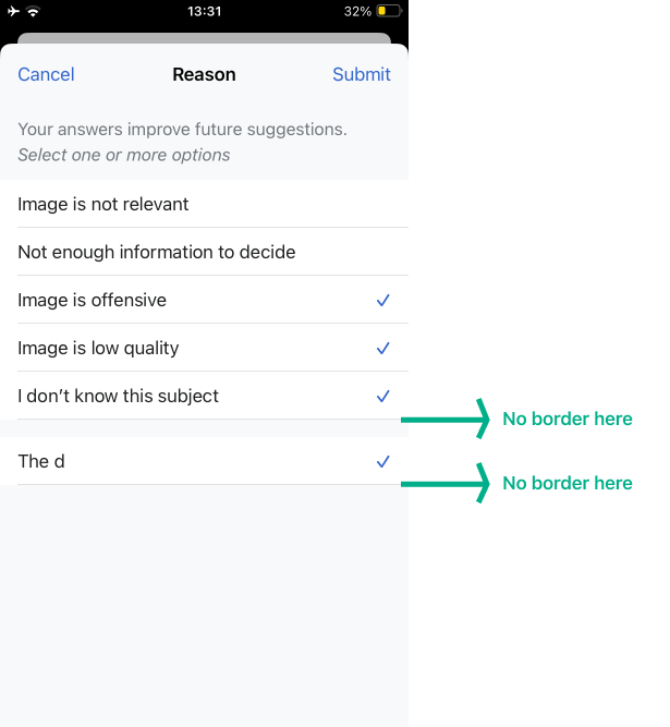
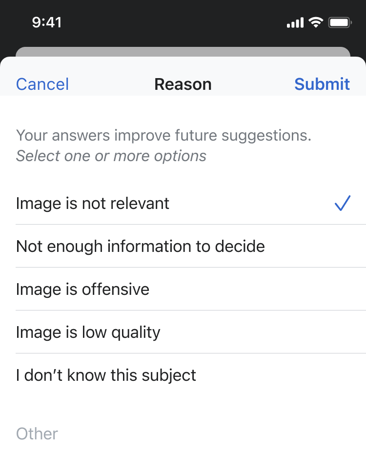
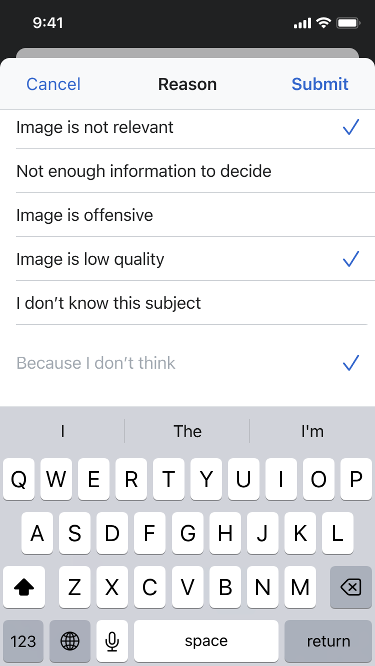
  • People may select multiple options.
  • Tapping cancel takes you back to the image recommendation.
  • Trying to type a reason in "Other" automatically selects this option.
  • Deselecting "Other" grey's out any left over text in the input field.
  • Tapping Submit takes you to the next article/image suggestion
  • Data is stored / events are logged in accordance with Shay's requirements T359131
Design:

Create the survey according to the figma reference

image.png (932×750 px, 66 KB)
image.png (1×750 px, 101 KB)
image.png (932×750 px, 69 KB)
Testing

Please test in TestFlight Wikipedia app 7.5.0 (3509).

Event Timeline

HNordeenWMF updated the task description. (Show Details)
Tsevener renamed this task from [M] Survey view for Image Recs to Survey view for Image Recs.Mar 5 2024, 4:55 PM
Tsevener renamed this task from Survey view for Image Recs to [M] Survey view for Image Recs.Mar 19 2024, 5:18 PM

@HNordeenWMF @OTichonova A few questions that came up during eng. sync that affect our estimates:

  • Is the expectation that the "Other" user reason textfield in this view expands vertically as the user types text that spans multiple lines, or just remains one horizontal line like a normal iOS textfield (and the text lines shown above it)? The bulk of our estimated time on this is towards if we have to do a vertically expanding field, but we can significantly reduce complexity and the estimated work time if 1) it operates like a standard one line textfield or 2) is a fixed sized textview.
  • As we began talking about in combined apps meeting: Is the expectation that the Cancel button here takes you back to the same image recommendation you were on, or the next recommendation when you return? In other words, are we requiring the user to submit a reason in this view to get new recommendations?
  • To confirm the logic: it seems like the most straightforward way to determine if the "Other" field should be selected or not is if the textfield is empty or not. If the field is empty, no checkmark is displayed. If the field is non-empty, the checkmark is displayed. Is this logic ok?

Hi @Dmantena, thanks for writing these out.

  1. It is normal iOS behavior to keep that text field standard one line. When designing I thought that would stay that way.
  2. On Android the Cancel would takes you back to the same image so for consistency that would be the same case on iOS.
  3. That logic sounds good to me.

@OTichonova:

  1. It is normal iOS behavior to keep that text field standard one line. When designing I thought that would stay that way.

Perfect – thanks!

  1. That logic sounds good to me.

Excellent, seems like the best path forward to me too.

  1. On Android the Cancel would takes you back to the same image so for consistency that would be the same case on iOS.

No worries if not, but do you happen to have any documentation/a direction to point me in to better understand this original decision on Android? To me it feels user hostile/confusing that the only way to proceed with more recommendations is either forced feedback via this survey or tapping "Not sure" on the previous screen, but I'd like to understand what context I may be missing to better understand the original decision.

@Dmantena

No worries if not, but do you happen to have any documentation/a direction to point me in to better understand this original decision on Android? To me it feels user hostile/confusing that the only way to proceed with more recommendations is either forced feedback via this survey or tapping "Not sure" on the previous screen, but I'd like to understand what context I may be missing to better understand the original decision.

& they still get to the next image by saying 'Yes' and publishing the image.

Here are some resources and research previously done by Growth (who initially did research and deployed the feature as one of their Newcomer Homepage Structured Tasks in late 2021) and Android:

  • Here is Growth's project page for 'Add an image' where they have documented the different iterations and decisions about the project.
  • Here is a deck with the first round of usability tests run by Growth back in 2021. Something relevant that I found on slide 22 was:

"Participants were often overly unequivocal in their decisions, under-using “Unsure” and skip. In some cases where the person had said out loud they are not sure, they nevertheless will still click Yes/No.
Action: Potentially provide more consequence to “No” such as asking for the rejection reason.
Action: Similarly provide review or confirm step when people select yes.
Action: Include quality metrics/gates to encourage more considered decision-making.
"

  • Here is a deck with the second round of usability tests done by Growth. It goes through the results of the 'Rejection flow' starting from slide 38.

@OTichonova Awesome thank you – will give them a read.

Additionally @Dmantena here is the Android MVP summarized results that served as the catalyst for the work of the Growth team. As well as the results of the fully featured version. If you want to talk synchronously of why Not Sure is a requirement, I am happy to make sure we make time for it in Combined Apps where Robin, Shay and I will be as the folks that have worked on this since the MVP and made the decisions you'd like to know more about.

@JTannerWMF Thanks for these links! To be clear, I don't perceive the "Not Sure"/"Skip" button as problematic but rather the "No" button requiring some form feedback response for forward progress with more recommendations as so (which from my initial survey of these docs seems to have originated from wanting to improve the research team's image training algorithm before publishing actual changes).

Oh, showing the survey for No is actually a requirement that comes from the API @Dmantena. Like even the survey options are directly from the API, there is no additional UI work done. The reasons that people provide improves (and changes) the suggestions (and suggestion source) that the model created by the research team provided, which is consumed by us, Growth and Structured Data. Does that help?

Hi @JTannerWMF and @Dmantena! Cooltey and Dmitry helped me verify those items, and on Android, the survey options are hard-coded. The responses are posted to the appropriate event stream that will be implemented and to a Growth endpoint.

Task covering the work to update the Growth API with the survey reasons T360574

@OTichonova This is now ready for design review in TestFlight Experimental build 7.4.10 (96). Note that the cancel and submit button currently do nothing, and I need to follow-up for some more accessibility work.

I wanted to note that there's a minor UI spacing difference between iOS 17 and iOS 16 because of API availability. I've included a screenshot that demonstrates the difference - iOS 17 on the left, 16 on the right.

survey_ios.jpeg (1×2 px, 279 KB)

@Dmantena okay thank you for including the screen shots. A couple of things I noticed.

  1. Could we get rid of the border that is at the bottom of the list & at the bottom of 'Other' in the first version and just at the bottom of 'Other' in the version where they are all together?
Group 25.png (667×615 px, 38 KB)
  1. In the case where I typed something in 'Other' and then proceeded to tap on other options from the list the cursor & keyboard stayed active. Is it possible to close the keyboard and get rid of the active cursor if someone selects or deselects other options from the list?
  1. Last slightly adjacent thing. I made this border color update proposition T351943 where I propose the border color to be gray300. Is it better to keep the borders the current gray400 and then when the ticket is picked up the border colors will be update to gray300 or is it worth changing this in the current designs?

Last slightly adjacent thing. I made this border color update proposition T351943 where I propose the border color to be gray300. Is it better to keep the borders the current gray400 and then when the ticket is picked up the border colors will be update to gray300 or is it worth changing this in the current designs?

@Dmantena For native editor I added a newBorder color in WKTheme that you should be able to lean on for now. When we pick up T351943 we can delete the old border throughout and remove new from this name.

@Dmantena okay thank you for including the screen shots. A couple of things I noticed.

  1. Could we get rid of the border that is at the bottom of the list & at the bottom of 'Other' in the first version and just at the bottom of 'Other' in the version where they are all together?
Group 25.png (667×615 px, 38 KB)
  1. In the case where I typed something in 'Other' and then proceeded to tap on other options from the list the cursor & keyboard stayed active. Is it possible to close the keyboard and get rid of the active cursor if someone selects or deselects other options from the list?
  1. Last slightly adjacent thing. I made this border color update proposition T351943 where I propose the border color to be gray300. Is it better to keep the borders the current gray400 and then when the ticket is picked up the border colors will be update to gray300 or is it worth changing this in the current designs?

These are all addressed in Experimental build 101. I used newBorder as suggested by @Tsevener.