Page MenuHomePhabricator

Enable the MediaWiki UI / "Form Refresh" Beta Feature in production
Closed, DeclinedPublic

Description

Now that it's been created, launching this should be scheduled…

Release requirements from https://www.mediawiki.org/wiki/Beta_Features/Package :

  • Make an extension - Extension:VectorBeta
  • Get prelim design review
  • Get prelim security review
  • Get prelim performance review
  • Make sure there is a wiki page on mw.org for it that is understandable to the general public
  • Flowify the Talk page for the project
  • Make sure there is someone on point for feedback - a product manager (either volunteer or WMF staff)
  • Make a bugzilla component for the extension
  • Enable the Final Version of the code on Beta Cluster at least a week before you want to go for production.
  • Make gerrit change (do not merge) to the BF whitelist in mediawiki config
  • Deploy!

Event Timeline

bzimport raised the priority of this task from to Medium.Nov 22 2014, 3:51 AM
bzimport set Reference to bz71477.
bzimport added a subscriber: Unknown Object (MLST).
tomasz set Security to None.

Tagged assuming that this might go ahead, but I have no special knowledge of it. :-)

What's the plan/timeline, yo?

ETA please.

As I mentioned on gerrit, the changes that were needed in mw.ui have been made. But, I am not sure how other parts of the work is progressing.

@Jdlrobson might know more.


oops, made the same comment twice

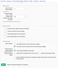
Screen_Shot_2015-04-28_at_12.10.25.png (200×708 px, 36 KB)

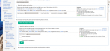
Screen_Shot_2015-04-28_at_12.12.31.png (923×795 px, 132 KB)

Not sure if people will be too exited when stuff looks like this....

Removed Jared from assignee; who is driving this now? Let's not push something out as a beta feature that doesn't have someone to care for it.

Beyond the design problems (examples above, plus more: eg1, eg2),
this probably also needs to be QA-checked for functionality.

I just discovered this Bug: T98905: Using shift-click to select a row of checkboxes should work with OO JS UI and MW UI (checkboxShiftClick)

Nemo_bis changed the task status from Open to Stalled.May 13 2015, 10:14 PM
Quiddity updated the task description. (Show Details)

Screen_Shot_2015-04-28_at_12.10.25.png (200×708 px, 36 KB)

Screen_Shot_2015-04-28_at_12.12.31.png (923×795 px, 132 KB)

Not sure if people will be too exited when stuff looks like this....

I guess for the first you're referring to the slightly awkward spacing? This is not a blocker to the Beta Feature in my opinion. It's something we can refine at any time.

For the second, I don't see anything wrong at all. Do you just not like the style?

Change 211081 had a related patch set uploaded (by Mattflaschen):
Add margin about watchlist submit button, on MW UI

https://gerrit.wikimedia.org/r/211081

The radiobuttons should be on individual lines here (and in TheDJ's second image above)

Algh0Se.png (232×1 px, 34 KB)

But vice-versa for the checkboxes (and the submit button) here (they should be on the same line)
FDYzdgX.png (682×1 px, 199 KB)

Removed Jared from assignee; who is driving this now? Let's not push something out as a beta feature that doesn't have someone to care for it.

@greg, there is technical debt in core for this (wgUseMediaWikiUIEverywhere). We really need to resolve this one way or the other.

This is not a 'feature' we want to maintain separately on an ongoing basis the way VE or Flow is. It is part of core, and the code forks need to be removed. Then, it needs to be maintained by the UX team and in general engineers leveraging it (same as any core component).

Using a Beta Feature temporarily is one possible path, but not the only one. We could also just do it directly (T72424), after sufficient testing.

Beyond the design problems (examples above, plus more: eg1, eg2),
this probably also needs to be QA-checked for functionality.

What exactly are you saying is wrong with the first one? Do you want them all on one line?

For the second, I guess you're referring to the button wrongly touching 'Associated namespace'. Fixed in https://gerrit.wikimedia.org/r/#/c/211081/ ; please review.

Please file bugs (you don't need to for the one I already fixed), so we can triage them and decide what's a blocker.

The radiobuttons should be on individual lines here (and in TheDJ's second image above)

Algh0Se.png (232×1 px, 34 KB)

But vice-versa for the checkboxes (and the submit button) here (they should be on the same line)
FDYzdgX.png (682×1 px, 199 KB)

It seems like you want them on the same line or not just because they were in the original version. That's not the goal here. The goal should be for the new version to be a productive interface.

I'm with @Quiddity. What causes all the control to be misplaced? If checkboxes are placed on one line, I expect them to be on one line. The controls should behave as standard UI controls with regards to being placed inline or as block elements.

The goal should be for the new version to be a productive interface.

If the positioning of radio selects and checkboxes seemingly becomes inverted from the original, with no apparent reasoning behind it, then I call that a problem, not a productive interface.

Examples of these are everywhere:

Screen Shot 2015-05-15 at 16.21.00.png (167×1 px, 23 KB)

In T73477#1287139, @Mattflaschen wrote:

Removed Jared from assignee; who is driving this now? Let's not push something out as a beta feature that doesn't have someone to care for it.

@greg, there is technical debt in core for this (wgUseMediaWikiUIEverywhere). We really need to resolve this one way or the other.

This is not a 'feature' we want to maintain separately on an ongoing basis the way VE or Flow is. It is part of core, and the code forks need to be removed. Then, it needs to be maintained by the UX team and in general engineers leveraging it (same as any core component).

Using a Beta Feature temporarily is one possible path, but not the only one. We could also just do it directly (T72424), after sufficient testing.

I have no idea what will come of the BetaFeatures project/process post Jared, but there were (presumably still are) very stringent rules on what can go out as a BF. Without a PM owning it, it doesn't go out (as a BF). Really, for any big UI refresh like this, I want a PM to own it to respond to feedback and drive it to a successful conclusion. Who will be doing that for this?

Bah, I've been repeatedly advising against creating a BetaFeature for this, much less enabling it everywhere, until we've made it work correctly at least most of the time. Apparently it was done quietly while I wasn't looking. I've been told that this will help us spot and fix issues, but I remember reporting the same issue with radio buttons myself a year ago and I see it's still there? Sad to see that all the effort goes into enabling new features and none into polishing them.

We should mark this as "Declined" and focus our effort on something useful that people want to work on, since clearly no one wants to work on this.

The blockers for this would probably amount to a few weeks of work, and it is all redundant anyway since we are allegedly moving from "MediaWiki UI" to "OOjs UI MediaWiki theme". The designs of the two have been rapidly diverging; if the aim is supposed to unify our interfaces, this must not be deployed.

It should be pointed out that these styles have been live on mobile since day one with no problem. and have made various forms usable.

I don't care how we implement these standard forms, whether it's oojs ui, mediawiki ui classes or some other library but we really should start validating our designs across all our forms and gauging reactions to changes in appearance. Bugs get fixed quicker when in front of people's eyes. The idea of the beta feature was to capture reactions to a new design, regardless of how made, and this feels like a wasted opportunity.

In my opinion, this entire initiative stalled because we were given the impression that the forms would be rewritten in oojs ui and I had thought that would have happened by now. I'd love a roadmap for UX standardisation as it's been a year now on how we plan to get a standard UI across the site and from an outsiders perspective I don't see any improvement to the state of affairs since last year (apart from a much sexier VisualEditor and a tiny bit more infrastructure namely templates and icons).

I hope we can discuss this at the Lyon Hackathon and make a commitment which approach we will take. There are various possible resolutions:

  1. Finish $wgUseMediaWikiUIEverywhere (see T72913: Remove $wgUseMediaWikiUIEverywhere dependency for button and text input styling, etc. for the progress that has already been made). A beta feature is not required for this.
  2. Completely remove $wgUseMediaWikiUIEverywhere from core, leaving it as if it were false.
  3. If there is a commitment to actually convert all of core to OO UI PHP (unlike MW UI, AFAICT, OO UI PHP is available in core, but not used from core), we could consider leaving the status quo until that is done. This only makes sense if there's actually a commitment to do this, which it doesn't sound like there is if matmarex is describing it as 'allegedly'.

Change 211081 abandoned by Mattflaschen:
Add margin about watchlist submit button, on MW UI

Reason:
So as to focus on the HTMLForm alternative.

https://gerrit.wikimedia.org/r/211081

In T73477#1298356, @Mattflaschen wrote:

I hope we can discuss this at the Lyon Hackathon and make a commitment which approach we will take. There are various possible resolutions:

Filed as T99827: Meeting: MW UI and OOjs UI/OO UI PHP planning. Tentatively scheduled for Workplace 2, Sunday 14:00.

Change 175406 abandoned by Glaisher:
Enable "Form Refresh" as a BetaFeature

Reason:
Per task

https://gerrit.wikimedia.org/r/175406