Page MenuHomePhabricator

Make contributions page actions more compact
Closed, ResolvedPublic

Assigned To
None
Authored By
Pginer-WMF
Apr 15 2015, 11:49 PM
Referenced Files
F5950089: pasted_file
Mar 1 2017, 7:14 AM
F5569636: pasted_file
Feb 9 2017, 12:26 PM
F5567954: Spectacle.C19729.png
Feb 9 2017, 10:52 AM
F5567956: Spectacle.E19617.png
Feb 9 2017, 10:52 AM
F4216148: Contrib page extended.png
Jun 30 2016, 11:22 AM
F4216144: compact contribs page.png
Jun 30 2016, 11:22 AM
F113647: contrib-list-pushed-down.png
Apr 15 2015, 11:49 PM
Tokens
"Doubloon" token, awarded by Nemo_bis."Baby Tequila" token, awarded by Sunpriat.

Description

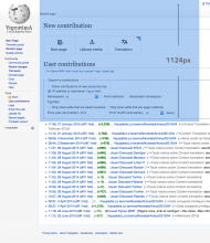
With the addition of new contribution actions to the Contributions page, and considering the size of the search form, the list of current contributions is pushed down the page:

contrib-list-pushed-down.png (2×1 px, 868 KB)

Proposed solution

By using an horizontal layout and reducing padding (8px and 16px modules), the action bar can be made more compact:

compact contribs page.png (768×1 px, 241 KB)

We need to monitor the effects on the use of the entry point when deploying this change to make sure we are not affecting the effectiveness of the entry point by making it less prominent.

Further ideas

We need to evaluate if the above change solves the concerns about accessing the contributions list. If that is not the case, we can explore additional approaches:

  • Remove the "new section header" .
  • Use an alternative compact version of the contribution actions only for those cases where the user has already made several contributions. In this way, new users (with few items in the contributions) will get a prominent call to action to create new content while advanced editors will be able to navigate their contributions easily while still having access to create new content.
  • Make the search form more compact/collapsible.
Event Timeline

Pginer-WMF raised the priority of this task from to Needs Triage.
Pginer-WMF updated the task description. (Show Details)
Pginer-WMF subscribed.
Amire80 triaged this task as Medium priority.May 4 2015, 4:34 PM
Amire80 subscribed.

Related: T96170.

Amire80 raised the priority of this task from Medium to High.Jun 23 2015, 8:39 AM
Amire80 moved this task from Needs Triage to CX6 on the ContentTranslation board.
santhosh lowered the priority of this task from High to Medium.Jun 25 2015, 3:04 AM

What is the status of this task, now that Wikimania 2015 is over? As this task is in the "Backlog" column of the #Wikimania-Hackathon-2015 project's workboard: Did this task take place and was successfully finished? If yes: Please provide an update (and if the task is not completely finished yet, please move the project to the "Work continues after Mexico City" column on the #Wikimania-Hackathon-2015 workboard). If no: Please edit this task by removing the #Wikimania-Hackathon-2015 project from this task. Thanks for your help and keeping this task updated!

A message to all open tasks related to the #Wikimania-Hackathon-2015. What do you need to complete this task? Do you need support from the Wikimedia Foundation to push it forward? Help promoting this project? Finding an intern to work on it? Organizing a developer sprint? Pitching it to WMF teams? Applying for a grant? If you need support, share your request at T107423: Evaluate which projects showcased at the Wikimania Hackathon 2015 should be supported further or contact me personally. Thank you!

@Aklapper and @Qgil, this is a task part of T105923: Fix issues found during Wikimania 2015 Hackathon and Workshops. We created such tasks to track issues that resulted from some hackathon activities such as design reviews and translation sessions. Having them together was helpful to avoid duplication, keeping the reference of the project version used when the issues were detected, and also have a curated list of issues to offer to any interested volunteer at the hackathon. Some of those tasks were resolved by hackathon participants, but the goal was not to solve all of them.

Given that context, and considering that the use of #wikimania-hackathon-2015 tag was quite inconsistent in the tasks of that list, I think it makes sense to remove it from this one if that generates some confusion. Let me know if anyone thinks differently.

I illustrate a proposal for more compact contribution actions:

compact contribs page.png (768×1 px, 241 KB)

For now we don't need to accommodate more options, but I wanted to illustrate also how this could scale when more options are added:

Contrib page extended.png (768×1 px, 257 KB)

That is a bit better - having the large icons at the top of Special:Contributions/Myname is too intrusive if it can't be disabled - either go for the compact or have a toggle turn it on and off; these links are already available under the Contributions link on the top line.

Change 336777 had a related patch set uploaded (by Santhosh):
Use OOJS UI for contributions page buttons

https://gerrit.wikimedia.org/r/336777

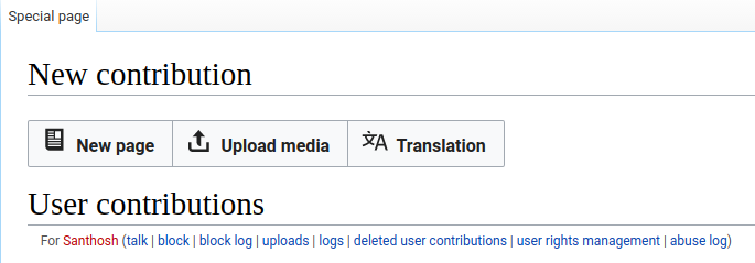
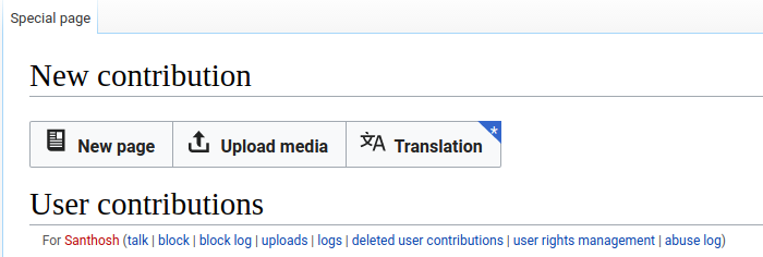
Screenshots from above patch:

Spectacle.C19729.png (239×685 px, 20 KB)

Spectacle.E19617.png (236×700 px, 21 KB)

Screenshots from above patch:

Great. The button height looks good. However, it seems that the icons and the labels are not properly aligned vertically.
I'd expect OOJs UI to deal properly with this, maybe there is some local CSS rule getting in the way?

I don't see any local CSS affecting the icons or labels. Should I hold merging of the patch before this issue is resolved?

pasted_file (123×433 px, 9 KB)

I don't see any local CSS affecting the icons or labels. Should I hold merging of the patch before this issue is resolved?

pasted_file (123×433 px, 9 KB)

If we are using the standard components and there is an issue on those, I think it is ok to merge in CX side and request a fix in the general components as a separate ticket (with the UI-Standardization tag). It is also interesting that the misalignment looked more prominent on Santhosh screenshot (where the page icon was sitting on the text baseline) than in yours.

Ah, I see the difference now. I still don't know what could cause it and on what conditions.

Make the search form more compact/collapsible.
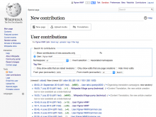
Reducing space or emphasis taken by the filters on top is worth exploring (collapsing only hides the problem), also for other special pages. Filing separate tasks or MediaWiki core would be nice of you.

Make the search form more compact/collapsible.

Reducing space or emphasis taken by the filters on top is worth exploring (collapsing only hides the problem), also for other special pages. Filing separate tasks or MediaWiki core would be nice of you.

Makes sense. We are exploring ways to improve the filtering system to make it both more powerful and require less space as part of the new filters for Recent Changes page. There will be a beta feature available soon, and based on the feedback, the results and research about similar pages, this model can be extended to other pages such as the contributions page (creating the specific Phab tickets in the way).

Great. The button height looks good. However, it seems that the icons and the labels are not properly aligned vertically.
I'd expect OOJs UI to deal properly with this, maybe there is some local CSS rule getting in the way?

That is being worked on : T158486: Vertical alignment of icon within ButtonElement, CapsuleMultiselect-, Dropdown- & SelectFileWidget is incorrect in OOUI

Do we need to wait for that to be fixed first before merging?

Do we need to wait for that to be fixed first before merging?

Yes, there is no urgency and OOJS update is already branched and I think it will be in core very soon(this week itself). So let us wait a bit and target next week branching of CX

Unless I am mistaken, the OOUI update including the fix for this was just merged to master.

Ah, yes, https://gerrit.wikimedia.org/r/#/c/340443/ is merged few hours back. So now we can proceed with testing our patch and merge.

Change 336777 merged by jenkins-bot:
Use OOJS UI for contributions page buttons

https://gerrit.wikimedia.org/r/336777