Page MenuHomePhabricator

C1. "Mark as resolved" for Flow topics
Closed, ResolvedPublic6 Estimated Story Points

Description

"Mark as resolved" is a UI change to Lock, and the way Summarize is used and displayed.

You can check this prototype (where you can mark as resolved the second topic and reopen it again). You can check this video to view it in action.

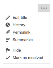
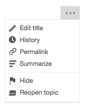
The new action is Mark as resolved, the undo is Reopen topic. They each have an icon for the dropdown menu, see examples:

action-menu.png (196×154 px, 10 KB)

action-menu-resolved.png (196×154 px, 9 KB)

To summarize an open topic (without resolving it):
-Choose Summarize in menu
-Summary editing field opens in the topic header, focus in the field
-Actions: Cancel, Update summary
-Update summary button is grayed out until there's text in the field

If the user clicks Update summary:
-Thin gray line in the topic header above the summary
-"Summary by Username:" above the summary text - extracted to T102665: Mark as resolved: Add authors line to topic summary (v2 if needed)
-The summary text in the topic header has same font, etc as regular text on the page

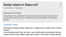
summarized.jpg (378×669 px, 171 KB)

To edit the summary on a (open or resolved):
-Choose "Edit summary" in menu
-Summary editing field opens in the topic header, focus in the field
-Existing summary text appears in editing field
-Actions: Cancel, Update summary

If the user edits the text and clicks Update summary:
-"Summary by Username & Username" appears as the byline.
-(If there are more than 2 users editing the summary, show the original person & the most recent person + # others. e.g. "Summary by A & B", "Summary by A & C + 1 other", "Summary by A & D + 2 others" etc.)
-New summary text is displayed

If the user removes all the existing summary text and clicks Update summary:
-The edit summary is blanked, and no summary or "Summary by Username" appears

To resolve a topic:
-The user clicks Resolve topic in menu
-The topic is marked as resolved
-In RC, watchlist & contributions log items, add the reason (marked as resolved)
-A check icon appears in the header, to the left of the topic title
-The timeago in the header changes to "closed just now", in bold while the summarize editing field is open
-The topic header text and background are a lighter shade than normal (need more details on this)
-The posts in that topic are collapsed
-The summary editing field opens, with focus in the field

If there is no existing summary:
-Actions: Skip summary, Update summary
-Update summary button is grayed out until the user types something in the editing field

If there is an existing summary:
-The existing summary text appears in the editing field
-Actions: Keep summary (changes to "Update summary" if changes are made to the text)

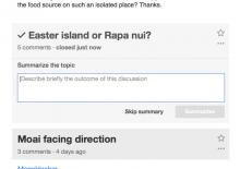
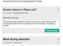
grayed summarize.jpg (485×684 px, 124 KB)

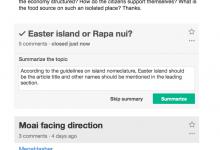
marking as resolved.jpg (504×737 px, 177 KB)

If the user clicks Update summary or Keep summary:
-The topic is marked as resolved
-The check icon is next to the topic title
-The timestamp says "closed timeago" (not bold)
-The posts are hidden (collapsed), only displaying the topic header
-For resolved topics, the topic header text and background are a lighter shade than normal (need more details on this)
-The summary appears in the topic header, with "Summary by Username:"

If the user clicks Skip summary:
-same as above, but don't display the summary or "Summary by Username"

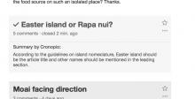
resolved topic.jpg (380×745 px, 125 KB)

To view the messages in a Resolved topic:
-Click on the Resolved topic header, and the messages "uncollapse"
-Click on the topic header again to "collapse" the messages
-Resolved topics are always collapsed by default on the Flow board
-On Topic pages, resolved topics are not collapsed
-Resolved topics are the only ones that can be collapsed, clicking on the topic header of an open topic does nothing

To reopen a resolved topic:
-Choose Reopen topic in the menu
-The topic is marked as open
-In RC, watchlist & contributions log items, add the reason (re-opened)
-The check icon is removed from the header
-The timeago in the header changes to "reopened just now", in bold while the summarize editing field is open
-The posts in that topic are unhidden
-The summary editing field opens, with focus in the field
-The existing summary text (if any) is displayed in the editing field
-Actions: Keep summary (turns to "Update summary" if changes are made to the text)

If the user clicks Keep summary:
-The topic is open
-No check icon in the topic header
-The timestamp returns to previous state, based on time of last message post/edit
-The posts are not collapsed
-The summary appears in the topic header, with "Summary by Username:"

If the user blanks the existing text in the summary field:
-Same as above, but don't display the summary or the "Summary by Username" line
reopening topic.jpg (480×662 px, 146 KB)

Icons

Event Timeline

There are a very large number of changes, so older changes are hidden. Show Older Changes

@Pginer-WMF This is great! I really like the check icon for resolved topics, and keeping the summary in the header makes sense. The prototype and video were also super helpful. :)

I wrote the new spec at the top of the ticket, in as much detail as I could think of. There are some questions that came up:

#1. I think we need a Cancel link for all of the actions (resolve, reopen, summarize, edit summary).

#2. For a resolved topic, you can see the messages by clicking on the topic header. Can you hide them again the same way? Also: we removed collapse/uncollapse from the board a little while ago because it didn't really fit any use case except to be a ToC. If you can collapse/uncollapse for resolved topics, should that also happen on open topics? (My preference would be to only have that on resolved topics, because there's an actual use case for it.)

#3. I'm assuming you can edit the summary on a resolved topic. Is that right?

#4. In the current Lock user flow, we put "This topic was locked by Username", but we don't put a byline on the topic summary. I'm glad we're combining the "reason" into the summary, but the "Summary by Username" byline feels heavy to me -- especially for the summary on an open topic. The most common use cases for summary & resolving may be things that are done as a matter of course -- "This discussion will be closed on Thursday" -- and it doesn't really matter who pulls the trigger on resolving it. We could treat it with the same weight as people who edit a post -- putting it down on the lower right. What do you think?

#5. This one's actually a bug in the current feature :) -- if you edit an existing summary and blank the text, to remove the summary completely, the Summarize button grays out and doesn't let you do it. I corrected that in the spec above.

#6. The "Keep summary" button doesn't quite fit when you're editing an existing summary, or reopening the topic. The editing field opens, and you could edit or blank the summary. What should the button say for Edit summary and Reopen topic?

#7. Do we have already have the icons for the checkmark in the topic header, the checkmark in the dropdown, and the Reopen topic icon in the dropdown?

#8. I think we'll need to adjust the topic headers for Hide/Delete/Suppress. Those will need "Hidden by Username timeago" in the summary area under the line.

Okay, those are all the details I can think of. :) Brain tired now.

  1. I think we need a Cancel link for all of the actions (resolve, reopen, summarize, edit summary).

There are a couple of details on the rational of some design decisions that may help to clarify this:

  • Making Resolve/Reopen direct. For an action such as resolve or reopen it make sense to make them as direct as possible: you mark it as resolved and it becomes resolved. There is no need for usr confirmation since (a) it is clear that it became resolved (with the aded tick mark) and (b) it is clear how to revert the actin if it was a mistake (the user will just go to the same menu and reopen it). For other actions (e.g., if they make the content disappear) it may make sense to apply other patterns (such as notification + undo, or asking for permission).
  • Connecting closing actions with the summary actions. After resolve/reopen a topic it makes sense to provide a summary. When transitioning the user to the summary editing we need to adjust a bit the messages to clarify the current status: if you show a "cancel" option, it is not clear whether that action will revert the "resolve" action you triggered before. By showing "Skip summary" in this context we communicate the idea of cancelling the summary action but keep the topic as resolved. Note that these changes will only happen when accessing the summary editing as part of the resolve/reopen workflow. For other context, the labels should remain unafected (e.g., if I click summarize anytime, I'll see the "cancel" button).
  1. For a resolved topic, you can see the messages by clicking on the topic header. Can you hide them again the same way? Also: we removed collapse/uncollapse from the board a little while ago because it didn't really fit any use case except to be a ToC. If you can collapse/uncollapse for resolved topics, should that also happen on open topics? (My preference would be to only have that on resolved topics, because there's an actual use case for it.)

I think it make sense to collapse/uncollapse resolved topics and it is ok if we just provide the functionality for them since they are collapsed by default.

  1. I'm assuming you can edit the summary on a resolved topic. Is that right?

Yes. You can edit the summary on any topic. The resolved/reopen actions transition automatically to edit summary (with some adjustment in the action names as described above) for convenience (anticipating the next step), but the regular summary editing should remain as it is.

  1. In the current Lock user flow, we put "This topic was locked by Username", but we don't put a byline on the topic summary. I'm glad we're combining the "reason" into the summary, but the "Summary by Username" byline feels heavy to me -- especially for the summary on an open topic. The most common use cases for summary & resolving may be things that are done as a matter of course -- "This discussion will be closed on Thursday" -- and it doesn't really matter who pulls the trigger on resolving it. We could treat it with the same weight as people who edit a post -- putting it down on the lower right. What do you think?

The reason was to keep the placement consistent with author info which is at the top-left of the content they create on posts. I kept the author of the summary in grey (and combined with the "summary label) to reduce the prominence, but we can think of other approaches.

  1. The "Keep summary" button doesn't quite fit when you're editing an existing summary, or reopening the topic. The editing field opens, and you could edit or blank the summary. What should the button say for Edit summary and Reopen topic?

"Keep summary" is only expected to be shown when (a) the user access the summarize action as a continuation from resolve/reopen actions, (b) the topic has already a summary, and (c) the user has not modified the summary text yet. That allows to keep the summary (including the authorship by another user), and communicate that the resolve/reopen action is positively completed (in this context a "cancel"-like action would be confusing).
In other contexts, the regular summary actions ("cancel" and "summarize" are expected).

  1. Do we have already have the icons for the checkmark in the topic header, the checkmark in the dropdown, and the Reopen topic icon in the dropdown?

There is an icon for the tick mark. The rest were created as I explored ways to represent concepts such as resolved/ongoing conversations. I'll export them and add them to this ticket.

  1. I think we'll need to adjust the topic headers for Hide/Delete/Suppress. Those will need "Hidden by Username timeago" in the summary area under the line

I'm less familiar with those actions. We can create a ticket with screenshots to adjust those and make sure they remain consistent.

DannyH renamed this task from Marking a Flow conversation as Closed/Resolved/Locked is a confusing experience (blocking for Catalan) to "Mark as resolved" for Flow topics.Jun 1 2015, 4:25 PM
DannyH updated the task description. (Show Details)

Currently, rev_mod_reason is used for the lock reason (lock is a moderation action)
We'll want to stop using rev_mod_reason and change summary (another revision object) when locking (now resolving).
But other places (e.g. recentchanges etc) may depend on rev_mod_reason to render moderation related things.

We'll want to stop using rev_mod_reason and change summary (another revision object) when locking (now resolving).

We discussed instead just using a simulated message (e.g. "Resolved the topic") as the rev_mod_reason.

DannyH renamed this task from "Mark as resolved" for Flow topics to C1. "Mark as resolved" for Flow topics.Jun 3 2015, 7:13 PM
DannyH raised the priority of this task from Medium to High.

When this is implemented, what's going to happen to topics that were already Locked?

Do they still look the same way, or should it change to the new format?

Change 217017 had a related patch set uploaded (by Mattflaschen):
WIP: Implement "Mark as resolved" user workflow

https://gerrit.wikimedia.org/r/217017

When this is implemented, what's going to happen to topics that were already Locked?

I think they should change to the new format. I see our change more as a rename (making the action more clear and fluent to apply) rather than removing some state and introducing a completely different one.

Keeping the old "locked" would also imply keeping the "unlock" action for those posts which may make things more complex than needed.

When this is implemented, what's going to happen to topics that were already Locked?

I think they should change to the new format. I see our change more as a rename (making the action more clear and fluent to apply) rather than removing some state and introducing a completely different one.

We're on the same page then. This is pretty much how I'm implementing it.

Excellent, that's what I was hoping for. :)

Change 217408 had a related patch set uploaded (by Mattflaschen):
WIP: Add ongoingConversation icon

https://gerrit.wikimedia.org/r/217408

Change 217408 merged by jenkins-bot:
MediaWiki, Apex themes: Add ongoingConversation icon

https://gerrit.wikimedia.org/r/217408

I looked at this on RoanWiki, and found a few bugs to clear up.

  • The styling for the summary should be the same size, spacing etc as regular text.
  • A resolved topic should say "closed timeago" in place of the regular timeago.
  • A reopened topic should go back to regular timeago, showing the time of the last post or edit -- not showing the time when it was resolved or reopened.
  • When there's an existing summary, the link for "Skip summary" should not appear. In those cases, just have the "Update summary" button.
  • The clickable area for collapsing should include the summary.

The clickable area for collapsing should include the summary

If I make the entire topic area clickable, it also gets activated when I click the timestamp or any menu item.

I can make the topic title and the summary clickable and not the space in between?

Whatever we choose, I feel we are missing a visual cue that something is even clickable and what it's going to do.

Yes, do the topic title and summary, without the space in between.

I agree that we may be missing a visual cue. My plan is to try it out and see what happens.

A resolved topic should say "closed timeago" in place of the regular timeago.
A reopened topic should go back to regular timeago, showing the time of the last post or edit -- not showing the time when it was resolved or reopened.

I think these are very interesting ideas and I would like to do them. If you think the feature is usable as is, I would like to merge it and get some serious QA before adding anything else. Let me know if you want me to work on it right away or create another task.

Great progress! I tried the patchset and I wanted to comment on some details worth considering (even if they are executed in upcoming iterations):

  • When a topic is collapsed, the "X comments" indicator should act as a trigger to expand/collapse it. It should behave as a regular link (turning blue on hover, and turning the cursor into the usual pointing hand). The topic link can also use the "hand" cursor to convey the interaction a bit more.
  • The action for mark as resolve in the menu should not be red. Red communicates data loss (which is not the case) and sends a warning message for an action that we are presenting as positive (you are getting work done) and fluent (you can undo it easily). We can make it blue on hover (quiet-progressive) to indicate it moves the topic one step in a process and distinguish it from simple navigation actions.
  • A placeholder text is missing in the summary text area. Especially when transitioning from resolving a task, the summary can help explain why the user is asked to add some text. The summary can be something along the lines of "Describe briefly the outcome of this discussion". Even if it cannot be done for VE due to T96593, we should support it at least for Wikitext.
  • For a resolved topic, if it has no summary reopening it should not open the (empty) summary to be edited. If the conversation was closed and there is no summarised outcome, it is not likely that there will be one when reopening it. Note that for resolved topics with a summary, it makes sense to ask the user to consider updating them since the discussion outcome may not apply after reopening it again.
  • On summarised topics there is no indication of authorship. In the prototype I included a label above the summary ("Summarised by X") to make it clear that the text below is a summary and who created it.
  • When editing a summary after resolving a topic, the "update summary button" should be disabled until the text is modified. Otherwise the user is presented a choice between that and "Skip summary" which is not clear (since both actions do the same at that point in time).

When a topic is collapsed, the "X comments" indicator should act as a trigger to expand/collapse it. It should behave as a regular link (turning blue on hover, and turning the cursor into the usual pointing hand). The topic link can also use the "hand" cursor to convey the interaction a bit more.

Done. The style of the link may need some tweaking. It stands out a lot:

Screen Shot 2015-06-19 at 08.00.31.png (164×785 px, 20 KB)

The action for mark as resolve in the menu should not be red. Red communicates data loss (which is not the case) and sends a warning message for an action that we are presenting as positive (you are getting work done) and fluent (you can undo it easily). We can make it blue on hover (quiet-progressive) to indicate it moves the topic one step in a process and distinguish it from simple navigation actions.

Done but mw-ui-icon-ongoingConversation-progressive-hover doesn't render, or doesn't exist. I don't know how it works, I'll check with @Catrope

On summarised topics there is no indication of authorship. In the prototype I included a label above the summary ("Summarised by X") to make it clear that the text below is a summary and who created it.

Was extracted to T102665: Mark as resolved: Add authors line to topic summary (v2 if needed)

Done. The style of the link may need some tweaking. It stands out a lot:

Sorry, I didn't describe it properly. The idea was to make it consistent with the timestamp next to it: grey by default ,but styled as a link on hover.

Change 219419 had a related patch set uploaded (by Sbisson):
Add progressive variant to ongoingConversation icon

https://gerrit.wikimedia.org/r/219419

Change 219419 merged by jenkins-bot:
MediaWiki theme: Add progressive variant to ongoingConversation icon

https://gerrit.wikimedia.org/r/219419

Change 217017 merged by jenkins-bot:
Implement "Mark as resolved" user workflow

https://gerrit.wikimedia.org/r/217017

Checked on http://test.wikimedia.beta.wmflabs.org/wiki/Talk:ET9.

Only two(small) things to address (besides the issue with not displaying user names for closed/re-opened topics).

  1. clicking 'Mark as resolved' - the 'Update summary' button appears active and green, not according to the following requirement:

Update summary button is grayed out until there's text in the field

  1. Currently, there is no indication that a topic was closed/re-opened. If we decide to show that a topic was re-opened, what to do with a timestamp for re-open action?

A resolved topic should say "closed timeago" in place of the regular timeago.
A reopened topic should go back to regular timeago, showing the time of the last post or edit -- not showing the time when it was resolved or reopened.

Payal.tiwari changed the point value for this task from 8 to 6.Dec 16 2016, 6:21 AM