Something like PACE minimal or barbershop http://github.hubspot.com/pace/docs/welcome/
Description
Description
| Status | Subtype | Assigned | Task | ||
|---|---|---|---|---|---|
| Open | None | T313819 Papercut: When fetching the data about a ZObject, show a pending animation state rather than just no response | |||
| Open | SGautam_WMF | T345921 LoadingIndicator: Add LoadingIndicator component to Codex | |||
| Open | None | T75972 Loading indicators / Progress indicators are inconsistent. | |||
| Resolved | • iamjessklein | T1181 VisualEditor loading indicator should feel more integrated into the mobile interface | |||
| Resolved | • Esanders | T219163 Rewrite jquery.spinner module to use CSS | |||
| Resolved | matmarex | T217784 Toolbar in loading overlay should display sooner in sequencing |
Event Timeline
Comment Actions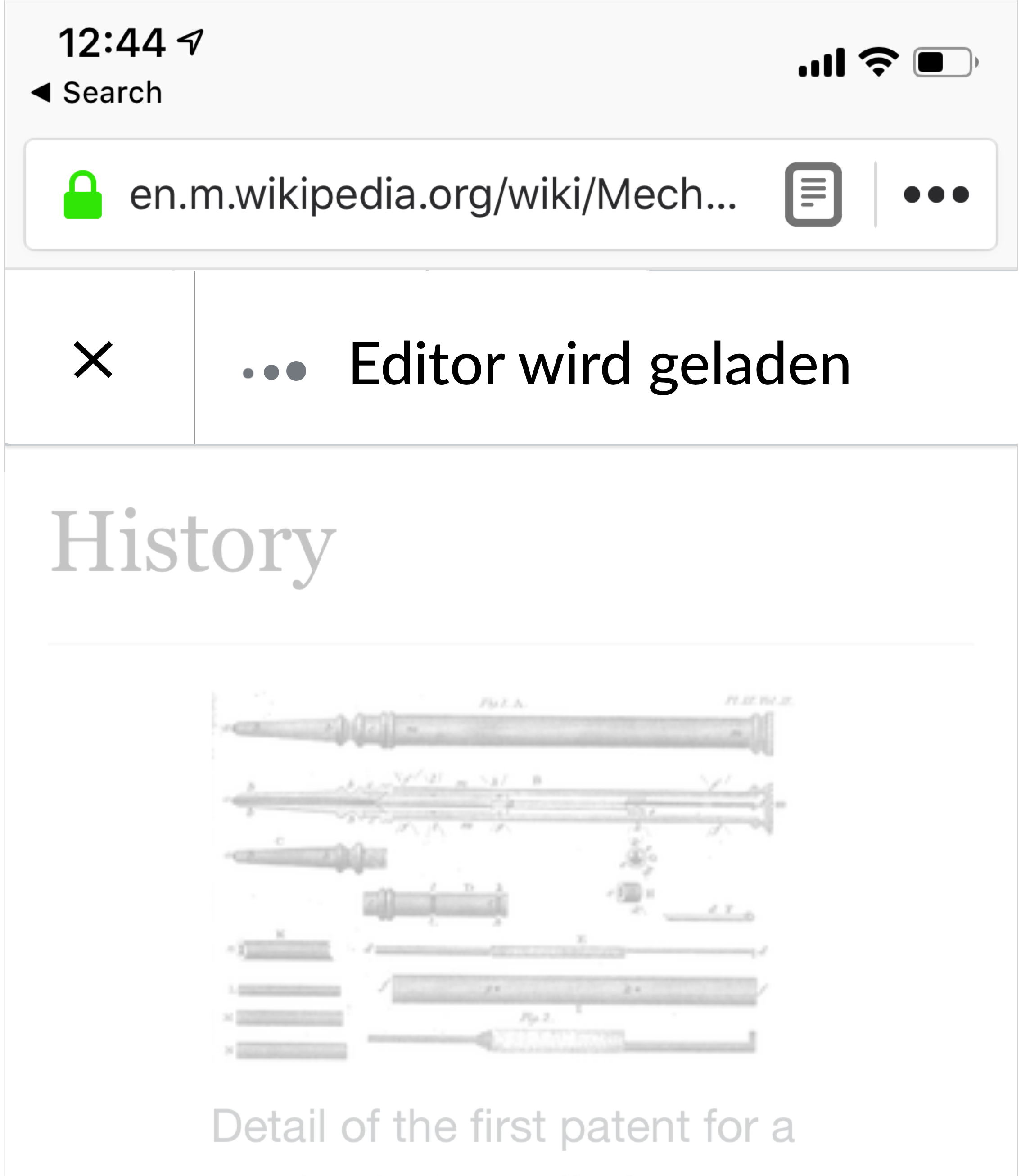
I'm thinking something pretty basic, keep the background color white and the close button on the left to have parody with the actual toolbar. In this instance, I've added the 3 loading dots as well.
Comment Actions
I'm not a big fan of the loading dots being used inline. They have only been used once before which is in CX (see T75972) where they are centred on the screen with more padding and at a larger size.
I think it also looks odd because the three dots are based on the horizontal ellipsis in typography, and these would usually appear after text (although in this context I'm not sure that would help).
In an inline context I would be more accustomed to seeing the rotating spinner used elsewhere in MobileFrontend, similar to:

The only other animation I can think of seeing inline is an actual ellipsis, e.g. Loading. -> Loading.. -> Loading... (repeat), but I'm not sure if this approach translates well to every script.
Comment Actions
An ellipsis is a (as in one) typographic character with three dots, … vs ... – depending on the font the three dots might look widely stretched, in any case they are always typographically wrong.
Comment Actions
I've iterated a bit in freehand and here's my latest proposal:
Notes:
- "Editor wird geladen" is German for "Loading Editor"
- The spinner animates indeterminately
- The height of the toolbar is 48px here, there seems to be some back and forth about the height size though, so we should probably decouple that and resolve the issue over in T209015
- In the event of text overflow, the string should be truncated with ellipsis
- This designed has been positively reviewed by @alexhollender and @cmadeo
Comment Actions
Minor nitpicks for when we implement:
- The text looks like it might be bold, it probably shouldn't be
- The spacing between the spinner are the text should be reduced. If the spinner has the same spacing either side as the close icon, it looks like there are three separate componenets: close, spinner, message, whereas I think it should look more like: close, spinner+message
- We can probably probably have a text ellipsis after the message, i.e. "❋ Loading editor..."
Comment Actions
Side note: we've historically used a gif for that loading spinner, but we could just as easily do it in CSS: https://loading.io/css/
Comment Actions
- Good call on spinner+message reading as one, but practically speaking, they are different elements.
- The text is not bold, it just appears that way due to the contrast with the opacity of the overlay
- I wasn't clear on the value of the ... after the word Loading Editor. Is this a semantic thing that I'm missing?
- I defer to you on CSS vs. gif - I suspect the CSS would decrease loading time and if that's true, +1
- Re: spacing - I was thinking the spacing between the close button and divider and the divider and start of spinner would be the same and then the space between the spinner and text would be 1/3 of that space. In the image below, I've used two gifs( for the close button and spinner) so the sizes aren't 100% accurate
- We should default to what is currently used for close button and text
Whenever we do implement this, please shoot my way for a design review before shipping.
Comment Actions
I wasn't clear on the value of the ... after the word Loading Editor. Is this a semantic thing that I'm missing?
It is just commonly used affordance to indicate that the action is ongoing. It is already used in some places in MediaWiki (e.g. "apisandbox-loading": "Loading information for API module \"$1\"...",, "unwatching": "Unwatching...",, "importstart": "Importing pages...",)
I defer to you on CSS vs. gif - I suspect the CSS would decrease loading time and if that's true, +1
Not sure which is fewer bytes, but the CSS will look better on high DPI devices.
Re: spacing - I was thinking the spacing between the close button and divider and the divider and start of spinner would be the same and then the space between the spinner and text would be 1/3 of that space. In the image below, I've used two gifs( for the close button and spinner) so the sizes aren't 100% accurate
Sounds good.
Comment Actions
*When we implement it, let's test the longest message on the narrowest screen with an ellipsis and then troubleshoot
- +1 to CSS
So, it looks like this ticket is ready to move over into "Ready for Pickup" - for engineers.
Comment Actions
This is a modified rendering of the current overlay, so using the correct icons/fonts/sizes:
Comment Actions
I implemented this, see patches on T217784#5179052. A few videos showing how it looks like (with artificially slowed down loading):
I am not entirely sure if you wanted the new design to remove the old blue progressbar? For now I removed it, but I feel like now it's less obvious when the loading actually completed – previously the large blue progressbar disappearing made it more noticeable, now it's only a small grey spinner that is replaced by the page title.
Comment Actions
@iamjessklein I'd be interested to hear how the current take on the spinner came together. Although it might have been used in Foundation products, it has never been a standard widget as stated in T75972.
I really like the progress made on the ticket, but share @matmarex' take on the spinner being less noticeable and think an indeterminate progressbar underneath the toolbar could be a viable alternative.
Let me know about your thoughts…
Comment Actions
The videos are showing the slower end of our expected loading times (~5s). I think the median load time is less than 2s and for quick loads a progress bar can feel a bit heavy. Unfortunately we can't know ahead of time how long the page will take to load.
Comment Actions
Migrating comments from gerrit:
Ed: Shouldn't the fake toolbar slide in though? I think it should...
Bartosz: I don't think it should. It appears instantly. Other overlays in MF do not have any animations like this; we only added it because it was appearing after a delay.
Ed: Ok, let's run this past Jess. I don't think we necessarily need to model our behaviour on what the rest of MF does, especially in this case as although VE is technically an overlay, it does its best to pretend it isn't.
(ping @iamjessklein)
Comment Actions
In my opinion the text going from disabled/gray to enabled/black is the obvious indication that the editor has loaded (and also a more contextual indicator than what's happening with the header).
Comment Actions
Fine by me if that was the intention.
I think this just leaves Ed's question about whether the placeholder toolbar should slide in (like the real toolbar does currently), or if it should appear instantly (as seen in the videos I posted: T1181#5179055).
Comment Actions
Looking at the animation again, I see that have you an intermediate stage once the editor switcher and publish button are available that truncates the loading message:
| 1 | 2 | 3 |
 |  |  |
While I can see the advantage of showing progress being made by showing elements as they become available, I think the fact there is no transition from 1 to 2 and the truncation of the message means we should probably just go straight from 1 to 3.
Comment Actions
Sure, done. (I'll note that this makes the editor switch dropdown inaccessible until both the editor code and the content has loaded.)
Comment Actions
👍to upload the version without the intermediate stage and add in the subtle slide down transition.
Comment Actions
Ed reviewed and merged the changaes, and the new loading indicator can now be seen on Beta, e.g. https://en.m.wikipedia.beta.wmflabs.org/wiki/Digital_object_identifier. It will go live on production sites next week, 18-20 June, per the usual train deployment schedule.