Display current echo notification count in the favicon — http://blog.tommoor.com/tinycon/
Alternative is T75209: The document title should be dynamically updated to include a (n) notifications count in the browser title bar.
| • Jaredzimmerman-WMF | |
| Nov 9 2014, 8:39 AM |
| F16216: 2014-11-26_01_31_29-Wikipedia,_wolna_encyklopedia_-_Opera.png | |
| Nov 26 2014, 12:41 AM |
| F16193: Screenshot_2014-11-25_15.07.54.png | |
| Nov 25 2014, 11:12 PM |
Display current echo notification count in the favicon — http://blog.tommoor.com/tinycon/
Alternative is T75209: The document title should be dynamically updated to include a (n) notifications count in the browser title bar.
Wow, no, please don't. Unlike, say, email services, providing notifications isn't the primary purpose of Wikipedia.
This is a common practice on many sites with notifications, not simply email applications/sites. Since many community members seem so concerned with other users missing or overlooking messages this seems like a pretty clear win for those use cases, what is your concern with implementing it?
My concern is feature bloat.
(And users ignoring messages sent to them is a human problem, not a technical one. You can't be seriously suggesting that anyone can accidentally miss an orange bar taunting them in the corner of every page until they click it.)
I don't see the orange bar as a permanent element. Do I think ignoring/overlooking messages is a technical/Design problem? It certainly can be.
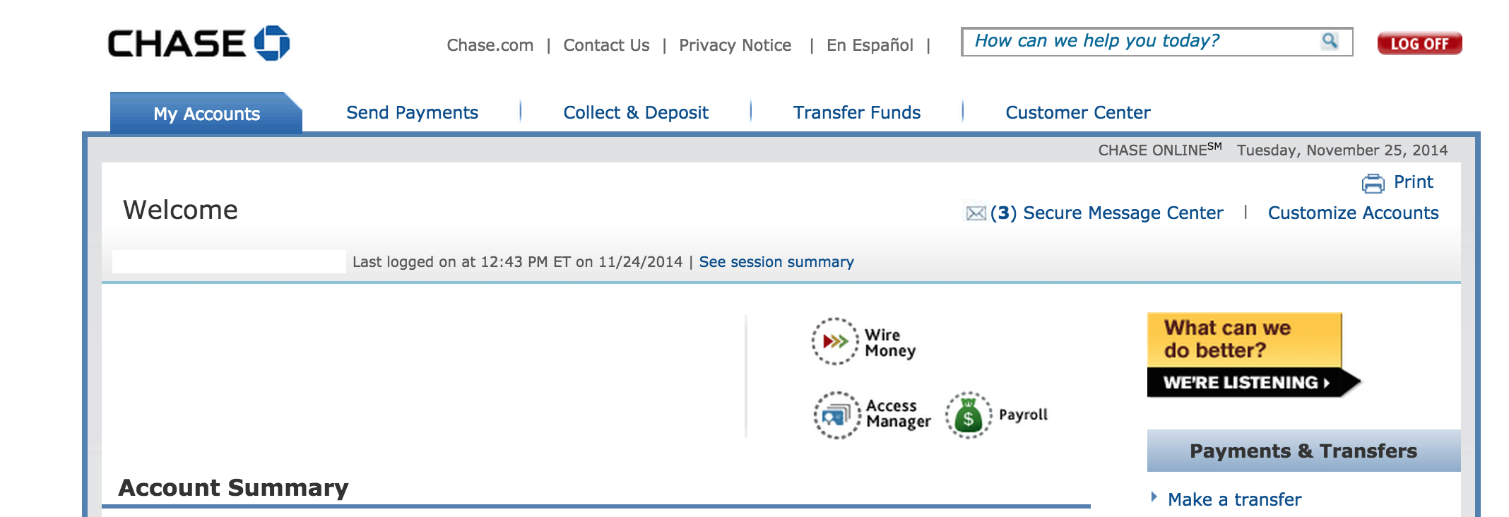
take a look at this interface, how many seconds does it take you to see how many messages you have? given this product (a bank account) does not have the main purpose of sending and receiving messages, the messages are still quite important, and in some cases time sensitive.
I don't think this request leads to feature bloat, and it has the plus of not cluttering the UI as well. Once we have a way to trigger notifications without page loads it will have the benefit of allowing someone to know a notification is present without even having the tab in focus.
It took me less time than the image took to load, so I guess a second or two. The red "Log off" button was the first thing I looked at, I completely ignored the massive "What can we do better?" image (banner blindness, heh) and started scanning the page for numbers, which I quickly found, since at the very least the number is bold and has an envelope icon.
That is, however, not how our design looks. Ours looks like this:
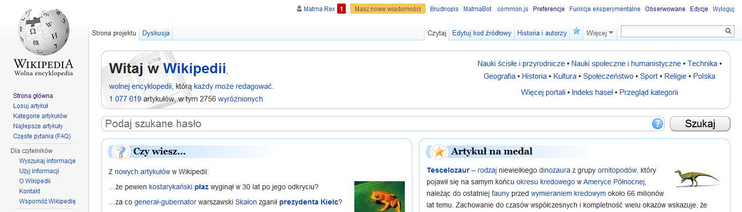
The red icon and the orange bar are the single colorful point in the entire UI, and immediately draw the eye (this is honestly rather skillful use of color, the Vector skin is subdued and the notifications are accented). This is visible even on the main page (which is rather flashy, compared to regular pages) and even in the miniature visible here (the bright blob shines through).
I use favicon to identify the sites when I have fifty tabs open. I don't need stuff covering them. When I look at Wikipedia, the indicator is obvious (to the point of being distracting sometimes when I really don't care what people want from me and just want to read the article); when I don't, I don't need to care about it. Please don't force-feed me more data every second, I am already sick from overeating.
That's simplifying the issue, since the orange bar does not show for mentions, which are used as messages in some cases.
Could this be implemented as a userscript/gadget, instead? Then people can opt-in, if they want it.
I find the numbers in the titles of Trello, Gmail, and Phabricator to be annoying. They blink/change, and distract my attention, 99% of the time for something that isn't urgent.
If I have a lot of tabs open - which I and many highly active editors usually do - then all those tabs will be blinking/updating.
See also T75209: The document title should be dynamically updated to include a (n) notifications count in the browser title bar.
See also (?) T34283: API method to poll centralized notifications
@Quiddity I've never noticed any blinking, are you just referring to when a new notification arrives? Or something else. Perhaps a video would be helpful.
I'd prefer not to proliferate gadgets but that might be a good way to do some quick testing.
sent while mobile
Ah, "blinking" was the wrong word, as that implies on&off. I'm just referring to when a new notification arrives. Especially the first one (going from nothing to (1) in a red bubble).
Also I updated my comment above, to note how the issue is magnified when there are multiple wiki tabs open at the same time.
I'd prefer not to proliferate gadgets but that might be a good way to do some quick testing.
This is exactly what Gadgets (and preferences) are for! Customizations that not everyone wants or needs, but are helpful to some people; customizations that will significantly detract from the experience of many, whilst benefiting others.
I'm not sure that "significantly detract from the experience" is a reasonable characterization of an established pattern like this. Although I understand that you find it distracting. Perhaps some subtle animation rather than it flashing in would would make it less distracting for you.
As Matmarex indicates, the purpose of the favicon is to visually identify the site, and while such notifications for email might be useful because it can tell you that you got a new email when you're on another tab (I assume there are folks out there who don't get so much noise email as to make it utterly meaningless), wikis aren't like email. You tend to care most about what's happening on the wiki when you're on the wiki itself, on one of those tabs, and there what we have on the page stands out quite effectively already, far more so than a favicon number would if implemented properly. When you're not on it, you're doing something else, and don't need the distraction.
Now I could buy that a subset of users might find this useful regardless (especially perhaps new users), but that is what a gadget would be for, as quiddity suggests. New users, too, would probably need to turn it off after awhile when it becomes less useful over time.
If you think that this would be useful to new users than a gadget is not a
very reasonable way to implement, as new users are unlikely to discover it,
by that logic it should be on for everyone and use a gadget to disable for
users who find it distracting.
*Jared Zimmerman * \\ Director of User Experience \\ Wikimedia Foundation
M +1 415 609 4043 \\ @Jaredzimmerman http://loo.ms/g0
Has that not been fixed? Seems like there would be a lot of use cases
for off-by-default; on-for-new-accounts gadgets, potentially.
Either way it'd need A/B testing to see if it even does affect new user
retention here, however.
Sadly we don't have a standard A/B test framework so until then I don't
know that having it as a blocker makes sense.
*Jared Zimmerman * \\ Director of User Experience \\ Wikimedia Foundation
M +1 415 609 4043 \\ @Jaredzimmerman http://loo.ms/g0
If there's no way to test it, then adding something that only *might*
help is probably not a good idea.
There are qualitative ways to test many things which are much more difficult to quantitatively test.
sent while mobile
User:Ainali raised the prospect of introducing some kind of visual indication within the favicon so they can know when/if they receive a new notification while focused on another tab:
I have at least one tab open of Wikidata, Wikimedia Commons, Swedish Wikipedia, English Wikipedia and Meta at all times. Usually >several of each. Having them open and switching to them feels easier than switching to the tab. I have the watchlists as the default >open page, and then any that have things I would like to read or come back to edit later.
This also reminds me that some other platforms (Mattermost, Slack, LinkedIn, Gmail) can give a visual clue in the favicon that there are notifications, so that if I would happen to be somewhere else knows that something has happened). | Topic:Wh5d6oyzjqpi1hzx
One issue is that we don't really have a single notification framework; compare e.g. T294382: Indicate number of new changes in watchlist in the document title. The other issue is that Wikipedia is not a platform where reacting to notifications is the primary purpose, unlike Mattermost/Slack/Gmail (Linkedin is more similar). Also FWIW neither Gmail nor Linked show notification counts in the favicon (they show it in the title instead, although Linkedin shows a binary "there are notifications" dot).
To be fair, I don't think there was much grounds to decline it. It would need some sort of product justification, which hasn't been attempted yet, but we would have to close a lot of tasks if that was enough reason for declining.
It's outside the scope of the Growth team (Echo's current maintainers-by-inheritance) though, so absent some reason of why this would have significant impact, I don't think we can spend either development or design research time on it.
Removing Wikimedia-Design as this is tracked with the Design and Growth-Team design already.