Page MenuHomePhabricator

Create a schedule table for sessions in a grid format for the developer summit
Closed, ResolvedPublic

Description

From last year’s survey, it seems like people had a hard time navigating between different venues (Phabricator, etherpad link, and wiki), a few thoughts about the same:

  • We re-organize our summit wiki content so that it's easier for participants to locate session information quickly. For example, we could make our summit main page showcase the event agenda in a grid format listing all the sessions, with each session block linked to the corresponding description page. On each description page, we showcase session title, its description, facilitators info, link to the online venue, link to resources page, etc. to avoid any back and forth between different spaces. We could learn this from how SRCCON does it.
  • In context of the simultaneous discussions on the talks:
    • We could probably use each sessions’ wiki discussion page, for allowing posting of comments from both in-person and remote participants.
    • We could encourage the use of tags like #Iamaremotee, #question, #info, #comment, #resource, etc. that would help our facilitators to moderate the session discussion on the go.
Event Timeline

Qgil triaged this task as Low priority.Nov 8 2016, 2:11 PM
Qgil moved this task from Backlog to November on the Developer-Advocacy (Oct-Dec-2016) board.

Thank you for starting this conversation.

About the schedule, there is https://www.mediawiki.org/wiki/Wikimedia_Developer_Summit/2017/Program#Schedule, which will evolve into a schedule in the next weeks.

I agree that http://schedule.srccon.org/ looks better than https://www.mediawiki.org/wiki/Wikimedia_Developer_Summit_2016#Monday.2C_January_4, and I bet is is mobile friendlier too.

About discussions, note that as it is designed now, each session has a Phabricator task, not a wiki page. Tasks can take comments too, but the main problem is that during the session people are not expected to reload all the time to see whether new notes / questions / comments have been added. Real-time editing is why the etherpads became popular.

One approach can be to focus on tasks before the session, on etherpad during the session, and then just copy & paste the contents of the etherpad to the task description at the end of the session. This way what remains for each session is a single Phabricator task with all the information and discussion held before, during, and after the session. The etherpads just go to the place where all the forgotten etherpads live.

Yesterday @TheDJ volunteered in the creation of an empty schedule at https://www.mediawiki.org/wiki/Wikimedia_Developer_Summit/2017/Schedule_table

I still think it would be better to have something like http://schedule.srccon.org/ (which I just checked on mobile and looks/behaves great indeed). Wikitext takes some HTML, including divs. Do you want to try, @srishakatux ?

srishakatux renamed this task from Improve collaborative note-taking and discussion spaces for talks for in-person and remote participants to Create a schedule table for sessions in a grid format for the developer summit .Nov 10 2016, 11:49 PM

@Qgil thanks for your input! @TheDJ Thank you for creating the table :) I will add more to it in the next few days or so.

@MelodyKramer @Rfarrand @ksmith I will share with you guys once this is done for feedback!

srishakatux raised the priority of this task from Low to High.Nov 10 2016, 11:53 PM

To be clear, I am proposing converting that HTML table in divs for better presentation,, flexibility, and mobile use.

Took the first step towards making the schedule table appear in a grid format with use of divs https://www.mediawiki.org/wiki/Wikimedia_Developer_Summit/2017/Schedule_table.

If the initial version makes sense, then I will make further iterations, improve the HTML code and design, and document it.

@TheDJ @Qgil Thoughts/ feedback? Would it be possible for you to point me to resources where I could investigate how I could make the wiki page with divs responsive? I looked at a few resources but couldn't find anything relevant. Also, could you connect me with people who could help review the HTML code and give feedback on whether it's the right approach or there are better ways of doing this (as it's the first time I am doing this HTML+wiki integration)?

Thanks!

I'm not a wikitext-HTML ninja, although I am happy to test and give feedback.

In the registration there was an option to volunteer with the website, and I bet some people offered help? If you don't have access to the list of responses, @Rfarrand can help.

For "extreme" cases there is the design mailing list.

I recommend the basic table approach, as used by TheDJ initially. Because:

It's more complex to edit a page that uses complex divs. Especially if we need to re-arrange sessions.

It's more difficult to understand which sessions are simultaneous, if they're not displayed in table form. (i.e. the downside of responsive layout, in thin screens.)

Tables work acceptably well on mobile, especially if we rotate our device.

It's what everyone is used to. For past examples:

The priority is to have an informative and nice-looking schedule that is usable both on desktop and mobile.

I personally think that this is easier to achieve with divs than tables, and both can be edited easily with VisualEditor. "This is what we have done until now" is not always a good argument. I am a heavy mobile user, and our schedules are usually a pain to navigate when checking on the go.

If you think of it, we don't need to stick on a table filled with columns and rows, smalls fonts, etc. We can just a have a plain single column that... wait, let me search... There we go, the first example I search for:

https://events.google.com/io2016/schedule

Let's try a second. Oh, look:

https://developer.apple.com/wwdc/schedule/#/

I am not cheating! :) These are literally the two first examples I have searched, just because they are the two main tech events that I can think of.

Said all this, I really don't mind what technical solution @srishakatux comes up with (I had strong opinions during our 1:1, I actually don't have them now).

""This is what we have done until now" is not always a good argument. " is my point exactly: using complex tables because of certain templates/structures that were easier to copy/paste doesn't mean this is what we need to keep doing, now that the visual editor offers a good option to creating and maintaining tables that also works well on mobile. Again, just a suggestion to spare everyone's time.

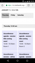
@Elitre @Quiddity I've taken your suggestion into account and changed the div approach for creating the schedule with simple tables. I believe the schedule should now be easier to edit with visual editor as well. Here is the link https://www.mediawiki.org/wiki/Wikimedia_Developer_Summit/2017/Schedule. It appears on the mobile phone as indicated in the screenshot below:

Screenshot_2016-11-21-18-15-02.png (1×720 px, 90 KB)

@MelodyKramer @Rfarrand @Qgil @TheDJ Do you have any other feedback/ concerns? Thanks!

srishakatux lowered the priority of this task from High to Medium.Nov 22 2016, 2:22 AM

Wait what? We're using tables for tabular data, not for layout. I would expect the tables to be more usable on mobile than a div based layout in that case.

I know the table is a work in progress, but even at this stage it might be worth correcting the dates and days of the week.
The event takes place Monday - Wednesday (which is January 9-11).

@Bawolff I am not sure I understood your comment :) With the current approach as well, we are using tables and not divs, and the idea was to allow the tabular data to render well on phone. So, it is an attempt to meet that goal. @Rfarrand thank you for noticing that. I made the changes.

Sorry, i see what you mean when i look at the new schedule. Some of the previous comments on this bug made me think we were getting rid of tables just for the sake of getting rid of tables, which doesnt make sense to me, but i see i was mistaken.

reached out to @cmadeo for help with UX review.

The Program committee needs to publish the drafty schedule on Monday 12. For this reason, it would be great to have this task completed by Friday 9 (you can always fine tune details in the wiki page itself).

srishakatux raised the priority of this task from Medium to High.Dec 2 2016, 10:27 PM

@Qgil Once we have a finalized schedule, I will update the table. I'm meeting with @cmadeo next Tuesday and I am hoping to make any further design-related changes required after that.

Additional note: besides what we currently have on each session block, I'm considering to add dummy links for youtube directs and IRC channel for discussion for remote participants.

Looking good overall, but some quick feedback:

  • Currently the time headers are breaking the table on iPhone 7
  • If there will be more than four sessions per time slot, having a way to minimize a time slot would be helpful for scrolling or keeping place on the schedule
  • Having two sessions per-row on desktop makes sense to take advantage of the screen width, however the titles are breaking a fair amount on mobile. Would it be possible to have each session take up a full width row on mobile?
  • Depending on how many time slots there are it might be helpful under the date selection tab to have links to each time slot or a dropdown of all of the timeslots
  • Wednesday is not centered in its tab cell
IMG_0282.PNG (1×750 px, 178 KB)
Header breaking table

@cmadeo Thank you so much for reviewing the table and giving such valuable feedback. I will incorporate your feedback, and will ask any questions that I might have if still meet on Tuesday :)

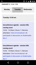
I've incorporated UX feedback given by @cmadeo here: https://www.mediawiki.org/wiki/Wikimedia_Developer_Summit/2017/Schedule/Day_2 and tested it on the mobile. It looks way better than the earlier version! thank you so much @cmadeo :)

Screenshot_2016-12-03-00-06-21.png (1×720 px, 136 KB)

I have added dummy links on the session block to show how I'm thinking of adding video and IRC discussion link for remote attendees. @Rfarrand @Qgil Do you have any feedback/ suggestions? Is there anything that I am missing? Once we have the final schedule, I will update the wiki and meet with @cmadeo for a quick and final UX review.

@Qgil @Rfarrand I've updated the schedule page that we previously created: https://www.mediawiki.org/wiki/Wikimedia_Developer_Summit/2017/Schedule/. If this looks okay, I will update our new program schedule page before we send out the emails to participants.

The design looks very good to me, thank you!

But wait, right now it is impossible to tell which sessions are concurrent. Would it be possible to leave an extra space to separate "blocks of time"?

Also, you listed all the Room 1 sessions first, then all the Room 2 sessions, making it quite impossible to see what sessions are concurrent.

Even if we are still discussing the exact times for each slot, I think it would be useful to add the draft times, so people can have an idea about what to expect. That would include breaks as well.

Since the schedule is not usable in its current stage, I'm taking the liberty to reopen this task.

I strongly urge

  1. Everything on one page (instead of split into 3)
    • This enables (A) easier watchlisting, (B) better usability (and less page-loading) for checking/searching for a session (e.g. if I don't remember what day it is happening), (C) easier editing if we want to move something from one day to another.
  2. the use of basic tables with minimal styling, for ease of editing by everyone

We should also redirect the old links (https://www.mediawiki.org/wiki/Wikimedia_Developer_Summit/2017/Schedule )
to the new location (https://www.mediawiki.org/wiki/Wikimedia_Developer_Summit/2017/Program )
in case anyone had those bookmarked/etc.

@Qgil my bad! I assumed that the layout is set, and we'll now keep updating the schedule as we go :) @Quiddity thanks for your feedback, I do agree that everything on one page makes it easier to view, I've taken your feedback in my latest changes.

I am showing tentative time slots that we are still planning on in the schedule now. Hopefully, they will make things clearer.

Here goes: https://www.mediawiki.org/wiki/Wikimedia_Developer_Summit/2017/Program

@Qgil could we just discard https://www.mediawiki.org/wiki/Wikimedia_Developer_Summit/2017/Schedule link?

cc @Rfarrand

The separation of time slots is clear now. Thank you!

@Quiddity, we have discussed the styles and the structure of the table and I think we are past the point of making changes unless there are bugs. With the Unconference slots, we might have up to 6 concurrent sessions, not 3. I have tested editing the table from mobile (visual editor) and it works just fine.

I have made the "break" separations more homogeneous. I think the background color should be a bit more different. In my laptop with daily light it is difficult to differentiate one from each other (no problem with my mobile phone).

I think the sentences for video streaming and recording can be shorter. Now they take too much attention away. "Video streamed" and "Video recorded" could be enough?

I have updated the schedule based on discussions between Program committee and Architecture committee. More changes are still expected, but we don't need to keep this task open for that.

PS: "Nature walk"??? :)

One last thing. There could be a page with information about all the rooms, with their names and own sections/anchors. Then in the schedule we could use the name of the rooms and link to the right section, instead of relying on a legend at the very end of the table.

@Qgil Thanks for making the changes :) Description for streamed videos will become something like "View live broadcast" & "participate in the discussion on IRC" with respective links. For recorded videos, I agree we can shorten the text.

@Rfarrand and I've plans of adding real room names to the schedule. I am also thinking how about in our room description section; we add the image of the venue floor plan?