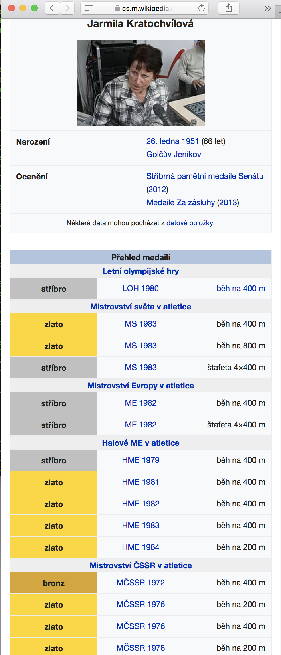
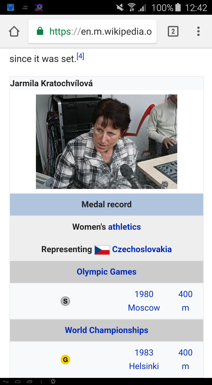
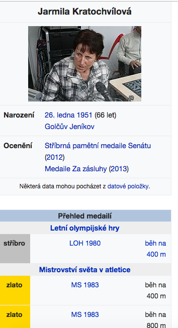
CSS rule .content table.infobox td { width: 100% } added in rEMFR98b155f7ebf75381c4e28dcab91d9d61839e8462 (T162913) broke a widely used template in Czech Wikipedia. You can see an example in this article (mobile version), the table in question is below the main infobox and has title "Přehled medailí". The middle column is much wider whereas the rightmost is as tight as possible, wrapping the words unnecessarily. Disabling the rule in browser's console fixes the problem.
This has been discussed, the conclusion was to report it here.
With rule (current):
Tablet:
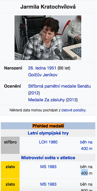
Mobile:
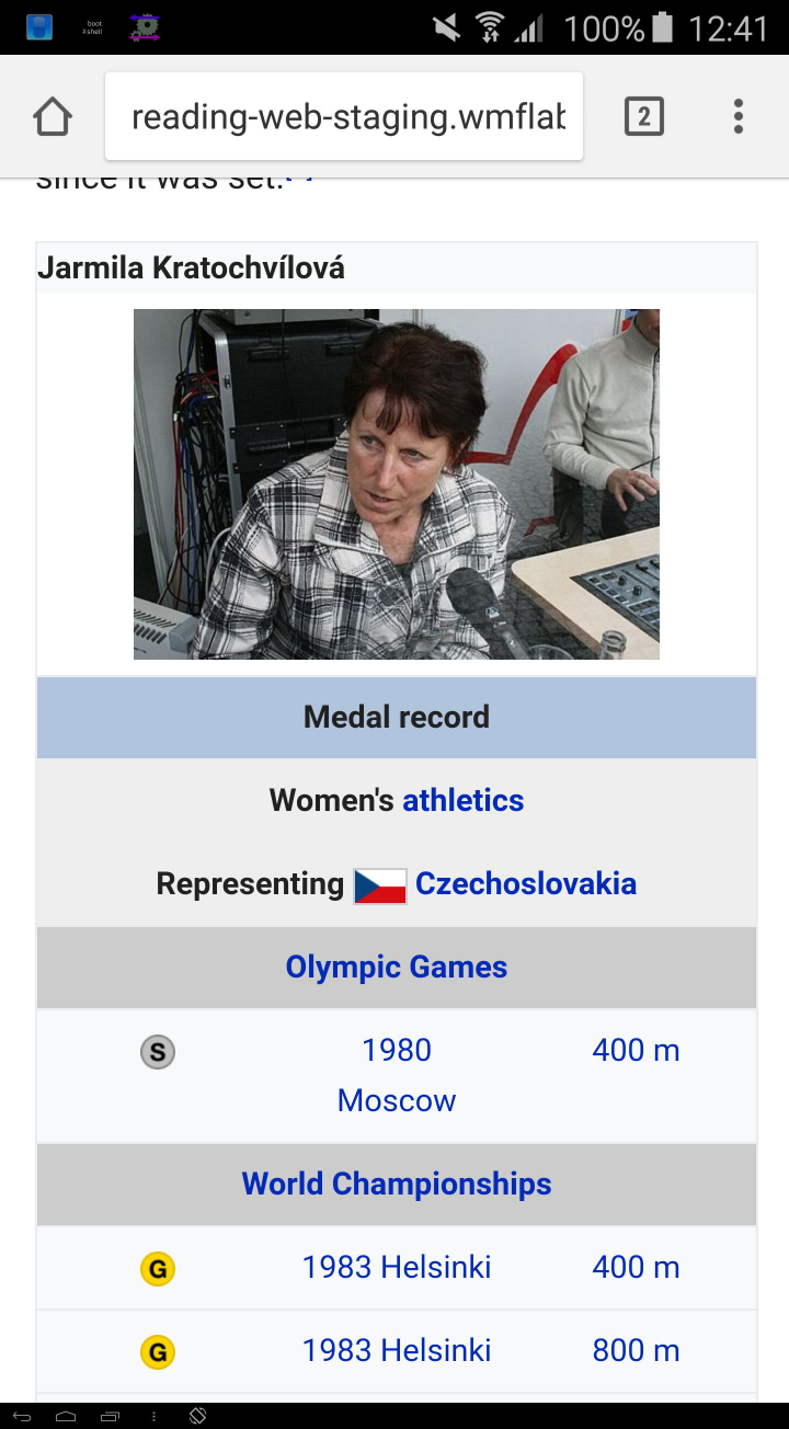
Without rule (proposed):
Tablet:
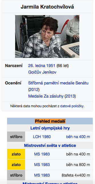
Mobile:

Developer notes
A fix using flex box has been proposed by @TheDJ in https://phabricator.wikimedia.org/T168716#3395086
- On grade A browsers, columns should be be equally divided
- On grade C browsers which do not support flex box (e.g. IE9), the text inside the infobox should be readable although the column width does not need to be equally spaced and text can wrap if necessary.