Page MenuHomePhabricator

Infobox caption should be properly formatted in the mobile view
Closed, ResolvedPublic2 Estimated Story Points

Assigned To
Authored By
Vachovec1
Jun 26 2017, 1:30 PM
Referenced Files
F28395687: T168861-1.png
Mar 16 2019, 12:31 AM
F28395694: T168861-2.png
Mar 16 2019, 12:31 AM
F28392508: image.png
Mar 15 2019, 11:31 AM
F28376770: Screen Shot 2019-03-12 at 3.58.01 PM.png
Mar 12 2019, 8:01 PM
Tokens
"Party Time" token, awarded by TheDJ."Burninate" token, awarded by Jdlrobson."Burninate" token, awarded by Dvorapa.

Description

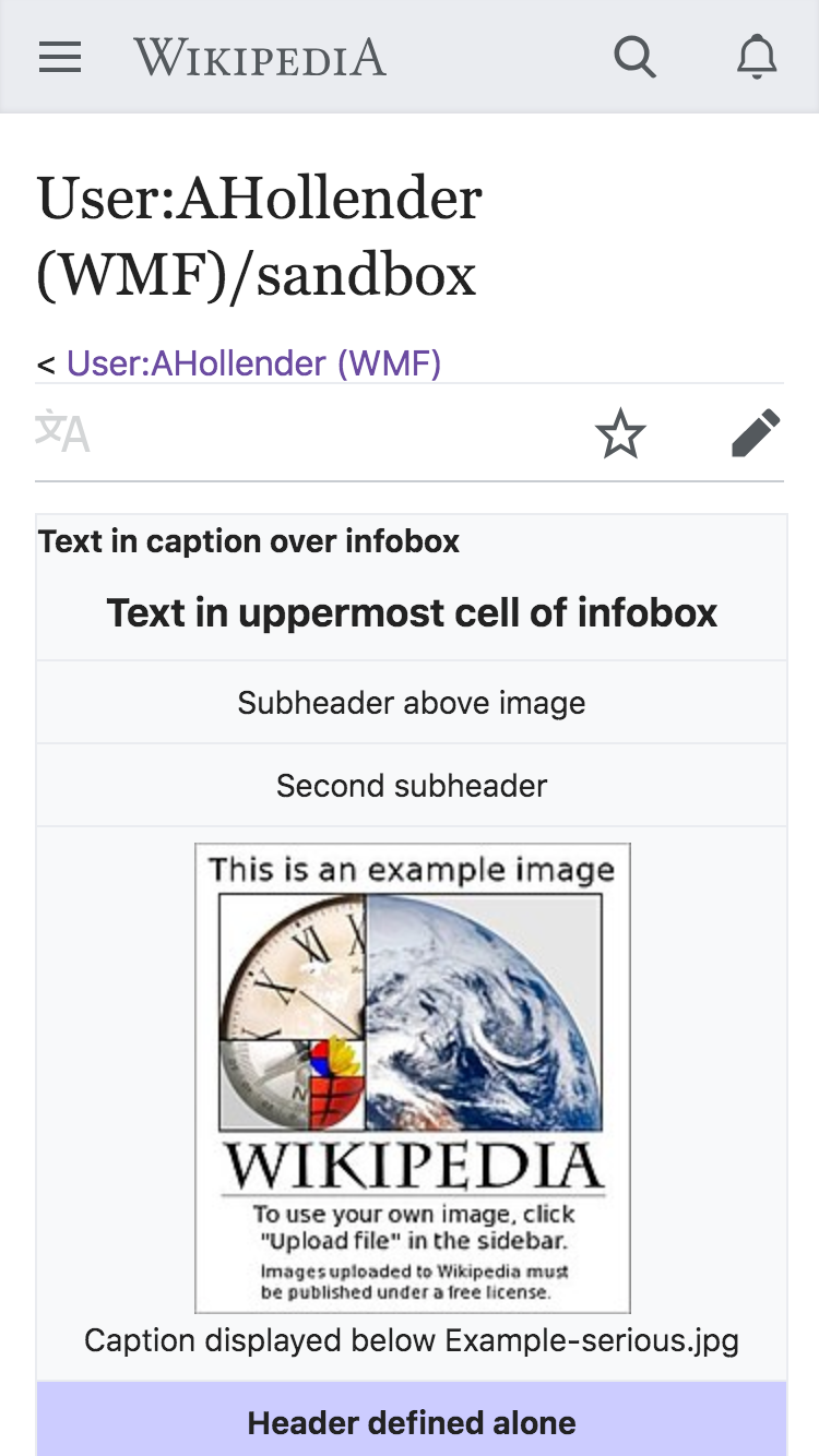
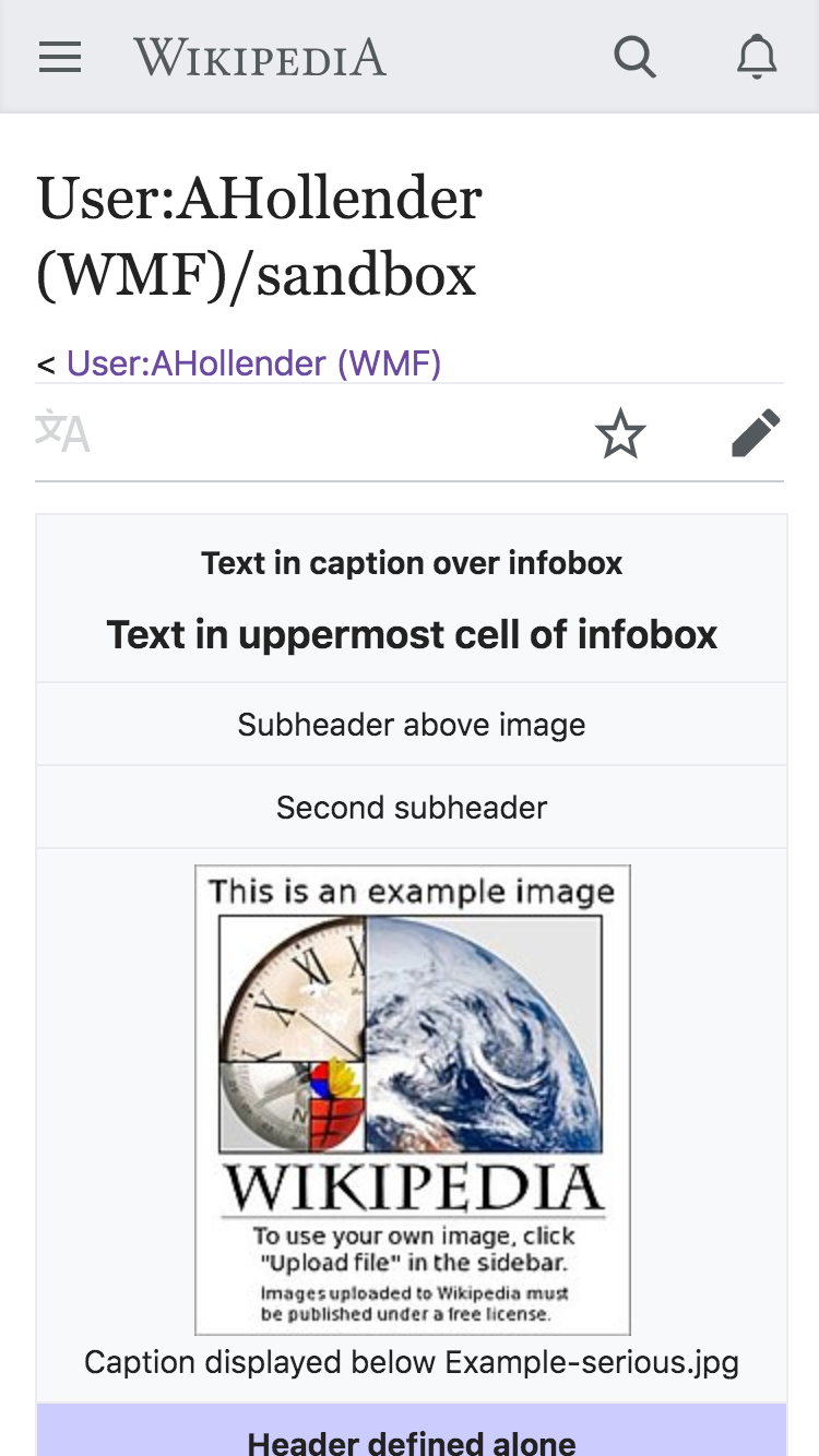
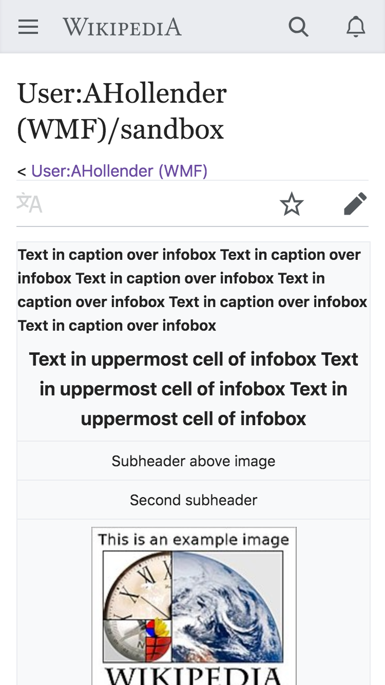
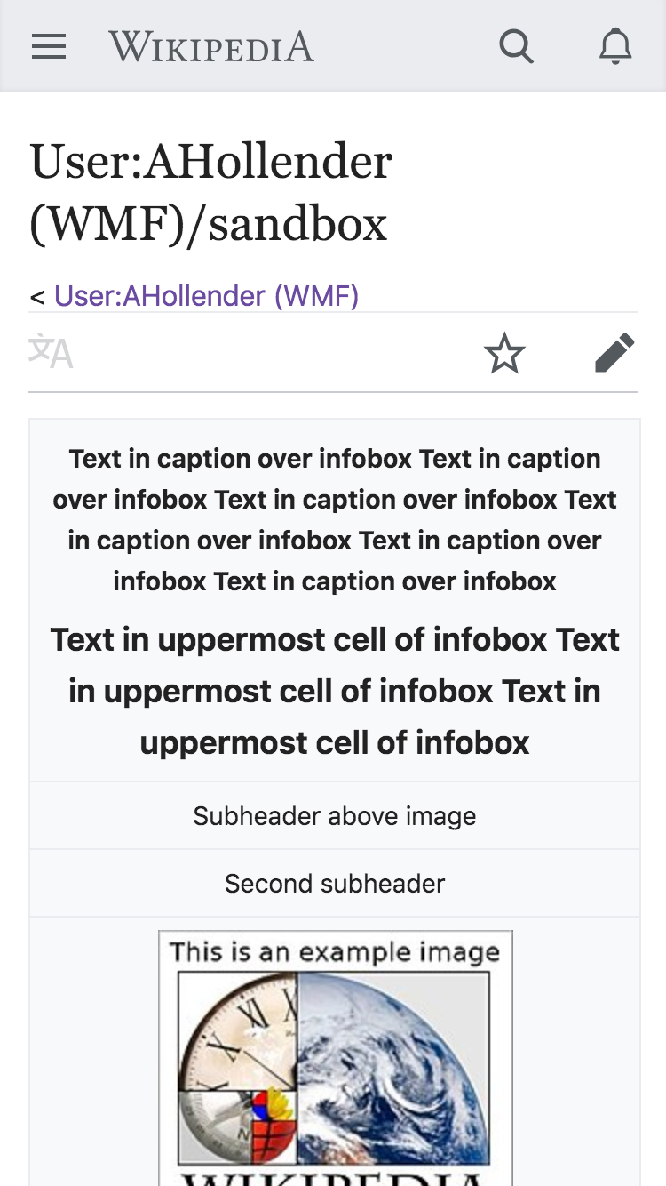
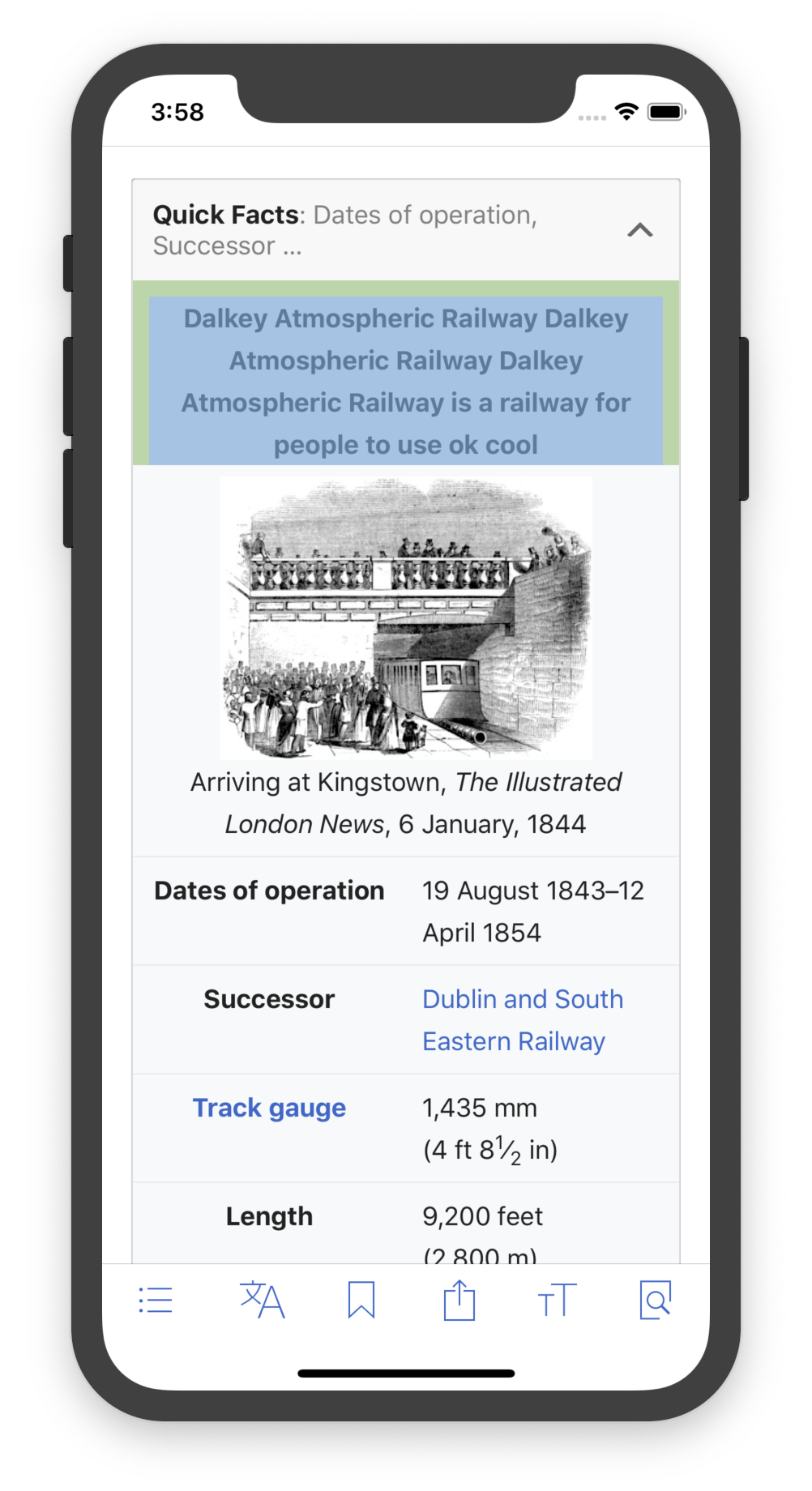
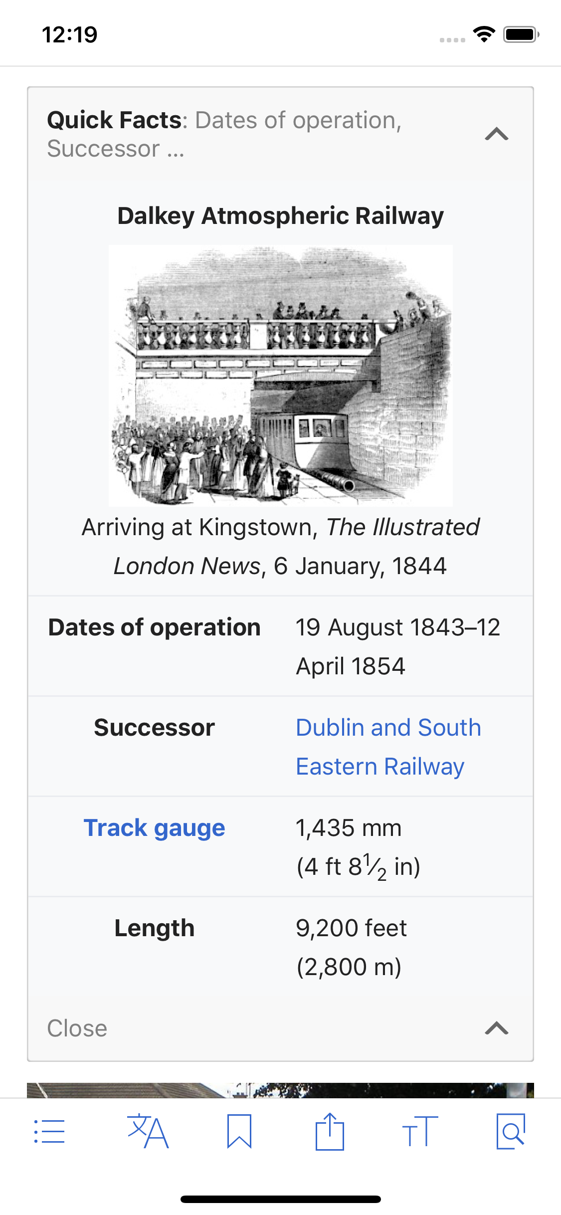
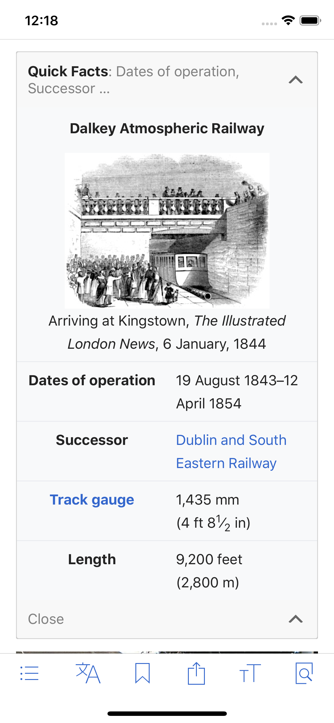
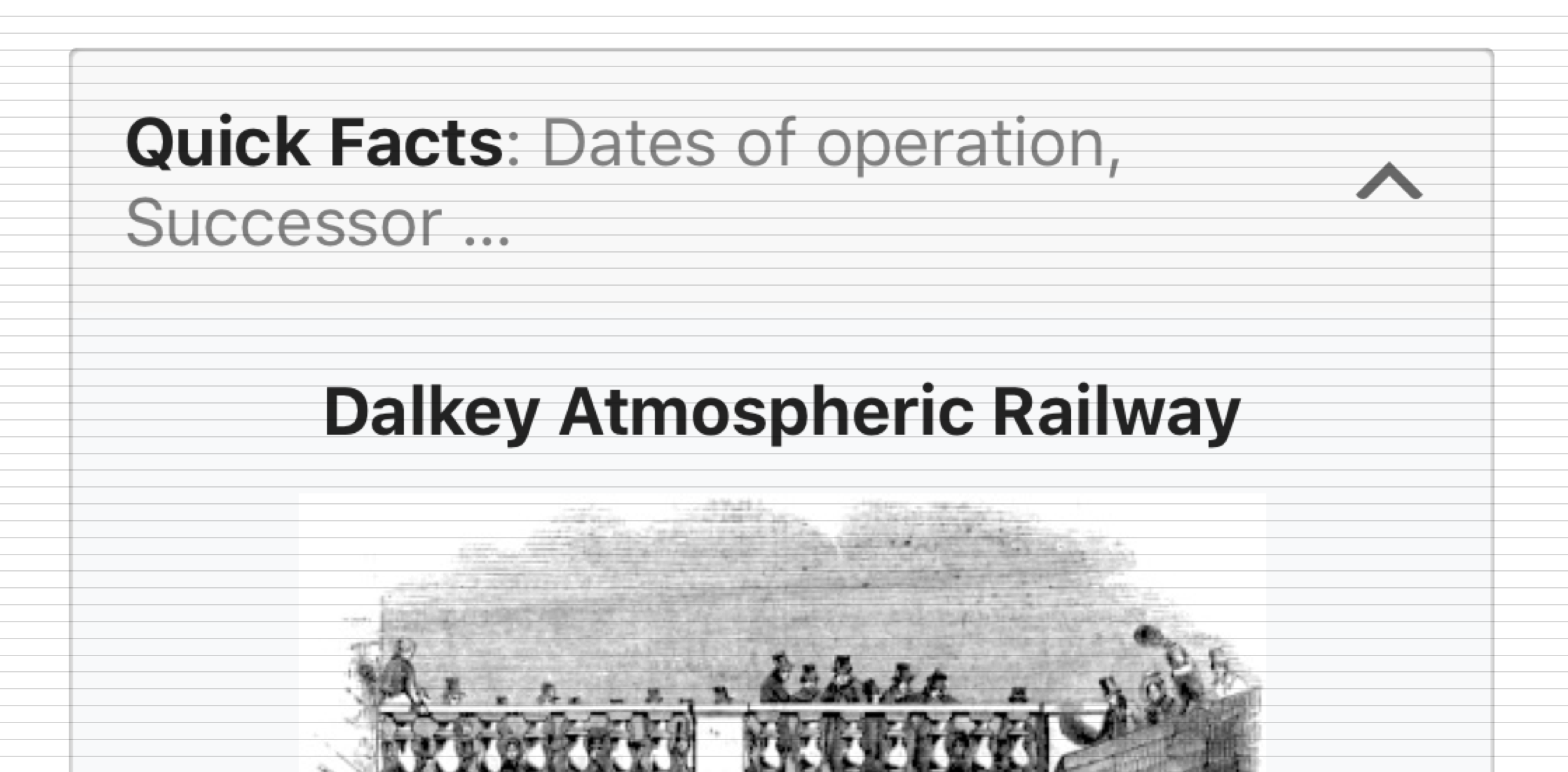
An infobox could have its header above the template table ("caption") or at the top of the template table ("above"). In the moble view, only in the second case the header is properly formatted (bigger font, centering). In the first case, no formatting is applied (the letters are "normal" and the header is centered to the left.

On desktop:

Screen Shot 2017-06-27 at 1.44.27 PM.png (433×1 px, 186 KB)

On mobile:

Screen Shot 2017-06-27 at 1.44.11 PM.png (642×400 px, 125 KB)

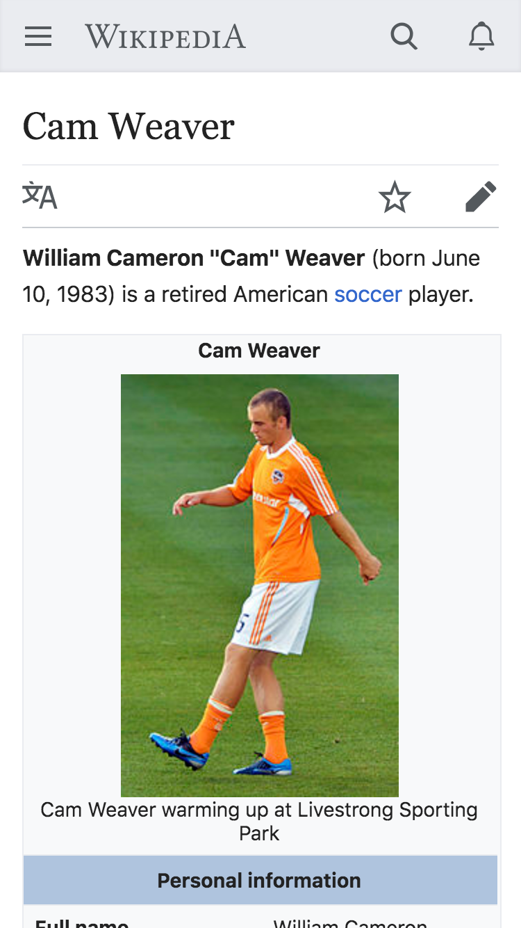
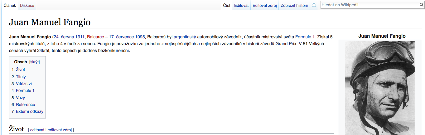
An example of suboptimal behaviour: https://cs.m.wikipedia.org/wiki/Juan_Manuel_Fangio (see the infobox header)

Acceptance criteria

Per T168861#4992309

  • captions are centered
  • captions have padding 10px on top, left and right (10px 10px 0)

QA steps

QA Results

StatusDetails
✅ PassedT168861#5028888

Event Timeline

There are a very large number of changes, so older changes are hidden. Show Older Changes
Jdlrobson added subscribers: Nirzar, Jdlrobson.

hey @Nirzar - any suggestions with how to style the caption?

Side note: Any reason why we repeat the title of the page in the infobox?

The <caption> tag defines a table caption.
The <caption> tag must be inserted immediately after the <table> tag.

Side note: Any reason why we repeat the title in the infobox?

No idea why. sometime it links to another article...

@Vachovec1

properly formatted (bigger font, centering)

I would want to know what you mean by "proper"?

Side note: Any reason why we repeat the title in the infobox?

No idea why. sometime it links to another article...

@Vachovec1

properly formatted (bigger font, centering)

I would want to know what you mean by "proper"?

Please read https://en.wikipedia.org/wiki/Template:Infobox#Title. At cs-wiki, the situation/usage is the same. Notice that the first option ("Text in caption over infobox") is actually the recommended option.

Regardless of user choice, both options should be equal (in mobile view). So the "caption" header should have the same form as the "above" header.

https://en.wikipedia.org/wiki/Template:Infobox#Title says its for accessibility reasons so whatever we do should ensure the infobox remains accessible.

Regardless of user choice, both options should be equal (in mobile view)

This is not necessarily true. Mobile users are limited in space and the whole purpose of the mobile site is to make our content user friendly. Yes, consistency is important, but in mobile the caption is displayed very close to the title of the page when you compare to desktop.

Yes, consistency is important, but in mobile the caption is displayed very close to the title of the page when you compare to desktop.

What are you talking about? Are we still discussing the caption of the infobox? Do you mean the absolute distance?

I am trying to say that there are two options, how the infobox header can be created, as clearly shown at https://en.wikipedia.org/wiki/Template:Infobox#Title. Both are used (obviously not simultaneously, but some exception could exist). So the mobile screen should expect both. Sure, the form does not have to be exactly the same, but at least the "caption" header should look like real heading.

@Jdlrobson @Vachovec1 This task's topic is that infobox captions look broken on mobile. They should look better or at least similar to infobox headings (as they have got the same purpose). For the question whether infobox title (in heading or caption) should be hidden on mobile I suggest to open a new task.

I think what we are trying to say is the redundancy of the label and the article title.

but at least the "caption" header should look like real heading.

I'm guessing The words "proper" and "real" is suggesting we should bump up the font size. I am okay doing the center alignment here but i think we need a standard fontsize which should be body font size so as to not take too much space and attention on small screens. as I said, in most cases this caption is redundant to the article title. I cycled through 60 articles on random just now and couldn't find a single one where the article title wasn't exactly the same as the infobox caption title. correct me if I'm wrong or if you have any data around this.

@Dvorapa

For the question whether infobox title (in heading or caption) should be hidden on mobile I suggest to open a new task.

Do you think that's a possibility? Would love to know your thoughts on that.

Do you think that's a possibility? Would love to know your thoughts on that.

If previous speakers talked about its redundancy, what are the options? Detect if there is no difference from page title and...

  • hide them. This could be applied to image caption in infoboxes too.
  • style them (to be smaller, italic).

@Dvorapa

For the question whether infobox title (in heading or caption) should be hidden on mobile I suggest to open a new task.

Do you think that's a possibility? Would love to know your thoughts on that.

That's probably not a good idea. The infobox heading can contain more information than just the copy of the article title. Look for example at the page https://en.wikipedia.org/wiki/Elephant. On the mobile view https://en.m.wikipedia.org/wiki/Elephant.

Jdlrobson raised the priority of this task from Low to Medium.Jul 11 2017, 9:30 PM

Looks like there is also an issue with existing behaviour: T170344

The lack of padding certainly makes the captions stand out too:

image.png (486×386 px, 87 KB)

I agree that where the caption is a an actual table <caption> element with text equal to the page title, it is probably not necessary to show it at all, although it won't be possible to compare the text value with a CSS only solution.

On cswiki this is just an alternative to standard infobox heading. They both should be highlighted enough and almost equally both on mobile and desktop. Sometimes it can held the same text as page title, but this is not a rule.

Jdlrobson moved this task from Needs analysis to Queue on the Web-Team-Backlog (Design) board.
Jdlrobson added a subscriber: XYZtSpace.
Jdlrobson added a subscriber: alexhollender_WMF.

There's been a few complaints about this now. Should be a quick one @alexhollender..?

Jdlrobson raised the priority of this task from Medium to High.Dec 15 2018, 3:52 PM
Jdlrobson moved this task from Queue to Next up on the Web-Team-Backlog (Design) board.

At least the infobox caption should be styled the same way as infobox header is. Whether to hide it or style it differently is for some follow-up discussion

It seems like there are two open questions here:

  1. can we fix the styling of infobox captions on mobile, such that read more like titles?
  2. should include infobox captions and titles if they are an exact match to the page title?

I wonder if it makes sense to open a separate task for question 2? I'm assuming it will be a longer conversation.

Regarding the styling, perhaps centering the text and adding 10px of spacing above and on the sides (and below in the cases where there isn't also an infobox title) is sufficient? Here are some examples of how that would look:

currentupdated
caption only
en.m.wikipedia.org_wiki_Dalkey_Atmospheric_Railway(iPhone 6_7_8).png (1×750 px, 316 KB)
en.m.wikipedia.org_wiki_Dalkey_Atmospheric_Railway(iPhone 6_7_8) (1).png (1×750 px, 290 KB)
caption + title
cs.m.wikipedia.org_wiki_Ghansk%C3%A1_hymna(iPhone 6_7_8) (1).png (1×750 px, 290 KB)
cs.m.wikipedia.org_wiki_Ghansk%C3%A1_hymna(iPhone 6_7_8).png (1×750 px, 290 KB)
caption + title
en.m.wikipedia.org_wiki_User_AHollender_(WMF)_sandbox(iPhone 6_7_8) (1).png (1×750 px, 354 KB)
en.m.wikipedia.org_wiki_User_AHollender_(WMF)_sandbox(iPhone 6_7_8).png (1×750 px, 353 KB)
caption + title long
en.m.wikipedia.org_wiki_User_AHollender_(WMF)_sandbox(iPhone 6_7_8) (3).png (1×750 px, 329 KB)
en.m.wikipedia.org_wiki_User_AHollender_(WMF)_sandbox(iPhone 6_7_8) (2).png (1×750 px, 320 KB)

There also seems to be a case where a caption is rendering with centered text and padding already, e.g. https://en.m.wikipedia.org/wiki/Cam_Weaver. which I do not understand.

en.m.wikipedia.org_wiki_Cam_Weaver(iPhone 6_7_8).png (1×750 px, 502 KB)

There also seems to be a case where a caption is rendering with centered text and padding already, e.g. https://en.m.wikipedia.org/wiki/Cam_Weaver. which I do not understand.

Some templates override the caption styles, so we just need to provide some sensible defaults.

can we fix the styling of infobox captions on mobile, such that read more like titles?

We can style it however we want

should include infobox captions and titles if they are an exact match to the page title?

Can't do much about this - currently is an editorial decision.

Am moving to developer backlog provided a/c match what we want to do!

Jdlrobson set the point value for this task to 2.Mar 5 2019, 5:44 PM

Change 494420 had a related patch set uploaded (by Jdlrobson; owner: VolkerE):
[mediawiki/skins/MinervaNeue@master] Add padding to infobox caption

https://gerrit.wikimedia.org/r/494420

There also seems to be a case where a caption is rendering with centered text and padding already, e.g. https://en.m.wikipedia.org/wiki/Cam_Weaver. which I do not understand.

en.m.wikipedia.org_wiki_Cam_Weaver(iPhone 6_7_8).png (1×750 px, 502 KB)

In that example, the caption is being given the following inline styles

element.style {
    line-height: 1.5em;
    text-align: center;
}

So although it doesn't have the top padding, the extra line height is giving it more space, and the text is aligned via the inline style.

also w. regards to @Volker_E duplicate patch T217632, the example infobox

image.png (274×650 px, 47 KB)

should look like this with the patch
Screen Shot 2019-03-12 at 13.35.18.png (462×800 px, 81 KB)

Change 494420 merged by jenkins-bot:
[mediawiki/skins/MinervaNeue@master] Add padding and center text in infobox caption

https://gerrit.wikimedia.org/r/494420

Not the biggest fan of centering text in general, but in this case with infoboxes where centered images come directly underneath, it seems acceptable to me to have them centered.

In T168861#4992309, @alexhollender wrote:

It seems like there are two open questions here:

  1. can we fix the styling of infobox captions on mobile, such that read more like titles?

Centering and padding seems sufficient, any other requests?

  1. should include infobox captions and titles if they are an exact match to the page title?

Let's not over-engineer here (any solution to this sounds like a bigger engineering task). IMO the captions in the examples given are helping “normal-sighted” people orienting even though it's minimal re-appearance of information, at the same time they are invaluable for assistive technology users to keep orientation.

The apps already override the caption to be centered. The change adds padding so it would go from this:

Simulator Screen Shot - iPhone X - 2019-03-12 at 15.51.59.png (2×1 px, 592 KB)

to this:

Simulator Screen Shot - iPhone X - 2019-03-12 at 15.52.03.png (2×1 px, 587 KB)

and with longer text (& padding visualized):

Screen Shot 2019-03-12 at 3.58.01 PM.png (1×1 px, 666 KB)

cc @cmadeo and @schoenbaechler to approve this extra padding. We can override the padding if it's not OK.

@JoeWalsh thanks for showing the before and after. Is there anyway that we could make the padding above and below the caption to be equal?

Hey @JoeWalsh, thanks for pinging.

I’m appreciating this extra padding, it adds more structure to the infobox. The title is perceived closer to the content below (image) which makes sense to me. As long as the infobox title sits on the 4px baseline grid on Android (e.g. a margin of 16px below the accordion title). @cmadeo, how about balancing it out a bit with slightly more margin-top for the infobox title so it sits a bit lower than before? E.g. margin-top: 16px; margin-bottom: 8px;.

@schoenbaechler that works for me, also seeing the current padding in a bit of a new light with your thoughts around structure. So happy to sign off on this as is (new padding) or trying out Robin's suggestion.

Edtadros subscribed.

@Jdlrobson https://en.m.wikipedia.beta.wmflabs.org/wiki/Juan_Manuel_Fangio redirects to the new user landing page for me. Is there an intermediate step I'm missing?

@cmadeo @schoenbaechler

without 8px below:

Simulator Screen Shot - iPhone X - 2019-03-14 at 12.19.21.png (2×1 px, 609 KB)

with 8px below:

Simulator Screen Shot - iPhone X - 2019-03-14 at 12.18.54.png (2×1 px, 563 KB)

[edit]: I missed the 16px comment - here's padding: 16px 16px 8px 16px

Simulator Screen Shot - iPhone X - 2019-03-14 at 12.18.54.png (2×1 px, 563 KB)

Thanks @JoeWalsh, I vote for F28388270 (aka “without 8px below).

Simulator Screen Shot - iPhone X - 2019-03-14 at 12.19.21.png (2×1 px, 609 KB)

CC: @cmadeo

@schoenbaechler without 8px below is 10px 10px 0px 10px - should that be updated to 16px to match the 4px grid or is 10px ok?

Hi @JoeWalsh, thanks. It’s positioned pretty ok, see screenshot below:

image.png (1×2 px, 601 KB)

Also, when looking at it a bit closer, it seems like that a 4px baseline is only party applied, so totally fine to not be that strict here.

Test Result

Status: ✅ PASS
OS: macOS Mojave
Browser: Chrome DevTools Device Emulator (iPhone X)

Test Artifact(s):

Compare the caption on https://en.m.wikipedia.org/wiki/Juan_Manuel_Fangio

T168861-1.png (2×1 px, 679 KB)

with http://reading-web-staging.wmflabs.org/wiki/Juan_Manuel_Fangio?useformat=mobile

T168861-2.png (2×1 px, 797 KB)

Confirm the latter is centered

Do some exploratory testing, clicking through links and attempt to find an infobox (table at the top of the article) where the text is not centered or looks different compared to the production equivalent (time box 10 mins)