Color palette - Android
| Element(s) | Light theme | Dark theme |
|---|---|---|
| Background & fill colors | ||
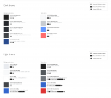
| Base | Base80-Gray #EAECF0 | Base10-Darkest Gray #222222 |
| Article dropdowns, Text fields, and Text areas | Base90-Snow White #F8F9FA | Base12-Exosphere Gray #27292D |
| "Paper" for Articles, Cards, Bottom sheets, Dialogs | Base100-White #FFFFFF | Base14-Thermosphere Gray #2E3136 |
| Article bottom toolbar | Base18-Mesosphere #43464A | Base18-Mesosphere #43464A |
| Article stack app bar | Base90-Snow White #F8F9FA | Base18-Mesosphere #43464A |
| App chrome | Accent50-Ink Blue #3366cc | Accent30-Dark Blue #2A4B8D |
| Primary form-fields, Primary action buttons/icons | Accent50-Ink Blue #3366CC | Accent75-Stratosphere Blue #6699FF |
| Full-color borders and rules | Base70-Lighter Gray #C8CCD1 | Base20-Dark Gray #54595d |
| Full-color secondary icons | Base20-Dark Gray #54595d | Base70-Lighter Gray #C8CCD1 |
| Destructive background (error highlight color) | Red50-Foundation Red #DD3333 | Red75-Sunset Red #FF6E6E |
| Warning background (warning highlight color) | Yellow30-Yellow #AC6600 | Yellow50-Foundation Yellow #FFCC33 |
| Highlight/Positive background (success messages, highlights) | Green30-Green #14866D | Green50-Foundation Green #00AF89 |
| Text colors | ||
| Primary (Body text, headings, Article titles) | Base10-Darkest Gray #222222 | Base90-Snow White #F8F9FA |
| Section title (Card titles, list headings) | Base20-Dark Gray #54595d | Base90-Snow White #F8F9FA |
| Secondary (Subheaders and captions, wikidata descriptions) | Base30-Foundation Gray #72777D | Base70-Lighter Gray #C8CCD1 |
| Link (links, some list headings) | Accent50-Ink Blue #3366cc | Accent75-Stratosphere Blue #6699FF |
| Destructive text (error messages, red links) | Red50-Foundation Red #DD3333 | Red75-Sunset Red #FF6E6E |
| Highlight/Positive text (success messages, highlights) | Green30-Green #14866D | Green50-Foundation Green #00AF89 |
| Material theme opacity element colors | ||
| Material theme Primary (text and icons) | Black@87% rgba(0,0,0,0.87) | White@100% rgba(255,255,255,1.0) |
| Material theme Secondary (text and icons) | Black@54% rgba(0,0,0,0.54) | White@70% rgba(255,255,255,0.70) |
| Material theme Disabled/De-emphasised (text and icons) | Black@38% rgba(0,0,0,0.38) | White@50% rgba(255,255,255,0.50) |
| Material theme borders and rules (text fields, component dividers, etc) | Black@12% rgba(0,0,0,0.12) | White@20% rgba(255,255,255,0.20) |
| Material theme Shadow (general translucent black where components do not have a shadow defined) | Black@26% rgba(0,0,0,0.26) | |


