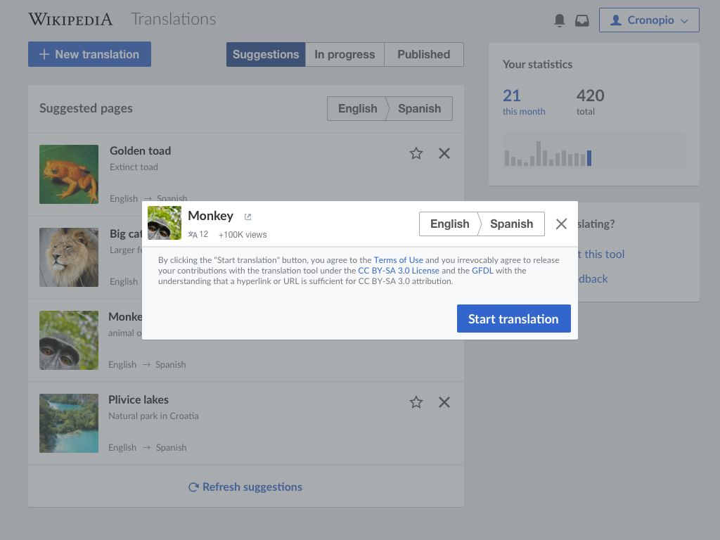
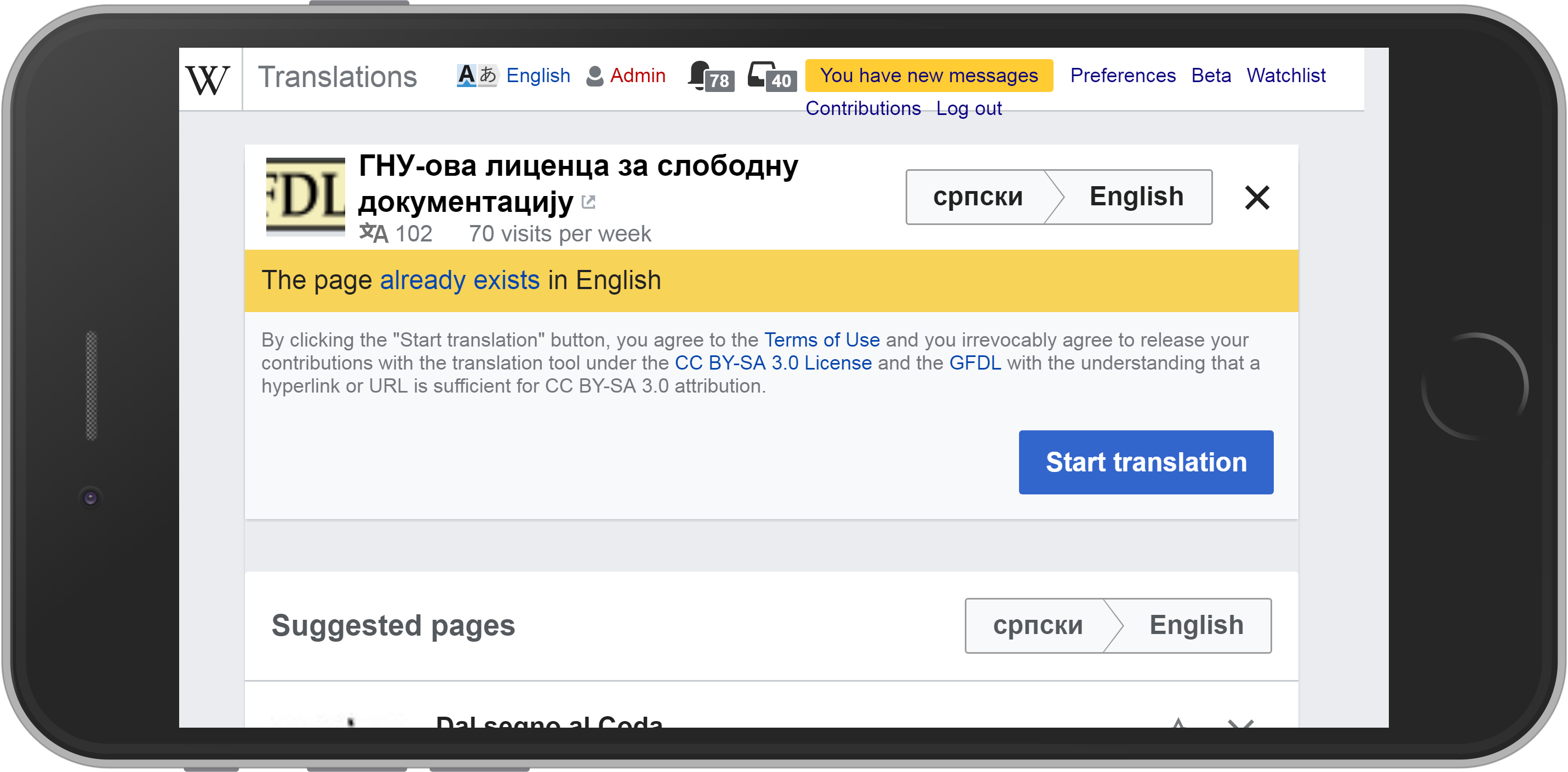
After updating the new translation dialog (T111094), users clicking on a suggestions should get a dialog in the same style, but in a modal way:
- Base20 (#54595D) at 50% opacity was used for the overlay.
| Pginer-WMF | |
| Oct 24 2017, 7:14 AM |
| F11095317: Screen Shot 2017-11-30 at 2.40.31 PM.png | |
| Nov 30 2017, 10:54 PM |
| F11095315: Screen Shot 2017-11-30 at 2.38.20 PM.png | |
| Nov 30 2017, 10:54 PM |
| F11095210: Screen Shot 2017-11-30 at 2.15.54 PM.png | |
| Nov 30 2017, 10:54 PM |
| F11084846: Screen Shot 2017-11-30 at 11.33.30.png | |
| Nov 30 2017, 11:00 AM |
| F11076306: small-screen-selected-source-page.PNG | |
| Nov 29 2017, 11:50 PM |
| F11076308: small-screen-landscape-selected-source-page.PNG | |
| Nov 29 2017, 11:50 PM |
| F11035695: Screen Shot 2017-11-27 at 3.11.02 PM.png | |
| Nov 27 2017, 11:50 PM |
| F11035744: Screen Shot 2017-11-27 at 2.55.15 PM.png | |
| Nov 27 2017, 11:50 PM |
After updating the new translation dialog (T111094), users clicking on a suggestions should get a dialog in the same style, but in a modal way:
| Status | Subtype | Assigned | Task | ||
|---|---|---|---|---|---|
| Resolved | Pginer-WMF | T157457 Align Content Translation with the design style guide | |||
| Resolved | • Petar.petkovic | T178866 Align the suggestion confirm dialog with the new translation one |
Change 391572 had a related patch set uploaded (by Petar.petkovic; owner: Petar.petkovic):
[mediawiki/extensions/ContentTranslation@master] Refactor language filter and selected source
Change 391572 merged by jenkins-bot:
[mediawiki/extensions/ContentTranslation@master] Refactor language filter and selected source page
@Pginer-WMF - it'd be great if you can provide some feedback on the following - just to make sure that the changes are fine from the design point of view:
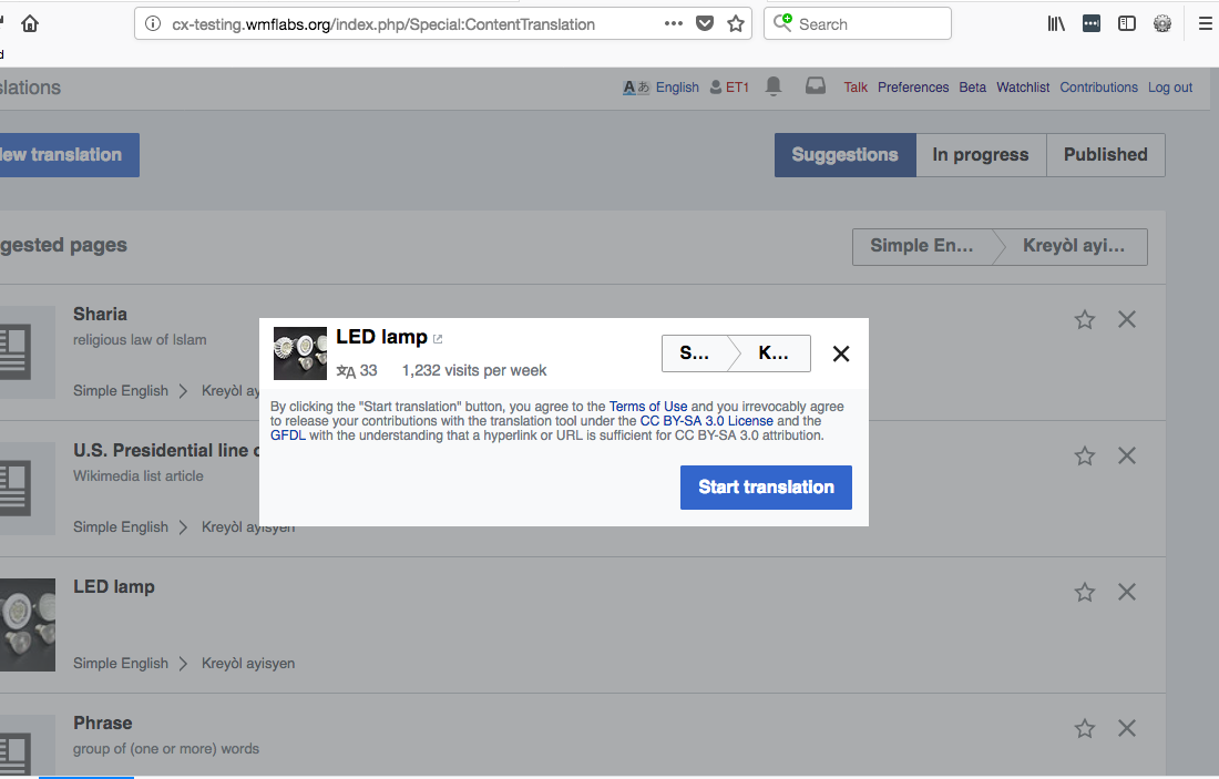
(1) The old 'New translation' box was not resizable. The new 'New translation' box will resize and some point the lang selection will be reduced to only one or two letters
(2) The old cx-sourceselector-dialog has border and border-radius. The new cx-selected-source-page--modal does not have it.
(3) As far as I could see from your mockup, the title of an article is placed vertically lower than the upper edge of the thumbnail image. In cx-testing, the title is aligned with the upper edge of the thumbnail. The mockup looks more balanced visually. It might be a good idea to make such adjustment - it could be a different ticket.
Thanks for the observations, those are quite relevant. More details below.
(1) The old 'New translation' box was not resizable. The new 'New translation' box will resize and some point the lang selection will be reduced to only one or two letters
We should be following a responsive approach where in the situations where there is too little room for showing a significant part of the language name we show the ISO codes. In the case of the example where there is room for one character plus the ellipsis, that's what I'd expect. We may want to adjust the responsive rules a bit to avoid these cases if they are common.
(2) The old cx-sourceselector-dialog has border and border-radius. The new cx-selected-source-page--modal does not have it.
When shown as a modal dialog we want to style it following the same style we use for cards (T158410):
(3) As far as I could see from your mockup, the title of an article is placed vertically lower than the upper edge of the thumbnail image. In cx-testing, the title is aligned with the upper edge of the thumbnail. The mockup looks more balanced visually. It might be a good idea to make such adjustment - it could be a different ticket.
This may be because of differences on the line height. I'd not make this a blocker. Let's see how that works in practice and we can create a separate ticket if further adjustment is needed.
Change 394146 had a related patch set uploaded (by Petar.petkovic; owner: Petar.petkovic):
[mediawiki/extensions/ContentTranslation@master] Allow more space for language filter
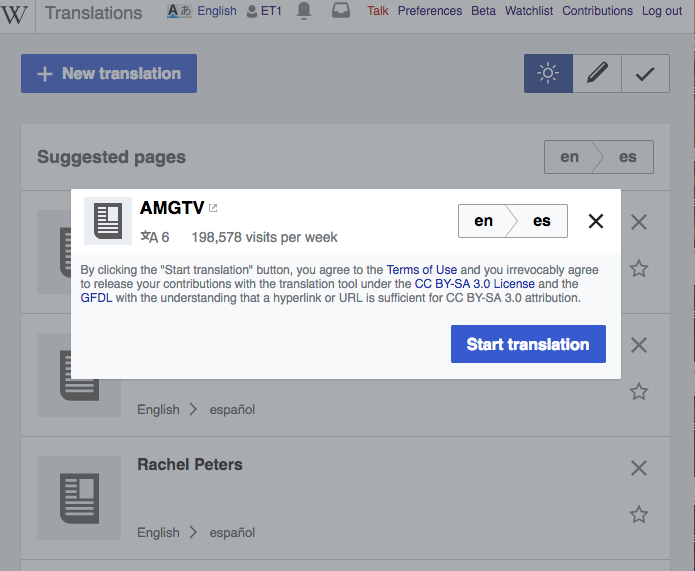
Now that many changes are made around language filters on Content Translation dashboard, and given my recent efforts to make various language filters behave same, I think it's time to reassess how much space we give to language filter elements.
Previously, I was following design decision to have maximum width of 25%. Now, I have increased space to 30% on devices below 700px and 40% for devices above that mark. On smaller screens, ISO codes are displayed, but some are more than two characters wide, and having some more space makes language selector look better, without impacting other elements on the page. On larger screens, we get less language names cropped, with little impact on other elements, like titles and info about selected page. @Pginer-WMF, if you are willing to give it a shot, you can check on beta (when available) to assess if change was worth it.
I have added border radius and shadow in the latest patch.
This may be because of differences on the line height. I'd not make this a blocker. Let's see how that works in practice and we can create a separate ticket if further adjustment is needed.
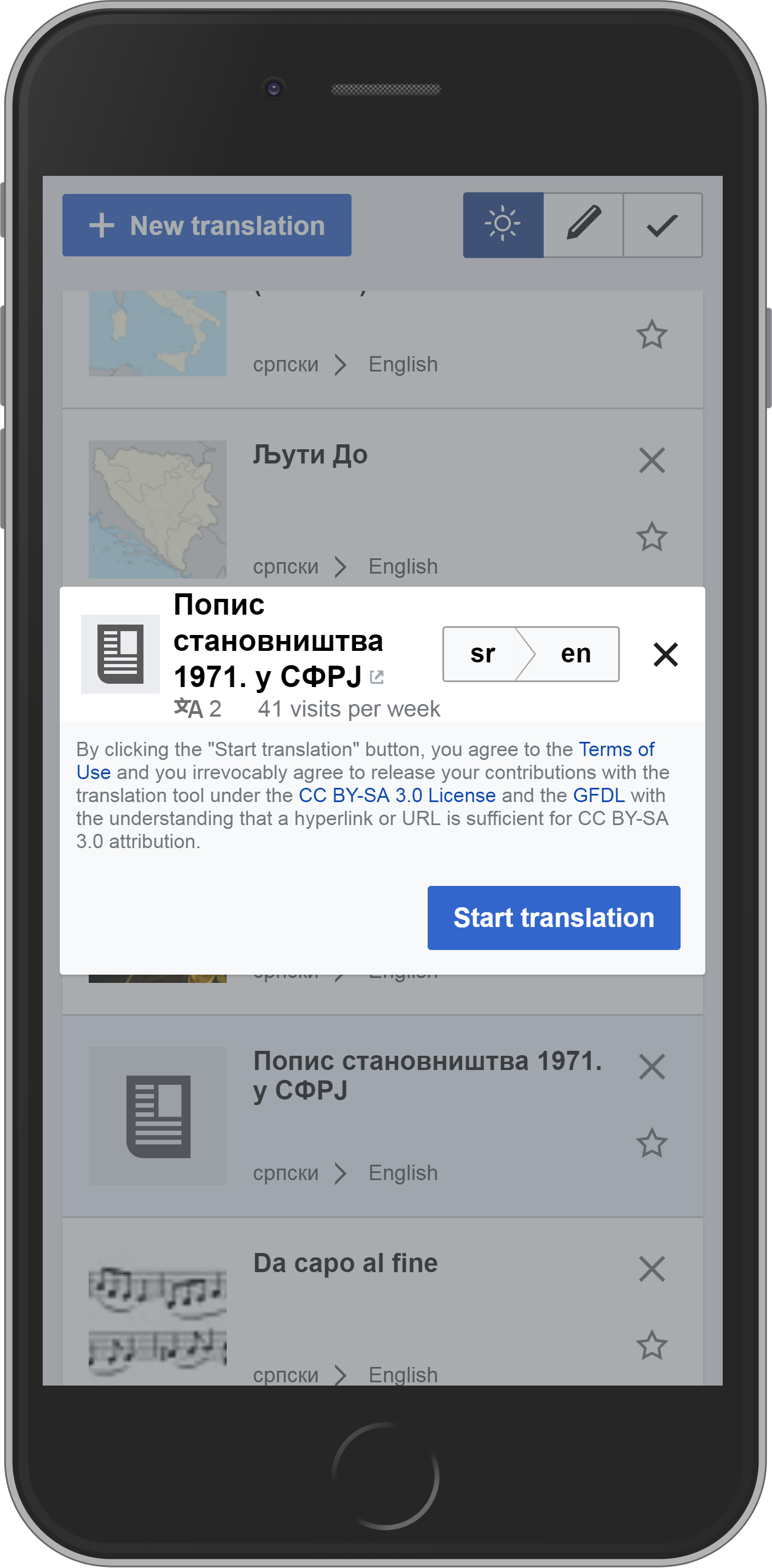
I actually like it better when title is aligned with top of the image. If you want to have different alignment, I suggest to play around with different screen/page title/language pair sizes and see what looks best. Please create separate ticket if you decide to change the looks.
One thing to have in mind is that we don't always have short title and big screen real estate. You can't make alignment predictions without seriously distorting the image, which I would not recommend.
Edit:
This was actually done as part of requirement, but as mentioned, we can't always have it without distorting the image.
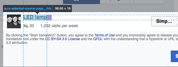
Here are some shots:
| Portrait | Landscape |
|---|---|
 |  |
The general approach to give more space to the language selector sounds good to me. I was not getting suggestions when I checked beta (screenshot below), so I was not able to check it live.

Regarding the cases where the title becomes too long in the confirmation step, I created a separate ticket to discuss possible solutions (T181701)
Increasing space for language filters is still not available as my patch is not reviewed yet.
Thanks for reporting inability to select languages for suggestions. I was aware of the problems in my local environment, but never realized it is in production.
Change 394146 merged by jenkins-bot:
[mediawiki/extensions/ContentTranslation@master] Allow more space for language filter
@Pginer-WMF, the change that allows more space to language filters is now on beta, you can check the behavior.
Checked in cx-testing - the resizing works much accommodating now - until $(window).width(); gets to 702, names of languages are displayed; below 702 language codes gets displayed smoothly - there are no abbreviations with one (or two letters). All language names are still readable until they change to lang codes
However, for long languages names, e.g. 'Sesotho sa Leboa' and 'Tsetsêhestâhese', it looks a little bit odd. Do you think we should fix it? Seems minor.
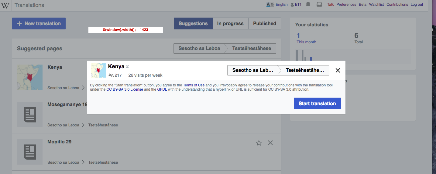
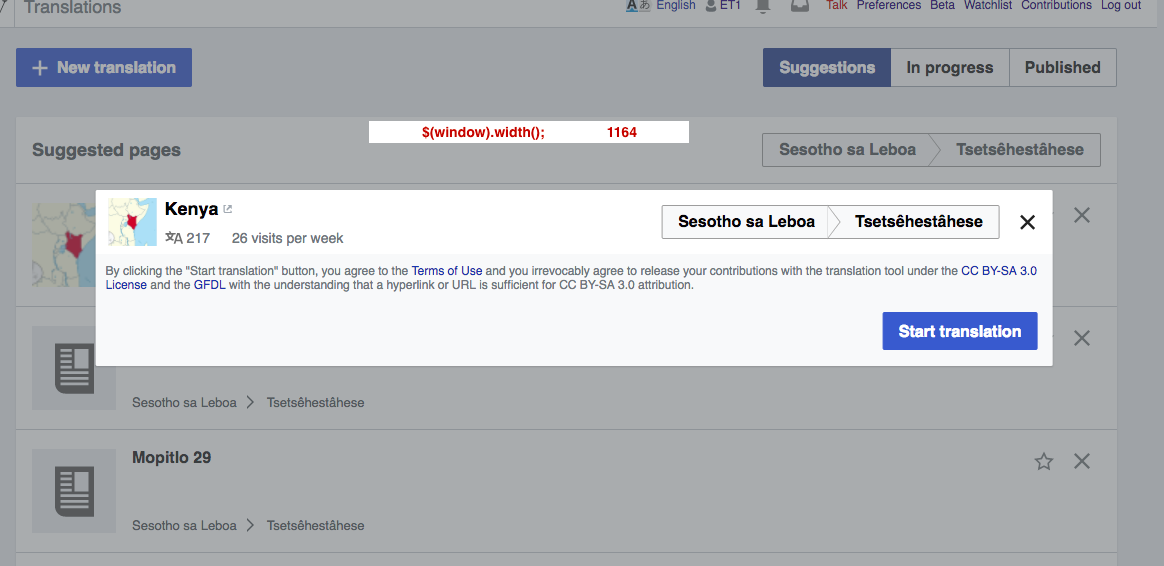
Thanks for reviewing this in detail. Having ellipsis for long languages is acceptable in this context. The user is seeing the full name when selecting them, so this just works as a reminder of the languages. That is, a user selecting "Tsetsêhestâhese" is likely to identify the language is the result of such selection is displayed as "Tsetsêhestâ..."