Page MenuHomePhabricator

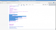
Text and selection are shifted
Closed, ResolvedPublic1 Estimated Story Points

Description

Reporting this from mediawiki.org (although I didn't manage to personally reproduce) as I also experience something similar from time to time (although not so severely).
More or less literally:

debian stretch + firefox (52.5.0 deactivated all addons) + vector skin

I just tried the new wikitext editor. The first article I tried to edit was https://de.wikipedia.org/w/index.php?title=Schwarzschild-Metrik&diff=170902272&oldid=170628851. Unfortunately the text seemed to be not in the right place, so when I selected and typed something it appeared approximately two lines below (I took some screenshots which I can upload in case they help). Also it did not tell me that I deleted the first line of the table, neither in the editor nor in the preview, I could only see it the diff-view. [...]

[...] The steps are

  1. enable new wikitext-modus
  2. enable syntax-highlighting
  3. go to Schwarzschild-Metrik
  4. click on "Quelltext bearbeiten" (edit source)
  5. press ctrl+f
  6. search for "mit dem Term"
  7. and you will see that the selection is already two lines above the actual text

I had a closer look at the problem again and it appears only in combination with the new syntax-highlighting beta feature. Apart from a few glitches (e.g. w:de:Wikipedia:Umfragen/Konzept für mathematische Formeln the escaped chem tag inside the template) it always worked well in the old editor and I like the more discrete and consistent choice of colors, but does not seem to work together with the new one. One can notice a wrong positioning of the cursor with respect to the text starting from about the first ref tag and the red spell-checking marks are completely off.

Event Timeline

Restricted Application added a subscriber: Aklapper. · View Herald Transcript

Finding this hard to reproduce. Note that these errors will probably be the result of specific page content and viewport width, so if you come across this error, record the exact page and revision (or wikitext) and the viewport width, by opening the console (in portrait mode) and typing innerWidth.

This is where it just happened to me, but I can't do what you're saying ATM. FWIW I noticed the issue doesn't come up immediately, I think I had typed several lines before seeing it.

Maybe Elitres problem is something different. The primary issue, i.e. the shift of the text that is shown with respect to what seems to be the "actual text" is there immediately, always and reproducible on every page I try to edit. I just tested the article of the day on en.wp and it happens with any innerWidth as soon as I switch on both syntax-highlighting and the new wikitext-mode.

After watching the video, I recognise this bug. I've reported it already, but unfortunately, it's still not resolved (T176073).

I really appreciate this, thanks. Isn't it showing what I describe, though, rather than what you originally reported?
Your cursor is not a few lines away (I don't remember if it's also showing content removal, probably need to re-watch it, it didn't render very well when I did it a few days ago).

I am not sure how those issues are related.

  • The two videos Bencemac linked in the other ticket look familiar, although I do not have to type anything and I also do not have to mouse-over an invisible button before the text gets shifted. At the start of an article it is just a few characters, "mit dem Term" in Schwarzschild-Metric is always shifted by two lines.
  • In the edit https://de.wikipedia.org/w/index.php?title=Schwarzschild-Metrik&diff=170902272&oldid=170628851 I remember that I did not delete any line (although this is hard to tell with an editor where the text is shifted by two lines), but also the preview was ok, only in the diff-view and after saving, the header of the following table was missing which is similar to Elitres issue. I did not try to reproduce this yet.
  • For me, the editor did not get totally unresponsive yet, but what is easy to reproduce is that after typing a little bit faster than I can type a meaningful sentence, "I can watch the letters [in my case it is words or sentences] appear one by one over the course of half a minute or so." https://www.mediawiki.org/wiki/Topic:U1up1kidsljot4ux while the text below and above are white when I try to scroll the page - that is without any other website open or any other processes that might use significant resources.

Could you post screenshots of a page that is broken with both syntax highlighting enabled and disabled? It's possible your browser+OS combination is resulting in them using different font sizes, which would cause this issue. Could you note your browser and OS?

Could you post screenshots of a page that is broken with both syntax highlighting enabled and disabled? It's possible your browser+OS combination is resulting in them using different font sizes, which would cause this issue. Could you note your browser and OS?

If you're referring to Debenben, they said:
debian stretch + firefox (52.5.0 deactivated all addons) + vector skin

My suspicion is resolving T182320 will fix this. Let's test again when that is closed.

Change 399616 had a related patch set uploaded (by Esanders; owner: Esanders):
[mediawiki/extensions/CodeMirror@master] Remove font-size now it is set by editfont

https://gerrit.wikimedia.org/r/399616

Change 399616 merged by jenkins-bot:
[mediawiki/extensions/CodeMirror@master] Remove font-size now it is set by editfont

https://gerrit.wikimedia.org/r/399616

I too was having this issue, making the new editor unusable with color highlighting. Seems the issue is the misalignment of CodeMirror (providing syntax highlighting) and the traditional input field (which is transparent). I added this to my common.css and seems to be working well, probably a horrible way of fixing it, but seemed to do it..

.ve-init-mw-desktopArticleTarget .CodeMirror
{
   left:.1em !important;
}

.skin-vector .ve-init-mw-desktopArticleTarget .CodeMirror
{
  padding-left: 1.7em !important;
  padding-right:1.9em !important;
}

@Drewmutt Thanks for the idea! To be honest, I don't have common.css and I don't want to create, but if this problem won't be solved in the near future, I'll try your solution.

I just had another try, and the issue is still there. I also tried adding the above to my common.css and it did not change anything. Here are the two screenshots requested

Screenshot from 2018-01-28 17-49-45.png (737×1 px, 79 KB)

Screenshot from 2018-01-28 17-49-08.png (737×1 px, 96 KB)

@Debenben The approach I tried, and you're more than welcome to give it a shot was to inspect the page, and make the text field visible (currently it's transparent) then tweak with the padding to get them to overlay exactly atop each other.

The alignment issue in vector was fixed 9 days ago in https://gerrit.wikimedia.org/r/#/c/405260/, but that patch hasn't been deployed yet. When it is deployed you should remove your common.css fix :)

Jdforrester-WMF assigned this task to Esanders.
Jdforrester-WMF set the point value for this task to 1.