Page MenuHomePhabricator

Develop two panel UI for TemplateWizard
Closed, ResolvedPublic8 Estimated Story Points

Description

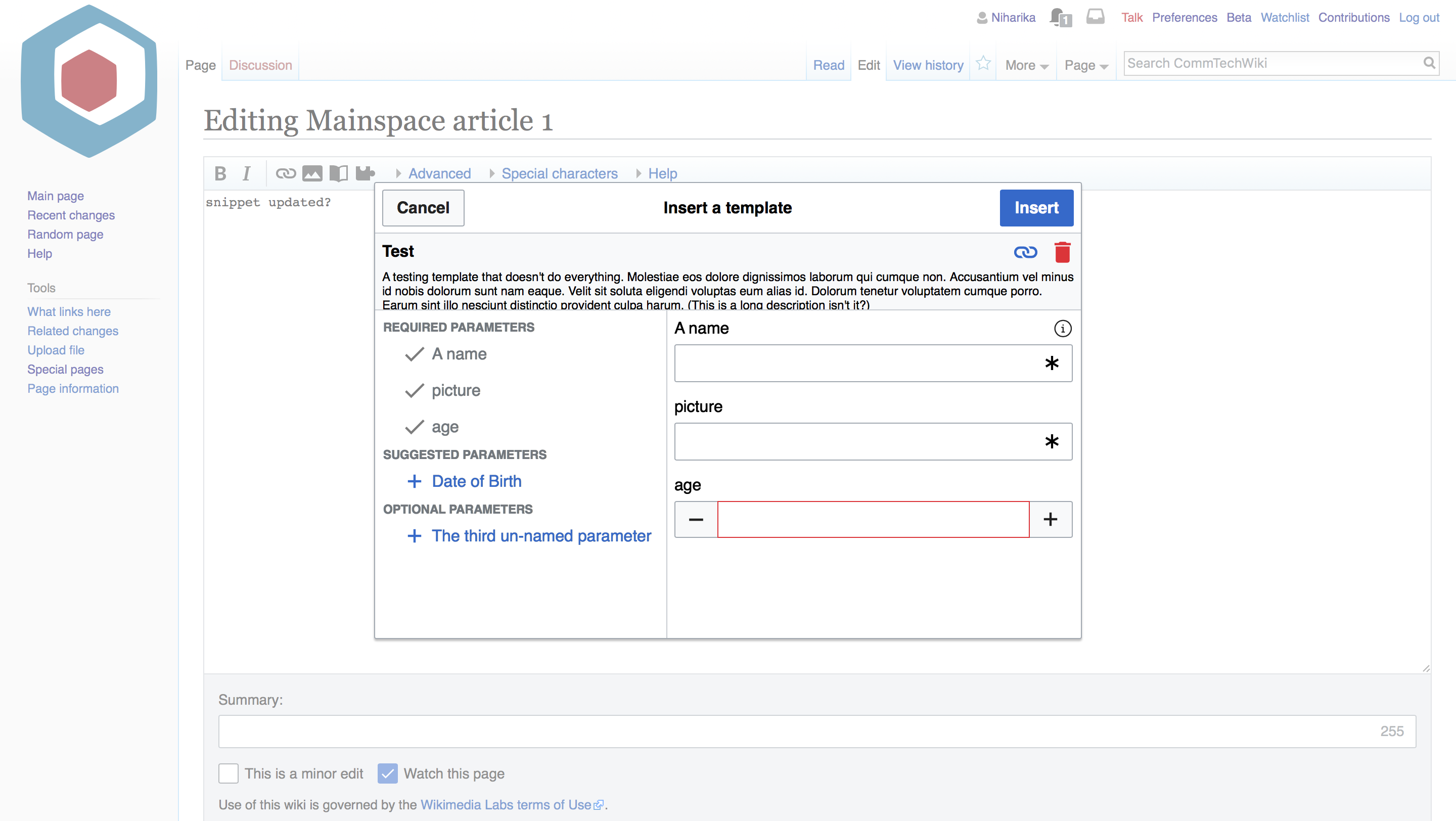
See parent task for mocks and details, including the Zeplin files for exact measures.

This task involves overhauling the current UI. This includes:

  1. Making the basic layout for the redesigned wizard. This includes the header, the two scrolling panels and the buttons.
  2. Having the required fields be added to the right panel by default.

Edit: I've split the other complex parts into different tickets.

Event Timeline

Niharika set the point value for this task to 8.
Niharika added a subscriber: cmadeo.

Change 430294 had a related patch set uploaded (by Samwilson; owner: Samwilson):
[mediawiki/extensions/TemplateWizard@master] WIP T192854 do not review

https://gerrit.wikimedia.org/r/430294

Change 430294 had a related patch set uploaded (by Samwilson; owner: Samwilson):
[mediawiki/extensions/TemplateWizard@master] Switch to two-column layout

https://gerrit.wikimedia.org/r/430294

The patch above starts this work (it's not complete, but should function). Some notes and queries:

  • I wasn't sure if the whole parameter name (in the left menu) was meant to be clickable, so I made it so.
  • The star indicator for required parameters appears by default at the left side of things, so it's currently a tick icon. Was wondering about making it also clickable, so at least the field would get focus when clicked.
  • The template title panel is not yet fixed in position, but it will be.
  • The two panels will scroll separately, and have a dividing bar.
  • The trash icon is a close icon, just because I've not changed that yet but does that maybe make more sense?
  • The template description is shown in the title panel, and the same place gets the warning message about no template data, or no description. Should these latter two be the same colour? I've set them as @colorLowSevere and @colorMediumSevere.
  • The search box doesn't show descriptions yet (and has some confusion going on with its borders).
  • When closing the template form and going back to the search form, should the search form be prefilled with anything (i.e. the template name)?
  • What should parameter labels in the left menu do when they're quite long? Wrap with a smaller line height?
  • There's no remove-all button yet.

I'm going away for the long weekend in a few hours, but wanted to get what I've got so far up on the commtech wiki (try it!) and attempt to explain where I'm up to. I'll get the funndamentals done as part of this ticket (the two-panel stuff), and maybe we can create other tickets for the various other bits that need to be done (otherwise this patch will get a bit big for review).

The patch above starts this work (it's not complete, but should function). Some notes and queries:

  • I wasn't sure if the whole parameter name (in the left menu) was meant to be clickable, so I made it so.

Having the whole parameter be clickable is fine but the colors for the icon and label (red and black) seem to be switched.

  • The star indicator for required parameters appears by default at the left side of things, so it's currently a tick icon. Was wondering about making it also clickable, so at least the field would get focus when clicked.

I'll ask @cmadeo about this.

  • The template title panel is not yet fixed in position, but it will be.
  • The two panels will scroll separately, and have a dividing bar.

+1

  • The trash icon is a close icon, just because I've not changed that yet but does that maybe make more sense?

Question for @cmadeo. Though VE uses the trash icon for similar stuff so I don't mind using that.

  • The template description is shown in the title panel, and the same place gets the warning message about no template data, or no description. Should these latter two be the same colour? I've set them as @colorLowSevere and @colorMediumSevere.

Another question for @cmadeo. I'd think that no description would be colored grey or such because it's not a warning, like in the case of absence of templatedata.

  • The search box doesn't show descriptions yet (and has some confusion going on with its borders).
  • When closing the template form and going back to the search form, should the search form be prefilled with anything (i.e. the template name)?

I don't think so. Let's keep it blank.

  • What should parameter labels in the left menu do when they're quite long? Wrap with a smaller line height?

One more for @cmadeo! Also with the bigger dialog size, I'm wondering if we can make the left panel longer, because the right panel looks humungous. I'm also rethinking if we should go back to the smaller size, or maybe a bit smaller size than this one.

  • There's no remove-all button yet.

No worries. We can do that in another ticket.

I'm going away for the long weekend in a few hours, but wanted to get what I've got so far up on the commtech wiki (try it!) and attempt to explain where I'm up to. I'll get the funndamentals done as part of this ticket (the two-panel stuff), and maybe we can create other tickets for the various other bits that need to be done (otherwise this patch will get a bit big for review).

Sounds good to me. We can have other tickets maybe for -

  • Removing and adding all fields
  • Showing info icons for fields
  • Separation of required/suggested/optional

Anything else too.

  • I wasn't sure if the whole parameter name (in the left menu) was meant to be clickable, so I made it so.

Perfect, thanks

  • The star indicator for required parameters appears by default at the left side of things, so it's currently a tick icon. Was wondering about making it also clickable, so at least the field would get focus when clicked.

I actually can't find a template that has a required parameter, would you mind pointing me towards one? Search seems a bit off right now so I can't rely on the templates I was using before. I'd prefer to not have it be clickable though, as tapping on any other parameter will not put focus on the field, but instead will remove the parameter.

  • The template title panel is not yet fixed in position, but it will be.

Sounds good

  • The two panels will scroll separately, and have a dividing bar.

Great, thanks!

  • The trash icon is a close icon, just because I've not changed that yet but does that maybe make more sense?

Let's keep the trash icon as it is more inline with OOUI

  • The template description is shown in the title panel, and the same place gets the warning message about no template data, or no description. Should these latter two be the same colour? I've set them as @colorLowSevere and @colorMediumSevere.

Yes, let's have them be the same color. There are some line height issues right now, but I'll hold off on polish tweaks until we're a bit further along.

  • The search box doesn't show descriptions yet (and has some confusion going on with its borders).

Will we still be able to have the search results appear in a box descending from the search box rather than in the main window though?

  • When closing the template form and going back to the search form, should the search form be prefilled with anything (i.e. the template name)?

No pre-fill, but we could have suggestion text like 'Search for a template'

  • What should parameter labels in the left menu do when they're quite long? Wrap with a smaller line height?

Yep, let's have them wrap. 16pt line height for 14pt text should work.

  • There's no remove-all button yet.

@cmadeo Test with the Test template. That has a few required params.

Will we still be able to have the search results appear in a box descending from the search box rather than in the main window though?

Is the current behavior acceptable? I think having them descend from the search box would be technically more challenging to do.

Thanks @Niharika, I'll check that out now.

My strong preference would be for the search results to descend from the search box if possible.

I've updated the draft that is live on CommTech wiki. http://commtech.wmflabs.org/wiki/Test?action=edit

Looking good! @cmadeo I feel like the dimensions are getting a tad bit too big (test here). Is it alright if we go with the dimensions of "Dialog with dropdowns ($overlay test)" from the demos?

Samwilson triaged this task as Medium priority.Jun 6 2018, 11:10 PM
Samwilson edited projects, added Community-Tech-Sprint; removed Community-Tech.

No worries, large (not larger) it is. I've fixed up a few other bits and pieces, and updated the commtech deployment.

How should long template descriptions should be handled? Just expand the top box as much as is required? Or clip the text?

@Samwilson let's just clip the text for now, as folks can tap on the link to the template page to read more if they need to.

@Samwilson Another thing - we want the sizes for text and buttons etc. aligned to what Carolyn put in the Zeplin files. You can click on the elements and get their dimensions from Zeplin. The only difference is that those files use a 'small' dialog size instead which we don't.

This is what long descriptions look like (I don't think very many templates have very long descriptions):

Screenshot-2018-6-22 Editing Template Test - CommTechWiki.png (121×761 px, 13 KB)

But usefully, the full description is shown in the prior step when the user is choosing the template from the list, so that's nice I think.

The parameter buttons are now indented (only 20px not 27 because the margins around them are smaller by default and I figured the indent should match those, which is how it is in the mocks). They're also non-bold, and the parameter section headings are bold.

I'm not sure about matching the mocks exactly, because that seems to be straying from the standard UI guidelines, and that should happen upstream I think. For example, the icon sizes are smaller than normal (20px) for the parameter buttons. Doing this would be a fiddle, and I think might not be the recommended way? (Happy to change things, of course! just let me know.)

On which note, the red minus sign will be done as part of T197927.

I've updated the CommTech wiki installation with the latest changes.

Let's clip the long descriptions to one line with an ellipsis and show it on hover?

About the sizes, there is some discrepancy on what TemplateWizard shows on commtech and what VE and Templatedata manager have.

VE - Image insert dialogVE - Template insert dialogTemplateWizard
VE 2.png (1×2 px, 1 MB)
VE.png (1×2 px, 1 MB)
CT.png (1×2 px, 453 KB)

If you flip between them, you'll notice how TemplateWizard seems a bit zoomed in. Here's a comparison on the Cancel buttons to show the size difference:

Cancel for TemplateData dialog on enwikiCancel button for TemplateWizard
Cancel - TD.png (1×1 px, 240 KB)
Cancel - CT.png (1×1 px, 186 KB)

Does this match up with what you see, Sam?

I've changed it to do the same window-sizing as TemplateData does (which is the window.height - 200, although for ours it's adding an extra bit to account for the footer; don't know if that's necessary). But as far as button sizes etc. I'm not seeing any difference.

The description is now one line with ellipsis, and it expands on hover. Does it look okay? It's a bit awkward in that the default text for non-templatedata is already too long and is thus cropped.

CommTech wiki is updated with the latest.

Hi @Samwilson + @NHarateh_WMF, sorry I was MIA for a bit!

Things are looking good! The current hover behavior feels a bit off though, could we truncate after two lines and not have any hover (eg. if it's three lines long and a user wants to read the full description they will have to click on the link to the template page).

I agree, two lines does look better.

The trouble with truncating after two lines is that we get into the area of tricky inspecting of the text and its visibility and acting accordingly, whereas for one line we just do white-space:nowrap; text-overflow:ellipsis. To do it for flowed text, we have to loop through the words or characters, see if each is visible, remove it accordingly and then add the ellipsis at the end. All rather error prone, if the large number of different jQuery plugins for doing it are anything to go by. (Of course, I may be completely out of date about this, and actually there's a simple method; let me know!)

Alternatively, we could expand the top box area as much as is required, and show the whole description.

Yep, no hover. Users can go to the template page to see full description.

Change 430294 merged by jenkins-bot:
[mediawiki/extensions/TemplateWizard@master] Switch to two-column layout

https://gerrit.wikimedia.org/r/430294

Description issue: T198291

I think that's the only outstanding thing from this? (I'm sure there are other issues of course, but as far as this ticket goes, are we there?)

Yep. This ticket was to cover the basics of the layout and we have all that. That's for the follow-up ticket. I'm sure Carolyn will have ideas for more things to fix.

Vvjjkkii renamed this task from Develop two panel UI for TemplateWizard to 9deaaaaaaa.Jul 1 2018, 1:14 AM
Vvjjkkii reopened this task as Open.
Vvjjkkii removed Samwilson as the assignee of this task.
Vvjjkkii raised the priority of this task from Medium to High.
Vvjjkkii updated the task description. (Show Details)
Vvjjkkii removed the point value for this task.
Vvjjkkii removed subscribers: gerritbot, Aklapper.
Niharika renamed this task from 9deaaaaaaa to Develop two panel UI for TemplateWizard.Jul 1 2018, 4:53 AM
Niharika closed this task as Resolved.
Niharika assigned this task to Samwilson.
Niharika lowered the priority of this task from High to Medium.
Niharika updated the task description. (Show Details)
CommunityTechBot updated the task description. (Show Details)