Page MenuHomePhabricator

Improve usability of TemplateWizard
Closed, ResolvedPublic

Assigned To
Authored By
Nirzar
Mar 21 2018, 9:40 PM
Referenced Files
F23269151: image.png
Jul 3 2018, 1:57 PM
F22147599: 10a.png
Jun 12 2018, 5:45 PM
F18834316: image.png
Jun 6 2018, 1:00 PM
F18143861: 09.png
May 10 2018, 11:51 PM
F18143859: 07.png
May 10 2018, 11:51 PM
F17623262: 13.png
May 3 2018, 10:04 PM
F17309449: Artboard.png
Apr 25 2018, 8:57 PM
F14688940: Screenshot-2018-3-8 Editing Main Page - Dev Wiki wiki1.png
Apr 20 2018, 9:32 PM

Description

Design and usability walkthrough and suggestions:

Google slides:
https://docs.google.com/presentation/d/18er3Qn4HTHIkpFqLQj1kmnmLdnlKKKXm8RVMthQVk0A/edit?usp=sharing

PDF:


Proposed design

Clickable prototype on Invision: https://wikimedia.invisionapp.com/share/A3H6T8XHN6F#/292472058_01
Redlines available on Zeplin: https://zpl.io/boBZ4Yv

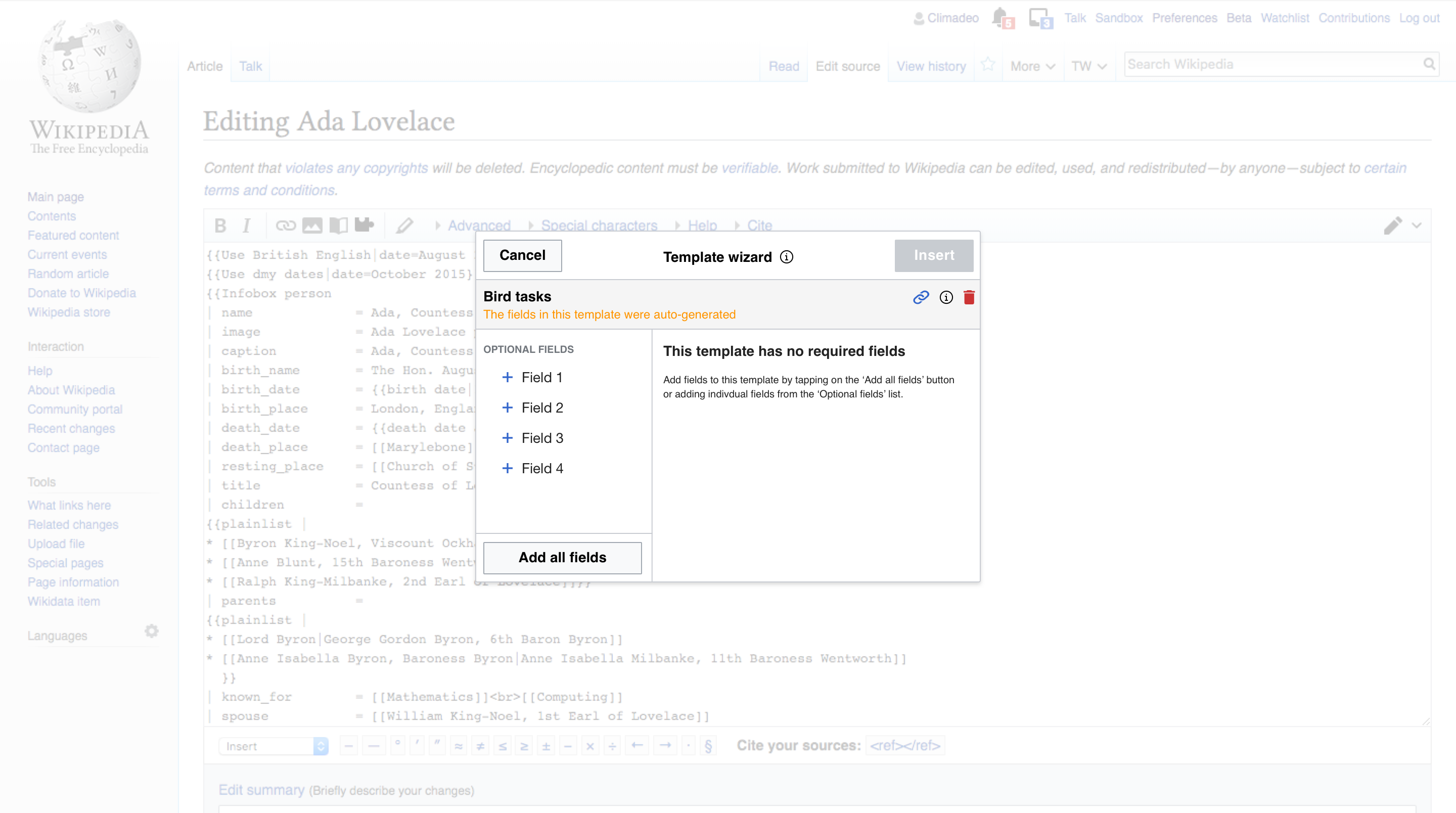
Artboard.png (2×23 px, 1 MB)

Design details

  • Utilize the OOUI 'Outline' widget to once a template is selected to easily allow users to scan across all optional fields and add them into the template wizard.
  • Include warning messaging when a user removes a field that they have entered content into.
  • Utilize a more compact form OOUI form style, with field name and actions above the text box
  • Enable users to add or remove all optional fields with a button.
  • Update typography and colors to utilize the WMF style guide and OOUI standards.

Documentation of feature:
https://meta.wikimedia.org/wiki/Community_Tech/Template_wizard

Usability of template wizard can be categorised into following things

1. Form elements
The forms used in the templatewizard have alignment issues. the label, field placement, the call to actions for a form do not follow standards.
We do not section required and non required fields in a form. the color compliance is secondary issue but first we need to use correct format for showing what is required and what is not. also we don't use colors for headers. colors shouldn't be used on their own for functional requirements

The helptext position (i icon) is also another layout issues.

2. in-product communication
The labels used for headers, actions are too technical and sometimes do not give correct expectation. cta that says "Use" or "Required parameters"

3. Appropriate signifiers
after selecting a template, the template info format is kinda broken. expectation of selection or documentation needs to have better signifier. expectation of external for documentation for example. also if the template does not have any "parameters" then the flow looks like it is stuck. we need to have different flows for templates with parameters and without param.

Event Timeline

There are a very large number of changes, so older changes are hidden. Show Older Changes
Restricted Application added a subscriber: Aklapper. · View Herald Transcript

A small comment on this after trying out: I would suggest that the start form, being ‘Select a template:’ field, be changed into full-width input (like summary field in edit field, for example), because the input is too small right now and for the big dialog that is being displayed the space is used not as efficiently as it could.

A small comment on this after trying out: I would suggest that the start form, being ‘Select a template:’ field, be changed into full-width input (like summary field in edit field, for example), because the input is too small right now and for the big dialog that is being displayed the space is used not as efficiently as it could.

That's exactly why we have auto-complete suggestions when you start typing in that field. You would never have to type out the entire field by yourself.

That's exactly why we have auto-complete suggestions when you start typing in that field. You would never have to type out the entire field by yourself.

I don’t really see how this relates to my comment. The ability of autocomplete is good, but we can use space more efficiently even with autocomplete available.

Could the above slides be attached here as a PDF?

cmadeo updated the task description. (Show Details)

Design updates to be made

  • Add a help icon to the header for information about how to use Template Wizard
  • Update the alerts to use the correct OOUI style
  • Add an alert for when users navigate away from a template that they have entered text into when selecting a new template
  • Add an alert for when users tap on cancel when they have entered text into a template

@cmadeo Two other things came up in a meeting my team discussed this in:

  1. "Popular templates" is rather hard to define and compute. A thing we can do instead is show the user's last used 5 or 6 templates. I imagine that just means changing the header on that screen.
  2. A couple people found the search bar persistence distracting. @Samwilson came up with an idea to convert the "Cancel" button to "Back" after a template has been selected so the user can go back to the search screen. This way we can remove the search bar once the user has picked a template. How does that sound?

I'd love to have the search box not just auto complete, but to also make it actually search the titles and (template data) descriptions of templates. I think that would be quite useful. Unfortunately, I don't think we have an API for that yet however.

I was going to say that perhaps we could search the template data that's stored in page_props, but it's compressed isn't it so that probably doesn't work?

Maybe we could do autocomplete on any word in the template title, and not just on the beginning?

And maybe add something clever in with the 'recently used templates' list, akin to how web browsers rank bookmarks based on how you've previously searched for them (e.g. every time I type 'per' in the search box, I end up using 'infobox person', so put that at the top of the list).

@Samwilson I like all your ideas but to begin with, I think we should go with the second one and also make it autocomplete on all words in the template title.

We can then think about expanding it to autocomplete on keywords in descriptions too which TheDJ brought up.

About the recently used templates, I was thinking if there's a better way. To find out recently used, we'd have to hook into every edit and parse it out for templates used and update localstorage key with that info. That sounds like a lot of code for not a lot of gain. What if we go back to the idea for popular templates but let the community decide what it wants to show up there? We can make a config page for that and to begin with, we fill it with the top x (6?) most transcluded templates.
From that point on we can allow the community to edit it if it likes. What do you think? @Samwilson @kaldari @MaxSem @TheDJ

Thanks all for your feedback!

"Popular templates" is rather hard to define and compute. A thing we can do instead is show the user's last used 5 or 6 templates. I imagine that just means changing the header on that screen.

What if we go back to the idea for popular templates but let the community decide what it wants to show up there? We can make a config page for that and to begin with, we fill it with the top x (6?) most transcluded templates. From that point on we can allow the community to edit it if it likes

This sounds reasonable to me, however I wonder if this moves a bit away from the original intent, which was to make it easier for first time users of Template wizard to get started with a template without having to initiate a 'blind' search? It'll take quite a bit of time for a new user to build up a history of templates, so I'm personally for the idea of allowing the community to decide what goes here. Then this first screen can be used as a tool for new users to get a better understanding of what is available from Template wizard without necessarily having to read through a help overflow.

A couple people found the search bar persistence distracting. @Samwilson came up with an idea to convert the "Cancel" button to "Back" after a template has been selected so the user can go back to the search screen. This way we can remove the search bar once the user has picked a template. How does that sound?

One other thought though is that we could have a remove icon appear in the Outline view next to the template that the user has chosen. This way users could simply remove their selected template and be returned back to the search screen, but still able to easily cancel out of the widget. I propose this, just because it would still allow for users to navigate out of Template wizard without having to click two buttons.

Let me know what you think and I'm happy to do a revision of the mocks for Monday! Thanks!

There's no way that a curated list is going to be useful because it's literally a selection of 5 out of 400K. Especially since people tend to stick to their own areas that have their own set of popular templates.

To find out recently used, we'd have to hook into every edit and parse it out for templates used and update localstorage key with that info

Nah, we just should remember what templates the user selected in the wizard.

One other thought though is that we could have a remove icon appear in the Outline view next to the template that the user has chosen. This way users could simply remove their selected template and be returned back to the search screen, but still able to easily cancel out of the widget. I propose this, just because it would still allow for users to navigate out of Template wizard without having to click two buttons.

I like that idea. We could also have the remove icon appear next to the template name on the right side, like for the template fields. You can update the mock for this. Thanks. :)

This sounds reasonable to me, however I wonder if this moves a bit away from the original intent, which was to make it easier for first time users of Template wizard to get started with a template without having to initiate a 'blind' search? It'll take quite a bit of time for a new user to build up a history of templates, so I'm personally for the idea of allowing the community to decide what goes here. Then this first screen can be used as a tool for new users to get a better understanding of what is available from Template wizard without necessarily having to read through a help overflow.

For first time users, we can do something like:

Recently used

Looks like you haven't used any templates in TemplateWizard recently, search for one to get started!
Meanwhile here are some suggested templates that you might want to use:
Option 1
Description
Option 2
Description
.....

Once the user has picked even one, we can switch to showing recently used only. I agree with Max that people tend to work in specific topic areas. For example, someone might just be working to add infoboxes to movies while another might be adding book citations exclusively.

Hold off on updating the mock for this though because we need to come up with a good way to generate that list for suggested mocks. If that turns out to be infeasible, we might do this another way.

@Niharika, @Samwilson: Are we ditching the fancy date formatting? Personally, I think it would be fine as a regular text field, especially since there will be cases like "circa 12th century".

@Niharika: Template suggestion sounds like a version 2 sort of feature to me: nice to have, but not strictly needed (and probably a bit complicated to implement).

@Niharika, @Samwilson: Are we ditching the fancy date formatting? Personally, I think it would be fine as a regular text field, especially since there will be cases like "circa 12th century".

That feels like a reduction in usability. And a loss of consistency around date formatting. We're letting templatedata for a template dictate when the date selector is shown. So for fields that expect "circa 12th century", I don't expect the templatedata to be "type": "date".

@Niharika: Template suggestion sounds like a version 2 sort of feature to me: nice to have, but not strictly needed (and probably a bit complicated to implement).

I think you're right but let's discuss this in our next standup and see if there are any other ideas we missed.

@cmadeo I just realized, the new mocks don't do the suggested and optional fields separation. It was pointed out as being a good idea a couple of times when I talked to people. Can we do something minimal to indicate if a field is optional or suggested in the Outline?

@Niharika the suggested fields appear on top in the mocks and have an asterisk instead of a blue plus. They are also pre-populated in the template and not removable. The optional fields are not pre-populated into template when in it loads, but can be added with the blue pluses.

Let me know if this is work-able or if there should be some other kind of indication?

Thanks!

That feels like a reduction in usability. And a loss of consistency around date formatting. We're letting templatedata for a template dictate when the date selector is shown. So for fields that expect "circa 12th century", I don't expect the templatedata to be "type": "date".

I'm not sure where this "date" format is actually being used, but I can't think of many cases where a date parameter will always be an exact date. Birth and death dates are often complicated (multiple calendars, disputed dates, vague ranges). The date for Infobox event is often a range (https://en.wikipedia.org/wiki/French_Revolution). And even the date for Infobox holiday is often complicated (https://en.wikipedia.org/wiki/Thanksgiving). What if we gave them a text field with a date picker (like Upload Wizard). In other words, when the format is "date" give them a date picker next to a text field. They can either enter a custom date or use the date picker which fills in the text field. In either case, it would not be validated. That gives users the convenience of the date field, but still allows for edge cases and exceptions.

@Niharika the suggested fields appear on top in the mocks and have an asterisk instead of a blue plus. They are also pre-populated in the template and not removable. The optional fields are not pre-populated into template when in it loads, but can be added with the blue pluses.

Let me know if this is work-able or if there should be some other kind of indication?

Thanks!

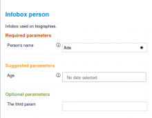
Ah, those are the required fields. There's three categories - required, suggested and optional. Right now we do separation via colored headings like:

Screenshot-2018-3-8 Editing Main Page - Dev Wiki wiki1.png (379×486 px, 14 KB)

You can try it out with the gadget to see how it looks right now.

We dropped the suggested vs optional separation in the new mocks and I just thought of it. Sorry.

Updated Zeplin, the png in the description and InVision based on the updates we've discussed so far. I haven't changed the 'Popular templates' yet though.

@Niharika, ah sorry I missed that! I'll think of a treatment for the suggested parameters.

I'm not sure where this "date" format is actually being used, but I can't think of many cases where a date parameter will always be an exact date.

The docs say that date fields are in ISO 8601 format, e.g. "2014-05-09" or "2014-05-09T16:01:12Z". Can we change that?

I like Ryan's idea about having the date field act as a way to either pick a date or type your own string and save it. We won't be able to validate it in the latter case, which is fine. I don't think we can do this with the current timepicker because it wipes the input clean when we leave it (but not really!). Can we use the Upload Wizard datetime picker (possibly even add it to OOJS library)?

@Niharika + @Samwilson just as an FYI, I made a few small changes based on feedback from design review and on Zeplin. Everything (png above, Zeplin + InVision have been updated)

@Niharika: UploadWizard uses the DateInputWidget, which is designed to accommodate ISO 8601 format (but still allows overriding with other values).

@Niharika + @Samwilson just as an FYI, I made a few small changes based on feedback from design review and on Zeplin. Everything (png above, Zeplin + InVision have been updated)

Thanks, Carolyn. It looks great!

@Niharika: UploadWizard uses the DateInputWidget, which is designed to accommodate ISO 8601 format (but still allows overriding with other values).

Ah, okay, thanks. Sam - what are your thoughts on this? I'd be okay going with a simple textbox if this seems complex to integrate. We'd have to make design changes to accommodate this too but that's for later.

I'm not sure about the date input. The requirement for the format to be ISO8601 seems pretty definite, and so I can't see why we'd want people entering other formats. On the other hand, I don't think the requirement should be that definite, so would rather have the more flexible date input widget. Let's wait and see how it looks when the other stuff is all up and running.

Speaking of which...

  • Is there an existing widget for creating comboboxes with descriptions, like in https://wikimedia.invisionapp.com/share/A3H6T8XHN6F#/screens/292472057 ? The only similar one I know of is the Wikidata lookup, but that's not OOUI (it's ui-oo...).
  • Is the field-list side bar based on an existing OOUI standard (of definition lists, or headings, etc.)? Or does it just need to be created from scratch?

Is there an existing widget for creating comboboxes with descriptions, like in https://wikimedia.invisionapp.com/share/A3H6T8XHN6F#/screens/292472057 ? The only similar one I know of is the Wikidata lookup, but that's not OOUI (it's ui-oo...).

The filter menu in Special:RecentChanges is sort of similar, although not sure if it's a widget or not.

For the date - we're sticking with the datepicker we have right now until we hear from users that it doesn't satisfy their use cases. I don't expect people to specify date as the field type in TemplateData without wanting an ISO8601 date format.

The filter menu in Special:RecentChanges is sort of similar, although not sure if it's a widget or not.

Seems it's a DIY one; I'll do something similar, that's a good lead.

Added a screen to Zeplin for messaging around auto-generated fields

Just checked in with @Volker_E who had some helpful feedback around typography and overlays. I'm going to make some tweaks today.

@Volker_E + @Niharika, just wanted to start a convo between the two of you regarding the warnings in the flow above.

@Volker_E brought up that the layering of dialogs is less than ideal and suggested having the warning text dialog replace the Template wizard dialog while open.
@Niharika had mentioned that the solution of having the warning dialog take over the Template wizard dialog might be technically difficult due to then needing to store user input while the error state is shown. The thought is that the 'broken dialog (error handling)' uses the treatment above, so would it be possible to continue to use it in this flow.

@Samwilson could we increase the width of the popover to be the same size as 'Simple dialog (larger)' from https://doc.wikimedia.org/oojs-ui/master/demos/?page=dialogs&theme=wikimediaui&direction=ltr&platform=desktop?

Would it be helpful for me to mock this up?

+ a heads up that the headers have been updated on Zeplin to include the template description.

Here's some quick notes from my meeting with Carolyn about the design changes we'll be doing:

  • The info icon will instead be a help link/button in the footer on the main page for the wizard. Footers are already used in VE Template editor and TemplateData editor and other places.
  • We'll be doing recently used templates for the first screen. (see T194434)
  • The dropdown stays at it is in the mock.
  • Popups - we're not sure. Carolyn will draw up another mock to try and appease @Volker_E :)
  • The template link icon might or might not change - under discussion.
  • Template header part will go away and we'll revert to the design we had before with the template heading on top of the right panel.

I've updated the Zeplin mocks and the InVision based on our meeting this afternoon @Niharika.

@Volker_E, two questions:

  • Would it be possible to continue using the link icon to represent a link to the information about the template? I'm weary to make the header a link as this seems outside of normal patterns for Headers and a link in the description text is not a given. Is there a different icon that could be used? Perhaps internal link?
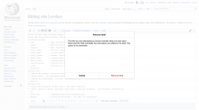
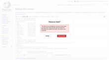
  • Do you have a preference for how the error message is presented from the designs below?
AB
07.png (1×2 px, 800 KB)
09.png (1×2 px, 812 KB)

@cmadeo Trying to pick this up again, please don't judge if I repeat things we've already been talking about in person:

  • Is the footer idea for a link not enough? What advantages would an icon bring to such link? We have 'linkExternal'
    image.png (58×216 px, 3 KB)
    that could be 'misused' for such, but I want to first clarify why an icon is important here…
  • As it's a modal dialog A seems reasonable. But the action button needs to be a primary one, so filled Red50 like in B.

@Volker_E Thanks for the feedback.

  • Is the footer idea for a link not enough? What advantages would an icon bring to such link? We have 'linkExternal'
    image.png (58×216 px, 3 KB)
    that could be 'misused' for such, but I want to first clarify why an icon is important here…

Forgive me, but I've forgotten what the footer idea for the link was? The main goal would be to have a consistent space for the link to appear as it does not always appear in the text below the template name.

  • As it's a modal dialog A seems reasonable. But the action button needs to be a primary one, so filled Red50 like in B.

Okay! I'll update the mocks tomorrow

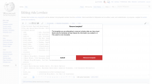
I've updated Zeplin + InVision to use the Red50 fill on the modal dialog

10a.png (1×2 px, 803 KB)

@Volker_E The way we currently have those messages with OO.ui.ProcessDialo pop a screen on top of the existing window. I agree this looks weird, and I'd love us to fix it, but we should do that in OOUI itself, not in this product.

Making the dialog basically change into the alert is actually a non-trivial amount of programming work.

The TemplateWizard dialog is a OO.ui.ProcessDialog, which has an internal way of handling errors; it's set up in the demos, too (see "Broken dialog (error handling)")
That way, the dialog presents the error, and puts itself into an error mode, which supports a lot of other secondary behaviors that OOUI supports.

I think this whole method of changing the way the dialog presents errors should be fixed in OOUI. For the specific task that deals with TemplateWizard, I would suggest we go by what the library gives us (to be fair, it's not that far from what you want) and then fix the design issues in OOUI itself.

@Mooeypoo I agree with your decent estimation of work (“non-trivial”) needed. Would you clarify with @cmadeo what the default would result in and also please both, feel encouraged to file follow-up tasks on any identified UX shortcomings of OOUI dialogs.

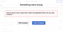
The default popup currently:

image.png (700×1 px, 117 KB)

@Mooeypoo I agree with your decent estimation of work (“non-trivial”) needed. Would you clarify with @cmadeo what the default would result in and also please both, feel encouraged to file follow-up tasks on any identified UX shortcomings of OOUI dialogs.

Yeah, let's file a task for fixing this in OOUI. I think this is probably not horrible to do through CSS to change the current (not ideal...) presentation so that it affects all OOUI dialogs, not just this one.

It looks like we're going with what we had in the initial designs (F17309449). @cmadeo could you update the mocks, please? Thanks.

@Niharika, will do!

@Mooeypoo + @Volker_E let me know if you need any assets for a ticket for updates to OOUI.

@Niharika mocks are updated in Zeplin + InVision

@Niharika Thanks so much! It was great to work with you and the team!