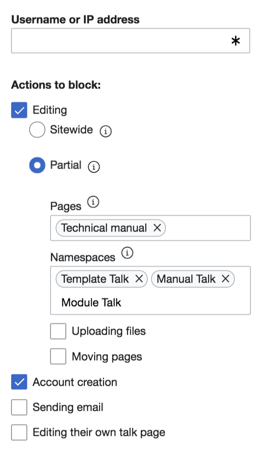
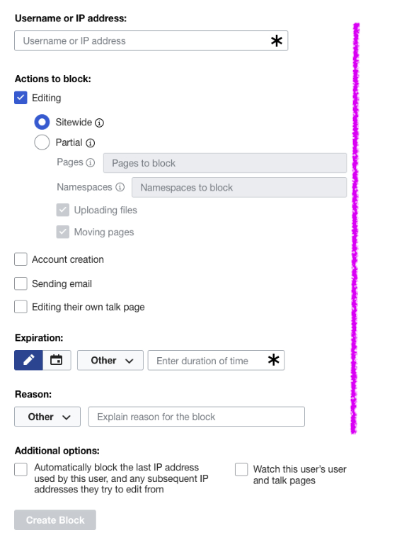
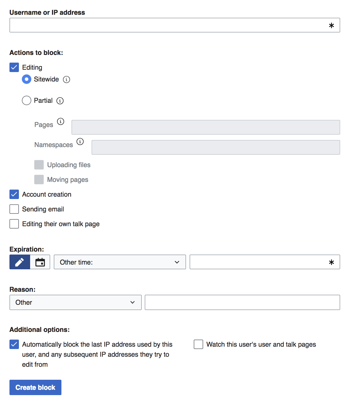
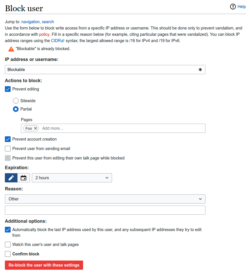
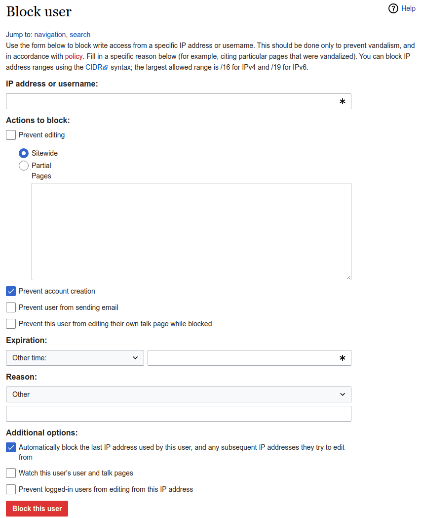
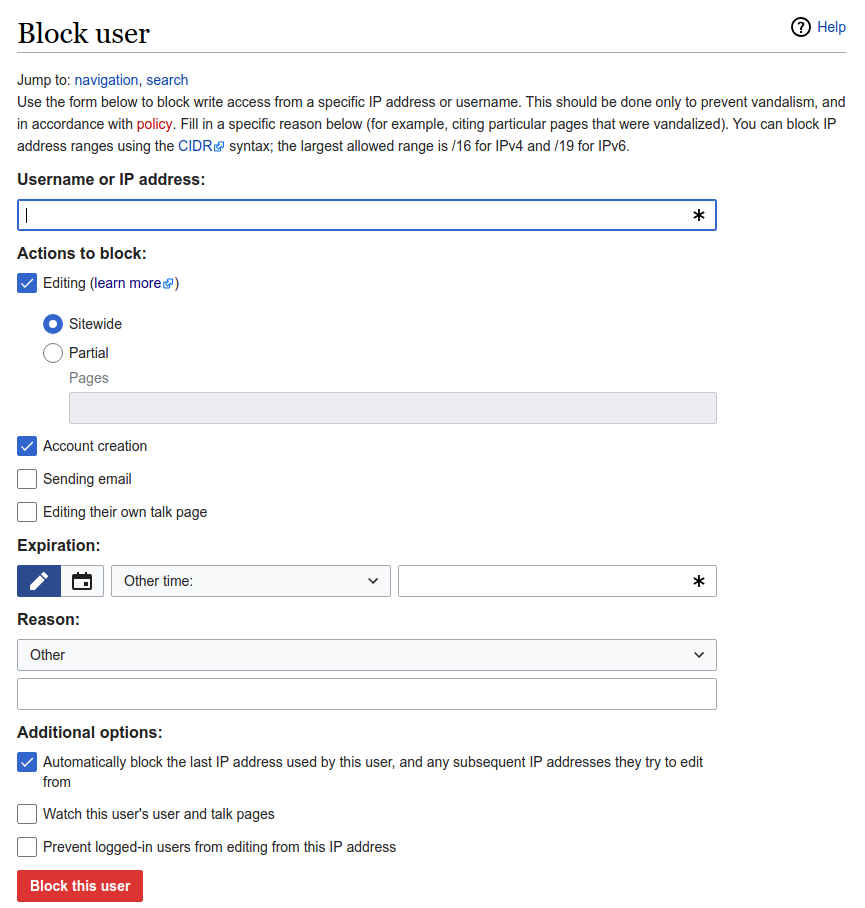
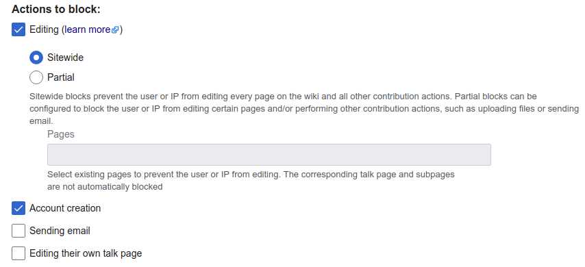
Page MenuHomePhabricator

Update Special:Block to match the design
Closed, ResolvedPublic8 Estimated Story Points

Assigned To
Authored By
TBolliger
Aug 24 2018, 9:39 PM
Referenced Files
F27834174: image.png
Jan 9 2019, 5:33 PM
F27812888: image.png
Jan 7 2019, 3:40 PM
F27812901: image.png
Jan 7 2019, 3:40 PM
F27791966: image.png
Jan 4 2019, 7:35 PM
F27791864: image.png
Jan 4 2019, 7:20 PM
F27791856: image.png
Jan 4 2019, 7:19 PM
F27790711: image.png
Jan 4 2019, 6:10 PM
F27790721: image.png
Jan 4 2019, 6:10 PM

Description

Acceptance criteria
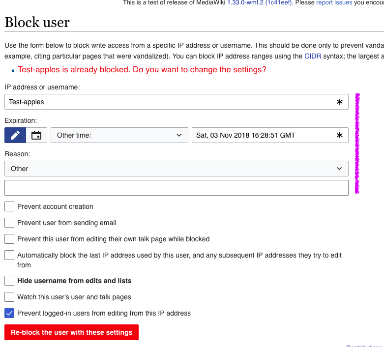
  • Special:Block matches the design (except functionality that has not yet been built). Changes include:
    • Add Actions to block section label
    • Add Editing checkbox
    • Align Pages and the input field to the same line
    • Move & relabel Account creation, Sending email and Editing their own talk page
    • Make the Expiration label bold
    • Make the Reason label bold
    • Align the reason dropdown + text field to one line
    • Add the Additional options section label
    • Every input field should extend to match the endpoint of the pages and namespace input fields, as per the design in Prateek's comment.
  • Verify Special:Block functions as expected on both RTL and LTR languages
  • Get a final OK from @Prtksxna before merging and closing.
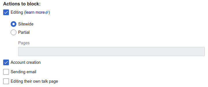
Designs

  • Mobile:

    Screen Shot 2018-11-03 at 8.35.18 PM.png (924×532 px, 92 KB)

    Related Objects

    Event Timeline

    TBolliger created this task.

    @TBolliger

    Is it ok if the editing checkbox is implied?

    What this means is that if you had a partial block, and you were to uncheck Editing and click Reblock the list of pages would be lost.

    If the list of pages needs to be retained, then we can make the checkbox explicit in which we would create a column in the database to save whether this is an editing block or not.

    What's the tradeoff here? On a purely technical level, is there a major difference in risk and effort?

    IIRC changing the database will require another conversation with the DBAs, which is added complexity. But not difficult.

    In general I'd prefer we do everything we can to preserve data, even if it isn't being actively applied. But this also sounds like a cornercase. We can also consider adding error messages as an alternative low-cost solution.

    @TBolliger

    The trade off is as you described.

    The proper way to do this would be to create a new column in the database and preserve the status of the checkbox. It provides a better user experience and is more straightforward from a code/API perspective.

    The only downside is having to do another schema change, which is time consuming (on other teams), but is not very much effort on our team. However, as Wikitech puts it:

    Schema changes on a live database are hard, and they should not be done lightly. That doesn't mean that schema changes should be avoided, not at all, a good database design is essential for security and performance.

    https://wikitech.wikimedia.org/wiki/Schema_changes

    I would recommend doing the schema change, but I wanted to notify you that there _is_ an alternative (albiet less than ideal) if you didn't want to go that route.

    I would prefer to avoid the time constraints that another schema change will cost us. IMO, we need to button up Partial Blocks.

    It sounds like @TBolliger is open to alternatives that would be much easier if less correct. Let's implement one of those alternatives and see how much push back we get, if any.

    I have a very strong hunch that non-editing blocks will be very infrequent — much less modifying a partial block to become a non-editing block.

    Let's go with the simplest solution. I'm sure we'll find some situations during QA that need error messages, potentially as part of T205147: Update the “USERNAME is already blocked” message if the user is partially blocked.

    I have one issue with the design that we may be able to fix directly in software. On the current tool, all the text input and dropdowns take the same width:

    magenta aligned.png (706×781 px, 103 KB)

    But in the new design, the different elements have different widths — username and expiration, pages and namespace, and finally reason:

    magenta 2.png (762×585 px, 127 KB)


    In my opinion every input field should extend to match the endpoint of the pages and namespace input fields.

    In my opinion every input field should extend to match the endpoint of the pages and namespace input fields.

    Agreed 👍🏽

    Screen Shot 2018-11-13 at 10.13.27 AM.png (1×1 px, 135 KB)

    dbarratt changed the edit policy from "Custom Policy" to "All Users".Dec 17 2018, 6:19 PM

    Change 482332 had a related patch set uploaded (by Tchanders; owner: jenkins-bot):
    [mediawiki/core@master] Update the design of Special:Block

    https://gerrit.wikimedia.org/r/482332

    Here's how it looks now (tooltips still need to be added):

    image.png (915×871 px, 97 KB)

    There are a few things missing, which we haven't implemented yet:

    • Blocking a user from specific namespaces
    • Blocking a user from uploading files
    • Blocking a user from moving pages

    @Prtksxna There are a few deviations from the mock-up, and I'd be interested to hear what you think:

    • The existing labels haven't been changed to the labels shown in the design (e.g. "Prevent account creation" etc), because I can imagine there being some opposition to changing them.
    • The "Pages" label is at the top of the widget for entering pages, rather than to the left, so the widget doesn't become too narrow. (This will affect the widget for entering namespaces even more, e.g. Spanish for namespaces is "Espacios de nombres".)
    • The checkboxes under "Additional options" are in a single-column list. This is for a couple of reasons: firstly, they aren't likely to line up well in a two-column list due to different length labels, and secondly, some of them appear and disappear as you interact with the form, meaning that the remaining options could jump between the first and second columns, which could look confusing.
    • The section headings appear in all caps on mobile. This is a decision made by the skin and the same thing happens on e.g. Special:Preferences.

    @Prtksxna What do you think we should do about the "Confirm block" checkbox, which appears if you are trying to re-block someone who is already blocked, with a new block? It currently displays like this:

    image.png (950×869 px, 103 KB)

    Finally, note that the enabling/disabling relationships between the Editing checkbox, Sitewide/Partial radios and Pages widget can't be done in the no-JavaScript version of the form:

    image.png (1×853 px, 86 KB)

    We could create a different design for these widgets in that form.

    I'll let Prateek leave his own answers as the designer for this project, but here are my thoughts:

    • We ran a banner on Special:Block on all wikis for one week to solicit feedback on our design changes. (T194301) We received some minor feedback but no major objections. Combined with the other outreach we've done in person at Wikimania and WikiCon North America, I think we're safe to update the labels to what they are in the mockup. They will be more straightforward than the old labels.
    • I have no strong opinion about the top vs. side alignment of the field label. Thank you for thinking of other languages!
    • Single column sounds good to me for the reasons you've provided.
    • The 'Confirm block' checkbox and error message seem to be the same as what's on production today. I don't think it's worth our effort to change too much, unless there are significant usability concerns.
    • I'll let you two decide on how best to lay out the no-JS version of this page. If that work adds up, we can split it to T205130. I think the hierarchy and tooltips convey most of the information. I remember on adding the multiselect widget to Preferences that we had a difficult time displaying a different hint text to inform users that the pages need to be on different rows. We'll have to be sure to add that to the help page.

    @Volker_E Is there an accessibility issue regarding the popup tooltips? I see the tooltips on Special:Preferences are inline rather than popup, e.g.:

    image.png (380×693 px, 47 KB)

    @Tchanders There's several separate issues with the popup tooltips as they are:

    1. They are slowing the tabbing flow
    2. They are nasty to work with on mobile due to the small interactive area
    3. They are not easily decipherable universally – i for information is a widely, but not universally known concept (moreover you have fun in Spanish language with ¡ exclamation mark)
    4. There's currently no clear connection given for screen readers on what the information in the popup refers to nor a clear link between the popup button and the popup itself.

    Therefore we aimed to provide a solution that better satisfies all those needs. See also T194115 for further discussion on the popup

    Thank you for the explanation, Volker. If our style guide is to move away from the ⓘ tool tips, then I think we should have Prateek send this through another round of design. We could probably achieve the same type of education via a product onboarding feature like Content Translation or Enhanced Watchlist.

    Thanks @Volker_E.

    @TBolliger With the messages to match the mockup, and the changes mentioned in T212964, it looks like this:

    image.png (908×865 px, 82 KB)

    Here's what inline tooltips look like, just in case it helps for redesigning the way we provide explanations (it's a bit more complicated to put tooltips on the individual radio options - I haven't shown that for now since we're not sure we're going with tooltips):

    image.png (390×854 px, 43 KB)

    Thank you for the explanation, Volker. If our style guide is to move away from the ⓘ tool tips […]

    What we've found when looking through the information provided in the info popups in Special:Preferences, was that the tips were overly verbose, in parts unnecessarily bloated. Inlined help has the “disadvantage” of presenting all the information immediately to the user, but if it's important information it resolves the issues stated above.

    Let's remove the tooltips for now (I'll strike them from the acceptance criteria) and work with Prateek on a better design solution in T213101: Add help text to Special:Block for Partial Blocks

    @TBolliger Great, so I think that means that the following two acceptance criteria are the only ones still not met:

    • Align Pages and the input field to the same line - waiting for @Prtksxna's approval
    • Align the reason dropdown + text field to one line

    With the reason widget, I have similar concerns about making it narrower - particularly in mobile I think it should be on two lines. In desktop, the reason messages are quite long in English and may take up more than half the line width in other languages, and custom messages in the "Other" field might be expected to be longer. Is there a good reason to put it on one line that I'm missing?

    We don't have to complete everything before merging+releasing. Thalia, I'll let you decide if you want to release the changes you've made so far before hearing from Prateek. In my opinion these are minor details that can change later on production, as I predict they would cause minimal/no disruption.

    Change 482332 merged by jenkins-bot:
    [mediawiki/core@master] Update the design of Special:Block

    https://gerrit.wikimedia.org/r/482332

    • The existing labels haven't been changed to the labels shown in the design (e.g. "Prevent account creation" etc), because I can imagine there being some opposition to changing them.

    Per @TBolliger, if there hasn't been any pushback lets go with the new labels.

    • The "Pages" label is at the top of the widget for entering pages, rather than to the left, so the widget doesn't become too narrow. (This will affect the widget for entering namespaces even more, e.g. Spanish for namespaces is "Espacios de nombres".)

    Makes sense, lets keep the labels on top.

    • The checkboxes under "Additional options" are in a single-column list. This is for a couple of reasons: firstly, they aren't likely to line up well in a two-column list due to different length labels, and secondly, some of them appear and disappear as you interact with the form, meaning that the remaining options could jump between the first and second columns, which could look confusing.

    Single column sounds good.

    • The section headings appear in all caps on mobile. This is a decision made by the skin and the same thing happens on e.g. Special:Preferences.

    This should be alright too.


    @Prtksxna What do you think we should do about the "Confirm block" checkbox, which appears if you are trying to re-block someone who is already blocked, with a new block? It currently displays like this:

    Thanks for surfacing this @Tchanders. Does this checkbox appear only when its a re-block or every time? If its only for re-blocks I think the label on the message is descriptive enough to tell the user whats happening and the checkbox doesn't really help in doing that. IMO we could remove it, but I'll let @TBolliger take the call based on other factors. Its not a huge problem if it stays.

    Finally, note that the enabling/disabling relationships between the Editing checkbox, Sitewide/Partial radios and Pages widget can't be done in the no-JavaScript version of the form:
    We could create a different design for these widgets in that form.

    Right. So, people will be able to enter into those fields but they might get ignored? Do you know of a precedent on how we deal with these kinds of forms elsewhere in MediaWiki?

    @Prtksxna The "Confirm block" checkbox does only appear for re-blocks. I've separated considering what to do about this into T213292 - I imagine it's low priority, since the checkbox has been in place for some time.

    So, people will be able to enter into those fields but they might get ignored? Do you know of a precedent on how we deal with these kinds of forms elsewhere in MediaWiki?

    I'll look into this and comment more on T205130 - but for now, yes those fields are interactive and may not function intuitively. I think researching what's best to do is worth doing in that task rather than this one.

    Thank you for your responses, Prateek! 🚀

    If you get a chance, could you please look at Thalia's latest work in https://gerrit.wikimedia.org/r/482332 and provide feedback on the spacing between the different elements?

    image.png (304×722 px, 18 KB)

    In my opinion the vertical spacing between ⃞ Editing and ⊚ Sitewide is too big, between ⊚ Partial and Pages is too big, and the bottom of the Pages inputfield and ⃞ Account creation is too small.

    @TBolliger Fyi, I just recently got a change merged by Thalia, removing the overly wide distance between ⊚ Partial and Pages which was a UI-Standardization issue. (I like the radio button description in your comment! :) )

    Good to know, thank you Volker! My screenshot was a few days old.

    An alternate would be to hold off on any fit-and-finish UI adjustments until we are feature complete, as we know we're adding a new input field for Namespaces and checkboxes for uploading files and creating pages. Thalia, Volker, Prateek — your thoughts?

    An alternate would be to hold off on any fit-and-finish UI adjustments until we are feature complete, as we know we're adding a new input field for Namespaces and checkboxes for uploading files and creating pages. Thalia, Volker, Prateek — your thoughts?

    Seems rightful to me, it's the best way to see the final form's elements and optimize them to each other.

    Should we mark this as stalled and put it back in the queue?

    @aezell Good idea to keep track of all this properly - filed as T213451, so this can stay closed.