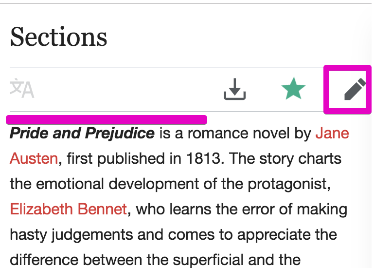
Page MenuHomePhabricator

Build Section Editing Prototype
Closed, ResolvedPublic

Description

Problem

  1. The heuristic analysis shows that users experience the inability (even if it's momentary) to focus due to loss of bearings when attempting to do section editing.
  2. For users that do find and use Section Editing, it is a clunky experience since they need to jump around the screen to identify where there content has moved to.

User story
When I am editing an article, I want to focus on just the section that I intend to edit so that I can confidently focus on the section and complete the edit.

Proposed solution

  • Remove all distracting text to allow for isolated editing of the section

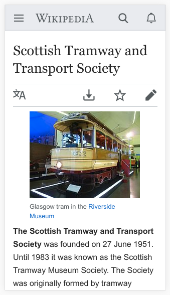
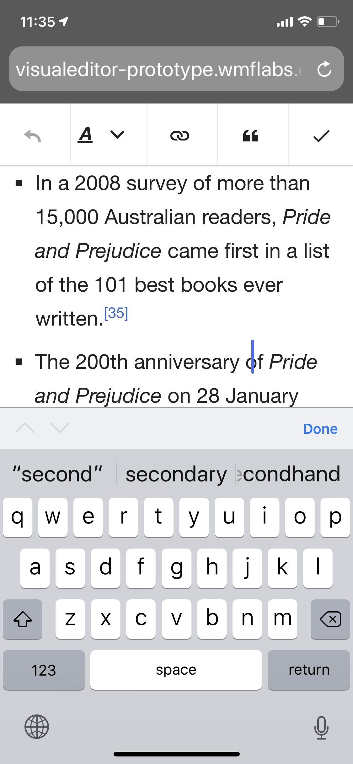
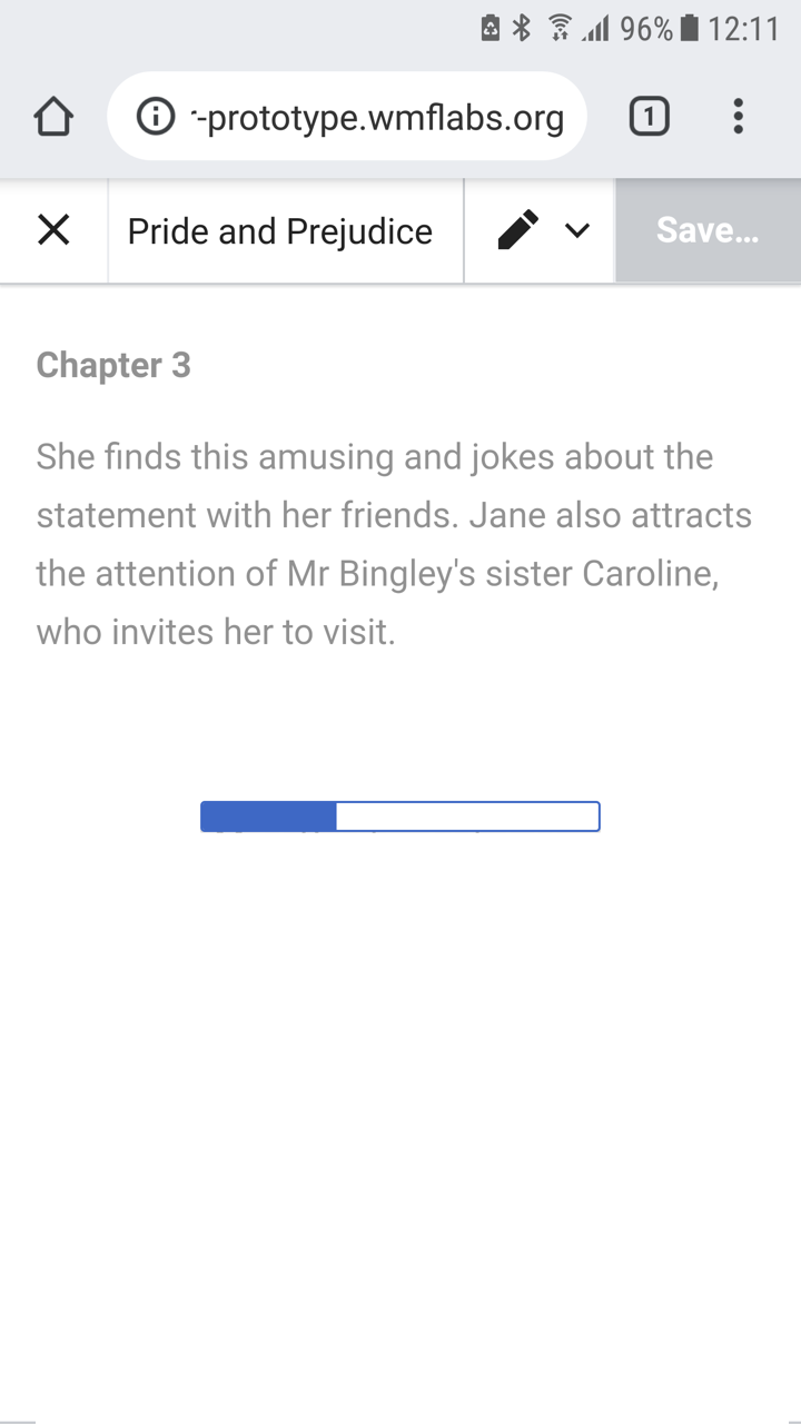
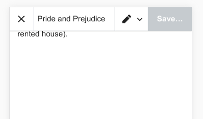
Mocks of proposed designs

T209979

Interaction flow

to come

STEPS:
  1. User opens the article to read
  2. User taps on section editing button
  3. User edits section
  4. User publishes edits
  5. User is taken back to reading view

Event Timeline

JTannerWMF created this task.
JTannerWMF edited projects, added VisualEditor (Current work); removed VisualEditor.
JTannerWMF added a subscriber: DannyH.

In general, the prototype T76541 communicates the core interaction quite nicely, there are a few tweaks that I think could make it a bit smoother for testing. Here's some initial feedback and general thoughts based on the first iteration:

  • Performance - The load time feels exceptionally slow
  • Content Notes - The article title should not be “Sections” but the actual article title (Pride and Prejudice in this case) - as it can be easily be mistaken for a label. The red links throughout the article may be slightly distracting so we just might also want to change the article to something else.
  • Interaction Design - After the user taps the section editing there is a pronounced screen jump. We should figure out a more fluid solution.
  • Bugs - I believe these are bugs, if you agree, then we should move these into separate tickets.
    • In Source editing mode, selecting to edit the whole article only shows the intro section when it should reveal the entire article
    • Inconsistency between VE/Source mode in the header (in source it is “Editing: <Article title>”, in VE it is “<Article title>”) - we might want to address this later in connection with T211255
    • When pressing section editing on desktop -depending on where you are within the section, you will land on a different place in that section. This only happens on desktop, not on mobile.

We also might want to consider that there are lots of editing pencils up to H4+ headings. Are so many needed? I'm of two minds because this might work better on longer articles. Note that on iOS edit on sections is only at H2s. Does it make sense to have more granular levels on mobile but not desktop?

cc/ @dchan @Esanders

iamjessklein renamed this task from Build Prototype to Build Section Editing Prototype.Jan 10 2019, 3:24 PM
  • Performance - The load time feels exceptionally slow

The labs instances are generally going to be slower, this is not indicative of production, where it should be slightly faster than the existing system.

  • Content Notes - The article title should not be “Sections” but the actual article title (Pride and Prejudice in this case) - as it can be easily be mistaken for a label. The red links throughout the article may be slightly distracting so we just might also want to change the article to something else.

The page could be moved, although unless we import hundreds of articles, the links are going to remain red.

  • Interaction Design - After the user taps the section editing there is a pronounced screen jump. We should figure out a more fluid solution.

Yes, we should look into this, however the code that manages this is spread across VE and MobileFrontend and so is not going to be trivial to fix. On VE desktop where we control all the code the transition is much smoother.

  • Bugs - I believe these are bugs, if you agree, then we should move these into separate tickets.
    • In Source editing mode, selecting to edit the whole article only shows the intro section when it should reveal the entire article

This was a deliberate decision made by the then mobile team, I believe made for performance reasons. I think there is a separate ticket about create separate links for edit-whole-document and edit-lede-section. I have an update to the patch which matches this behaviour in visual mode (so it edits the lede section). If we want to change this is should be consistent in both modes and we should be aware it would be a big change to the current mobile wikitext experience.

  • Inconsistency between VE/Source mode in the header (in source it is “Editing: <Article title>”, in VE it is “<Article title>”) - we might want to address this later in connection with T211255

The rationale here (which is a bit clearer on desktop) is that the old wikitext editor reloaded the page and presented a form which was not the article, and so the title was changed to "Editing: Foo" as you were no longer reading the article. When we implemented VE on desktop we were no longer reloading the page and showing a form, but seamless transitioning the document between read mode and edit mode. In this context it made no sense for the title to jump-change from "Foo" to "Editing: Foo". I think this rationale still applies to the current mobile situation, but does fall apart a bit when you consider the seamless switching between VE and VE source mode (which we should bring to mobile eventually).

  • When pressing section editing on desktop -depending on where you are within the section, you will land on a different place in that section. This only happens on desktop, not on mobile.

If this can be reproduced consistently we can file a bug for it.

We also might want to consider that there are lots of editing pencils up to H4+ headings. Are so many needed? I'm of two minds because this might work better on longer articles. Note that on iOS edit on sections is only at H2s. Does it make sense to have more granular levels on mobile but not desktop?

This is a worthwhile discussion to have, but change something like this on desktop would be a pretty significant change, and probably beyond the scope of this project.

  • In Source editing mode, selecting to edit the whole article only shows the intro section when it should reveal the entire article

This was a deliberate decision made by the then mobile team, I believe made for performance reasons. I think there is a separate ticket about create separate links for edit-whole-document and edit-lede-section. I have an update to the patch which matches this behaviour in visual mode (so it edits the lede section). If we want to change this is should be consistent in both modes and we should be aware it would be a big change to the current mobile wikitext experience.

Note also this is essentially T203151

Based on @Esanders feedback, I would recommend that we tweak the prototype by changing the "Sections" title to an actual page title.

editall.png (550×769 px, 86 KB)

The "Edit All" button is something that we should consider and is currently being proposed in T210659. Considering the fact that the current top-most edit icon in VE doesn’t enable whole page editing and since this is the case on wikitext, it is definitely unexpected behavior. Additionally from a UX performance perspective, if an Editor is trying to make many edits, it would be easier to have this one Edit All button then, click back and forth and wait for the page to slowly load. I know this wouldn't be trivial work, but we have a few options here:

  • Change the existing button to be an Edit All button T203151
  • Float a pencil button next to the first paragraph (I believe this will be needed whether we make an Edit All button or not.
  • Decouple this work and address it in conjunction with the toolbar improvements T211255

If fixing this unexpected affordance is a blocker to closing this ticket, then we should continue to work on this. Otherwise, we can work that through in the respective tickets (and close out this prototype build ticket after the title is fixed).

cc/ @Esanders @dchan @JTannerWMF

Float a pencil button next to the first paragraph (I believe this will be needed whether we make an Edit All button or not.

Note that many articles begin with an image or infobox, which on mobile is usually 100% width. MobileFrontend appears to magically detect infoboxes and move them below the first paragraph (even though the infobox comes first), but this is not the case with images, so it's not always going to be possible to float the pencil button inside some flowing text:

image.png (588×339 px, 124 KB)

good point @Esanders - let's remove that as an option

@Esanders @dchan - can you point out any changes that were made recently so I can focus my feedback there?

Functionally there have been no changes.

Tested this with iOS and Android on:

  • mobile Firefox (most up to date version)
  • mobile Safari (most up to date version)
  • mobile Chrome (most up to date version)

Everything is behaving as I'd expect.
One small tweak (that is really a nit) is that when you get into the editing view, and scroll to the bottom of the section, there's a large amount of extra white space. Is this avoidable?

GIF image-C6C719DB8C4D-1.gif (320×320 px, 623 KB)

@iamjessklein The whitespace is required to allowed you to scroll down far enough such that the last line of text can appear the above the onscreen keyboard (the height of which we cannot know, so must assume to be nearly as tall as the screen). If you have found a situation on a particular device where it appears there is too much whitespace we can look into that.

Okay, I just tried this with the keyboard up and it still looks a touch excessive to me AND I just discovered a wonky bug where the cursor does not stay put on scroll. I wasn't able to capture this as a screencast but here's a still.

IMG_817A948FE0E5-1.jpeg (2×1 px, 574 KB)

In addition to the whitespace and cursor that I listed above, there's one bit of polish that would be great. When doing the transition between clicking the contextual button and getting to the edit pane, it would be great if the non-selected section content could drop out of the view (opacity). This would help set the expectation that the one particular section is going to be edited (rather than all of the text in the whole article):

image.png (1×720 px, 97 KB)

In addition to the whitespace and cursor that I listed above, there's one bit of polish that would be great. When doing the transition between clicking the contextual button and getting to the edit pane, it would be great if the non-selected section content could drop out of the view (opacity). This would help set the expectation that the one particular section is going to be edited (rather than all of the text in the whole article):

This is difficult at the moment because the read-mode HTML doesn't include the section markup we have in edit mode.

Okay, I just tried this with the keyboard up and it still looks a touch excessive to me ...

Testing on Chrome with user agent set to iPhone I get just enough whitespace to push the last line to the top of the screen, which is correct:

image.png (245×418 px, 9 KB)

In addition to the whitespace and cursor that I listed above, there's one bit of polish that would be great. When doing the transition between clicking the contextual button and getting to the edit pane, it would be great if the non-selected section content could drop out of the view (opacity). This would help set the expectation that the one particular section is going to be edited (rather than all of the text in the whole article):

This is difficult at the moment because the read-mode HTML doesn't include the section markup we have in edit mode.

Is this something that we plan on doing at some point?

Okay, I just tried this with the keyboard up and it still looks a touch excessive to me ...

Testing on Chrome with user agent set to iPhone I get just enough whitespace to push the last line to the top of the screen, which is correct:

image.png (245×418 px, 9 KB)

With regard to this - I think that the pain point right now is the cursor. Should I file that as a bug?

Closing. The prototype is complete and we are now user testing T209986