Page MenuHomePhabricator

Homepage: clarify transitions between module states
Closed, DeclinedPublic

Description

In testing out the newcomer homepage, we realized that the transitions of states in the modules (e.g. from complete to incomplete) are very subtle -- sometimes words change, sometimes icons change, but no animation or anything draws the eye. It's possible users don't notice that they are making progress. Here are two comments from @MMiller_WMF regarding the start module (T217105):

  • As I played with this module, I realized that the email module's transition from "Add your email" to "Confirm your email" is probably too subtle. Since it's just words that change, it's hard to notice that I've made progress on the module. This would not be for the initial release -- but do you agree? And do you think there could be a way to indicate that the user has accomplished the first part of that module?
  • In general, I felt like the modules transition from incomplete to complete really quietly. Like, I notice that I've completed a module when I return to the homepage and notice that the checkmark is green. Again, not for the initial release, but I wonder if there is a way to animate or indicate or congratulate that the user accomplished one. I could imagine an animation when the user returns to the homepage, or a toast for the moment they complete it.
  • Desktop design
  • Desktop noJs design
  • Mobile design

Event Timeline

For future reference, I'm adding here some feedback by @Dyolf77_WMF which is relevant to this task.

  • The four modules at the top of the page (Start module) look confusing on first visit, and don't convey a clear hierarchy on where to get started (they have same size, same color treatment)
    • When I used the Home page for the first time, I was a little bit confused how to use it. There are so many boxes and I was searching what to do first and how I could understand what task was done or not.
  • A design proposal was also suggested: grey background and red link color (note: temporary solution just to show how it could work) would highlight the tasks that haven't been accomplished yet.
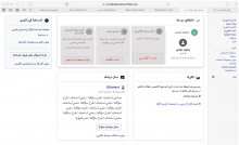
    maquette.png (684×1 px, 236 KB)

Thanks @Cntlsn my design is just a rough suggestion, fully of design errors. But I hope you understand my point of view.

Hello!

I have worked on a possible design solution to the issue of clarifying transitions between module states in the start module.

The idea is to animate elements in the module whose task has just been accomplished to capture the attention of the user upon returning to the Homepage, and to progressively dim the completed modules to convey the idea that the module turned into its "silent" state.
(The existing treatment for changing module's copy and button state will remain unchanged).

Desktop

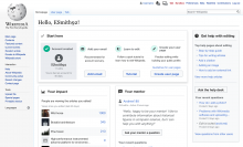
  • The completed module will feature an animated checkmark and a grey background color (entering with a light animation) when user gets back to the Homepage after completing the task.
    Screenshot 2019-08-05 19.04.53.png (1×2 px, 685 KB)
  • The first transition to be displayed will always be the completion of the Account creation module, on the first visit to the Homepage.
    • The checkmark icon will animate with a light bouncing effect
    • The background color will fade in

    • All other modules will display the same treatment and animation, when the user gets back to the Homepage after completing the related task.
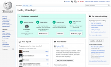
  • The last transition to be displayed will turn the whole start module into its temporary completed state (the definitive completed state will be addressed in T219391)
    Screenshot 2019-08-06 11.38.51.png (1×2 px, 691 KB)
    • The background color for the whole start module will fade to green, while the background for the completed modules will fade from grey to green

Desktop noJS
Users with noJS will get the dimmed background treatment, without animations.

Mobile

  • The completed module will feature an animated checkmark in the Start module preview when user gets back to the Homepage after completing the task, and a grey background color (entering with a light animation) in the module details dialog when first visiting after completing the task.
  • The first transition to be displayed will always be the completion of the Account creation module, on the first visit to the Homepage.
    • The checkmark icon in the Start module preview will animate with a light bouncing effect
    • The background color in the Start module details dialog will fade in

  • The last transition to be displayed will turn the whole Start module preview into its temporary completed state
    • The background color for the whole Start module preview will fade to green

    • At this point all the modules in the Start module details dialog will have grey background

@RHo @MMiller_WMF @Catrope Looking forward to get feedback on this before adding alla the relevant specs.

I forgot to mention that, for the new designs to work well from a visual point of view, I would suggest to remove the dividers currently placed between the modules of the Start module.
The modules are already spaced enough to communicate separation of their content and actions, removing the separators would just result in a cleaner layout.

Are we sure about moving this to 4 tasks to make to a step-by-step to complete? It is the feeling I have when I look at the mockups.

If we go for a step by step, we should make the steps more clear, with numbers.

Are we sure about moving this to 4 tasks to make to a step-by-step to complete? It is the feeling I have when I look at the mockups.

If we go for a step by step, we should make the steps more clear, with numbers.

It is likely that the number of tasks or content of the tasks may change, and given they are not meant to be sequential steps, I support @Cntlsn's design which keep it to this minimal animation change for now (with no numbers).

Keeping in-progress since the end transition will likely change pending completion of T219391

Closed as this is superseded by T260780