Description
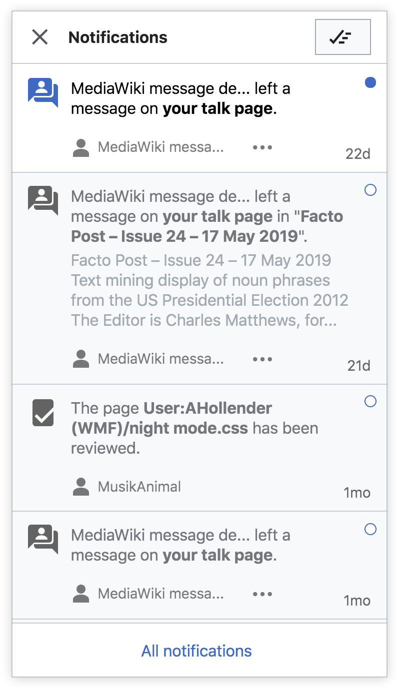
I think with some design refinements the read-state for notifications could be clearer. Currently the black text and dark gray background don't do an adequate job of communicating that a notification has been read.
User story: As a user, I'd like a clearer read-state for notifications, so that I have a better idea of when a notification has been read.
Designs
| current | refined |
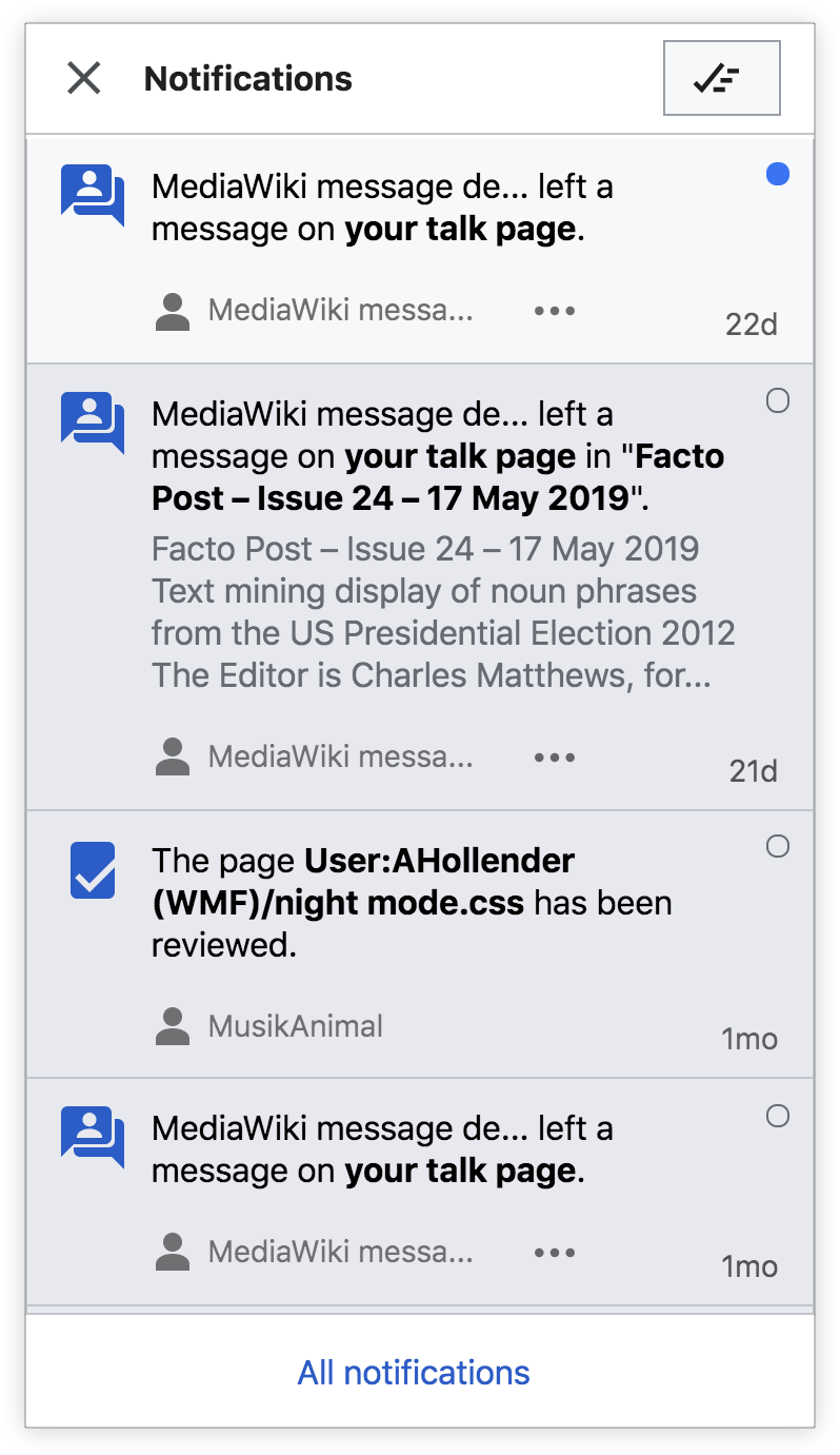 | 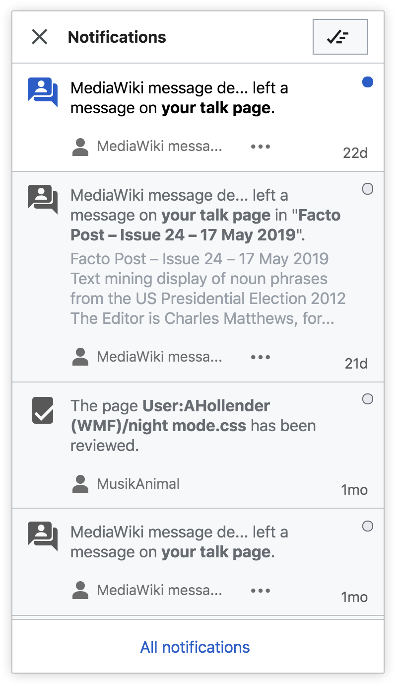 |
Changes to "read" treatment:
- update background to Base90 (#f8f9fa)
- change icon color to Base20 (#54595d)
- change primary text to Base30 (#72777d)
- change secondary text to Base50 (#a2a9b1)
Developer notes
This is in the Echo extension
Note: Special:Notifications is incompatible with foreign MFContentProviderScriptPath.