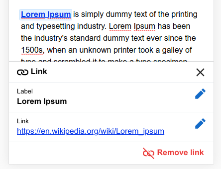
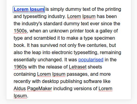
Right now, when a user taps on the first pencil on the Edit card for a link, it closes the Edit card and goes back to the page. I feel, it's not quite apparent at this point that it's for changing the label. There is no visual cue other than the highlight (which also goes out of view, because of T227627) and the keyboard appearing. I understand that previously it used to be the same but we didn't have any explicit button on mobile to change the label, but now I feel there might be a user expectation for clearer indication of what it's for.
Also, once you are in that label editing mode, tapping on the link again and again does not bring back the edit card but keeps the user in that confusing stage unless they click somewhere else and then again click back on that link.
Description
Details
| Status | Subtype | Assigned | Task | ||
|---|---|---|---|---|---|
| Resolved | None | T221247 [Epic] Mobile context items | |||
| Resolved | None | T221298 Edit cards: usability testing | |||
| Invalid | None | T221307 [Engineering Epic] Mobile edit cards | |||
| Resolved | Esanders | T225834 Edit cards: deploy v2 to all wikis | |||
| Resolved | Esanders | T226679 Deploy Edit Cards v2.0 to prototype server | |||
| Resolved | • iamjessklein | T221299 Edit cards v2: conduct usertesting.com test | |||
| Invalid | None | T227894 [EPIC] User Testing Outcomes | |||
| Resolved | Esanders | T228220 Consider improving the workflow for adding label for link on mobile |
Event Timeline
There is no visual cue other than the highlight
This is a good point, we should be able to restyle the link on mobile when the cursor is present, for example using the solid blue outline and white background we use for text input widgets:
In v3 we will hopefully be introducing form-based label editing, but in the interim this should help.
Change 524828 had a related patch set uploaded (by Esanders; owner: Esanders):
[VisualEditor/VisualEditor@master] Distinguish activate link styling
+1 @Esanders, this is a great spot, @Ryasmeen.
And Ed, the solid blue outline and white background looks great.
One note: there seem to be some instances when the cursor does not show. Although, I have not yet been able to identify a pattern to replicate this little bit of weirdness.
Actual Behavior
- Tap an existing link (could be an internal or external link)
- Tap the link label edit pencil "✎"
- The solid blue outline with the a white background is shown
- ⚠️In some instances, the cursors is not visible
Expected behavior
- Tap an existing link (could be an internal or external link)
- Tap the link label edit pencil "✎"
- The solid blue outline with the a white background is shown
- The cursors is blinking
I can reproduce this intermittently on iOS, so it looks like a browser bug. It is not a a regression, but it is more obvious now we use a collapsed cursor instead of selecting the whole word.
Roger that. Ed, it sounds like you're suggesting we not spend any more time trying to figure out a solve for T228220#5359999 before releasing v2. If that's the case, then I agree, provided @iamjessklein doesn't feel strongly otherwise.
Note to self: identify browser and OS next time.
I've monkey-patched a guessed fix to the prototype server, which seemed to work (although it was only failing about 5% of the time to begin with), so if you verify that it resolves it for you I'll go with that fix.
Just tested again (iOS + Chrome). The issue seems to happening for me with same frequency as before [1].
- Video demonstrating issue: Skip ahead to 0:28: https://youtu.be/protPdXii34
Sounds good: T229022
Are you okay with styling changes?
Yep. The solid blue outline and white background looks great to me.
@iamjessklein, do you feel okay about these styling changes?
"Styling changes" = notice the blue outline and white background that surrounds an existing link's label in this video: https://www.youtube.com/watch?v=protPdXii34&feature=youtu.be
👍these are the changes that we discussed in our last review. I'm good with the implementation.
Change 524828 merged by jenkins-bot:
[VisualEditor/VisualEditor@master] Distinguish active link styling
Change 524830 had a related patch set uploaded (by Bartosz Dziewoński; owner: Esanders):
[mediawiki/extensions/VisualEditor@master] Update VE core submodule to master (fbbb9c4cb)
Change 524830 merged by jenkins-bot:
[mediawiki/extensions/VisualEditor@master] Update VE core submodule to master (fbbb9c4cb)

