Designs
| 1) | 2) | 3) | 4) | 5) | 6) |
 |  |  |  |  |  |
Notes
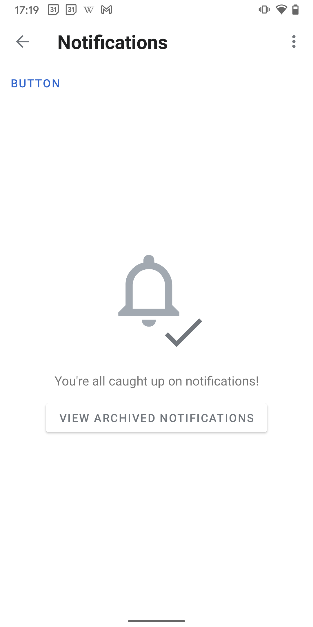
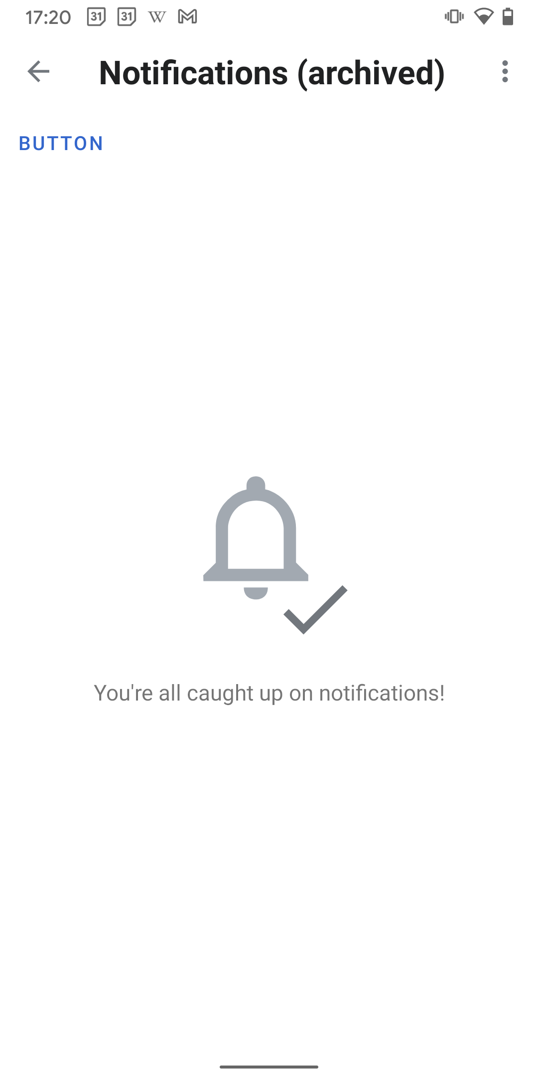
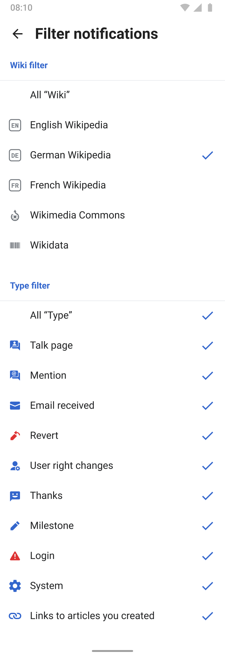
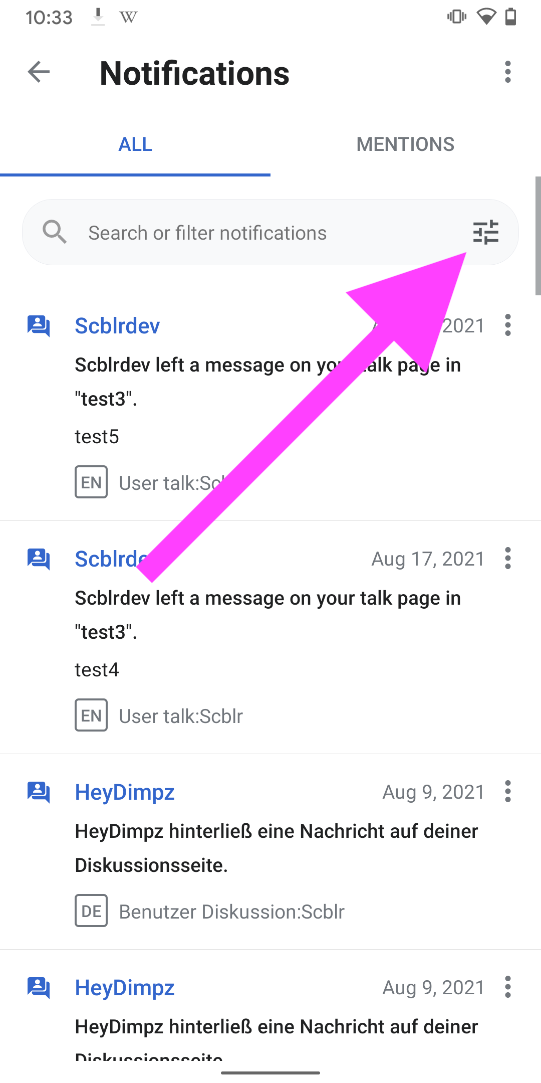
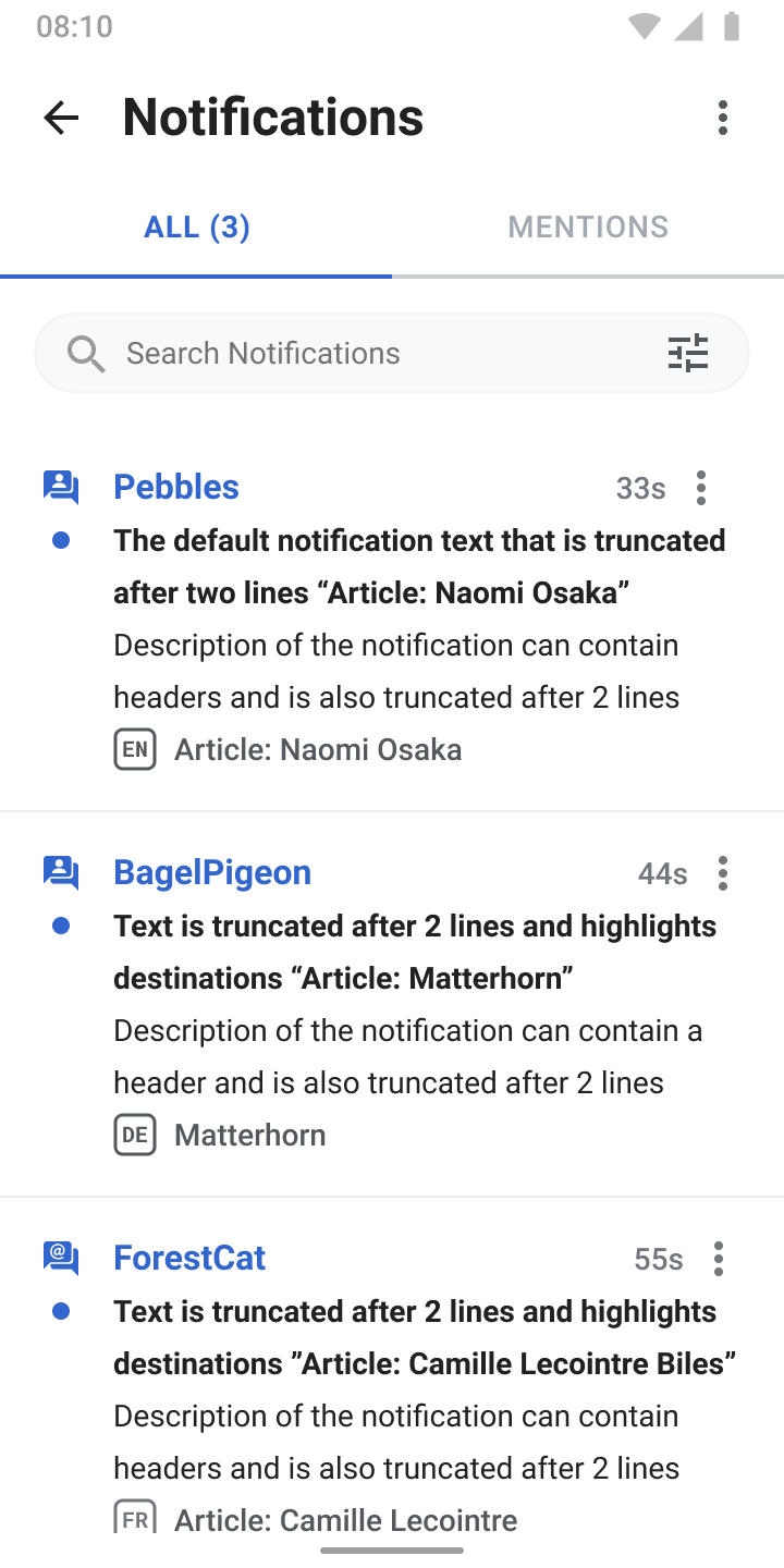
- The notifications list view consists of a search bar and a filter option (icon in the search bar). Tapping the search bar leads to view 4). Tapping the filter/tune icon leads to screen 2).
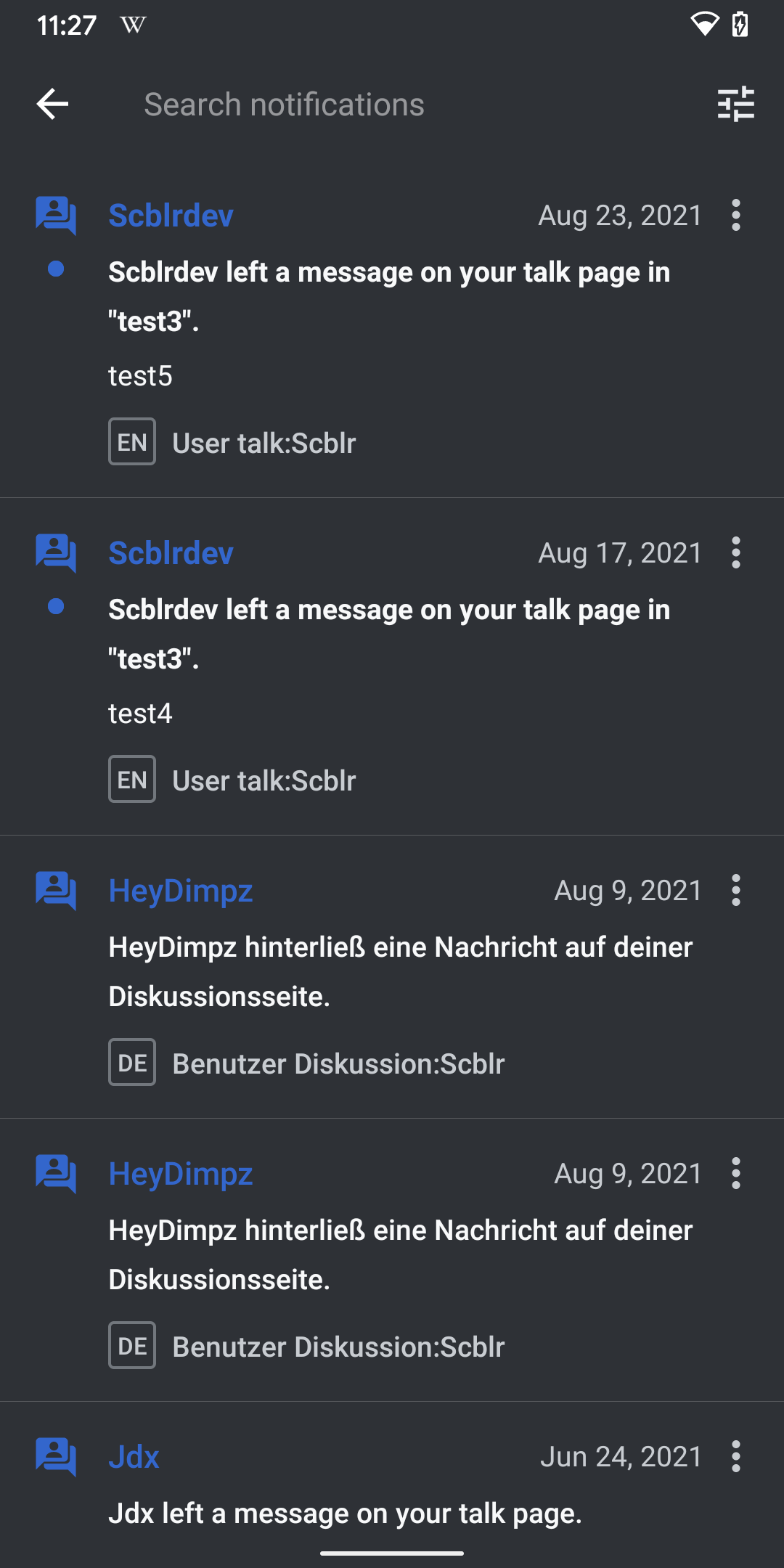
- Filter disabled: By default, all wikis, projects or types are enabled (= nothing has been deselected by users)
- Filter enabled:
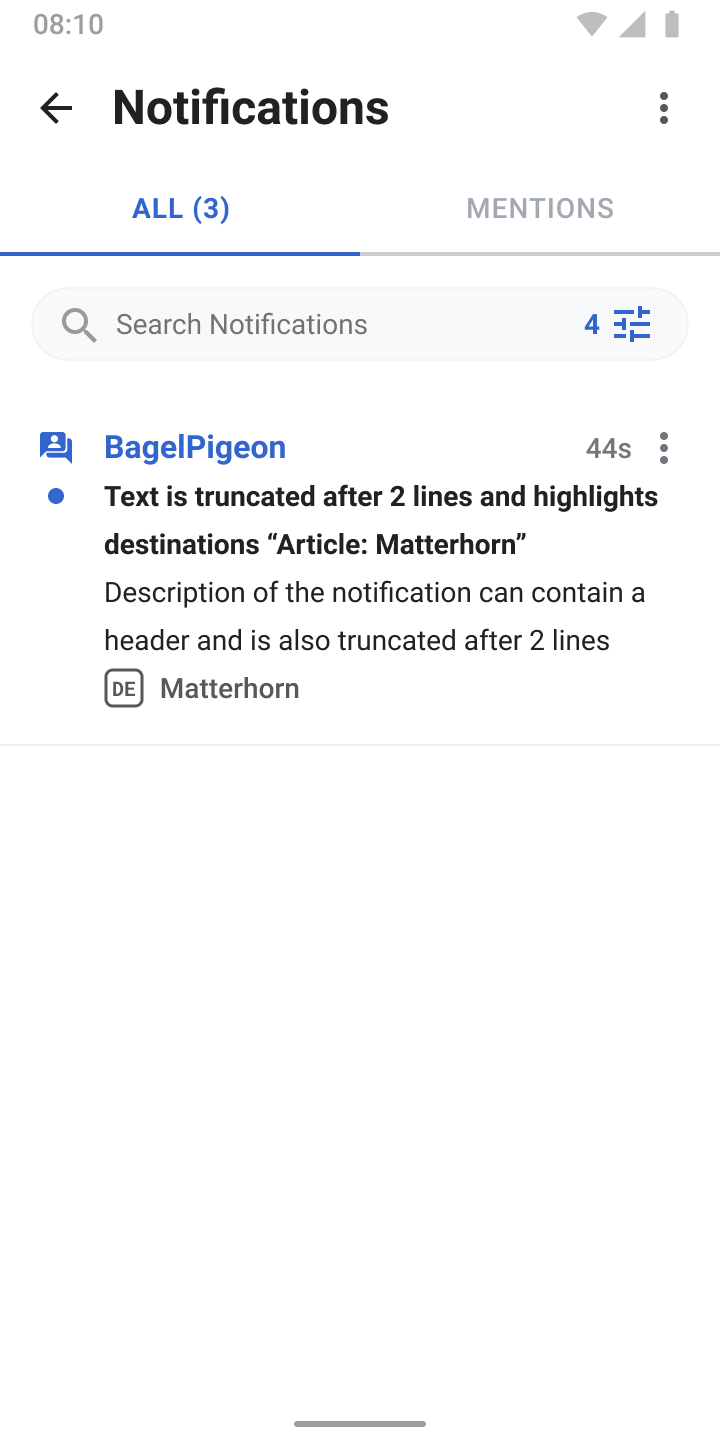
- If users deselect an item (wiki, project or type), list view filtering is enabled, see screen 3).
- Multiple wiki, project or type filters can be enabled at once (checkbox)
- Enabled filter in list view: If a filter is enabled (= a wiki, project or type is deselected), the icon turns into accentColor and a number of how many filters are enabled is added next to the filter icon.
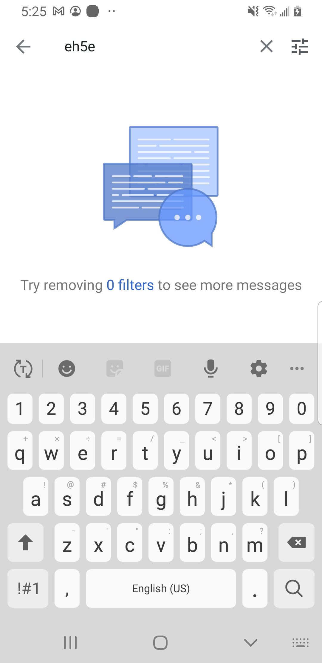
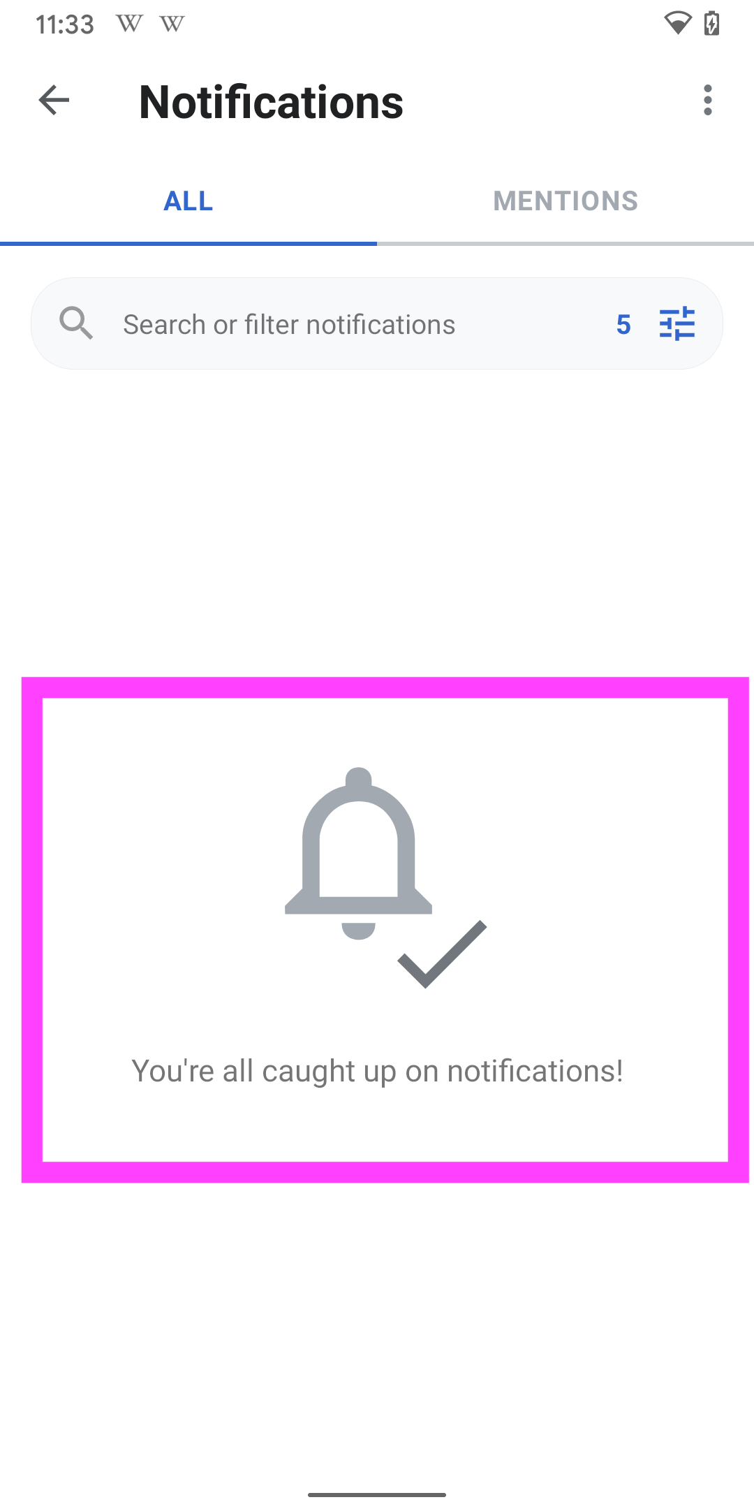
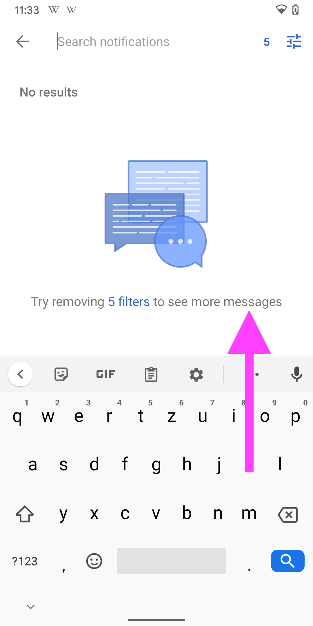
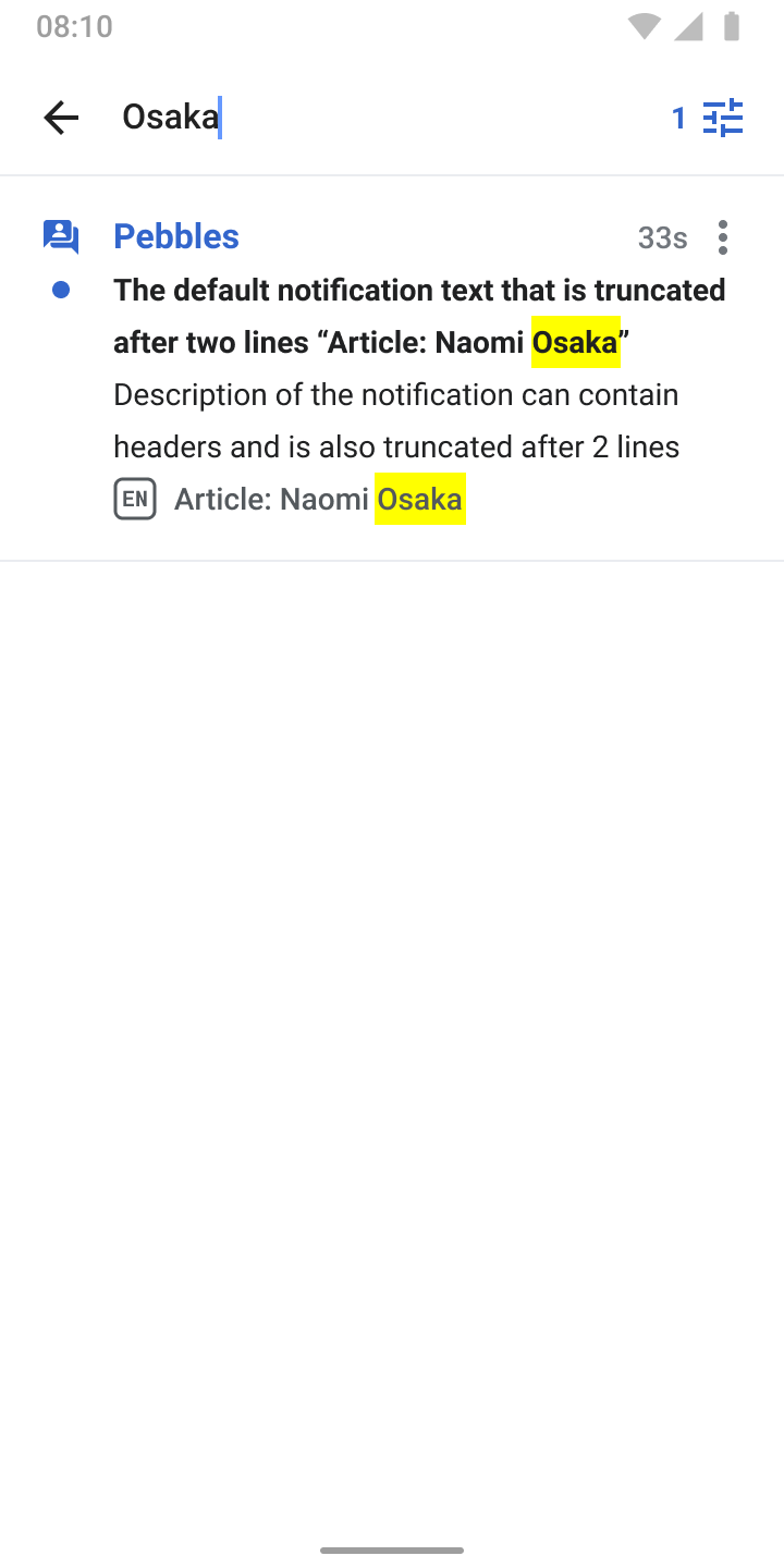
- Search: Tapping the search bar leads to this view. It searches the user’s list of notifications.
- If a filter is enabled, it searches within the filter. In addition, the active filter indicator from the search field is displayed (top right in the app bar) to make sure the user is aware that a filter is active.
- Found search terms are highlighted in yellow (same as for 'Find in Page'
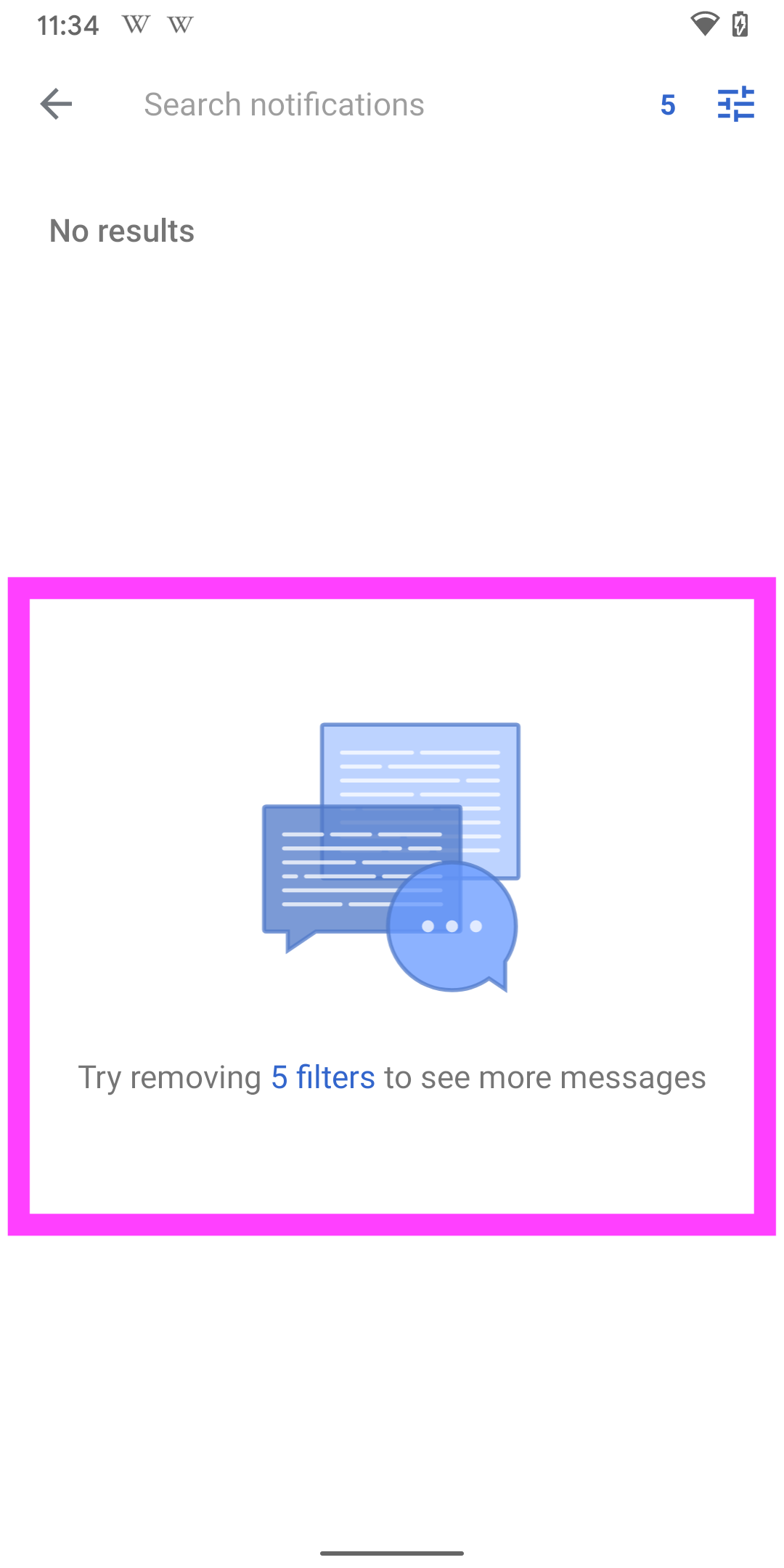
- Empty state: No results found
- If filters are active, show an illustration with helper text that a filter is active and also contains a direct link to the filter view (screen 3)
- If no filters are active, show the “No results” text (same as for Wikipedia’s search)