Page MenuHomePhabricator

Add an image: image viewer
Closed, ResolvedPublic

Description

From the parent task:

  • Image thumbnail
    • On the left under the suggestion reason.
    • Show a small version of the suggested image. It should always fit into the same horizontal rectangle, even if that means letterboxing it (like for a portrait-shaped image).
    • In the lower right of the thumbnail should be an icon to expand the image to fullscreen. The icon floats above the thumbnail with transparent gray, so you can still see the image underneath it.
    • Triggered when anywhere in the image thumbnail on the image inspector is selected (not only the fullscreen icon area).

This task is about the experience after the user taps the icon to expand to fullscreen.

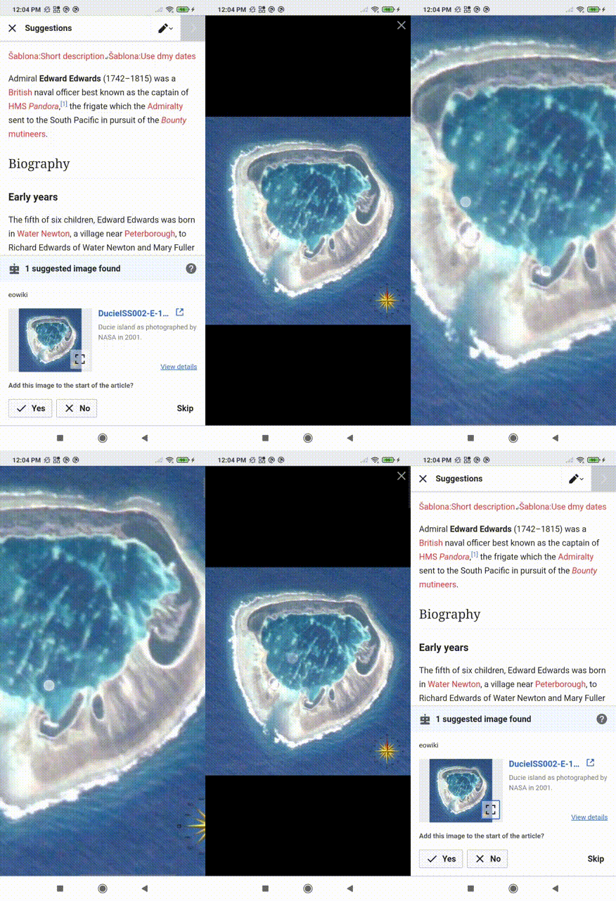
  • Once fullscreen, the user should be able to zoom in farther and pan around the image using the "pinch" and two-finger gestures on their device.
  • It should not show image details, just the image alone.
  • The fullscreen image should have an "X" to close it in the upper right.
  • The browser back button should close the image viewer and take the user back to the task.

Spec details on Figma: https://www.figma.com/file/ULhJr1isDstRbGE5vjYDsr/Add-images-structured-task-[Growth]?node-id=3011%3A8775

Event Timeline

With this patch, image URL will be included in the task data.

Hi @MMiller_WMF @RHo — when the image is letterboxed, should clicking the area outside the image close the dialog as well (in addition to the close button)?

Screen Shot 2021-09-20 at 12.03.23 PM.png (1×738 px, 466 KB)

Hi @MMiller_WMF @RHo — when the image is letterboxed, should clicking the area outside the image close the dialog as well (in addition to the close button)?

Screen Shot 2021-09-20 at 12.03.23 PM.png (1×738 px, 466 KB)

Hi @mewoph - ideally we want to hew to the existing mobile MediaViewer component as possible, which means only the close button should close the fullscreen image.

Thanks @RHo — I just noticed that this task is under the TBC section in the parent task. Should this also have the PLACEHOLDER keyword as well?

Re: MediaViewer, is the expectation that this image viewer would have all the same controls or would it just have the image and the close button?

Thanks @RHo — I just noticed that this task is under the TBC section in the parent task. Should this also have the PLACEHOLDER keyword as well?

from my perspective it seems straightforward enough to do on its own, unless @MMiller_WMF wants to pause it with the other Add image tasks anyway and concentrate on 'lull' tickets these next couple of weeks.

Re: MediaViewer, is the expectation that this image viewer would have all the same controls or would it just have the image and the close button?

Thanks for checking, it would be only the image and close button, as the other controls can lead the person astray from the main add image task.

@mewoph -- I think this task is well-developed enough to work on. Please do proceed!

Change 722657 had a related patch set uploaded (by MewOphaswongse; author: MewOphaswongse):

[mediawiki/extensions/GrowthExperiments@master] Add an image: Image viewer

https://gerrit.wikimedia.org/r/722657

@RHo for accessibility & usability purposes, the X to close the overlay probably needs to stand out more. If the image is landscape, or if the device is in landscape orientation, the gray X will be over the image and it can be pretty hard to see depending on the background.

image.png (700×606 px, 639 KB)

Minerva already has an overlay component with a closing X, perhaps we should use that and place the image inside it?

@RHo @kostajh Maybe we can use the same semi-transparent close icon w/a drop shadow like MediaViewer on desktop?

Screen Shot 2021-09-24 at 9.26.59 AM.png (190×494 px, 31 KB)

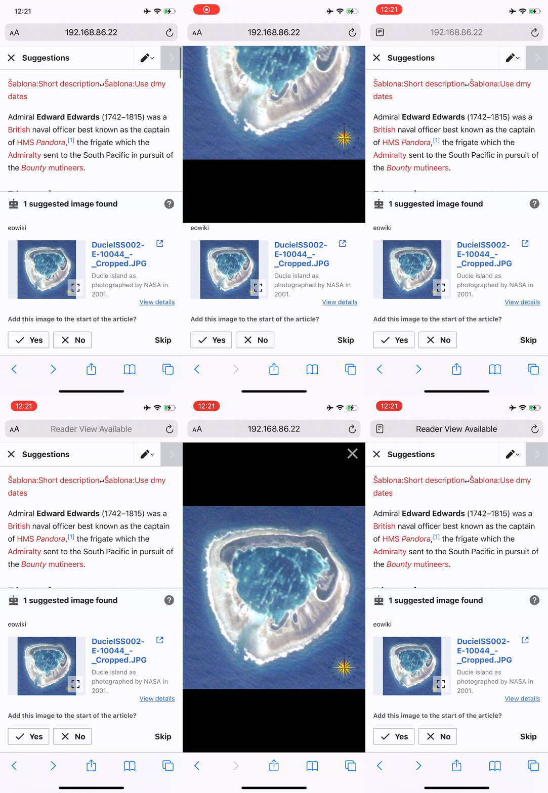
Hi @kostajh and @mewoph, the proposal to re-use MediaViewer was intended to reduce work as I assumed it's vetted for accessibility on mobile to account for the the "x". I'm looking on mobile now and it seems the way it works on mobile is that the image always appears below the "x", and zooming in zooms the "x" as well (see screencast).


This is not the most ideal (since the "x" can be easily zoomed offscreen), but it does satisfy the colour accessibility requirement. So my preference would be Mew's idea of using the close icon with drop shadow (since this is also used on the left and right chevron arrows on Mediaviewer mobile).

Thanks for confirming @RHo! Another question: for images that have a transparent background, should we include the tiled background like MediaViewer does so that images with black lines against a transparent background show up (example: https://commons.wikimedia.org/wiki/File:African_Elephant_SVG.svg) or should we use a solid color?

Screen Shot 2021-09-27 at 1.05.37 PM.png (1×1 px, 247 KB)

With #000 background:

Screen Shot 2021-09-27 at 1.06.42 PM.png (1×1 px, 66 KB)

@RHo what should the back button behavior be? Close the image viewer or navigate away from the task?

Once fullscreen, the user should be able to zoom in farther and pan around the image using the "pinch" and two-finger gestures on their device.

Note, it won't be too useful as the image is sized to fit the screen, so zooming in will just make it pixelated. A proper zoom (tiling) is way beyond what we could fit into this project.

Change 722657 merged by jenkins-bot:

[mediawiki/extensions/GrowthExperiments@master] Add an image: Image viewer

https://gerrit.wikimedia.org/r/722657

Thanks for confirming @RHo! Another question: for images that have a transparent background, should we include the tiled background like MediaViewer does so that images with black lines against a transparent background show up (example: https://commons.wikimedia.org/wiki/File:African_Elephant_SVG.svg) or should we use a solid color?

Screen Shot 2021-09-27 at 1.05.37 PM.png (1×1 px, 247 KB)

With #000 background:

Screen Shot 2021-09-27 at 1.06.42 PM.png (1×1 px, 66 KB)

The MediaViewer checkerboard please, thanks for checking!

@RHo what should the back button behavior be? Close the image viewer or navigate away from the task?

Hi @Tgr - it will be to close the image viewer and return to task, and that reminds me I have added the link to the Figma spec on the task description.

Once fullscreen, the user should be able to zoom in farther and pan around the image using the "pinch" and two-finger gestures on their device.

Note, it won't be too useful as the image is sized to fit the screen, so zooming in will just make it pixelated. A proper zoom (tiling) is way beyond what we could fit into this project.

Definitely not a priority to introduce proper zoom, but enabling this will helpful up to a point for many images.

Change 724808 had a related patch set uploaded (by MewOphaswongse; author: MewOphaswongse):

[mediawiki/extensions/GrowthExperiments@master] Add an image: image viewer updates

https://gerrit.wikimedia.org/r/724808

With updated back behavior (via swiping back & via back button):

imageview_ios_back.gif (1×886 px, 3 MB)

If there is time, I think it might be good to revisit the dialog animation. When swiping back, seeing the dialog animate out is rather odd so perhaps the animation can be skipped. Currently the dialog animation is the default one used for VE's dialogs. There is a related task to update the dialog animation: T288978: Add a link: Mobile dialogs should appear fading in and out from the centre of the screen.

Hi @mewoph - I forgot to specify but actually can we use the MediaViewer animation behaviour of popping open and close instead? For the reason that you say that the swiping is quite odd.

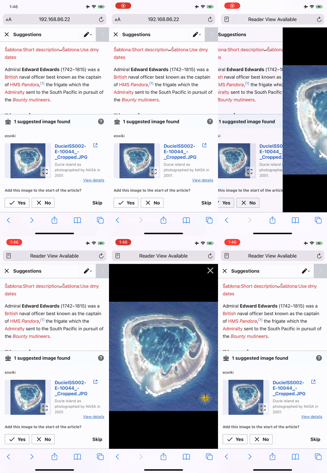
Hi @RHo thanks for the clarifications, here's the updated (non)animation:

imageview_ios_noAnimation.gif (1×886 px, 2 MB)

Hi @RHo thanks for the clarifications, here's the updated (non)animation:

imageview_ios_noAnimation.gif (1×886 px, 2 MB)

Thanks @mewoph that feels better. Can we also remove the slide right animation when closing the full screen image?

Change 724808 merged by jenkins-bot:

[mediawiki/extensions/GrowthExperiments@master] Add an image: image viewer updates

https://gerrit.wikimedia.org/r/724808

Hi @RHo the slide right is native iOS behavior (to go back to the previous page).

Hi @RHo the slide right is native iOS behavior (to go back to the previous page).

Ah OK gotcha, so that doesn't happen if the user presses the close button?

That's right. Here's a video w/the two ways of navigating back.

That's right. Here's a video w/the two ways of navigating back.

That's perfect, thanks for clarifying!

Checked on testwiki wmf.9 and arwiki wmf.9 - works as per the specs.