Page MenuHomePhabricator

[EPIC] [New component] Toast: Add Toast component to Codex
Open, Needs TriagePublic

Assigned To
None
Authored By
AnneT
Mar 11 2022, 2:55 PM
Referenced Files
F62388135: image.png
Jun 19 2025, 8:29 AM
F57791855: image.png
Dec 9 2024, 7:01 PM
F57791866: image.png
Dec 9 2024, 7:01 PM
F57791841: image.png
Dec 9 2024, 7:01 PM
Restricted File
May 2 2024, 3:01 PM
F35021269: Superuser receives message.png
Mar 23 2022, 2:55 PM
F35020199: Captura de pantalla 2022-03-22 a las 18.32.50.png
Mar 22 2022, 5:36 PM

Description

Background

Define and implement the Toast component to Codex.

Description

A short and temporary pop-up notification, meant to be noticed without interrupting the user experience.

User stories

  • As a user, I need Toast notifications to provide quick, temporary feedback about my actions without disrupting my workflow.

History

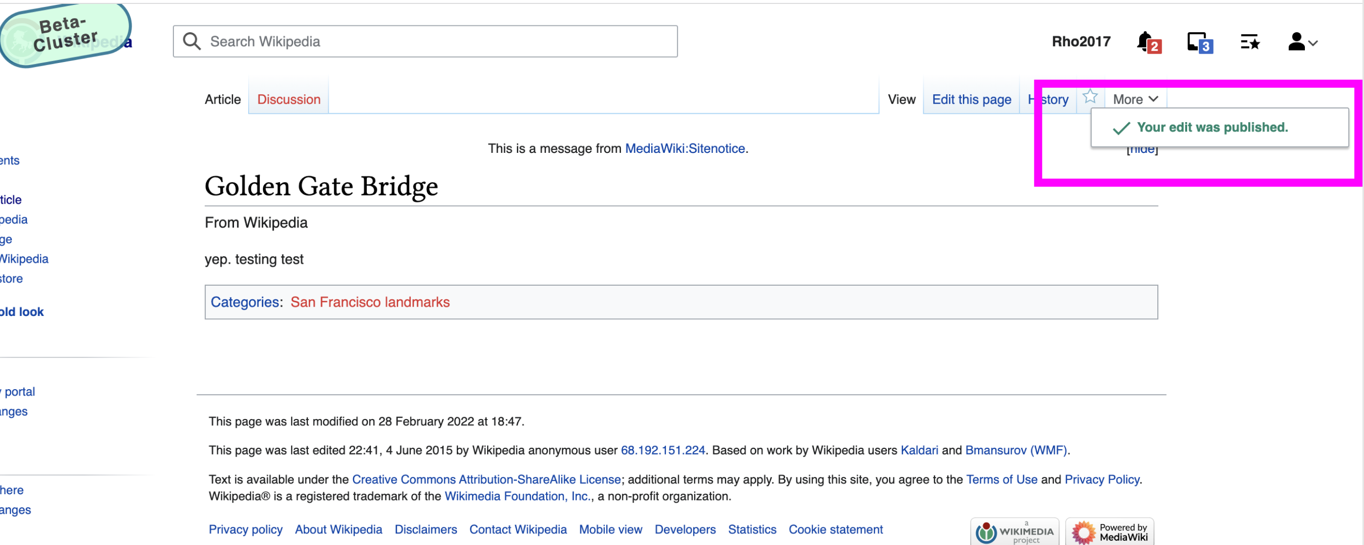
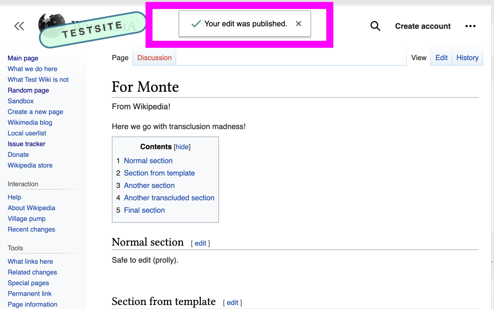
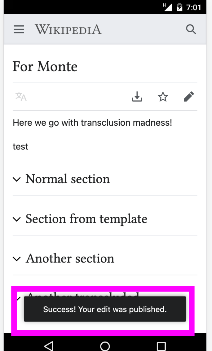
Various projects are already using a Toast component, a message that pops in and is displayed temporarily:

  • WikiLambda (see code)
  • MachineVision (see code and this task that includes a design artifact)
  • Mobile

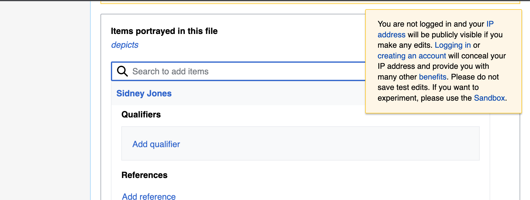
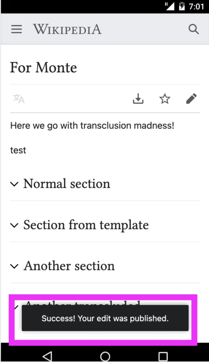
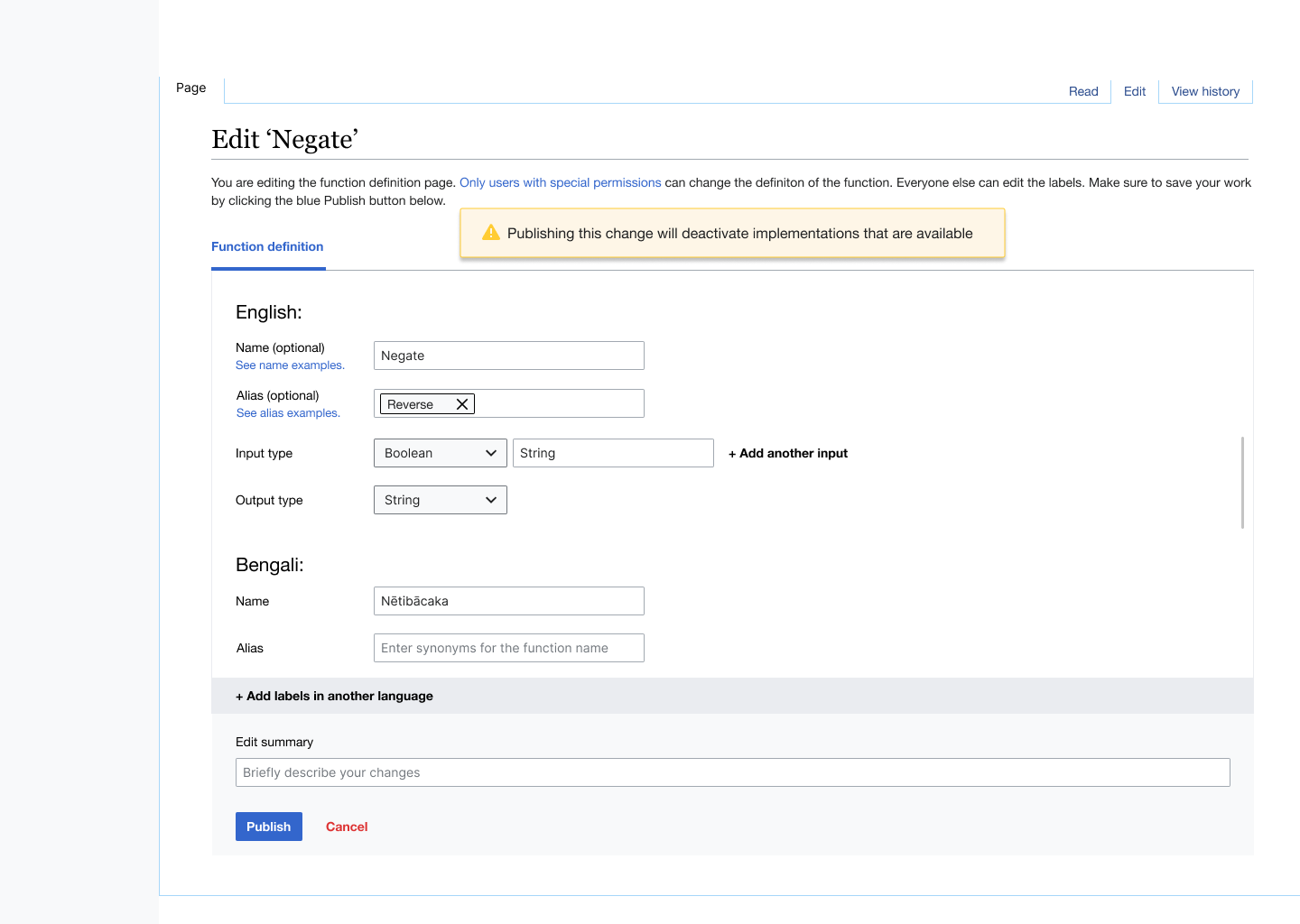
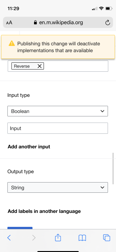
The WikiLambda component looks like the Message component, while the MachineVision and mobile versions simply have a black background with white text.

Other use cases
image.png (1×4 px, 460 KB)
Wkifunctions
image.png (1×4 px, 694 KB)
Minerva
image.png (1×1 px, 300 KB)
Edit Check

Known use cases

Describe known use cases for this component, including the project, team, and timeline

Existing implementations

These artifacts are listed for historical context. The figma spec, linked below, is the source of truth for the new component.

Wikimedia community:

External libraries:

  • Add links to any examples from external libraries

Component Drivers

Designer: @OTichonova / @bmartinezcalvo
Engineer: @AnneT

Open questions

  • List any current open questions here

Design spec

Guidelines

Anatomy

Designer should list the structure and properties of the component.

Style

Designer should list the visual features of the component.

Interaction

Designer should list interaction specifications.

Documentation

Designer should describe how the component should be documented, including configurable and standalone demos.

Acceptance criteria

Minimum viable product

This task covers the minimum viable product (MVP) version of this component. MVP includes basic layout, default states, and most important functionality.

MVP scope

  • List all parts of the MVP scope for this component

Design

  • Design the Figma spec sheet and add a link to it in this taskx
  • Document the compoent's guidelines and include them in this task
  • Include the component in the Figma library. This step will be done by a DST member.

Code

  • Implement the component in Codex

Future work

  • If applicable, list future work that should be done for this component after the MVP is implemented as part of this task. You should open new, standalone tasks for all future work.

Details

Other Assignee
bmartinezcalvo

Related Objects

Event Timeline

There are a very large number of changes, so older changes are hidden. Show Older Changes

User receives a message that they've disabled implementations.png (1×1 px, 64 KB)

@aishpant not sure if you should use a toast here since toast component appears to give feedback to the user when he does an specific action. In this case (tell me if I'm wrong) it seems that the message should be a fixed message to explain what will happen when he publish changes (maybe it should be a message closer to the publish button). Could you send me the link to Figma to understand better the context?

Hi all! Barbara and I discussed yesterday and I realized it is not a toast but a message! So it should behave however messages behave in the DS. I'll send an update of the mockup later today.

ldelench_wmf raised the priority of this task from Lowest to Needs Triage.Jan 25 2023, 6:35 PM
AnneT renamed this task from Consider designing and building a Toast component in Codex to Consider designing and building a ToastNotification component in Codex.Feb 14 2023, 5:39 PM
AnneT updated the task description. (Show Details)
CCiufo-WMF renamed this task from Consider designing and building a ToastNotification component in Codex to ToastNotification: Add ToastNotification component to Codex.Mar 15 2024, 10:29 PM

See also T42307: mw.notification Usability Improvements, which is approaching the same question from the other direction.

For a potential use case for a Codex toast, see T363484: Update ParserMigration notice, which is a user notification related to the roll out of the new Parsoid wikitext parser/renderer.

{F49825409}

Code: css / js / resource loader

One desideratum that came up during the design review for T363484 was the ability to anchor the toast to some UX element, ie to pop up a notice that says "this new thing is happening, and if you want to know more, this menu item or indicator is the place to go".

CCiufo-WMF subscribed.

See also T42307: mw.notification Usability Improvements, which is approaching the same question from the other direction.

For a potential use case for a Codex toast, see T363484: Update ParserMigration notice, which is a user notification related to the roll out of the new Parsoid wikitext parser/renderer.

Thanks for surfacing this! I'm realizing this component is not on our roadmap despite being labelled as a "Planned New Component". I'm correcting that now.

{F49825409}

This screenshot isn't displaying for me, could you try re-attaching it?

One desideratum that came up during the design review for T363484 was the ability to anchor the toast to some UX element, ie to pop up a notice that says "this new thing is happening, and if you want to know more, this menu item or indicator is the place to go".

That makes sense but is probably outside the scope of this particular component. The need here seems to be more of a general notice about something that just happened on the page. What you're describing sounds like it belongs in a general suite of tools for "onboarding" a user onto a specific feature or UI change. As far as I'm aware there has not been an attempt to unify an approach to these user/feature onboarding experiences. Last it was discussed within Design-System-Team was for the Growth team's OnboardingDialog (T332767), where it was determined that at least for now, it would not make sense to bring it or other onboarding related components into Codex.

CCiufo-WMF renamed this task from ToastNotification: Add ToastNotification component to Codex to [EPIC] ToastNotification: Add ToastNotification component to Codex.Aug 29 2024, 2:11 PM
CCiufo-WMF assigned this task to OTichonova.
CCiufo-WMF triaged this task as Low priority.
CCiufo-WMF updated Other Assignee, added: bmartinezcalvo.
CCiufo-WMF changed the task status from Open to In Progress.Aug 30 2024, 8:33 PM

Some notes about placing the ToastNotification at the bottom of the viewport:

One complicating factor is the iOS keyboard, which difficult to work around when placing items on the page relative to it. If the iOS keyboard is displayed, we would want the ToastNotification to appear above it. However, this may not be easily achievable.

Normally, when placing an item at the bottom of the viewport, we'd use CSS to fix it a certain distance above the bottom. We can't do this because the iOS keyboard isn't part of the viewport, so it would overlap with the Toast.

We also can't easily compute the position in JavaScript. There is a browser API called the VisualViewport, which is just the part of the viewport you can see, meaning it does not include the part covered by the iOS keyboard. Unfortunately, it doesn't update quickly enough to allow us to move the Toast if the keyboard furls or unfurls, or even place the Toast above it if the keyboard is open the whole time. I played around with this a bit and was unable to get the Toast to show up above the iOS keyboard unless I did a drastic change like turning my phone into landscape mode then back to portrait.

There seems to be a consensus that you can't rely on the visual viewport to give you timely updates when the keyboard opens or closes. So, I don't know if there's a reliable way we can make sure the toast is visible on iOS. That said, we do not typically expect the keyboard to be visible when a Toast is shown, so perhaps this doesn't matter.

El T303612#10239571, @AnneT escribió:

There seems to be a consensus that you can't rely on the visual viewport to give you timely updates when the keyboard opens or closes. So, I don't know if there's a reliable way we can make sure the toast is visible on iOS. That said, we do not typically expect the keyboard to be visible when a Toast is shown, so perhaps this doesn't matter.

Since the Toast will appear after user actions, there should not be any problems with the keyboard initially. Additionally, in a previous usability testing in T321893: Dialog: Evaluate fullscreen on mobile, we found that both iOS and Android Chrome browsers have similar keyboard issues. When the keyboard appears, the footer and header no longer stay fixed, which means the Toast might not stay visible at the top either. @AnneT could you please confirm this?

@OTichonova conducted some usability testing in (T377618) to test the best original placement for the ToastNotification in both desktop and mobile. Since the results analyzed said that mobile participants prefer the Toast at the bottom and there was a slightly equal preference for desktop participants for bottom and top, we've decided to implement the first version of ToastNotification with a consistent bottom-center position in all devices. A different placement (or other custom placements) can be considered in future iterations if needed.

Additionally, in case we need to test real keyboard issues with iOS (or Android Chrome) users, we could create a real prototype and test this before/after implementing the component.

Since the Toast will appear after user actions, there should not be any problems with the keyboard initially. Additionally, in a previous usability testing in T321893: Dialog: Evaluate fullscreen on mobile, we found that both iOS and Android Chrome browsers have similar keyboard issues. When the keyboard appears, the footer and header no longer stay fixed, which means the Toast might not stay visible at the top either. @AnneT could you please confirm this?

Correct, at least in iOS, if the keyboard appears after the toast, it will cover the toast. I've experimented with the VirtualViewport API as mentioned above, as well as dynamic viewport units, and had no success.

bmartinezcalvo renamed this task from [EPIC] ToastNotification: Add ToastNotification component to Codex to [EPIC] Toast: Add Toast component to Codex.Dec 2 2024, 10:05 AM
bmartinezcalvo updated the task description. (Show Details)

As discussed and decided with the DST, this component will be finally named "Toast" to avoid longer and compound names. In case we reorganize the components list into groups in the components panel in Codex, this Toast will be grouped with the rest of the feedback components under a Notifications/Messages/Feedback section.

As discussed and decided with the DST, this component will be finally named "Toast" to avoid longer and compound names. In case we reorganize the components list into groups in the components panel in Codex, this Toast will be grouped with the rest of the feedback components under a Notifications/Messages/Feedback section.

@CCiufo-WMF I would recommend we prioritize T309109, which will add groups to the sidebar of the components section of the docs site, soon for 2 reasons:

  • "Toast" is a very UX-professional term and most people won't know what it is until reading about the component
  • The list of components is quite long now and it's hard to find anything

One note about how Toasts should interact with other fixed or floating elements: If we want to ensure that Toasts are shown in the right order/placement when there are things like floating buttons, bottom sheets, or even Toasts from other features, we would need to implement a system in MediaWiki to send Toasts to the right place on the page with the right z-index, position, etc. This would not be part of the Toast component itself.

For the initial Toast component, I recommend we just instruct developers to place the Toast component within the markup of the feature, and if we find that Toasts are conflicting with other UI elements on the page, we can consider a solution at that time. Vue has a built-in way to enable you to send markup to a specific element (teleporting).

CCiufo-WMF changed the task status from In Progress to Open.Dec 10 2024, 10:37 AM
CCiufo-WMF removed OTichonova as the assignee of this task.
CCiufo-WMF raised the priority of this task from Low to Needs Triage.
CCiufo-WMF triaged this task as Low priority.
CCiufo-WMF moved this task from Supporting to Next on the Design-System-Team (Roadmap) board.
CCiufo-WMF moved this task from Next to Later on the Design-System-Team (Roadmap) board.
CCiufo-WMF moved this task from Later to Next on the Design-System-Team (Roadmap) board.
CCiufo-WMF added a subscriber: OTichonova.

Would there be any plans to use the Codex toast in mediawiki.notification? (TSP has a use-case, which we're discussing in T386498#10625355.)

Would there be any plans to use the Codex toast in mediawiki.notification? (TSP has a use-case, which we're discussing in T386498#10625355.)

We factored in the use case for mediawiki.notification when designing this component, but there are no plans for DST to actually make that change as part of implementing the component. Ideally it would use the Codex toast eventually. Updating a core system element like that always brings challenges though and requires some careful consideration and coordination. If there is a real need from TSP, we could explore what that could look like along with the MediaWiki Platform and likely others.

CCiufo-WMF raised the priority of this task from Low to Needs Triage.
CCiufo-WMF moved this task from Next to Later on the Design-System-Team (Roadmap) board.

I think the close button should be seriously considered to be a default, if not required. Currently mw.notification-style popups are a bit of a minefield: you can have links in them, but you have to be very careful to click on them and not on the surrounding space, because that closes the notification. Ultimately, this is very inaccessible, especially if someone has motor issues. I understand that adding a button is going to eat some space there but if that’s the concern, then the useless icon on the left/right that is now required should be removed instead.

Additionally, currently in mw.notification one can fine-tune which toasts appear together and which toasts replace the ones that already appeared. This seems to be a much better system than what is currently being proposed, as the notifications of the same type do not stay around but the notifications of different types do not get destroyed because of some developer oversight. What is the reasoning for saying that multiple toasts cannot appear together?

(The decision to put the toasts in the bottom centre also seems questionable to me, as it requires more muscle memory to remember that these notifications appear in the middle of nowhere, as opposed to previous top right position. I understand not wanting to put them in top right because of sticky elements, but bottom right would be much less disruptive if that’s the consideration here.)

Addendum: I think that while action buttons seem like a good idea to you as English speakers, they are not good idea for all languages, and would eat up space unnecessarily on desktop. For example, English Edit, used in example, can be Редактировать in Russian (Undo is Отменить), leaving very little space. If there is a necessity to describe those in the spec, it would be much better if mobile behaviour was what was happening on desktop as well (i.e., if there is little text, show button on the same line, if there is a lot of text, show it on another line), as you cannot reasonably predict the button length in translations. Right now Codex ‘deals’ with it by enforcing hyphenation, but that won’t help if you have a max-width of 512px.

Currently mw.notification-style popups are a bit of a minefield: you can have links in them, but you have to be very careful to click on them and not on the surrounding space, because that closes the notification. Ultimately, this is very inaccessible, especially if someone has motor issues.

Yeah, aiming links in toasts is a constant headache. See also T316425: multiline links made things even worse (although, as I understand, the toasts will now be wider, so multiline links will be less common?).

Additionally, currently in mw.notification one can fine-tune which toasts appear together and which toasts replace the ones that already appeared. This seems to be a much better system than what is currently being proposed, as the notifications of the same type do not stay around but the notifications of different types do not get destroyed because of some developer oversight. What is the reasoning for saying that multiple toasts cannot appear together?

Is this based on

image.png (524×754 px, 136 KB)
(figma)? Could the team clarify whether this applies to toasts from a single "system" (for which you can now set a tag with mw.notify()) or multiple "systems"? I agree that stacking toasts from different "systems" is a normal practice.

The general guidelines around the Toast component is to not overly rely on them to communicate critical information or actions. Toast are meant to be supplemental and brief, which is why only one action is recommended at most, and stacked notifications should be rare (even if from the same feature/system). There are of course going to be exceptions to this which is why most Codex components (including the Toast) are designed to be flexible enough to customize for a specific use case. Many of the mw.notification use cases don't follow these guidelines and would need to be revisited before being ported to the Codex Toast. Using the component wouldn't automatically replace whatever logic is built in to mw.notification. All the "don'ts" in the spec should be taken as recommendations and not strict rules.

As @CCiufo-WMF comments, Toast component idea is to use Toast for temporary, brief, and non-critical notifications that don't require immediate interaction. When detailed information is needed, the issue is critical, or immediate action is required. a Message component should be used instead.

DTorsani-WMF renamed this task from [EPIC] Toast: Add Toast component to Codex to [EPIC] [New component] Toast: Add Toast component to Codex.Jul 29 2025, 2:20 PM