This task involves the work with revising how the new Reply button appears to make them less distracting to people while continuing to ensure people who are new can quickly and easily recognize the buttons.
Issue
Viewing/reading talk pages with many comments on desktop or mobile can be a bit tough on the eyes because of how visually prominent the Reply buttons currently are:
| Desktop |
|---|
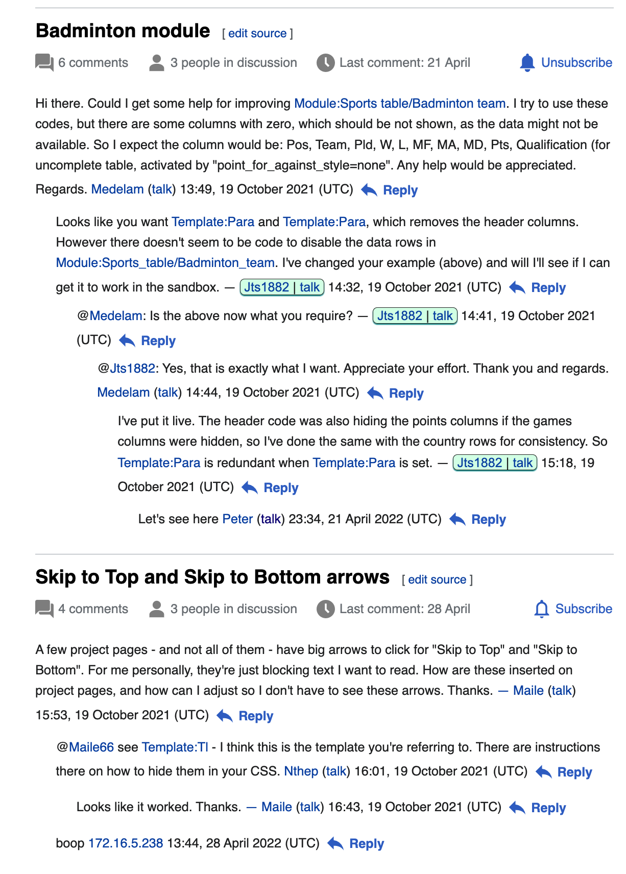 |
Requirements
Mobile
- No changes; Reply links will continue to:
- Appear on the line beneath the comment to which they are related
- Be preceded by an arrow
Desktop
- Remove the "arrow" that appears before each Reply link/button
- Note: Reply links/buttons will continue to appear immediately after a comment's signature and NOT on a new line.
References
- User:আফতাবুজ্জামান: "The "Reply" button on computer devices is now big, but it is not nice to see the big button repeatedly on pages that have a lot of discussion." | See: Topic:Wvwd06jr8wr6iux5
- @Klein: "I'm not sure if that's a good thing or not but the blue reply link kinda created a small blue sea." | See: mw:Feedback: Klein Muçi
- @Xaosflux: "I'd probably style them to be less aggressive for myself though." | See: en.wiki