Page MenuHomePhabricator

[Story] Useful empty state of item and property
Open, HighPublic

Description

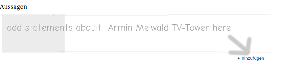
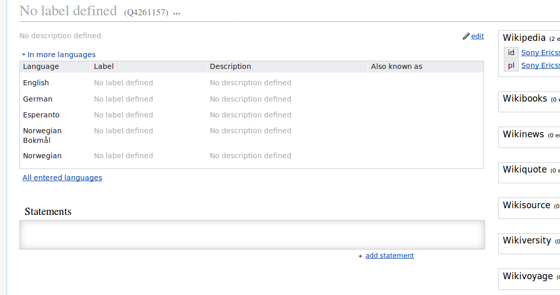
When an item or property has no statements it should still look good and inviting. This way we give people a good initial experience and give a nudge towards making empty items more useful.

In order to achieve this we will:

It is important that we first tackle the language box before the statement section because otherwise people might be prone to add statements without understanding the entity the item is supposed to describe.

Event Timeline

Lydia_Pintscher raised the priority of this task from to Medium.
Lydia_Pintscher updated the task description. (Show Details)
Lydia_Pintscher changed Security from none to None.
Lydia_Pintscher removed a subscriber: Unknown Object (MLST).
Lydia_Pintscher raised the priority of this task from Medium to High.Dec 15 2014, 2:09 PM
Lydia_Pintscher renamed this task from useful empty state of item and property to [Story] Useful empty state of item and property.Aug 23 2015, 6:40 PM
Lydia_Pintscher removed a subscriber: Wikidata-bugs.

Design suggestion: See e.g.

jansuggest.png (205×911 px, 13 KB)

In our usability test (5 People) it was a problem for all and a severe problem for 4 users to create their first statement.

Thus we suggest a raise in priority.

What about we implement above suggestion (or something in the gist of it)? I assume it is relatively easy (inferring from my work with template engines, but our approach might be different) and we could get this "high" ticket from end-2014 moving forward. (@thiemowmde, what do you think?)

Quickly discussed this with Jan. I'd prefer us to have a text with a small explanation and an in-line button/text that leads to adding a new statement.
Question: Is this possible from the technical side? If not how far can we get to something like in Jan's mock-up?

I played around with this a little bit. I suggest to change the button from "+ add" to "+ add statement" (this repeats the word "Statements" from the headline), as well as add an empty placeholder box:

image.png (578×1 px, 61 KB)

The box disappears the moment the first statement is added. This is even possible with pure CSS:

.wikibase-statementgrouplistview > .wikibase-listview:empty {
    border: 1px solid #c8ccd1;
    box-shadow: inset 0 0 1em #c8ccd1;
    float: left;
    min-height: 3em;
    width: 100%;
}

[…] have a text with a small explanation and an in-line button/text that leads to adding a new statement.

I'm afraid I don't understand. Where should this new button be, how should it look like, and what happens to the existing "+ add" button? To what does "in-line" refer to? "Lead" from where to where?

My comment above was written before I saw your response, @Lydia_Pintscher.

Steps forward:

  • During todays engineering time we decided to not have an empty gray box, but a box with at least some text.
  • The text can be generic and must not mention the item label as seen in Jans mock. This can be changed later if needed.
  • The placeholder text should not be rendered server-side but client-side. The reason is that there are no "add" buttons if JavaScript is disabled. A call to action ("click here to add the first statement") is counter-productive if there is no way to fulfill it.
  • The moment the user clicks the "add statement" button, the placeholder text must disappear, and reappear if "cancel" is clicked.

About the actual content of the placeholder:

  • Do not use images with text. Even if technically possible, it's a pain to localize SVGs. Talk to @Incabell.
  • Technically it is possible to allow wikitext in the message, including images and everything. However, I believe this is counter productive and not really needed. Most notably, images don't scale well on mobile. An arrow pointing at the "add" button will, for example, be entirely misplaced the moment any minor change is done to the CSS, either via a mobile skin, user CSS, or whatever. Please let's start with a text message.
  • But make sure the text message can contain links to help pages.

Yes, fine with what @thiemowmde writes, though it would be good if we could somehow make the "add" button more prominent of point to it (technical solution is open)

See the scenario which I wrote for this: https://www.wikidata.org/wiki/Wikidata:Usability_and_usefulness/Scenarios#Add_a_new_item_from_scratch

I just saw this on GitHub. I was unaware of this when I made my design above. Nice to see others come to the same conclusion (empty, inset box with text).

image.png (358×1 px, 26 KB)

The HTML for this is:

<div id="commit_comments_bucket" class="compare-tab-comments">
    <div class="blankslate">
        <h3>No commit comments for this range</h3>
    </div>
</div>

The CSS is:

.blankslate {
    position: relative;
    padding: 32px;
    text-align: center;
    background-color: #fafbfc;
    border: 1px solid #e1e4e8;
    border-radius: 3px;
    box-shadow: inset 0 0 10px rgba(27,31,35,0.05);
}

Nice example! It lacks the "push" to the add button, but it is great that others choose a similar design as you to signifying emptiness, so it seems to work to convey this.