Per discussion in T116417
Description
Description
Related Objects
Related Objects
- Mentioned In
- T85638: Please make the "More" and "Fewer" setting in the Insert menu be sticky
- Mentioned Here
- T154113: Allow addition of source-mode-only sequences to special character inserter in 2017 Wikitext Editor
T93243: Flow's VE toolbar v2
T116417: Come up with a better re-usable UI concept for a button to switch editor-mode; the current one is confusing, and hard to discover
Event Timeline
Comment Actions
No, it can't be modal as on many wikis people will want to keep it open constantly while they type.
Comment Actions
This makes sense, you can close it as Declined.
Just want to mention T154113 in order to remember this issue later.
Comment Actions
I think these are two different aspects: (a) having the panel non-blocking (which I agree makes total sense), and (b) using a toggle button to show/hide it. However, I think it is only the later aspect what is preventing the omega button to be moved inside a sub-menu. Using a toggle button to open/close the character panel may not be the only option.
For example, it should be possible to use the omega button to open a non-blocking panel which could have its own close button. In that way, it is not that important for the omega button to be visible all the time. Thus, it could be moved to a sub-menu while keeping the panel non-blocking.
Are there any concerns with that kind of approach?
Comment Actions
Plus having symbols on bottom like keyboard is a +
For example, it should be possible to use the omega button to open a non-blocking panel which could have its own close button.
I had something similar. it uses the same space as current solution
Plus having symbols on bottom like keyboard is a +
Comment Actions
We used the button as a toggle because vertical space is at a premium and it seems wasteful to throw away 40px for the sake of one button.
Comment Actions
@Esanders horizontal space is at premium on the toolbar and it seems wasteful to throw away 40px for sake of one button that we know is not frequently used but we cannot do anything about it because we believe we don't have a better solution.
Comment Actions
just questioning that decision because I see a false logic. it's a choice between 40px vertical space on screen in one use case VS 40px horizontal space on toolbar in all use cases. I don't think that choice is hard.
also to note, the vertical 40px space has less value because when you scroll you get more of article space.
Comment Actions
furthermore, as this is a unique panel, we can have a close inside the panel
this will require one less column in grid of symbols but i think that is a good trade off.
Comment Actions
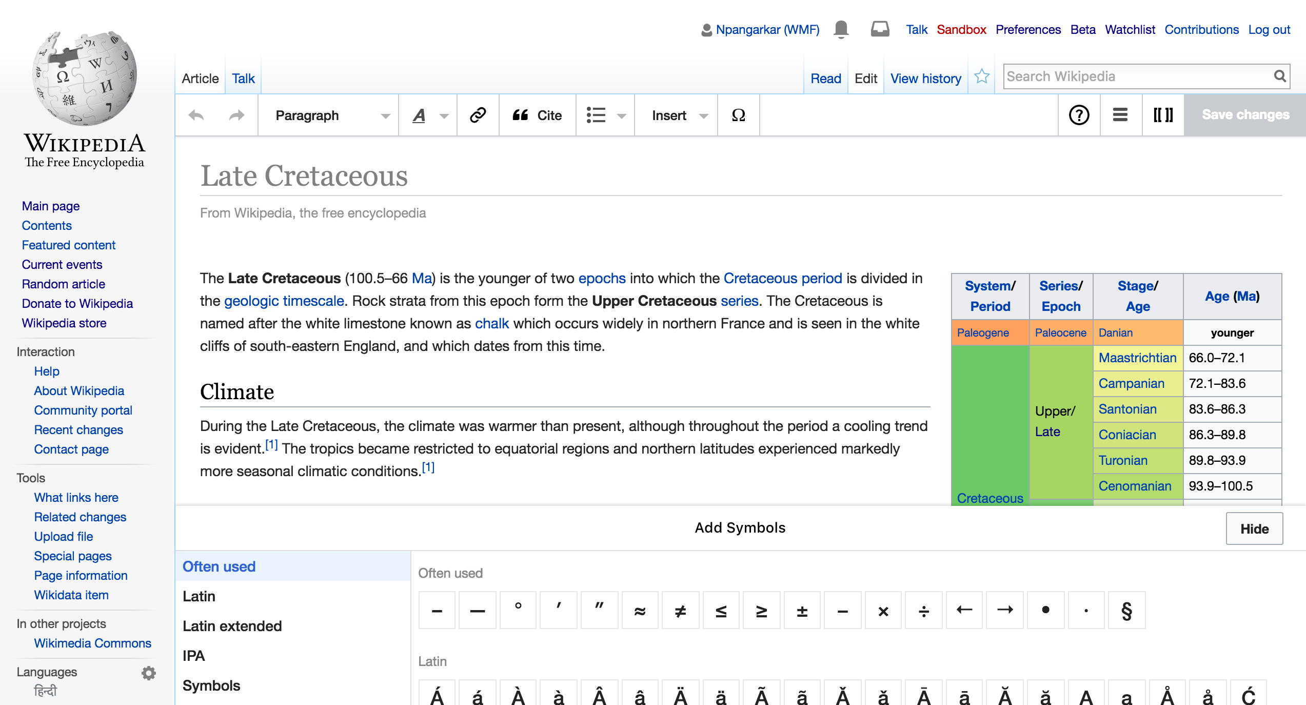
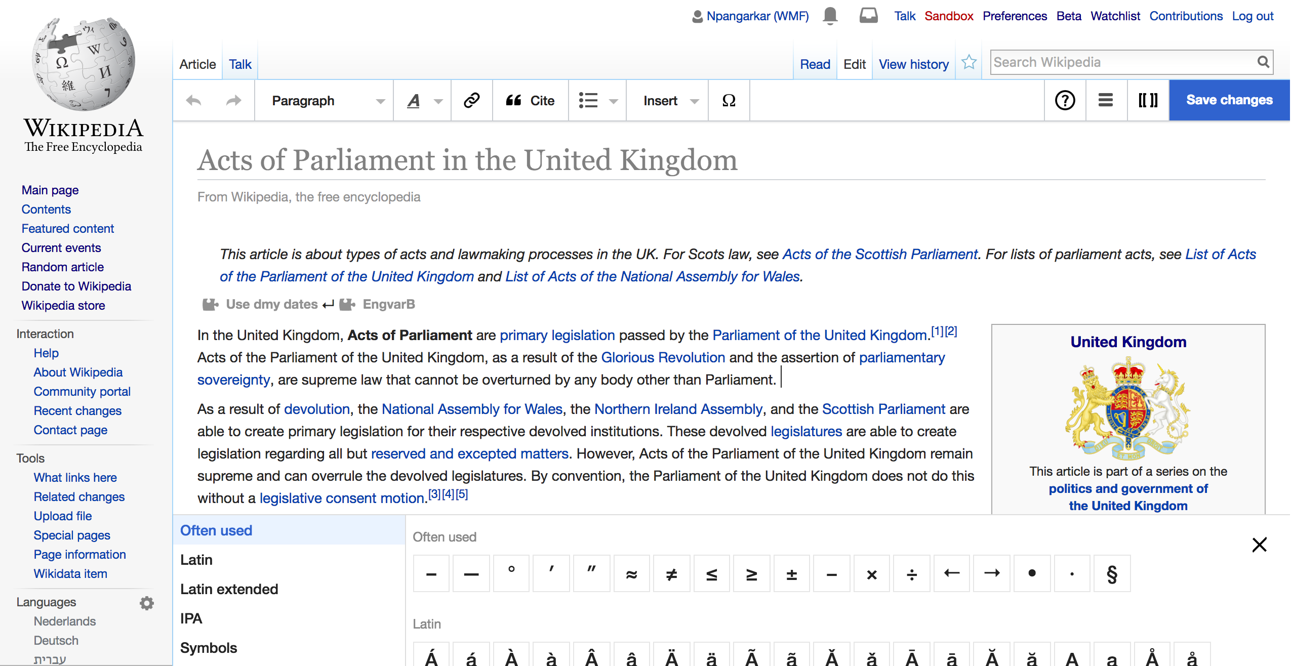
moving symbol out of toolbar has added advantage of that icon with a label. right now the icon does not say "insert a symbol" by any means. when this item will be in the insert menu, we can have an explicit label too
Comment Actions
It is also worth noting we have an on-going piece of work to integrate jquery-IME with the toolbar, in which case we might to group that with the special char inserter.
Comment Actions
The "special characters" control is fundamental to support for many languages, though as Ed says we're going to integrate the on-screen IMEs with it (which will turn it from a 10% tool to a 50% tool). Either way, we're continuing not to remove it.