Page MenuHomePhabricator

MUL - Submit button on Special:SetLabelDescriptionAliases is too wide on smaller screens
Closed, ResolvedPublic3 Estimated Story Points

Assigned To
Authored By
Sjoerddebruin
May 20 2017, 12:53 PM
Referenced Files
F37033789: Screenshot 2023-05-25 at 10.49.05.png
May 25 2023, 8:51 AM
F37033787: Screenshot 2023-05-25 at 10.46.12.png
May 25 2023, 8:51 AM
F37033778: Screenshot 2023-05-25 at 10.38.31.png
May 25 2023, 8:40 AM
F37033776: Screenshot 2023-05-25 at 10.38.02.png
May 25 2023, 8:40 AM
F36923989: de-extralarge-fixed.png
Mar 23 2023, 12:40 PM
F36923984: de-extralarge.png
Mar 23 2023, 12:40 PM
F36921788: Screenshot 2023-03-21 at 15.00.34.png
Mar 21 2023, 2:02 PM
F36921780: Screenshot 2023-03-21 at 14.49.19.png
Mar 21 2023, 2:02 PM

Description

Problem:
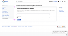
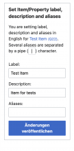
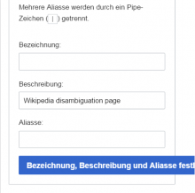
The submit button on Special:SetLabelDescriptionAliases at the moment says "Set label, description and aliases". On smaller screens this causes a overflow at the right. The situation is even worse if you use the German language (Bezeichnung, Beschreibung und Aliasse festlegen).

Screenshots:

screenshot.png (467×471 px, 23 KB)

Solution:

The form has two steps:

The new button copy could reflect these 2 steps ('Save' doesn't apply to the 1st step):

  1. Change the label of the button in the first step of the form to "Continue". (Informs of the existence of another step to users)
  1. Change the label of the button in the second step of the form to "Publish changes". (Lets users know that their changes will be applied to and reflected on the Item's page)
  1. Update the license text above the last step of the form (see screenshot below) to reflect the change: "By clicking "Publish changes", you agree to the terms of use, and you irrevocably agree to release your contribution under the Creative Commons CC0 License."
  1. In order to prevent the button from overflowing the layout due to the length of its copy (e.g. due to localization), we should allow its content to wrap.

Mockup:
Step 1:

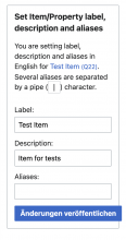
Screenshot 2023-05-25 at 10.38.02.png (1×2 px, 325 KB)

Step 2:

Screenshot 2023-05-25 at 10.38.31.png (1×2 px, 349 KB)

Notes:

  • @Lucas_Werkmeister_WMDE mentioned that this might involve reading a configuration setting to decide if the copy should be "Publish changes" (e.g. Wikidata) or "Save changes" (purely internal Wikibase).
  • Prioritized now, so that it can be done while working on T330193.

Acceptance criteria:

  • The button matches the solution.
  • The license text is updated
  • This note about the configuration setting was considered.
Event Timeline

There are a very large number of changes, so older changes are hidden. Show Older Changes
Nikki subscribed.

This seems to be caused by white-space: nowrap; on the button coming from https://gerrit.wikimedia.org/g/mediawiki/core/+/master/resources/lib/ooui/oojs-ui-core-apex.css#27.

It displays fine if that's removed:

Bildschirmfoto_2022-11-04_15-48-38.png (295×344 px, 9 KB)

This seems to be caused by white-space: nowrap; on the button coming from https://gerrit.wikimedia.org/g/mediawiki/core/+/master/resources/lib/ooui/oojs-ui-core-apex.css#27.

It displays fine if that's removed:

I've added an override to MediaWiki:Common.css which should be removed once this is fixed: https://www.wikidata.org/w/index.php?diff=1846414731

@Sarai-WMDE What do you think about just changing the button copy to "Save"?
@Manuel Maybe we can do this together with the mul changes on that page.

@Lydia_Pintscher: Yes, good idea! I added it to the epic.
@Sarai-WMDE: The UX decision is yours, I have added all the options that I saw to the tasks.

Manuel renamed this task from Submit button on Special:SetLabelDescriptionAliases is too wide on smaller screens to MUL - Submit button on Special:SetLabelDescriptionAliases is too wide on smaller screens.Mar 16 2023, 12:36 PM
Sarai-WMDE updated the task description. (Show Details)

@Lydia_Pintscher @Manuel I updated the task description with my recommendation. Let me know what you think 🙏🏻

Sprint 6 Planning - Notes
regarding copy on the button:

I created a new task to address the copy variations of our "Publish" buttons (T332705).

Based on a recent conversation, and thanks to @LucasWerkmeister's input, I settled on a new suggestion for the copy of the button at the last step of the form: "Publish changes". The new copy tries to:

  1. Be more consistent with the terminology used to apply changes in Item pages ("Publish") – and beyond, see edit mode of article pages in Wikipedia.
  2. Try to communicate to the user that their changes are going to be visible in the Item page (made public) immediately after performing that action.

I refrained from using simply the verb "Publish" because this is not a single block of content that is being made available online, but more a set of potential modifications. "Publish changes" sounded more accurate in this context.

Please don't forget to fix the problem. :)

Changing the text will be an improvement, but won't make the text on the button wrap on smaller screens when it needs to.

Hey @Nikki 👋🏻 The thing is that it is generally a good practice in interface design to both use short, clear labels for actions (to improve readability) and prevent button labels from breaking into more than one line (to improve legibility).

This is why the OOUI button used here was implemented to actually keep its label from wrapping. So, improving the copy of the call to action to make it more succinct is actually the recommended and most efficient solution. Meaning: we would have to replace any copy or fix any layout that could cause the button to wrap if we let it, too.

That being said, wrapping could be a better alternative than letting the button overflow (the interface looks less broken at least). So we might use that solution as a last resort in cases when modifying the copy or the layout were impossible. I'm not sure whether we're going to run into overflow again in this particular case, but I would rather reduce the copy to "Publish" if we suspect this is going to be an issue.

Hey @Nikki 👋🏻 The thing is that it is generally a good practice in interface design to both use short, clear labels for actions (to improve readability) and prevent button labels from breaking into more than one line (to improve legibility).
This is why the OOUI button used here was implemented to actually keep its label from wrapping. So, improving the copy of the call to action to make it more succinct is actually the recommended and most efficient solution. Meaning: we would have to replace any copy or fix any layout that could cause the button to wrap if we let it, too.

I would have thought making the page scroll horizontally has a bigger negative effect on legibility though. It seems like an issue in OOUI if it doesn't let you pick between buttons which never wrap and buttons which do, since the only reason the text is going to wrap in a situation like this (single button at the bottom of a form) is to prevent horizontal scrolling. Short labels are good, but the length will always depend on the language, font and font size.

That being said, wrapping could be a better alternative than letting the button overflow (the interface looks less broken at least). So we might use that solution as a last resort in cases when modifying the copy or the layout were impossible. I'm not sure whether we're going to run into overflow again in this particular case, but I would rather reduce the copy to "Publish" if we suspect this is going to be an issue.

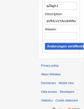
Here's how it looks with the button label set to the German translation of MediaWiki:Publishchanges (which is not the longest translation) and the default font size set to extra large:

de-extralarge.png (676×527 px, 30 KB)
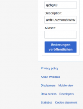
versus with the CSS I added to Wikidata's common.css:
de-extralarge-fixed.png (690×525 px, 30 KB)

As someone still watching this ticket: I honestly never understood why OOUI hard-codes a nowrap in this situation. It's never helpful, especially not in an environment where we have to consider over 200 languages. It might make sense to combine it with text-overflow: ellipsis in situations where we know the end of the string is not that important, or when we know the full text can be found somewhere else. But this is not the case for a button label. When a button label is long there is a reason for that. We should never just cut off an arbitrary piece.

Reducing the text to "Publish" in English unfortunately doesn't make the issue go away. Any of the over 200 localizations might still be significantly longer, as @Nikki demonstrates.

I strongly suggest to embrace these "limitations", let button labels wrap and choose meaningful labels that make it easy to understand what a button does.

Thanks, @Nikki and @thiemowmde, for your input on the button label wrapping. I agree with your points and thus updated the task description accordingly. Heads-up to @Manuel.

Task Breakdown Notes;

  • Is it actually a user requirement to have different copy depending on the context of the Wikibase instance? @Sarai-WMDE @Manuel (In reference to the note by Lucas)

Potential Plan of Action:

  1. Find the translation key the button should use for each of the cases
  2. Update the templates to use each of the new translation keys
  3. Copy the existing license message and add the "In the last step of this form" to it

(My note is referring to $wgEditSubmitButtonLabelPublish, which we respect elsewhere in Wikibase, see e.g. T161367 and T228260.)

Task Breakdown Notes;

  • Is it actually a user requirement to have different copy depending on the context of the Wikibase instance? @Sarai-WMDE @Manuel (In reference to the note by Lucas)

(My note is referring to $wgEditSubmitButtonLabelPublish, which we respect elsewhere in Wikibase, see e.g. T161367 and T228260.)

In my opinion, it makes sense to preserve that configuration variable: "Publish" is the standard in Wikidata, where changes are made public by default. In the context of Wikibase, "save" can be more accurate, given that edits are not necessarily "made in the open". Allowing users to define the most accurate copy for their Wikibase instance based on its use case sounds convenient.

Publish would be fine for both Wikidata and Wikibase Cloud. I don't know about Wikibase Suite:

@jon_amar-WMDE: Per our values of openness and accessibility, should we actively cater to non-public Wikibase instances with a convenience setting, or not? In this case, I could see "Publish" as the only default for all instances. This would make the default convenient for value-aligned Wikibases. Other closed Wikibases would then need to live with "Publish" or would need to change the MediaWiki messages by hand. We could also continue to cater to both scenarios with a default (see last the comment by Sarai). What is your perspective on this?

I am not sure it makes sense to make this decision in isolation for this button. We have made the decision before to follow the setting everywhere. It'd feel weird to me to change this here unless we make this a general decision to not support the setting anymore.

I was thinking about the general case. But if that decision was consciously made at some point, let's stick to it for this task as well.

@ItamarWMDE: Yes, it continues to be a user requirement to have different copies depending on the context of the Wikibase instance.

Change 919850 had a related patch set uploaded (by Noa wmde; author: Noa wmde):

[mediawiki/extensions/Wikibase@master] Change submit button copy for Special:SetLabelDescriptionAliases

https://gerrit.wikimedia.org/r/919850

@noarave as discussed in an off-line conversation, I wonder if it would be possible to remove the license text from the first step and only include it in the last part, rather than dynamically changing the copy. After all, as Itamar mentioned, no changes are actually being applied until that last screen is reached. This sounds like a simpler solution.
The copy of said message would be: "By clicking "Publish changes", you agree to the terms of use, and you irrevocably agree to release your contribution under the Creative Commons CC0 License."
Please let me know whether this sounds feasible. Thank you!

Change 919850 merged by jenkins-bot:

[mediawiki/extensions/Wikibase@master] Change submit button copy for Special:SetLabelDescriptionAliases

https://gerrit.wikimedia.org/r/919850

This looks good and matches the latest specifications described in https://phabricator.wikimedia.org/T165870#8854823. Thank you!
There's only a last change needed: in order to prevent the button from overflowing the layout due to the length of the copy in certain languages, we wanted to allow its label to wrap. This might be a matter of removing the property white-space: nowrap;. Would that be feasible?

Screenshot 2023-05-25 at 10.46.12.png (1×572 px, 97 KB)
Screenshot 2023-05-25 at 10.49.05.png (1×570 px, 100 KB)

It appears that, in order to bypass the no-wrap behaviour of the OOUI button in this (or any) special page, we'd have to write separate style modules each time. It is unclear if this is a fair trade-off to solve potential edge cases (we're trying to cover for all localizations in minimal viewport sizes). From a UX perspective, it sounds reasonable to anticipate and prevent experience and layout issues, but the impact of the fix appears quite small compared to the effort. We require a product decision from @Lydia_Pintscher here.

From my side, I'll proceed to bring the topic up to the attention of the Design system team at WMF. I think this requires a centralized solution: we'll discuss if it makes sense to include a property to allow button wrapping in Codex, and evaluate applying a potential change to OOUI.

<snip>
From my side, I'll proceed to bring the topic up to the attention of the Design system team at WMF. I think this requires a centralized solution: we'll discuss if it makes sense to include a property to allow button wrapping in Codex, and evaluate applying a potential change to OOUI.

For further context, see also T93552 and the comments in https://gerrit.wikimedia.org/r/c/198670.

Moving this back to product verification as per above comments.

Thank you, everyone! \o/

About the missing no-wrap behavior: I still marked this task as resolved, as I would very much prefer a centralized solution over individual investments in separate style modules. So we need to make a note of the UX debt that we introduced here and advocate for a centralized solution (see T337865: Buttons: limit text length with ellipsis when it exceeds the maximum).

Thank you @Sarai-WMDE for bringing it up with WMF!

As part of our proposal to include a prop to allow button text wrapping in the new design system, I'm in the look-out for real examples in our projects where it would definitely make sense to let a button label wrap. I agree with the preventive approach that accommodates for localization, nevertheless, it'd be great to support the case by providing some examples where: 1) the issue cannot be solved by simplifying or making the button label more concise, 2) the issue can't be solved by modifying the placement of the button on the layout, 3) reasonable viewport sizing is taken into account (anything below 320px might not be too reasonable). These would not only help justify the need for a prop, but would also help to illustrate usage recommendations, Any help here would be much appreciated.

I think the problem we have are the unknown unknowns – situations we currently can't think of. I would love to ask the question the other way around: When does it make sense to cut off an arbitrary part of a button label?

Or maybe like this: What's worse, a button that get's cut-off when it shouldn't or a button that wraps when it shouldn't? Sure, both is a problem. In both cases we want to look for other solutions. But I'm afraid we can't avoid running into this problem in all possible situations, including the ones we currently can't think of (unknown unknowns). If it happens the user should be able to continue using the interface without guessing what a button might mean, and ideally report the problem to us so we can fix it.