Page MenuHomePhabricator

Personalized first day: build Variation A
Closed, ResolvedPublic

Description

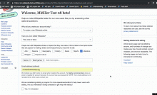
This task is for engineering the first minimal version of the feature, which is mocked up as Variation A here See design details on T206372: Personalized first day: design survey experience.

Here are requirements for the feature, which may change over time. They are split into "Variation A", which refer to things that we need before even deploying the first version (six week range), "Subsequent version", which are things we will need in a subsequent version (two month range), and "Long term", which are things we'll need if this feature really takes off and spreads to more wikis (one year range). Even though those second two sections are not needed for Variation A, they are listed here for completeness and so that engineers can make decisions that keep paths open for the future.

Variation A

  • After the user successfully creates their account from Special:CreateAccount, they should be directed to a Special page containing the survey.
  • After completing the survey, they should see a Special page that thanks them for their response, and then they should be redirected back to their "return-to" page from before account creation.
  • If they skip the survey, they should not get the page that thanks them and they should be redirected back to their "return-to" page from before account creation.
  • After that page, they should be redirected back to their "return-to" page from before account creation.
  • This should not happen for auto-created accounts from other wikis.
  • Anonymous users should not be able to access the survey.
  • The survey should include the user's username in its header.
  • The survey should have two button that allows the user either skip completing the form or to submit it.
    • If the user clicks the skip option, nothing they entered into the form will be saved.
    • If the user clicks to submit, whatever they have entered in the form will be saved, whether or not they have completed the whole form.
  • The form is available on desktop and mobile web (existing Minerva skin for Special pages).
  • The form should be able to hold questions with these types of responses:
    • Single-select question (drop-down or radio button group) – e.g., "What is the main reason you are creating an account?"
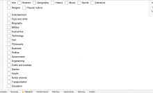
    • Multi-select with typeahead – e.g., "What topics are you interested in editing?"
    • Open-ended – e.g., "Do you have any questions about editing right now?"
    • Text-input – e.g., user's email address
    • Checkbox – e.g., "Check here to be contacted by a mentor."
  • The overlay should have space for a header and for arbitrary text and links.
  • For the question about "topics interested in editing", the user should be able to select from a set of options or type in their own. When typing, they should be able to select from a separate set of options.
  • PM and Designer will want to be able to swap out new questions and response options on short notice, even after the feature is in production, as well as turn the feature off entirely. Being able to do this with SWAT deploys would be sufficiently fast, but waiting for the weekly train would not. In the farther future, we may want to allow communities to configure these elements, but we don't need to allow that yet.
  • We will need to be able to split new account creations into different variants for experimentation. For instance, some new accounts should get the full overlay, some with fewer questions, and some with no overlay.
  • When we are testing this feature, we will want it to be easy to "turn it on" for certain people in Test Wiki. For instance, someone testing might want to create many new accounts in a row to test out the form, but wouldn't want every person creating a new account in Test Wiki to get the form.
  • Data should be stored in such a way that our team's data analyst can easily access it in real time, as responses come it.
  • Data should include whether a user skipped the form, along with the count of how many times they have skipped/submitted, and a timestamp of the most recent submission.
  • Future user experiences can be governed by it, such as a redirect to a different page, or a popup with help content.
  • This version should work for both Javascript and non-Javascript users.

Subsequent version – see task T207717: Personalized first day: build Variation C

  • Deployed as an overlay on top of the account creator's original context.
  • Discloses one question at a time, with progress indicator.
  • Data should be stored in such a way that future user experiences can be governed by it, such as a redirect to a different page, or a popup with help content.

Long term

  • We will want the content of the form to be easily translatable by community members so they can adapt it to their own languages.
  • Community members should be able to add, subtract, and reconfigure questions from the form, with the ability to choose from a standard set.
  • Users that dismiss the questions should have a way to go back and fill them out later.
Details

SubjectRepoBranchLines +/-
mediawiki/extensions/GrowthExperimentsmaster+28 -16
mediawiki/extensions/GrowthExperimentsmaster+331 -219
mediawiki/extensions/GrowthExperimentsmaster+6 -4
mediawiki/extensions/GrowthExperimentsmaster+5 -0
mediawiki/extensions/GrowthExperimentsmaster+4 -8
mediawiki/extensions/GrowthExperimentsmaster+13 -20
mediawiki/extensions/GrowthExperimentswmf/1.33.0-wmf.4+13 -20
mediawiki/extensions/GrowthExperimentswmf/1.33.0-wmf.4+4 -8
mediawiki/extensions/GrowthExperimentswmf/1.33.0-wmf.4+5 -0
mediawiki/extensions/GrowthExperimentsmaster+47 -1
mediawiki/extensions/GrowthExperimentsmaster+1 -0
mediawiki/extensions/GrowthExperimentsmaster+2 -2
mediawiki/extensions/GrowthExperimentsmaster+6 -0
mediawiki/extensions/GrowthExperimentsmaster+4 -3
mediawiki/extensions/GrowthExperimentsmaster+868 -2
mediawiki/extensions/WikimediaEventsmaster+364 -4
Show related patches Customize query in gerrit

Related Objects

Event Timeline

There are a very large number of changes, so older changes are hidden. Show Older Changes

I defer to @nettrom_WMF on the questions about our ability to track who is in which experiment groups. @nettrom_WMF, could you please weigh in on that?

@SBisson : I thought about this, and I think it would be fantastic if we can record data for all users so that we know what experiment and group they were in and have that readily available for all users that were in an experiment. My main concern is that we'll switch between experiments and conditions, and knowing exactly when they started & ended, what the various groups were, and so forth, will become complicated over time. If we store it explicitly, we don't need to document the set of rules needed to infer it.

I think this means adding a _group field that stores the group the user was in. For the control group, I think storing that field and the _experiment field is all we technically need, but we might also want to store the _submit_date field if we want to use that later to purge data.

Change 470913 merged by jenkins-bot:
[mediawiki/extensions/GrowthExperiments@master] Welcome survey: embed privacy policy links in messages

https://gerrit.wikimedia.org/r/470913

@SBisson : I thought about this, and I think it would be fantastic if we can record data for all users so that we know what experiment and group they were in and have that readily available for all users that were in an experiment. My main concern is that we'll switch between experiments and conditions, and knowing exactly when they started & ended, what the various groups were, and so forth, will become complicated over time. If we store it explicitly, we don't need to document the set of rules needed to infer it.

I think this means adding a _group field that stores the group the user was in. For the control group, I think storing that field and the _experiment field is all we technically need, but we might also want to store the _submit_date field if we want to use that later to purge data.

I think I understand what you want but I also used misleading language here and in the code. There is no experiments AND groups, there's only groups, that I call experiments. Let me try to explain the configuration options of the survey.

There is a list of groups. Every group has a name, a way to specify which users are part of it, and a list of questions. For example, we can have the following config:

Groups:
  Name: "target"
  Users: "0-3"
  Questions: [ "reasons", "email", ... ]

  Name: "control"
  Users: "4-9"
  Questions: []

The first group contains users whose id end with 0, 1, 2, or 3. They will be presented with questions "reasons", "email", etc.

The second group, with users whose id end with 4, 5, 6, 7, 8, 9, won't be presented any question. They won't be redirected to the survey at all but we will still capture that they were in the group named "control" and it was determined at a specific timestamp, which would be pretty much the same as their user registration timestamp. Note that this group definition can be omitted and the result would be generally the same but the _experiment field would contain "NONE" since those users matches no group.

Let me know if this is starting to make sense. We can also have a conversation to clarify exactly what we need and what it should be called.

Change 471054 had a related patch set uploaded (by Sbisson; owner: Sbisson):
[mediawiki/extensions/GrowthExperiments@master] Welcome survey: store which group a user is in

https://gerrit.wikimedia.org/r/471054

Change 471092 had a related patch set uploaded (by Sbisson; owner: Sbisson):
[mediawiki/extensions/GrowthExperiments@master] Use a standard <a> tag for privacy policy link

https://gerrit.wikimedia.org/r/471092

Change 471092 merged by jenkins-bot:
[mediawiki/extensions/GrowthExperiments@master] Use a standard <a> tag for privacy policy link

https://gerrit.wikimedia.org/r/471092

@SBisson : This makes sense, thanks for explaining that! I don't see a need to change the way groups are set up, because we can define the names of the groups in such a way that it would be possible to track experiments and assignments. If the format is set to something like "[experiment name]_[group name]" it's easy for me to split that later if I need to. So for a hypothetical first experiment with two groups "survey" and "control", the group names could be "exp1_survey" and "exp1_control".

When it comes to what we store for the control group, I think the value of the _experiment field is all that we need. I was worried that it would be difficult to filter based on timestamps if we don't also store that, but because the user_properties table has an index for up_property, it will be easy to find all users in our experiments and join that with the user table to get the registration timestamp for doing that kind of sorting/filtering.

When it comes to the user ID-based group assignment, I am deeply concerned about basing it on consecutive sets of IDs. Because the number of accounts registered per day on Czech Wikipedia is low (around 40), we are likely to end up sorting users based on the time of day their account is created, and that greatly complicates the process of trying to draw statistical conclusions based on what our users are doing.

Ideally, I'd like group assignment randomized, because that results in groups that overall have equal expectations coming into an experiment (in other words, the only difference in their behavior should come from whatever treatment we give them). But, that might make the code complicated. A shortcut could be to assign the group based on a user's ID modulo the number of groups, that should work fine as long as the number of possible groups is small.

[...]
Ideally, I'd like group assignment randomized, because that results in groups that overall have equal expectations coming into an experiment (in other words, the only difference in their behavior should come from whatever treatment we give them). But, that might make the code complicated. A shortcut could be to assign the group based on a user's ID modulo the number of groups, that should work fine as long as the number of possible groups is small.

I think modulo would work relatively well. It has a nice property of alternating. Consecutive users would get groups: a, b, c, a, b, c, etc. However, it assumes that all groups are of equal size. If it's not the case, we can assign weight to groups but it gets complicated quickly. Another drawback here is that some user ids are taken by auto-created users so as far as our population is concerned, they are skipped.

Random is also interesting. We could configure groups like we do now with ranges but instead of checking the last digit of the user id we would use a randomly generated number. I'm assuming the distribution of the PHP rand() function is more or less uniform[1]. This approach has the issue of being ephemeral: there's no way to reconstruct how a specific user should have been classified. I don't know if it's a problem in practice though.

Let me know what you think of those approaches or if something else would work better.


[1] I ran this a number of times and it's surprisingly close to 50%/50%.

$trial=1000; $a=0; $b=0; for ($i=0; $i<$trial; $i++) { if (rand(0, 9) < 5) { $a++; } else { $b++; } } echo "a: $a, b: $b";

Change 471258 had a related patch set uploaded (by Sbisson; owner: Sbisson):
[mediawiki/extensions/GrowthExperiments@master] Remove left padding of the links for mobile

https://gerrit.wikimedia.org/r/471258

Change 471264 had a related patch set uploaded (by Sbisson; owner: Sbisson):
[mediawiki/extensions/GrowthExperiments@master] Welcome survey: Show 2 more topics in the first list

https://gerrit.wikimedia.org/r/471264

Change 471265 had a related patch set uploaded (by Sbisson; owner: Sbisson):
[mediawiki/extensions/GrowthExperiments@master] Welcome survey: privacy 'statement', not 'policy'

https://gerrit.wikimedia.org/r/471265

I think modulo would work relatively well. It has a nice property of alternating. Consecutive users would get groups: a, b, c, a, b, c, etc. However, it assumes that all groups are of equal size. If it's not the case, we can assign weight to groups but it gets complicated quickly. Another drawback here is that some user ids are taken by auto-created users so as far as our population is concerned, they are skipped.

Good catch about the autocreated users and how that could mess with our group assignment! I can also see that it can get complicated quickly if we want the groups to be of different sizes. Both of those suggest we should not pursue that idea further.

Random is also interesting. We could configure groups like we do now with ranges but instead of checking the last digit of the user id we would use a randomly generated number. I'm assuming the distribution of the PHP rand() function is more or less uniform[1]. This approach has the issue of being ephemeral: there's no way to reconstruct how a specific user should have been classified. I don't know if it's a problem in practice though.

Let me know what you think of those approaches or if something else would work better.

PHP's rand() function uses a Mersenne Twister RNG (rand() is an alias for mt_rand(), which I only know because I looked it up to learn more). For our purposes that should be perfectly adequate, and as you've found out it's basically uniform. It does have the drawback that we cannot infer a user's group assignment later[1], so we do need to store group assignments for all users in our experiments.

Footnotes:
1: If we know the seed of the RNG and how far into the sequence of numbers we are, we would, because if you seed a Mersenne Twister RNG with the same seed it generates the same random sequence. That's useful for reproducing results (e.g. in research, or for verifying your test of uniformity), but not really meaningful or technically feasible in our case.

Change 471264 merged by jenkins-bot:
[mediawiki/extensions/GrowthExperiments@master] Welcome survey: Show 2 more topics in the first list

https://gerrit.wikimedia.org/r/471264

Change 471265 merged by jenkins-bot:
[mediawiki/extensions/GrowthExperiments@master] Welcome survey: privacy 'statement', not 'policy'

https://gerrit.wikimedia.org/r/471265

Change 471258 merged by jenkins-bot:
[mediawiki/extensions/GrowthExperiments@master] Remove left padding of the links for mobile

https://gerrit.wikimedia.org/r/471258

Change 471054 merged by jenkins-bot:
[mediawiki/extensions/GrowthExperiments@master] Welcome survey: store which group a user is in

https://gerrit.wikimedia.org/r/471054

Change 472464 had a related patch set uploaded (by Sbisson; owner: Sbisson):
[mediawiki/extensions/GrowthExperiments@master] [wip] Style checkboxes as toggle buttons

https://gerrit.wikimedia.org/r/472464

Change 472464 abandoned by Sbisson:
[wip] Style checkboxes as toggle buttons

https://gerrit.wikimedia.org/r/472464

Here's a few commands that can be executed in your browser's Javascript console to help with testing

Read the current survey responses for the current user
mw.user.options.get('welcomesurvey-responses');
Reset the survey responses for the current user
new mw.Api().saveOption( 'welcomesurvey-responses', '' );

Note that after you've reset the responses, you may be assigned to the control group, in which case you'll be redirected to your previous context (or likely the Main page). To make sure to be part of the target group, add ?welcome-survey-experimental-group=exp1_group1 to the URL.

Change 472580 had a related patch set uploaded (by Sbisson; owner: Sbisson):
[mediawiki/extensions/GrowthExperiments@master] Fix group redirect

https://gerrit.wikimedia.org/r/472580

Change 472580 merged by jenkins-bot:
[mediawiki/extensions/GrowthExperiments@master] Fix group redirect

https://gerrit.wikimedia.org/r/472580

@SBisson - results of my testing in descending order of importance:

(1) It seems that ?welcome-survey-experimental-group=exp1_group1 is not working anymore.
(2) The always-present -email-field issue is fixed - the email field appears only for users who did not filled it out upon registration.
(3) Assigning users to groups seems to be fine; no more odd entries in db.

There are some issues with the form, which @MMiller_WMF and you need to sort out:

(4) T209197: Welcome survey: "More topics" menu closes after every selection - filed it as a bug; will look more at it. I saw it in Chrome - feels that in different browsers it could be different.
(5) When Welcome survey is loaded, especially with a slow network connection, the incomplete CSS is displayed:

Screen Shot 2018-11-08 at 9.54.45 AM.png (554×907 px, 62 KB)

(6) (the edge case) Entering free text input into 'Add topic' twice, converts text into red without any additional warning to a user. I did not file it as a bug. I saw it only when the entered text occupies more than two lines - probably the extreme case. Need to re-verify it. Because of (1) it's kind of tedious.

(7) (the edge case again) If text input for 'Add topic' occupies more than two lines - clicking on the checkbox 'Yes, I am interested' does not put a check mark into it, but first accommodates that lengthy input in 'Add topic', so the checkbox jumps down and doesn't get checked - see the screen recording:

@SBisson - results of my testing in descending order of importance:

(1) It seems that ?welcome-survey-experimental-group=exp1_group1 is not working anymore.

The parameter was renamed to just group

(4) T209197: Welcome survey: "More topics" menu closes after every selection - filed it as a bug; will look more at it. I saw it in Chrome - feels that in different browsers it could be different.

Being discussed in the task.

(5) When Welcome survey is loaded, especially with a slow network connection, the incomplete CSS is displayed:

Screen Shot 2018-11-08 at 9.54.45 AM.png (554×907 px, 62 KB)

Yes, this is because the control is being transformed from a bunch of checkbox to a fancy TagSelectWidget when all the javascript is loaded. Fundamentally I cannot change the fact that it gets transformed after the page is loaded but I can hide it until it is fully ready or some other way to make it more subtle and less jumpy.

(6) (the edge case) Entering free text input into 'Add topic' twice, converts text into red without any additional warning to a user. I did not file it as a bug. I saw it only when the entered text occupies more than two lines - probably the extreme case. Need to re-verify it. Because of (1) it's kind of tedious.

I don't really understand here. Do you have a screenshot or can you provide the text you entered?

(7) (the edge case again) If text input for 'Add topic' occupies more than two lines - clicking on the checkbox 'Yes, I am interested' does not put a check mark into it, but first accommodates that lengthy input in 'Add topic', so the checkbox jumps down and doesn't get checked - see the screen recording:

I see. On blur, the add items text box processes what it contains and adjusts its size accordingly. That causes everything after to shift down. I propose to let this one go.

@RHo -- could you please weigh in on the severity of these issues?

Change 473492 had a related patch set uploaded (by Sbisson; owner: Sbisson):
[mediawiki/extensions/GrowthExperiments@master] Don't assume a POSTed survey shows the confirmation page

https://gerrit.wikimedia.org/r/473492

@RHo -- could you please weigh in on the severity of these issues?

Sure, of the still unresolved issues:

(5) When Welcome survey is loaded, especially with a slow network connection, the incomplete CSS is displayed:

Screen Shot 2018-11-08 at 9.54.45 AM.png (554×907 px, 62 KB)

Yes, this is because the control is being transformed from a bunch of checkbox to a fancy TagSelectWidget when all the javascript is loaded. Fundamentally I cannot change the fact that it gets transformed after the page is loaded but I can hide it until it is fully ready or some other way to make it more subtle and less jumpy.

Yes, would be great if we can hide these checkboxes initially until the JS is loaded.

(6) (the edge case) Entering free text input into 'Add topic' twice, converts text into red without any additional warning to a user. I did not file it as a bug. I saw it only when the entered text occupies more than two lines - probably the extreme case. Need to re-verify it. Because of (1) it's kind of tedious.

I don't really understand here. Do you have a screenshot or can you provide the text you entered?

If it is only occurring in the edge case that a user enters a topic so long that it line-wraps, think we could let this one go.

(7) (the edge case again) If text input for 'Add topic' occupies more than two lines - clicking on the checkbox 'Yes, I am interested' does not put a check mark into it, but first accommodates that lengthy input in 'Add topic', so the checkbox jumps down and doesn't get checked - see the screen recording:

I see. On blur, the add items text box processes what it contains and adjusts its size accordingly. That causes everything after to shift down. I propose to let this one go.

+1 to letting this one go, for same reason as (6)

Change 473500 had a related patch set uploaded (by Sbisson; owner: Sbisson):
[mediawiki/extensions/GrowthExperiments@master] Hide checkboxes while they are being converted to TagMultiselectWidget

https://gerrit.wikimedia.org/r/473500

Agree with @RHo and @SBisson - rechecked and

  • closed

(4) T209197: Welcome survey: "More topics" menu closes after every selection

  • Re

(6) (the edge case) Entering free text input into 'Add topic' twice, converts text into red without any additional warning to a user. {..}

It turned out that it's a way to indicate the duplicate entry to a user. We can certainly let it be like it is.
Just for the record - it looks like the following:

Screen Shot 2018-11-13 at 1.40.48 PM.png (245×647 px, 49 KB)

Screen Shot 2018-11-13 at 1.37.29 PM.png (126×639 px, 20 KB)

Change 473492 merged by jenkins-bot:
[mediawiki/extensions/GrowthExperiments@master] Don't assume a POSTed survey shows the confirmation page

https://gerrit.wikimedia.org/r/473492

@SBisson @Etonkovidova @RHo --

I just did a bunch of testing on both desktop and mobile and only found one little edge case issue on desktop and one question on mobile. Everything else seems totally great. Some highlights were: randomization worked (i.e. about half of the 13 accounts I created got the survey and half did not); redirecting back to original context worked as expected, even back to the editing context or to a Talk page; it asked me for my email address only when I had not already entered it; and the external links to other pages (privacy statement, help desk, and tutorial) all worked right.

My one issue with mobile is that the "topic selection" drop down situation behaves a little weirdly and is difficult to deal with because it, like, iteratively scrolls as you try to get it to go away. @RHo could you try it out and let us know what you think?

The desktop edge case is in the gif below. This occurs when I try to enter a custom topic more than once. It turns into grayed out text, and then when I click into the field and hit return, it turns into the first option in the dropdown list.

Topic_response_2018-11-14_01.gif (814×1 px, 435 KB)

Change 473500 merged by jenkins-bot:
[mediawiki/extensions/GrowthExperiments@master] Hide checkboxes while they are being converted to TagMultiselectWidget

https://gerrit.wikimedia.org/r/473500

Checked for (5) - looks fine now.

(5) When Welcome survey is loaded, especially with a slow network connection, the incomplete CSS is displayed:

Screen Shot 2018-11-08 at 9.54.45 AM.png (554×907 px, 62 KB)

@RHo and @MMiller_WMF - only three minor things left:

(1) It'd be better to have 'Please enter a valid email address' vs. 'Please enter an email address'.

(2) There is one interesting case with selection from drop down list. Type 'T' in 'Add more topics' - twp options will be presented: 'Technology' and 'Transportation'

Screen Shot 2018-11-14 at 3.26.35 PM.png (215×702 px, 38 KB)

Hit 'Enter' - 'Entertainment' will be selected instead:
Screen Shot 2018-11-14 at 3.26.54 PM.png (118×673 px, 17 KB)

(3) For some reason, when the 'Add topic' is added via hitting' Enter', the form is outlined in red and the next entry will be red- it might look to a user as a warning:
Screen Shot 2018-11-14 at 3.58.06 PM.png (88×679 px, 13 KB)

@RHo and @MMiller_WMF - only three minor things left:

(1) It'd be better to have 'Please enter a valid email address' vs. 'Please enter an email address'.

– Not sure if it is needed in the hint text, it is meant to be the same as the 'Create account' field.

(2) There is one interesting case with selection from drop down list. Type 'T' in 'Add more topics' - two options will be presented: 'Technology' and 'Transportation'

Screen Shot 2018-11-14 at 3.26.35 PM.png (215×702 px, 38 KB)

Hit 'Enter' - 'Entertainment' will be selected instead:
Screen Shot 2018-11-14 at 3.26.54 PM.png (118×673 px, 17 KB)

(3) For some reason, when the 'Add topic' is added via hitting' Enter', the form is outlined in red and the next entry will be red- it might look to a user as a warning:

Screen Shot 2018-11-14 at 3.58.06 PM.png (88×679 px, 13 KB)

– I'm also getting this on Mobile (see https://www.youtube.com/watch?v=cV_1wIUbBAk) - is it possible to turn off whatever validation is occurring on this input field to prevent this from happening?

Found a couple more issues below:
(4) Add topics input is jumpy on Mobile - I am getting the same bug that @MMiller found where the tapping on Add topics appears to be popping open the entire list and simultaneously opens the device keyboard, which for some causes the form to scroll the input off screen. (see https://www.youtube.com/watch?v=cV_1wIUbBAk - ~10sec mark, helpful to play at 0.25 speed).
@SBisson - is it possible to stop showing the all the options on initial focus and only show matching results when the user inputs a value into the field as a way to fix this issue?

(5) Show a warning dialog if the user has answered any question in the survey and then presses Skip
Not technically a bug but I think it is important to include for when users accidentally hit the skip button after they've taken the trouble to fill out the form. Created a ticket here T209580

Change 473843 had a related patch set uploaded (by Sbisson; owner: Sbisson):
[mediawiki/extensions/GrowthExperiments@wmf/1.33.0-wmf.4] Hide checkboxes while they are being converted to TagMultiselectWidget

https://gerrit.wikimedia.org/r/473843

Change 473844 had a related patch set uploaded (by Sbisson; owner: Sbisson):
[mediawiki/extensions/GrowthExperiments@wmf/1.33.0-wmf.4] Don't assume a POSTed survey shows the confirmation page

https://gerrit.wikimedia.org/r/473844

Change 473843 merged by jenkins-bot:
[mediawiki/extensions/GrowthExperiments@wmf/1.33.0-wmf.4] Hide checkboxes while they are being converted to TagMultiselectWidget

https://gerrit.wikimedia.org/r/473843

Change 473844 merged by jenkins-bot:
[mediawiki/extensions/GrowthExperiments@wmf/1.33.0-wmf.4] Don't assume a POSTed survey shows the confirmation page

https://gerrit.wikimedia.org/r/473844

per conversation with @SBisson @MMiller - for varA, we'll change the styling of the Skip button to make it more obviously a secondary exit action by making the button (1) Frameless and (2) Destructive:

image.png (344×1 px, 119 KB)

Change 474318 had a related patch set uploaded (by Sbisson; owner: Sbisson):
[mediawiki/extensions/GrowthExperiments@master] Welcome survey A: improvements

https://gerrit.wikimedia.org/r/474318

Change 474318 merged by jenkins-bot:
[mediawiki/extensions/GrowthExperiments@master] Welcome survey A: improvements

https://gerrit.wikimedia.org/r/474318

The translated survey privacy statements are now available on Foundation Wiki so they can be linked in the survey:

Change 474328 had a related patch set uploaded (by Sbisson; owner: Sbisson):
[mediawiki/extensions/GrowthExperiments@wmf/1.33.0-wmf.4] Welcome survey A: improvements

https://gerrit.wikimedia.org/r/474328

Interesting that seemingly similar issue was fixed in T209657: [wmf.4-regression] RC/Watchlist - red outline for 'Filter changes' area:

(3) For some reason, when the 'Add topic' is added via hitting' Enter', the form is outlined in red and the next entry will be red- it might look to a user as a warning:

Screen Shot 2018-11-14 at 3.58.06 PM.png (88×679 px, 13 KB)

And there is another issue on Special:Block:

Screen Shot 2018-11-16 at 3.38.02 PM.png (270×752 px, 25 KB)

Screen Shot 2018-11-16 at 3.38.11 PM.png (276×788 px, 28 KB)

I think I was able to fix it for the survey. It should be OK on betalabs.

Change 474328 merged by jenkins-bot:
[mediawiki/extensions/GrowthExperiments@wmf/1.33.0-wmf.4] Welcome survey A: improvements

https://gerrit.wikimedia.org/r/474328

Mentioned in SAL (#wikimedia-operations) [2018-11-19T19:36:27Z] <catrope@deploy1001> Synchronized php-1.33.0-wmf.4/extensions/GrowthExperiments/: WelcomeSurvey fixes (T206371) (duration: 00m 46s)

@MMiller_WMF - the two specs below, I marked with the exclamation point (green). It's just reminders that for variation A 1) only half of users (randomly) will get the survey and 2) all of users in exp1_group1 will have the same survey questions.

After the user successfully creates their account from Special:CreateAccount, they should be directed to a Special page containing the survey.

We will need to be able to split new account creations into different variants for experimentation. For instance, some new accounts should get the full overlay, some with fewer questions, and some with no overlay.

Thanks, @Etonkovidova. The one that I see without a checkmark is "This version should work for both Javascript and non-Javascript users." Did you check that?

@MMiller_WMF

This version should work for both Javascript and non-Javascript users.

The form accommodates non-Javascript users only partially -drop-down selection menus and suggestion list are not present. Check-boxes are clickable and Submit/Skip buttons work.

@SBisson -- @Etonkovidova found that the survey does not work for no-JS users. Is that a bug?

@MMiller_WMF

This version should work for both Javascript and non-Javascript users.

The form accommodates non-Javascript users only partially -drop-down selection menus and suggestion list are not present. Check-boxes are clickable and Submit/Skip buttons work.

As far as I can tell, everything works as design in no-js mode. The only thing that's different is that "other topics" is a plain text box since suggestions are not possible without javascript. This is the agreed solution.

If you find anything that appears not to be working, please post detailed steps and/or screenshots.

Thx, @SBisson - it turned out that drop-down menus not working is a quirk in Chrome dev tools option of JavaScript disabling. If a page with disabled Javascript re-loaded, the drop-down menus are displayed.

Yes, only suggestions are missing in no-js, which is ok.

This is deployed and going fine. Resolving.

I think modulo would work relatively well. It has a nice property of alternating. Consecutive users would get groups: a, b, c, a, b, c, etc. However, it assumes that all groups are of equal size. If it's not the case, we can assign weight to groups but it gets complicated quickly. Another drawback here is that some user ids are taken by auto-created users so as far as our population is concerned, they are skipped.

Good catch about the autocreated users and how that could mess with our group assignment! I can also see that it can get complicated quickly if we want the groups to be of different sizes. Both of those suggest we should not pursue that idea further.

Random is also interesting. We could configure groups like we do now with ranges but instead of checking the last digit of the user id we would use a randomly generated number. I'm assuming the distribution of the PHP rand() function is more or less uniform[1]. This approach has the issue of being ephemeral: there's no way to reconstruct how a specific user should have been classified. I don't know if it's a problem in practice though.

Let me know what you think of those approaches or if something else would work better.

PHP's rand() function uses a Mersenne Twister RNG (rand() is an alias for mt_rand(), which I only know because I looked it up to learn more). For our purposes that should be perfectly adequate, and as you've found out it's basically uniform. It does have the drawback that we cannot infer a user's group assignment later[1], so we do need to store group assignments for all users in our experiments.

Footnotes:
1: If we know the seed of the RNG and how far into the sequence of numbers we are, we would, because if you seed a Mersenne Twister RNG with the same seed it generates the same random sequence. That's useful for reproducing results (e.g. in research, or for verifying your test of uniformity), but not really meaningful or technically feasible in our case.

For future reference you could avoid storing a user pref by either hashing the user ID (preferrably with an experiment ID salt). This would give you an even non-alternating distribution that is deterministic.

You could also do this by seeding the RNG with the userID and using the first number it generates. See https://wikitech.wikimedia.org/wiki/A/B_testing