Page MenuHomePhabricator

Personalized first day: design survey experience
Closed, ResolvedPublic

Description

Background

Per the epic task T206365, part 1 of the "Personalized first day" idea will be to gather more information from New Editors when they first create an account. The following outlines the form design to present to newly created accounts.

User job story

When I finish creating an account on Wikipedia...
...I want to get guidance on what I can do post-sign up...
...so that I feel welcomed and and can easily get started on contributing to Wikipedia.

Proposed design

The following outlines initial designs of the form informed by previous a comparative review of similar post sign-up survey forms (see T206373), initial feedback from Community consultations, and Engineering recommendations (see task T206371#4659748) .

In all variations, the user is only being shown the form AFTER successfully creating a new account.

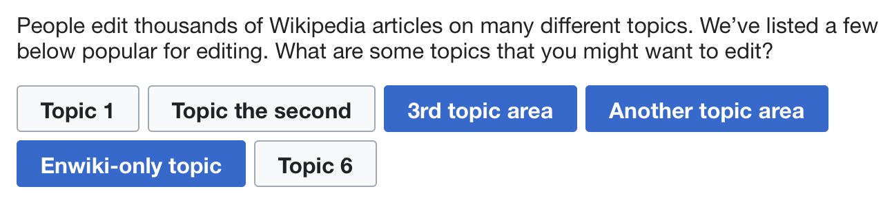
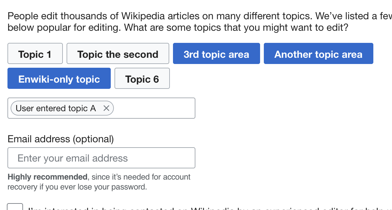
Variation A. Form on a single Special page

This tracks the design on T206371
Mocks - see Invision prototype at: https://wikimedia.invisionapp.com/share/PBOLQ4KX479#/screens/326072425
  • Notes on the design:
    • "Getting started" secondary section is included to see if providing more upfront help for editing increases Editor activation, esp. for user who do not complete the form.
    • All fields are shown on one page, with user returning to their pre-account creation context if they select "Skip"
    • Any form fields that are completed will be sent if the user selects to "Submit", with the user being re-directed to a confirmation page where selecting a "Close" button will return them to a pre-account creation context
    • Users who provided an email address during account creation do not see the Email address option

Variation B. Multi-step form on a simplified Special page

This variation was rejected as an overly complex interim solution, and we will move to the var C solution directly shortly after var A.
Mocks - see Invision prototype at: https://wikimedia.invisionapp.com/share/PBOLQ4KX479#/screens/326251031
  • Notes on the design:
    • The reduced chrome (no sidebar and simplified top navigation) is modeled on the Special:ContentTranslation tools pages
    • One to two questions per step makes it less daunting for the user
    • Selecting the radio options for Q1 and Q2 will auto advance users to the next step
    • There is a more prominent SKIP button
    • Added another side section about privacy and data collection for consideration per initial feedback (can also apply to other design variations)

Variation C. Form shown on a modal over pre-account creation context

This tracks the design on T207717.
Mocks - see Invision prototype at: https://wikimedia.invisionapp.com/share/3KONGXXX4YU

This proposed design is based on the comparative review and initial testing suggesting that showing users an optional form in this format is seen as less imposing and distracting from their original context.

  • Notes on the design:
    • Uses the "Process dialog" component in OOUI
    • Dialog opens over whatever screen the user was on prior to creating an account
    • Clicking on any help or privacy link will open in a new tab
    • Radio buttons and check boxes are styled as toggle buttons using CSS
    • Use returns to their pre-account creation context if they select "Skip"
    • Any form fields that are completed will be sent if the user selects to "Submit". The user is then shown an extra "Confirmation" step in the dialog, where selecting the "Close" button will return them to a pre-account creation context.
    • Users who provided an email address during account creation do not see the Email address option

Open questions:

  • Should users be allowed to complete the form later? If so, how do we prompt them, and where do we send them? Some ideas:
    • An echo notification prompts them several hours after first declining the form.
    • Via email.
    • The overlay pops up again at some other time.
    • A bot could request that they do it via their talk page.

Subtasks:

  • Survey question copy - update task T206375
  • Determine if we can use WikiProjects on KO and CS as the basis for the "Interested Topics" question - see T207290
  • T207888 - Test usability of design

Event Timeline

@RHo -- could you please link your latest mockups here?

Here is some feedback from @revi:

  • We should make it clear that the questions are optional.
  • We should make it clear where the answers go, e.g. whether they are private or public or what.
  • Revi can make us a list of WikiProjects in Korean Wikipedia, and label which ones are active. This can help us populate the "What topics are you interested in?" question.

Concerning privacy, we should also add everywhere that we don't disclose email adresses to anyone. Thinking about that, don't you think that explanations about how Wikimedia cares about privacy should be shown in the right sidebar, instead of calls to edit (that may be more tempting than the survey)?

One thing I just remembered is that the call-for-mentor checkbox kinda implies you (WMF) may share email with mentors so that mentors can contact mentee, which is probably not the case here.

Thanks @MMiller_WMF , @Trizek-WMF and @revi - made some initial design updates in response to some of your comments so far. I've also updated the task description with some more information about the mocks in their current state.

Considering the set on the initial questions we want to show on the form are fairly agreed upon now, suggest we keep this ticket as being focused on the design and layout of the form, and have discussions around copy (e.g., phrasing of questions, answer types, and what secondary help content to include) on task T206375 instead.

Using the CX layout makes me feel like I've quit Wikipedia (for a better Wikipedia but that's not the topic). Don't you think that may disturb some people?

List of Wikiprojects by activity: (incomplete right now) 사용자:Revi (WMF)/LOW

Using the CX layout makes me feel like I've quit Wikipedia (for a better Wikipedia but that's not the topic). Don't you think that may disturb some people?

Using the CX chrome is a way to minimize the extraneous nav chrome on a Special page to make it more like a full page overlay that is commonly used for post sign-up welcome screens; with the intention that it helps users focus on the onboarding task.
With regards to concerns the visual design being too different, it is merely following the visual style guide used for newer Wikipedia UIs like the mobile web view (and CX), so I do not foresee it as being as an issue for people thinking they have gone to some other site. Especially since the target audience are new account creators, they're unlikely to have any expectations of what a page "should" look like that someone very ingrained with Wikipedia may expect.

Thank you for you reply. That's more clear now.

I have a general update on our plans here, and some specific questions.

General updates: @SBisson, @RHo, and I have decided that we will plan for Variation A to be in production by 2018-11-06, but that we will strive to develop Variation B in time. If Variation B is late, we will roll it in later. We can decide to pursue Variation C once we start seeing results come in. We also decided not to worry yet about how users can return to the form to complete it later. We'll decide on that once we see results coming in.

Specific questions:

  • @RHo -- you wrote that mobile will come later. I thought that @SBisson's implementation will work on mobile out-of-the-box and we wouldn't need to deploy to mobile later -- that we would get it all at once. Is that not correct?
  • Is there a world in which the Variation B design works without reducing the chrome? What the user will go through is the standard account creation page (has chrome), our new page (reduced chrome), then back to their context (has chrome). Could be a little disorienting, but I just want to see what you think.
  • I see that in Variation B, selecting an option for the first couple questions advances the workflow without using the "Next" button. What does the "Next" button do in that case?

hi @MMiller - some responses inline below:

Specific questions:

  • @RHo -- you wrote that mobile will come later. I thought that @SBisson's implementation will work on mobile out-of-the-box and we wouldn't need to deploy to mobile later -- that we would get it all at once. Is that not correct?
  • Yes I didn't fully update the original task description properly. Still want to create a subtask since the mobile version also needs to have QA & design review and think it will be clearer to have this done on a separate ticket.
  • Is there a world in which the Variation B design works without reducing the chrome? What the user will go through is the standard account creation page (has chrome), our new page (reduced chrome), then back to their context (has chrome). Could be a little disorienting, but I just want to see what you think.

I understand the trepidation, but based on looking at some other places with similar onboarding, the design hypothesis is that users will be more likely to focus and complete the 'task' of onboarding without the distraction of being able to navigate away via the various links on the top nav, side nav, and the search bar. As an anecdotal aside, I did check with @Pginer-WMF that they have not had feedback from CX users about the difference in design being jarring.
Also, whilst this may be potentially be so for the Desktop user, the reduced chrome in var B is actually quite similar for the ~20-25% of new account creations that are on mobile web.

  • I see that in Variation B, selecting an option for the first couple questions advances the workflow without using the "Next" button. What does the "Next" button do in that case?

Since we are making all questions optional, the next is for when the user doesn't want to answer questions 1 and 2. Another scenario when the Next is handy is if the user selects the "Other reason" response in Q1, in which case they would click next after filling in the free text field.

By default, version A will look and work well on mobile (but we will have to think about the sidebar on the right). Not showing the form for mobile users is extra work.

  • Is there a world in which the Variation B design works without reducing the chrome? What the user will go through is the standard account creation page (has chrome), our new page (reduced chrome), then back to their context (has chrome). Could be a little disorienting, but I just want to see what you think.

I was under the impression from yesterday's discussion that the custom chrome was completely out. Did I misunderstand?

@SBisson @RHo -- I learned some more about this from both of you today, and scheduled time for us to talk on Monday. Stephane explained some of the technical and maintenance implications of pursuing the custom chrome, so let's talk in person.

@SBisson, @RHo, and I discussed designs today, and we decided to plan two main iterations of the design:

  • For our Nov 6 deadline, we will build Variation A.
    • OOUI Special page.
    • All questions on one page.
    • Works fine for no-JS users.
    • Works out-of-the-box for mobile.
  • After completing Variation A, we will jump straight to Variation C.
    • Overlay that dims the backing chrome.
    • One question at a time.
    • No-JS users will continue to get Variation A.
    • Need to decide what to do for mobile.

We will be skipping over Variation B because it turns out that the reduced-chrome skin is not actually maintained as an official skin. If our team were to use it, it would be as a hack that would have ripple effects in terms of maintenance burden.

We'll continue to use this task to document any design changes as we work on this project.

Sounds good @MMiller_WMF. One clarification is that if we use the Process dialog component then mobile will show OOTB as a full screen overlay.

We built version A and then version C. Do we take time to measure if solution A works before moving to C and how? A may be preferred to C by users for any reason.

We built version A and then version C. Do we take time to measure if solution A works before moving to C and how? A may be preferred to C by users for any reason.

From my perspective, the reason for not building var C immediately is more technical constraints (a version that is no-js and can be implemented with OOTB form components) so that we have data to measure sooner. If upon moving to the *intended* design C, we find that the drop-off rates are higher than A, we can re-evaluate reverting to A.

Yes, that's a good question, @Trizek-WMF. As @RHo, we are going to start building Var C even before we have a lot of data from Var A, but once we have Var C, we can experiment with drop-off rates between the two and discover if Var A really is better.

@RHo @SBisson -- I want to leave a note here as a suggestion from @Urbanecm. We were discussing that it's possible for users to fill out Variant A multiple times by continuing to visit the URL. @Urbanecm wondered if it is possible/easy/smart for us to have something on the page if someone visits it again after having already fill it out, perhaps that says at the top, "You have already completed these questions. Fill it out again to update your responses."

I could imagine that this would be substantially more work to handle a small edge case (that may become obsolete with Variant C), but I wanted to hear your thoughts.

[...] something on the page if someone visits it again after having already fill it out, perhaps that says at the top, "You have already completed these questions. Fill it out again to update your responses."

If it's just a message at the top it's not hard to do.

If users want to update their replies, maybe they would like to know what was already here. They just have then to edit the page.

Variation A

Care to clarify about "Enwiki-only topic"? Is this about "(Your wiki name)-specific topic", which just happen to be "English Wikipedia" in this example or does it really mean "English Wikipedia" and nothing else? If latter, what is "enwiki-only topic" in Korean Wikipedia?

image.png (288×1 px, 58 KB)


screenshotcomment
image.png (826×668 px, 89 KB)
You're asking for an email address, and...
image.png (676×1 px, 107 KB)
You're asking for the email address, again

Variation B & C

Similar to ^, if you are asking for an email address on this special dialogue, we should skip "email" procedure on Special:CreateAccount.
</workhat>

Hi @revi - to clarify, the topics shown are all just placeholders and don't mean anything, we haven't settled on how these options will be shown yet (that is the subject of T207290)
Apologies that using" enwiki-only topic" was confusing!

In regards to the email question, it will only be shown on the form if the user did not enter an email during account creation.

hi @MMiller_WMF - I've updated the mocks and description, consider the design and therefore this task completed.

We decided that the topics we will list for the question "What are some topics that you might want to edit?" are:

Shown explicitly as options
Arts
Science
Geography
History
Music
Sports
Literature
Religion
Popular culture

Available in the typeahead
Entertainment
Food and drink
Biography
Military
Economics
Technology
Film
Philosophy
Business
Politics
Government
Engineering
Crafts and hobbies
Games
Health
Social science
Transportation
Education

Respondents will also be able to type their own responses.

These were made as a list of topics that occur frequently in WikiProjects across wikis (thanks to T207290) and other lists of important topics. We will see what kind of responses we receive, and then decide how to improve the question and responses.