Page MenuHomePhabricator

Suggested edits - low contrast issue for .suggested-edits-difficulty-indicator
Closed, ResolvedPublic

Assigned To
Authored By
Etonkovidova
May 26 2020, 11:21 PM
Referenced Files
F35695919: image.png
Nov 2 2022, 10:06 AM
F35695916: image.png
Nov 2 2022, 10:06 AM
F35695914: image.png
Nov 2 2022, 10:06 AM
F35695912: image.png
Nov 2 2022, 10:06 AM
F35695908: image.png
Nov 2 2022, 10:06 AM
F35631442: Screenshot 2022-10-26 at 16.38.02.png
Oct 26 2022, 2:55 PM
F35631444: Screenshot 2022-10-26 at 16.37.10.png
Oct 26 2022, 2:55 PM
F35631438: Screenshot 2022-10-26 at 16.44.02.png
Oct 26 2022, 2:55 PM
Tokens
"Love" token, awarded by Volker_E.

Description

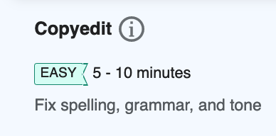
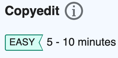
On Special:Homepage the difficulty tag fails Web tool Accessibility audit for not having enough contrast ratio between the text and background color:

i. Hard tag

Screen Shot 2020-05-25 at 9.25.05 PM.png (784×530 px, 135 KB)

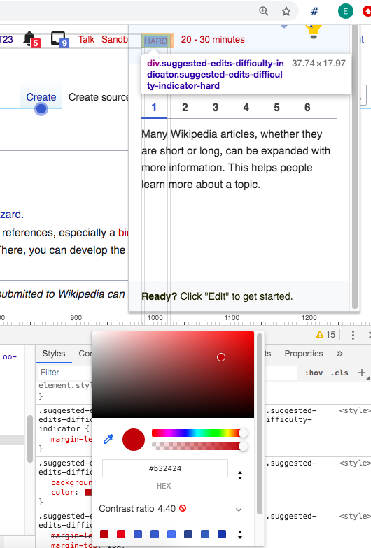
.suggested-edits-taskexplanation-additional-info .suggested-edits-difficulty-indicator-hard {
    background-color: rgba(179,36,36,0.2); 
    color: #b32424; 
}

ii. Medium tag

image.png (272×484 px, 33 KB)

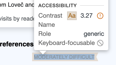
.suggested-edits-taskexplanation-additional-info .suggested-edits-difficulty-indicator-medium {
  background-color: rgba(172,102,0,0.2);
  color: #ac6600;
}
NOTE: The opacity 0.2 over the rgba(234,243,255,0.5) pale blue background causes a mixed "muddy" colour in both cases.

Proposed solution

Update all the difficulty tags (easy, medium, hard) to be at least WCAG AA compliant on any background color.

Utilize the same color tokens as in the message component. The border with a darker tone (e.g. border-color-success) and the text with color-base #202122 so the contrast between text and background is WCAG AA compliant.

Option 1 (1).jpg (175×309 px, 23 KB)

Event Timeline

This is because the background colour has an opacity rgba(179,36,36,0.2); over a non-white layer, so the #b32424 text ends up being over a darker color (#E7CED3) than the hex version of #F0D3D3 of Red30@20%. The same issue occurs on the medium tag as well as was originally captured on T250222.

I'll put some proposals to update the difficulty tags to be at least WCAG AA contrast compliant.

RHo added a project: Growth Design.
RHo moved this task from 📗Backlog (Current sprint) to 🔥To Do on the Growth Design board.
RHo moved this task from Inbox to Triaged but Future on the Growth-Team board.
RHo triaged this task as Medium priority.
RHo updated the task description. (Show Details)
RHo moved this task from 🔥To Do to 💪In Progress on the Growth Design board.

Additionally, the following labels (div.suggested-edits-difficulty-indicator.suggested-edits-difficulty-indicator-easy and div.suggested-edits-difficulty-level.suggested-edits-difficulty-level-easy has low contrast (the screenshots are from Chrome webdev Lighthouse report):

Screen Shot 2022-02-15 at 12.35.26 PM.png (592×1 px, 150 KB)

Hi team, after consulting @bmartinezcalvo on our design system color styles and guidelines, we could work with the following;
Option 1
Same color tokens as in the message component. The border with a darker tone (e.g. border-color-success) and the text with color-base #202122 so the contrast between text and background is good.

Option 1 (1).jpg (175×309 px, 23 KB)

Option 2
Dark color background for the tag to be highlighted.

Option 2.jpg (175×309 px, 21 KB)

What do you think?

@BKots-WMF Thank you for working on this! I'll update this task with the first design option you presented.

I believe the colors used in the level indicators below the suggested edits card are in some pantone sync with the ones used in the "Select type of edits" dialog. Can you confirm it @RHo?

Screenshot 2022-10-24 at 12.16.54.png (1×2 px, 521 KB)

Would this change affect any other interfaces? Asking this because it looks like we would like to keep using the 3-level color association for more interfaces in the future in leveling up (figma) and using the message component color association maybe could create some confusion. What do you think @BKots-WMF
@RHo ?

I believe the colors used in the level indicators below the suggested edits card are in some pantone sync with the ones used in the "Select type of edits" dialog. Can you confirm it @RHo?

Screenshot 2022-10-24 at 12.16.54.png (1×2 px, 521 KB)

Sorry @Sgs - the image above F35619894 is showing as a "Restricted file" - maybe some deprecation of a previous issue introduced with permissions changes on Phab (T310833) - could you please update permissions to view?

image.png (154×606 px, 18 KB)

Would this change affect any other interfaces? Asking this because it looks like we would like to keep using the 3-level color association for more interfaces in the future in leveling up (figma) and using the message component color association maybe could create some confusion. What do you think @BKots-WMF
@RHo ?

I believe the colors used in the level indicators below the suggested edits card are in some pantone sync with the ones used in the "Select type of edits" dialog. Can you confirm it @RHo?

Screenshot 2022-10-24 at 12.16.54.png (1×2 px, 521 KB)

Hi @Sgs - yes, but the darker tone Yellow700, Green700, and Red700 in for example the levels icons and text in the above screenshot will be used in the outline of the updated tags outline, so I don't think it is an issue.

Would this change affect any other interfaces? Asking this because it looks like we would like to keep using the 3-level color association for more interfaces in the future in leveling up (figma) and using the message component color association maybe could create some confusion. What do you think @BKots-WMF
@RHo ?

For the reason above (Easy/Med/Mard levels still using the same Green/Yellow/Red colours respectively), I don't see the changes being at odds with future levelling up work.

Hi @Sgs - yes, but the darker tone Yellow700, Green700, and Red700 in for example the levels icons and text in the above screenshot will be used in the outline of the updated tags outline, so I don't think it is an issue.

Thanks for clarifying. I tried to implement the new design with the darker outline but I don't know how to achieve the border with CSS in a concave polygon. I tried using :before and clip-path but I don't think creating layers works here. Ideas welcome. Can you share the link to the figma design, maybe I can look how they implement it :) Alternatively we could simplify the shape.

Hi @Sgs,
Yes, I agree with @RHo We have maintained the colors and just added the outline, hopefully this shouldn't be an issue.

Hi @Sgs - yes, but the darker tone Yellow700, Green700, and Red700 in for example the levels icons and text in the above screenshot will be used in the outline of the updated tags outline, so I don't think it is an issue.

Thanks for clarifying. I tried to implement the new design with the darker outline but I don't know how to achieve the border with CSS in a concave polygon. I tried using :before and clip-path but I don't think creating layers works here. Ideas welcome. Can you share the link to the figma design, maybe I can look how they implement it :) Alternatively we could simplify the shape.

Hi @Sgs - I had a go by adding a :before and updating styling on :after to achieve this effect in Chrome and Safari (it is admitted a bit janky in Firefox):

image.png (438×500 px, 39 KB)

Here's the link to the codepen which has the gory hack details in case it helps:
https://codepen.io/reets/pen/qBKByVo

Here's the link to the codepen which has the gory hack details in case it helps:
https://codepen.io/reets/pen/qBKByVo

Thank you for that, I had not think of using the :before/:after borders. Nice!

Change 849593 had a related patch set uploaded (by Sergio Gimeno; author: Sergio Gimeno):

[mediawiki/extensions/GrowthExperiments@master] Suggested edits: update task level indicator color contrast

https://gerrit.wikimedia.org/r/849593

I have updated the styles for both the homepage and the help panel.

BeforeAfter
Homepage
Screenshot 2022-10-26 at 16.44.21.png (276×766 px, 24 KB)
Screenshot 2022-10-26 at 16.44.02.png (262×746 px, 24 KB)
Help panel
Screenshot 2022-10-26 at 16.37.10.png (1×746 px, 88 KB)
Screenshot 2022-10-26 at 16.38.02.png (1×742 px, 134 KB)

I can confirm lighthouse is not yielding this particular color contrast anymore. Credit on the solution goes to @RHo :) Thanks for working on this @BKots-WMF !

Sgs changed the task status from Open to In Progress.Oct 26 2022, 2:55 PM
Sgs moved this task from In Progress to Code Review on the Growth-Team (Sprint 0 (Growth Team)) board.

Change 849593 merged by jenkins-bot:

[mediawiki/extensions/GrowthExperiments@master] Suggested edits: update task level indicator color contrast

https://gerrit.wikimedia.org/r/849593

kostajh subscribed.

@Sgs @RHo one issue with the solution (sorry I didn't notice in code review) is that the label doesn't look correct if the user scales the browser zoom.

90%:

image.png (192×388 px, 16 KB)

110%:

image.png (192×388 px, 18 KB)

120%:

image.png (192×388 px, 14 KB)

130%:

image.png (192×388 px, 18 KB)

150% (this one is OK):

image.png (192×388 px, 16 KB)

Oops, this is an issue with the previous version as well, so I'll make a new task for it: T322197: Suggested edits: Difficulty label does not display properly at various zoom levels

Urbanecm_WMF changed the task status from In Progress to Open.Nov 7 2022, 8:45 AM

I have updated the styles for both the homepage and the help panel.

BeforeAfter
Homepage
Screenshot 2022-10-26 at 16.44.21.png (276×766 px, 24 KB)
Screenshot 2022-10-26 at 16.44.02.png (262×746 px, 24 KB)
Help panel
Screenshot 2022-10-26 at 16.37.10.png (1×746 px, 88 KB)
Screenshot 2022-10-26 at 16.38.02.png (1×742 px, 134 KB)

I can confirm lighthouse is not yielding this particular color contrast anymore. Credit on the solution goes to @RHo :) Thanks for working on this @BKots-WMF !

Thx, @Sgs! I checked in wmf.8 - the fixes pass the accessibility check.