NOTE: this task is completely independent of the new "add links" task type and can be deployed to production as soon as it's ready.
Based on our user testing, we want to make it easier and clearer how to navigate and select tasks in the suggested edits feed on mobile.
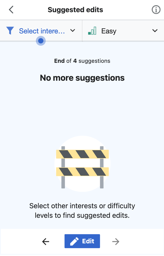
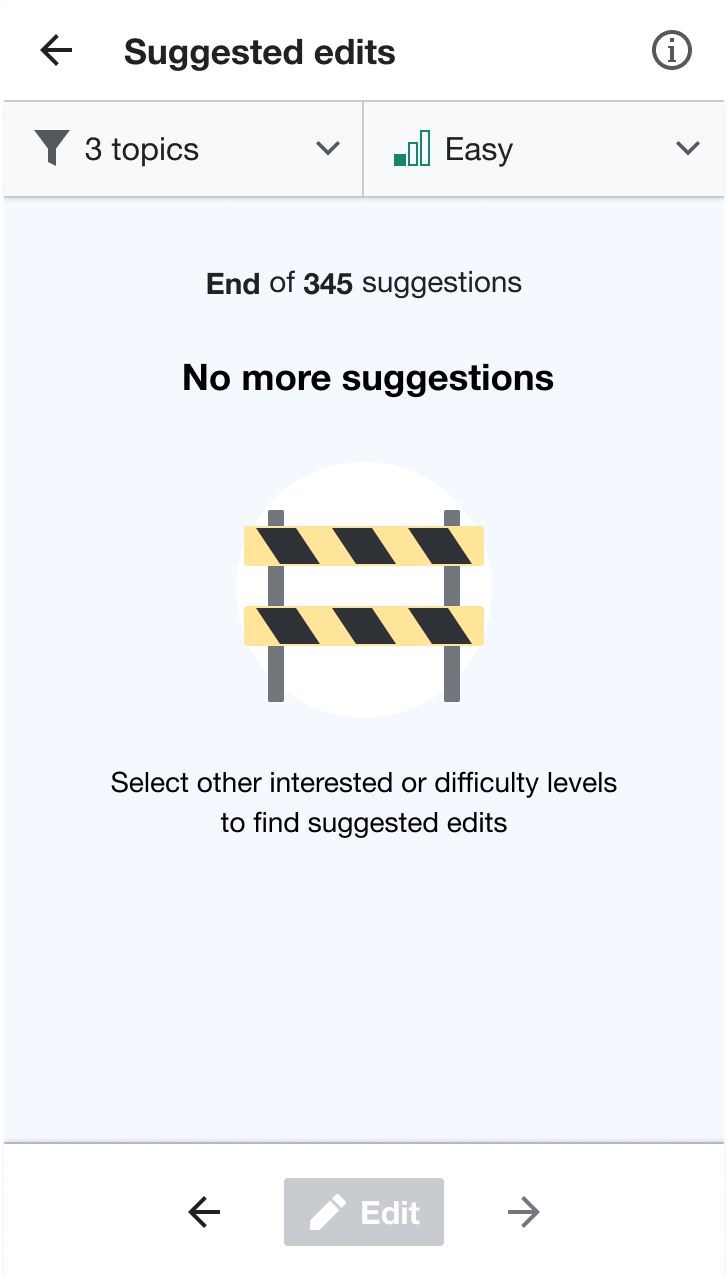
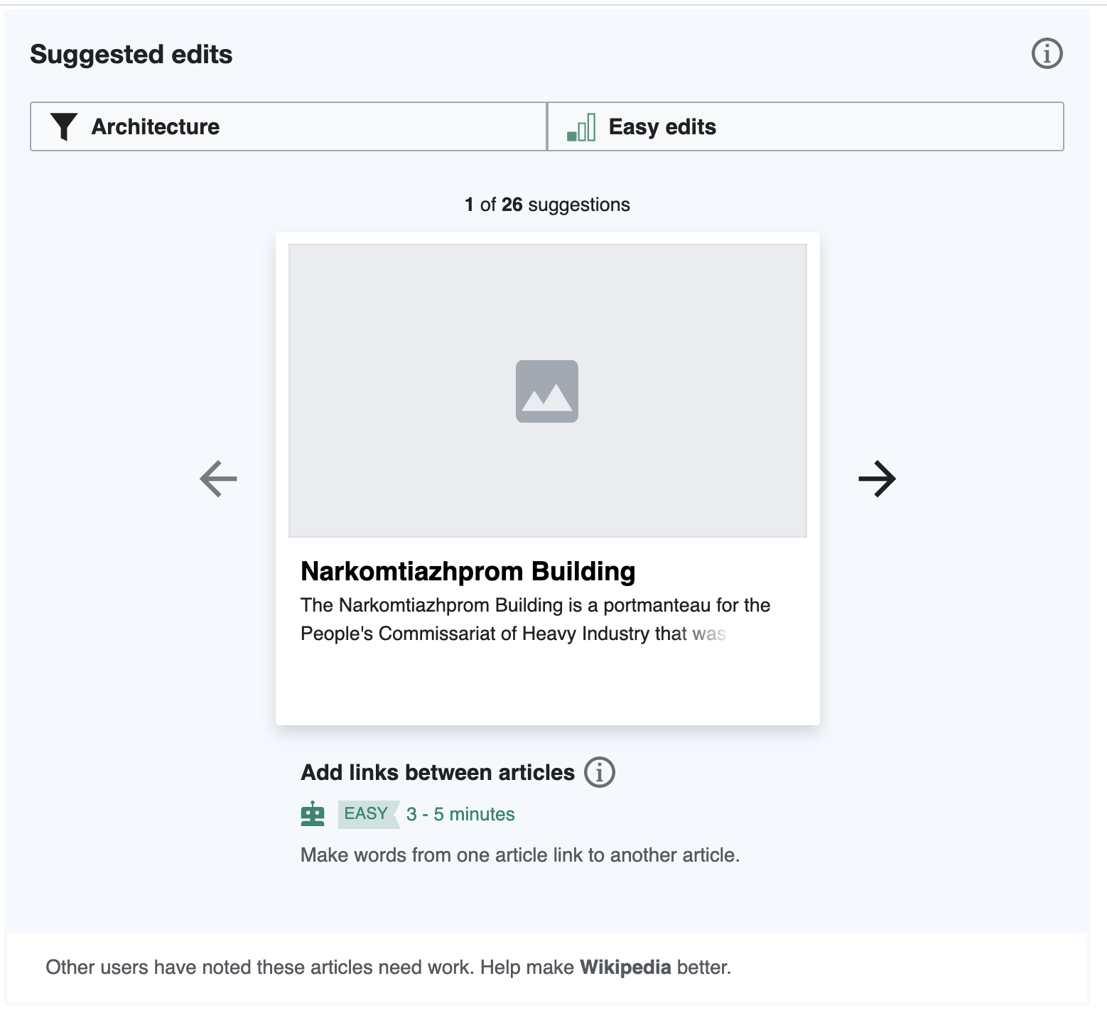
- Remove the current footer that begins, "Other users have noted these articles need work..."
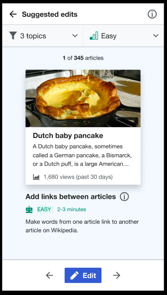
- Add a footer that contains a blue edit button in the middle with a white pencil icon. This button opens the article, just as tapping on its suggestion card will open it, too.
- The footer should be sticky, so that it's always at the bottom of the screen. Note for QA: let's make sure that these buttons are not so low on the screen that they trigger the Safari navigation bar to open on iOS.
NOTE: We do not want to move the navigation arrows unless the swipe gesture is implemented in T268709 - so it may be preferable to coincide this with that task.
Mockup as of 2021-01-12:
NOTE: Refer to Figma for up-to-date detailed redline mocks and specs:
Mobile: https://www.figma.com/file/2SONd8P1tsexIB5coMOp8h/Growth-Structured-tasks?node-id=181%3A65
Desktop: https://www.figma.com/file/2SONd8P1tsexIB5coMOp8h/Growth-Structured-tasks?node-id=112%3A0