Page MenuHomePhabricator

Add new watchlist icon, and amend related 'recentChanges' & 'userContributions' icon for DSG, Codex & OOUI
Closed, ResolvedPublic

Description

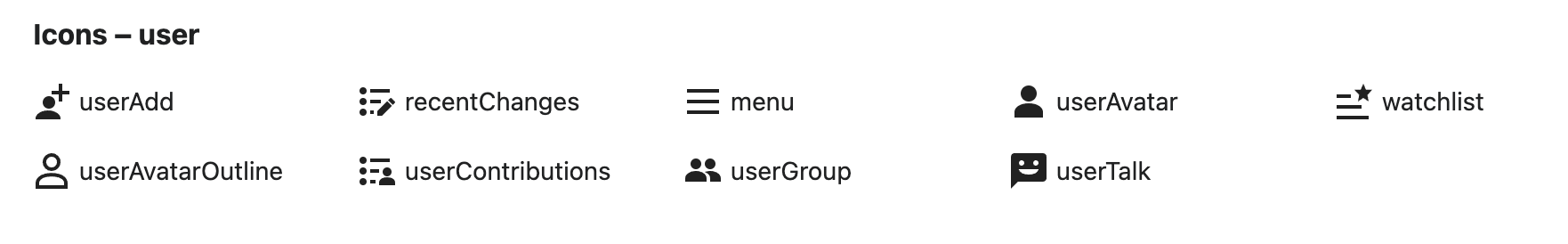
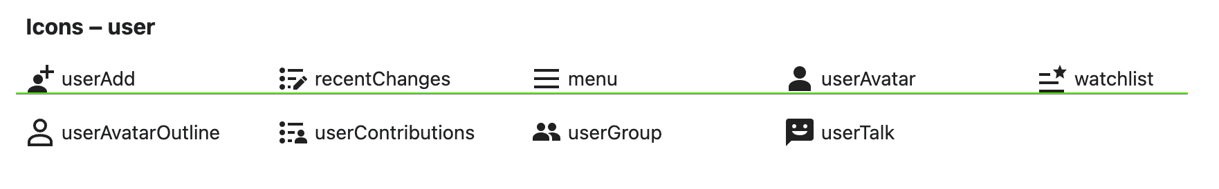
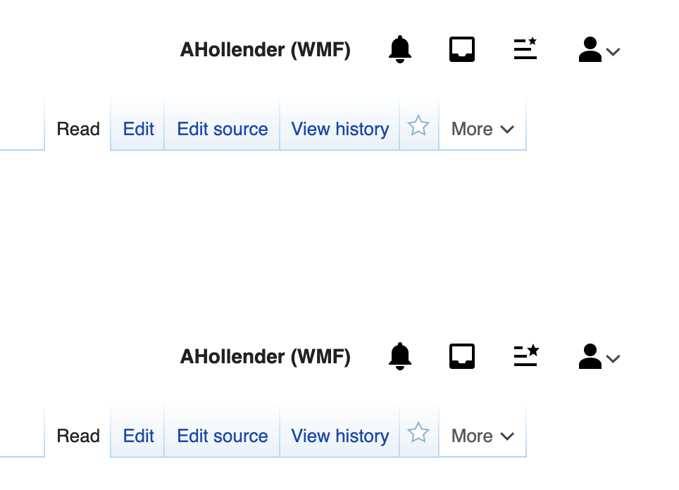
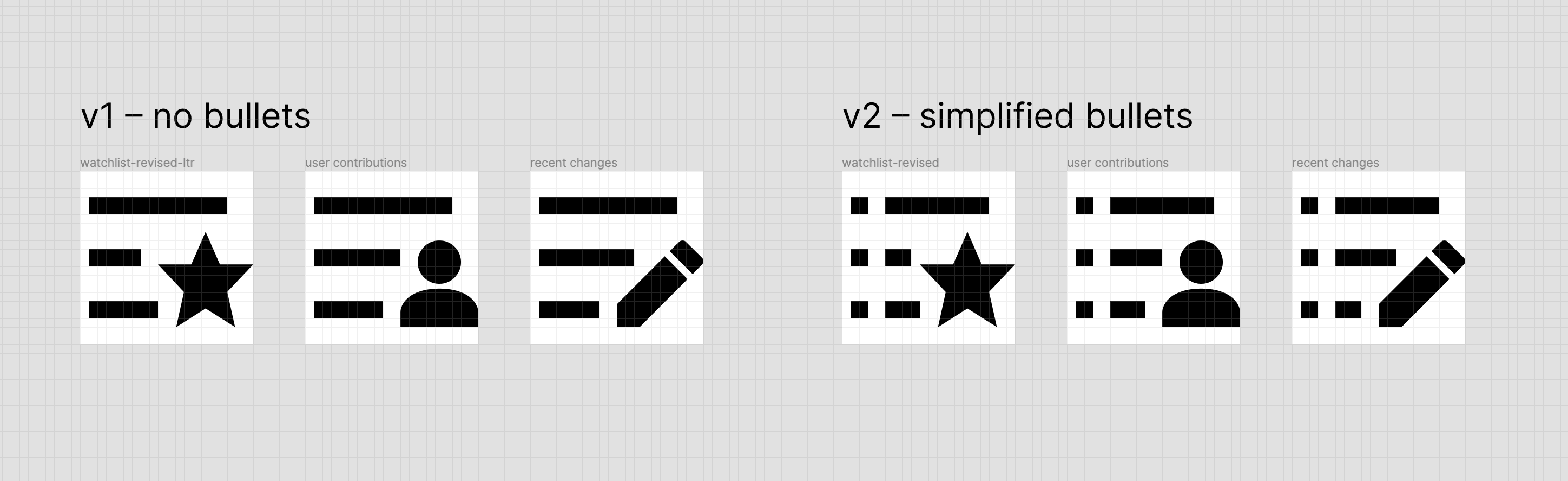
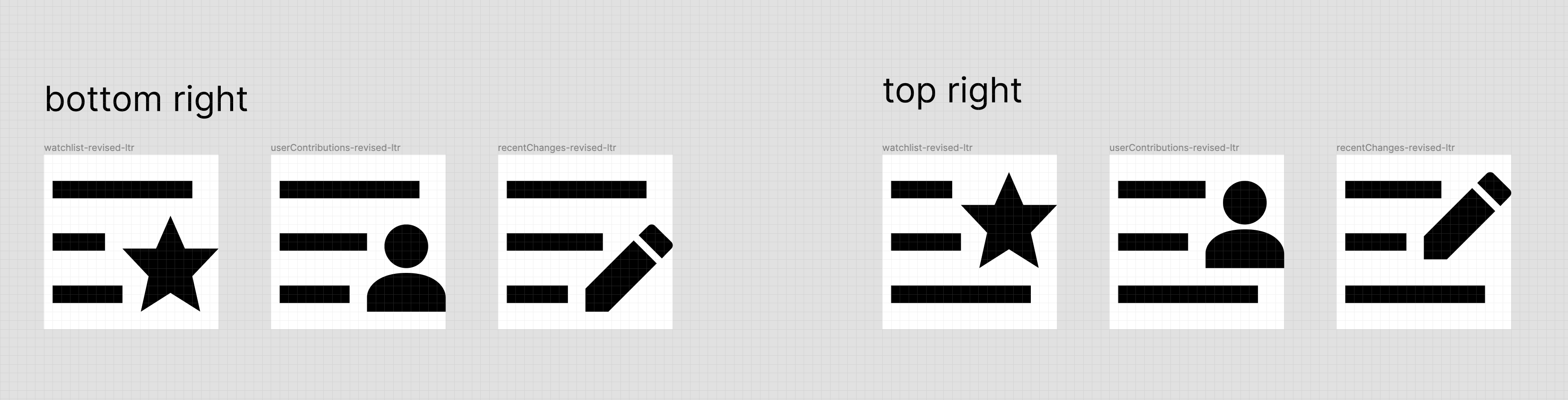
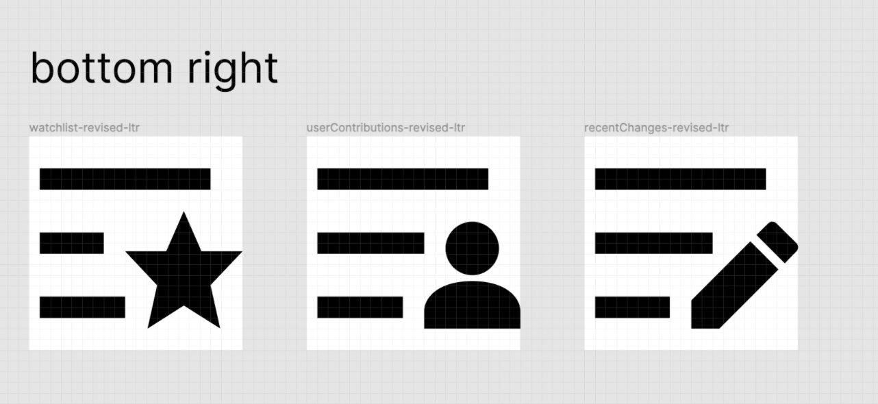
In T289619#7475379 a new watchlist icon was proposed that combines the star with a list.

Screen Shot 2021-11-02 at 12.25.09 PM.png (333×1 px, 133 KB)

Goal

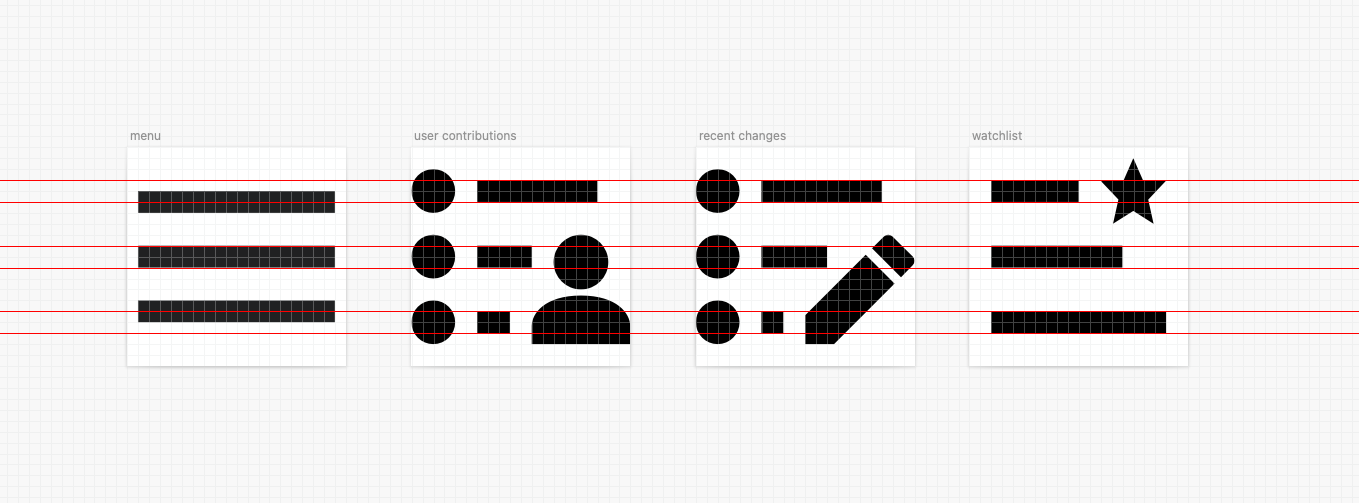
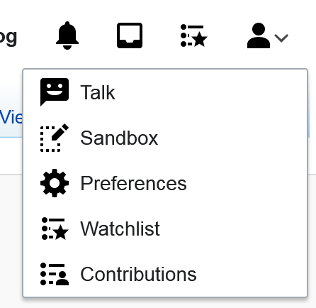
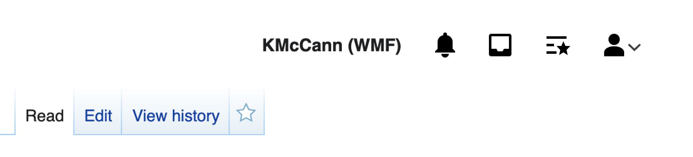
A new 'watchlist' (LTR/RTL) SVG will need to be added to and
'recentChanges' & 'userContributions' will be aligned and updated

  • OOUI to make 'watchlist' available in Vector.
  • Codex
  • Design Style Guide (DSG)
    • Figma source file
    • DSG repository

Extended goal
With @Nardog's feedback we've returned to the drawing board for all list modifier icons ('recentChanges', 'userContributions', 'watchlist') to simplify and visually emphasize what the lists are about.

Design resources

Event Timeline

There are a very large number of changes, so older changes are hidden. Show Older Changes
This comment was removed by Volker_E.
Volker_E renamed this task from Add new watchlist icon to OOUI to Add new watchlist icon to DSG, Codex & OOUI.Dec 21 2021, 3:43 AM
Volker_E updated the task description. (Show Details)
Volker_E added a subscriber: bmartinezcalvo.

Change 748892 had a related patch set uploaded (by VolkerE; author: VolkerE):

[oojs/ui@master] icons: Add 'watchlist'

https://gerrit.wikimedia.org/r/748892

Change 748892 merged by jenkins-bot:

[oojs/ui@master] icons: Add 'watchlist'

https://gerrit.wikimedia.org/r/748892

Change 750260 had a related patch set uploaded (by VolkerE; author: VolkerE):

[design/codex@main] icons: Add 'watchlist' icon

https://gerrit.wikimedia.org/r/750260

The current design of the 'watchlist' icon runs into problems when added to modern Vectors user navigation:

image.png (274×1 px, 42 KB)

image.png (274×1 px, 42 KB)

@alexhollender The baseline is not aligning and also setting it apart to other list items (reason lies in the top watchlist star position), which will look erroneous in Vector's perception
Mind that we decided to reduce the baseline for the 'userAvatar' icon for aesthetic and Vector implementation reasons (in comparison to the bigger 'userAvatarOutline' icon).

Change 750260 merged by jenkins-bot:

[design/codex@main] icons: Add 'watchlist' icon

https://gerrit.wikimedia.org/r/750260

@Volker_E I've updated the icon so that it shares the same layout as Recent changes and User contributions. As you can see the top and bottom lines in the Menu icon are 1px off from the others.

Screen Shot 2022-01-05 at 9.59.56 AM.png (503×1 px, 44 KB)


Change 752231 had a related patch set uploaded (by VolkerE; author: VolkerE):

[oojs/ui@master] icons: Amend 'watchlist' icon to fit in with other list icons

https://gerrit.wikimedia.org/r/752231

Change 752231 merged by jenkins-bot:

[oojs/ui@master] icons: Amend 'watchlist' icon to fit in with other list icons

https://gerrit.wikimedia.org/r/752231

Change 752234 had a related patch set uploaded (by VolkerE; author: VolkerE):

[design/codex@main] icons: Amend 'watchlist' to fit in with other list icons

https://gerrit.wikimedia.org/r/752234

Change 752234 merged by jenkins-bot:

[design/codex@main] icons: Amend 'watchlist' to fit in with other list icons

https://gerrit.wikimedia.org/r/752234

ovasileva triaged this task as Medium priority.Jan 10 2022, 10:13 AM

Change 753557 had a related patch set uploaded (by Jforrester; author: Jforrester):

[mediawiki/core@master] Update OOUI to v0.43.0

https://gerrit.wikimedia.org/r/753557

Change 753557 merged by jenkins-bot:

[mediawiki/core@master] Update OOUI to v0.43.0

https://gerrit.wikimedia.org/r/753557

The icon doesn't look like it's signifying a list because the lines don't have the same length. It looks like "favorite paragraph" or something. Why not just repurpose userContributions and swap the user for a star?

The icon doesn't look like it's signifying a list because the lines don't have the same length. It looks like "favorite paragraph" or something. Why not just repurpose userContributions and swap the user for a star?

hm, I'm not sure the length of the lines is an issue. The user contributions or recent changes icons don't have the same length lines either.

Looking at this icon again I do wonder if the start is too small. Perhaps it would be an improvement to increase its size a bit:

image.png (696×964 px, 111 KB)

@RHo @Volker_E thoughts?

@alexhollender I think that looks good and would also help users to quicker identify the icon.

In T297979#7648816, @alexhollender wrote:

hm, I'm not sure the length of the lines is an issue. The user contributions or recent changes icons don't have the same length lines either.

The shorter lines in those existing icons are clearly to avoid interference with the foreground object (user/pencil). It's not just that they don't have the same length, it's that the middle one is shorter for no reason.

Screenshot with F34929753:

Screenshot 2022-01-25.png (281×283 px, 11 KB)

I agree with @Volker_E that the larger star makes it more easily recognisable, and am assuming the reason in the shorter first and second horizontal strokes to signify list is so that there is sufficient space between the star shape at small size so that it doesn't bleed into those lines.
However, I do agree with @Nardog that it would be worthwhile exploring a version where the star icon is in the same position (bottom right) as the other "list" icons for user contributions and recent changes.

@RHo thanks for weighing in. regarding the position of the star, here is @Volker_E's previous suggestion to put it in the top-right: T289619#7312883. and here is your agreement that the top-right is the correct location: T289619#7355379.

@KieranMcCann would you be cool with finishing this up? Seems like maybe increasing the size of the star, then finalizing with @Volker_E (and/or @RHo?) what the appropriate position is? For context: the initial discussion started here: T289619#7312819.

In T297979#7649601, @alexhollender wrote:

@RHo thanks for weighing in. regarding the position of the star, here is @Volker_E's previous suggestion to put it in the top-right: T289619#7312883. and here is your agreement that the top-right is the correct location: T289619#7355379.

Thanks, yes I was looking for this thread! My bad as it seems I didn't realise at the time that the two existing list icons user contribs and RC "attachments" were in the bottom right, and thought the bottom right positioning would apply to those icons too. It seems that we should try to have consistent position for these attachment elements, but happy for @KieranMcCann to resolve per your comment below.

@KieranMcCann would you be cool with finishing this up? Seems like maybe increasing the size of the star, then finalizing with @Volker_E (and/or @RHo?) what the appropriate position is? For context: the initial discussion started here: T289619#7312819.

Consistency with RecentChanges would be especially welcome as the features share much of the interfaces.

Besides, we've come to understand three bars signify a menu, not a list. We need the bullets to signify a watchlist.

No problem @alexhollender. I’ll take a look.

Embiggened the star.

Screenshot 2022-01-26.png (434×446 px, 23 KB)

Hi all. So my personal opinion is that the icon works better without bullets. With these kind of compound icons which have modifier elements then I think it is best to keep the number of visual elements within the whole icon to a minimum to prevent visual noise.

I would personally apply this rule to the userContributions and recentChanges icons too. I think the three lines are enough to indicate a ‘list’, and in fact this is quite common use for things such as playlist icons that you see in music software i.e. three lines with a small play arrow.

The use of bullets within the icon itself is useful to a user when they are actually creating a list – i.e. within text editing tools.

If we felt that it was necessary to retain the bullets then I would suggest simplifying the icons by removing the circles and just creating a break in the line to create square bullets the same height as the horizontal lines – see v2 below.

Here are my suggestions (v1 being my preferred option):

Screenshot 2022-01-27 at 10.50.56.png (888×2 px, 150 KB)

and my suggested whishlist icon in context:

Screenshot 2022-01-27 at 10.50.31.png (502×2 px, 56 KB)

So my personal opinion is that the icon works better without bullets. With these kind of compound icons which have modifier elements then I think it is best to keep the number of visual elements within the whole icon to a minimum to prevent visual noise.

I agree with @KieranMcCann , I think we should reduce the noise of our iconography and try to make them as simple as possible.

+1 without bullets.

+1 as well to the no bullet version, though v2 with the cleaner square dot is also a great improvement. With either option, it would make sense as @KieranMcCann recommends to update across all three icons (userContributions, recentChanges, and watchlist).

One clarification, @KieranMcCann do you think that it is a distinction where these three "list" icons have the element on the bottom right, whereas other icons (like editLock and editUndo) have the element on the top right?

image.png (94×756 px, 10 KB)

+1 for the no bullet version and very much +1 to the comparison of emphasizing bullets only for text editing contexts.
I would argue against v2 that we then have two different bullet list representing icons.

In response to several (good) critique points by @Nardog: With an amendment of the other items, the inconsistency would disappear. Note, that a menu is a list of items per definition. The icon context/label supports the application of both styles of icons – with or without bullets – as a list of items. Additionally the then increased icon would support identifying the specific list (watchlist, user contributions list…) quicker.

Lastly, I'd prefer top right corner as general position for all such icon combinations that @RHo has already pointed out.

Yeah as long as watchlist, recentChanges and userContributions have consistent aesthetics I don't have much of an objection to removing the bullets. It is a change in the spirit of the "Reduce to the essential form" principle, so it has that going for it.

Thanks for all the comments @bmartinezcalvo @RHo @Volker_E @Nardog

@RHo Sorry for the slow response to your question about the placement of modifier elements – I just wanted to mull this one over a bit. My personal opinion is that it’s okay for the placement of these type of elements to change if it is a part of the icon itself. My reason for saying this is that the best placement of the secondary element may vary depending on the shape of the main element of the icon. I cant find an example within our own icon set but this example from Material Design explains what I mean:

Screenshot 2022-01-28 at 10.00.36.png (862×1 px, 70 KB)

In this example a top-right placement would not work well for ‘new label’ icon, and a bottom-left placement would not work well for the ‘add chart’ icon. So having flexibility around this is probably useful.

The exception to this rule for me would be when the additional element is a ‘modifier’ that isn’t actually part of the icon itself but a layer on top – for example a number badge on top of the notification icon:

Screenshot 2022-01-28 at 10.06.12.png (204×238 px, 7 KB)

In this instance I would go for a consistent bottom-right placement that we currently use.

In terms of the three icons in question watchlist userContributions and recentChanges, here is a comparison of the options:

Screenshot 2022-01-28 at 10.10.38.png (938×3 px, 313 KB)

I would personally favour a bottom-right placement of the element. Mainly as a I just think it looks neater in these instances – particularly the user icon sitting on the baseline rather than floating in the top-right. The top-right version of the watchlist icon also makes me think of a flag (but that might just be me).

Let me know if you have any thoughts or disagree with my points :)

I agree with @KieranMcCann on using icon modifier placement according to each icon as we can't find the right placement that fits all our icons.

I also agree with the bottom-right proposal for these 3 icons (top-right proposal reminded me of flags too and modifiers on bottom are better supported).

Captura de pantalla 2022-01-28 a las 13.05.50.png (590×1 px, 673 KB)

In terms of the three icons in question watchlist userContributions and recentChanges, here is a comparison of the options:

Screenshot 2022-01-28 at 10.10.38.png (938×3 px, 313 KB)

I appreciate how you've detailed your thought process. I think this comparison does a great job of illustrating your point that the placement of the secondary element should be dependent both on the main element, and the secondary one (e.g. the user icon, as a secondary element, looks odd in top positions).

+1 to your recommendations here.

Thanks for all the comments @bmartinezcalvo @RHo @Volker_E @Nardog

@RHo Sorry for the slow response to your question about the placement of modifier elements – I just wanted to mull this one over a bit. My personal opinion is that it’s okay for the placement of these type of elements to change if it is a part of the icon itself. My reason for saying this is that the best placement of the secondary element may vary depending on the shape of the main element of the icon. I cant find an example within our own icon set but this example from Material Design explains what I mean:

Screenshot 2022-01-28 at 10.00.36.png (862×1 px, 70 KB)

In this example a top-right placement would not work well for ‘new label’ icon, and a bottom-left placement would not work well for the ‘add chart’ icon. So having flexibility around this is probably useful.

How would we generalize/phrase such guideline for documentation purposes?

The exception to this rule for me would be when the additional element is a ‘modifier’ that isn’t actually part of the icon itself but a layer on top – for example a number badge on top of the notification icon:

Screenshot 2022-01-28 at 10.06.12.png (204×238 px, 7 KB)

I'd like to keep the notifications out of this icon modifier position topic, as they are covering a only relatively related discussion with separate requirements: T280708

Thanks for all the comments @bmartinezcalvo @RHo @Volker_E @Nardog
@RHo Sorry for the slow response to your question about the placement of modifier elements – I just wanted to mull this one over a bit. My personal opinion is that it’s okay for the placement of these type of elements to change if it is a part of the icon itself. My reason for saying this is that the best placement of the secondary element may vary depending on the shape of the main element of the icon. I cant find an example within our own icon set but this example from Material Design explains what I mean:

Screenshot 2022-01-28 at 10.00.36.png (862×1 px, 70 KB)

In this example a top-right placement would not work well for ‘new label’ icon, and a bottom-left placement would not work well for the ‘add chart’ icon. So having flexibility around this is probably useful.
The exception to this rule for me would be when the additional element is a ‘modifier’ that isn’t actually part of the icon itself but a layer on top – for example a number badge on top of the notification icon:
Screenshot 2022-01-28 at 10.06.12.png (204×238 px, 7 KB)

That makes sense, thanks for the consideration and explanation @KieranMcCann.

How would we generalize/phrase such guideline for documentation purposes?

hi @Volker_E - the icon section of the style guide doesn't currently provide any guidance about modifier element placement that this would be contravening, so perhaps we can paraphrase the above explanation to something like:
"The placement of the secondary modifier element may vary to best so that its placement is in the quadrant that does not impede the shape and legibility of the main element of the icon. However, typically on LTR icons, the placement is on the top right."

In this instance I would go for a consistent bottom-right placement that we currently use.
In terms of the three icons in question watchlist userContributions and recentChanges, here is a comparison of the options:

Screenshot 2022-01-28 at 10.10.38.png (938×3 px, 313 KB)

I would personally favour a bottom-right placement of the element. Mainly as a I just think it looks neater in these instances – particularly the user icon sitting on the baseline rather than floating in the top-right. The top-right version of the watchlist icon also makes me think of a flag (but that might just be me).

Agree. I think this tracks with the above justification that all three "list" icons are more legible as such with the top list line being shown the full width of the icon.

Thanks again all for the comments.

@Volker_E With regards the guidelines/documentation I’d agree with what @RHo said above and I think the suggested copy outlines it really clearly. It may also be useful to provide some visual examples to explain it – like the Material Design ones I used in my previous comment. Maybe I can work with @bmartinezcalvo on any updates to the icon documentation that are necessary?

Regarding the notifications modifier, I appreciate there are other discussions about this, but I just wanted to mention it to make clear its distinction from the type of icons we are discussing on this ticket.

Here are SVGs of the three revised icons – in both LTR and RTL. Just let me know if you need me to do anything else.

Volker_E renamed this task from Add new watchlist icon to DSG, Codex & OOUI to Add new watchlist icon, and amend related 'recentChanges' & 'userContributions' icon for DSG, Codex & OOUI.Jan 30 2022, 8:58 PM
Volker_E updated the task description. (Show Details)

Thanks again all for the comments.

@Volker_E With regards the guidelines/documentation I’d agree with what @RHo said above and I think the suggested copy outlines it really clearly. It may also be useful to provide some visual examples to explain it – like the Material Design ones I used in my previous comment. Maybe I can work with @bmartinezcalvo on any updates to the icon documentation that are necessary?

Regarding the notifications modifier, I appreciate there are other discussions about this, but I just wanted to mention it to make clear its distinction from the type of icons we are discussing on this ticket.

Here are SVGs of the three revised icons – in both LTR and RTL. Just let me know if you need me to do anything else.

Those are looking great. One thing is, that the recentChanges RTL version features a wrongly directed edit pencil though, it should be a right-hander pencil, even though it's on the left (majority of right handers win here).

Change 759839 had a related patch set uploaded (by VolkerE; author: VolkerE):

[design/codex@main] icons: Update 'recentChanges', 'watchlist' and 'userContributions'

https://gerrit.wikimedia.org/r/759839

Those are looking great. One thing is, that the recentChanges RTL version features a wrongly directed edit pencil though, it should be a right-hander pencil, even though it's on the left (majority of right handers win here).

@Volker_E Hmmm, not sure that will work. I’ve created it – see the comparison below – but to my eyes it doesn’t look right if the point of the pen is not pointing to the end of the line – as that indicates it is writing the text.

Anyone else have an opinion on this?

Screenshot 2022-02-08 at 10.04.20.png (996×2 px, 203 KB)

I think there should be consistency there so it would make sense to keep the pencil nib on the left side along with the existing 'main' edit icon, or else flip all edit icons with the pen to tilt the other way.
Perhaps there could be a slight nudge to the pencil position so that it feels more like it has 'finished writing' the bottom line of text, and/or also reducing the length of the bottom line so that it doesn't bump into the middle of the pencil as much?
It may be helpful to get input from some RTL users.

Was right now preparing another version of the patch, with this:

image.png (828×1 px, 95 KB)

I personally agree with @RHo, it doesn't make sense to break our own findings about edit pencil directionality for a only slightly better visual fit.
Also, I think in context the icon prepared and shared above works well. Please note, that 'recentChanges' was planned for AdvancedMobileContributions, but has never been used anywhere since.

Updated icon SVG:

Change 761016 had a related patch set uploaded (by VolkerE; author: VolkerE):

[oojs/ui@master] icons: Update 'recentChanges', 'watchlist' and 'userContributions'

https://gerrit.wikimedia.org/r/761016

Change 759839 merged by jenkins-bot:

[design/codex@main] icons: Update 'recentChanges', 'watchlist' and 'userContributions'

https://gerrit.wikimedia.org/r/759839

Change 761016 merged by jenkins-bot:

[oojs/ui@master] icons: Update 'recentChanges', 'watchlist' and 'userContributions'

https://gerrit.wikimedia.org/r/761016

Volker_E removed a project: Patch-For-Review.
Volker_E updated the task description. (Show Details)

Change 761653 had a related patch set uploaded (by Jforrester; author: Jforrester):

[mediawiki/core@master] Update OOUI to v0.43.1

https://gerrit.wikimedia.org/r/761653

Change 761653 merged by jenkins-bot:

[mediawiki/core@master] Update OOUI to v0.43.1

https://gerrit.wikimedia.org/r/761653

Volker_E added a project: I18n.
Volker_E updated the task description. (Show Details)