Page MenuHomePhabricator

Test VectorVisualEnhancementsNext flag
Closed, ResolvedPublic1 Estimated Story Points

Description

Background

We would like to do some extra QA before enabling

Acceptance criteria

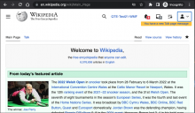
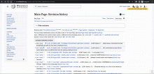
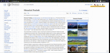
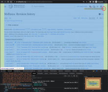
Spot-check the following across a couple of namespaces (Main page, article page, history page) and across different viewports.

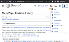
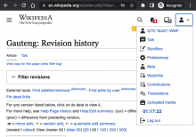
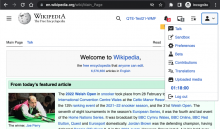
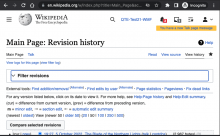
  • Icons and buttons across the page
  • Collapsed ToC button and contents in different locations (page title, sticky header, floating)
  • Width toggle
  • Alignment of elements on the page with the padding of .mw-page-container across different viewports and layouts

Related tickets:
T321504: [M] [Technical] Vector should consistently use mw-ui-icon-flush-left and mw-ui-icon-flush-right utility classes
T319449: [M] Create toggle to control the fixed width of the content for Vector 2022 skin

QA Results - Prod

Related Objects

Event Timeline

ovasileva set the point value for this task to 1.

@alexhollender_WMF @ovasileva @Edtadros

TLDR: I couldn't find any visual changes that were obviously wrong using Pixel, but there were a couple ambiguous changes I had questions about.

I ran the following Pixel commands to see the visual changes between the disabled and enabled $wgVectorVisualEnhancementNext feature flag:

  1. I edited Pixel's LocalSettings.php to disable the flag: $wgVectorVisualEnhancementNext = false;
  2. I ran ./pixel.js reference to obtain reference images.
  3. I edited Pixel's LocalSettings.php to enable the flag: $wgVectorVisualEnhancementNext = true;
  4. I ran ./pixel.js test to obtain test images and compare against the reference images.

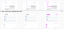
The report generated is located at https://joyful-elf-dff4a2.netlify.app/desktop/ . The "reference" column shows images with the feature flag disabled while the "test" column shows images with the feature flag enabled.

I couldn't find any obviously wrong changes, but I did notice the following which might be noteworthy:

  • Echo's labels now show when there are zero items whereas before they didn't show:

Screen Shot 2022-11-08 at 1.58.10 PM.png (1×3 px, 716 KB)

  • There are some minor changes to legacy Vector's tabs associated with this flag, but they are very minor.

Screen Shot 2022-11-08 at 1.55.04 PM.png (1×3 px, 278 KB)

  • Echo's labels now show when there are zero items whereas before they didn't show:

Screen Shot 2022-11-08 at 1.58.10 PM.png (1×3 px, 716 KB)

this would be a blocker if it's actually occuring

Change 855027 had a related patch set uploaded (by Jdlrobson; author: Jdlrobson):

[mediawiki/skins/Vector@master] Hide Echo notification count when zero

https://gerrit.wikimedia.org/r/855027

The report generated is located at https://joyful-elf-dff4a2.netlify.app/desktop/ . The "reference" column shows images with the feature flag disabled while the "test" column shows images with the feature flag enabled.

I believe quite a few of the pixel errors in these results are regressions.

Screen Shot 2022-11-09 at 11.44.21 AM.png (1×3 px, 758 KB)

Screen Shot 2022-11-10 at 11.30.07 AM.png (1×1 px, 214 KB)

Screen Shot 2022-11-10 at 11.30.03 AM.png (906×1 px, 155 KB)

Screen Shot 2022-11-09 at 4.20.19 PM.png (384×2 px, 71 KB)

  • T323177 The language button is shifted a few pixels due to the addition of align-items: center to the page titlebar in this patch.

    Screen Shot 2022-11-09 at 12.17.56 PM.png (164×2 px, 26 KB)

Screen Shot 2022-11-09 at 12.21.52 PM.png (682×3 px, 866 KB)

  • T323172 There is extra spacing around the icon buttons on viewports below tablet.

https://gerrit.wikimedia.org/r/c/mediawiki/skins/Vector/+/857026

Screen Shot 2022-11-15 at 11.53.40 AM.png (1×2 px, 530 KB)
https://jmp.sh/qBcSfEA2

  • T323176 Sticky header icon buttons are missing 8px padding

Screen Shot 2022-11-15 at 4.42.27 PM.png (1×2 px, 580 KB)
https://jmp.sh/w9fMa6NB

Change 855041 had a related patch set uploaded (by Nray; author: Nray):

[operations/mediawiki-config@master] Enable VectorVisualEnhancementsNext flag on Beta

https://gerrit.wikimedia.org/r/855041

Change 855041 abandoned by Nray:

[operations/mediawiki-config@master] Enable VectorVisualEnhancementsNext flag on Beta

Reason:

Will be covered by 854129

https://gerrit.wikimedia.org/r/855041

@Edtadros FYI, the VectorVisualEnhancementsNext feature has now been enabled on beta so QA testing can begin on that

Change 855027 merged by jenkins-bot:

[mediawiki/skins/Vector@master] Hide Echo notification count when zero

https://gerrit.wikimedia.org/r/855027

Change 855156 had a related patch set uploaded (by Jdlrobson; author: Jdlrobson):

[mediawiki/skins/Vector@master] Echo in Legacy Vector should not be impacted by feature flag

https://gerrit.wikimedia.org/r/855156

Change 855158 had a related patch set uploaded (by Jdlrobson; author: Jdlrobson):

[mediawiki/skins/Vector@master] Dropdown arrow pixel should only apply to modern Vector

https://gerrit.wikimedia.org/r/855158

Change 853400 had a related patch set uploaded (by Jdlrobson; author: Bernard Wang):

[mediawiki/skins/Vector@master] [Technical] Fix sticky header search input alignment when VisualEnhancementFlag is enabled

https://gerrit.wikimedia.org/r/853400

Change 853400 merged by jenkins-bot:

[mediawiki/skins/Vector@master] [Technical] Fix sticky header search input alignment when VisualEnhancementFlag is enabled

https://gerrit.wikimedia.org/r/853400

Change 855156 merged by jenkins-bot:

[mediawiki/skins/Vector@master] Echo in Legacy Vector should not be impacted by feature flag

https://gerrit.wikimedia.org/r/855156

@bwang can you fix the visibility of your screenshots?

I've manually reviewed the Pixel failures and there are 2 issues with legacy Vector that must be fixed before this change rolls out those are:

I've merged the following as these seemed like good technical improvements to our codebase and did address the issues flagged above:

Looks like a good change but doesn't quite work for me:

After the change, there still seems a slight misalignment:
{F35736539}

The fix in https://gerrit.wikimedia.org/r/c/mediawiki/skins/Vector/+/853396 and https://gerrit.wikimedia.org/r/c/mediawiki/skins/Vector/+/855101, while small, seems to complicate the codebase a so I'm curious if these issues are important enough to fix from a design perspective. Suggest reaching out to Alex about it and perhaps delaying to after the deploy if possible:

  • The language button is shifted a few pixels due to the addition of align-items: center to the page titlebar in this patch.
  • The spacing between the collapsed ToC button and page title has been reduced by 6px on viewports larger than tablet.
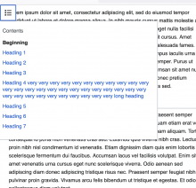
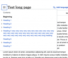
  • Placement of ToC dropdown menus are off.

The report generated is located at https://joyful-elf-dff4a2.netlify.app/desktop/ . The "reference" column shows images with the feature flag disabled while the "test" column shows images with the feature flag enabled.

I believe quite a few of the pixel errors in these results are regressions.

  1. Placement of ToC dropdown menus are off. https://gerrit.wikimedia.org/r/c/mediawiki/skins/Vector/+/853396

Screen Shot 2022-11-09 at 11.44.21 AM.png (1×3 px, 758 KB)

Screen Shot 2022-11-10 at 11.30.07 AM.png (1×1 px, 214 KB)

Screen Shot 2022-11-10 at 11.30.03 AM.png (906×1 px, 155 KB)

  1. The spacing between the main menu button and logo has been reduced by 6px on viewports larger than tablet. This also affects the alignment of the searchbar. https://gerrit.wikimedia.org/r/c/mediawiki/skins/Vector/+/855090

Screen Shot 2022-11-09 at 4.20.19 PM.png (384×2 px, 71 KB)

  1. The spacing between the collapsed ToC button and page title has been reduced by 6px on viewports larger than tablet. https://gerrit.wikimedia.org/r/c/mediawiki/skins/Vector/+/855101

    Screen Shot 2022-11-09 at 4.22.15 PM.png (154×1 px, 13 KB)
  1. The language button is shifted a few pixels due to the addition of align-items: center to the page titlebar in this patch. https://gerrit.wikimedia.org/r/c/mediawiki/skins/Vector/+/855101

    Screen Shot 2022-11-09 at 12.17.56 PM.png (164×2 px, 26 KB)
  1. Fixed by 853400 The spacing of the search bar in the sticky header is also misaligned.

Screen Shot 2022-11-09 at 12.21.52 PM.png (682×3 px, 866 KB)

thanks for documenting these @bwang. none of them seem like blockers to me. if it's helpful to prioritize them I would say these two are more important than the others:

  1. The spacing between the main menu button and logo has been reduced by 6px on viewports larger than tablet. This also affects the alignment of the searchbar.
  2. Placement of ToC dropdown menus are off. https://gerrit.wikimedia.org/r/c/mediawiki/skins/Vector/+/853396

Change 855158 merged by jenkins-bot:

[mediawiki/skins/Vector@master] Dropdown arrow pixel should only apply to modern Vector

https://gerrit.wikimedia.org/r/855158

The language button is shifted a few pixels due to the addition of align-items: center to the page titlebar in this patch. https://gerrit.wikimedia.org/r/c/mediawiki/skins/Vector/+/855101

@alexhollender_WMF Question relating to this issue, how much do you care about the alignment of the ToC and language button in the titlebar when the title is very long?

Vertically centered:

Screen Shot 2022-11-11 at 1.30.17 PM.png (404×2 px, 77 KB)

Not centered:
Screen Shot 2022-11-11 at 1.30.26 PM.png (384×2 px, 77 KB)

Vertically centered is simpler from a CSS point of view because we dont need to manually space each button depending on it's padding.

Change 856676 had a related patch set uploaded (by Jdlrobson; author: Jdlrobson):

[mediawiki/skins/Vector@master] Drop unnecessary watchstar icon classes on toggle

https://gerrit.wikimedia.org/r/856676

Bug raised by @dom_walden on T317710#8389485 - watchstar icon doesn't update on certain pages. Fixed in above patch.

Change 856676 merged by jenkins-bot:

[mediawiki/skins/Vector@master] Drop unnecessary watchstar icon classes on toggle

https://gerrit.wikimedia.org/r/856676

The language button is shifted a few pixels due to the addition of align-items: center to the page titlebar in this patch. https://gerrit.wikimedia.org/r/c/mediawiki/skins/Vector/+/855101

@alexhollender_WMF Question relating to this issue, how much do you care about the alignment of the ToC and language button in the titlebar when the title is very long?

Vertically centered:

Screen Shot 2022-11-11 at 1.30.17 PM.png (404×2 px, 77 KB)

Not centered:
Screen Shot 2022-11-11 at 1.30.26 PM.png (384×2 px, 77 KB)

Vertically centered is simpler from a CSS point of view because we dont need to manually space each button depending on it's padding.

I prefer the top alignment

  • Echo's labels now show when there are zero items whereas before they didn't show:

Screen Shot 2022-11-08 at 1.58.10 PM.png (1×3 px, 716 KB)

this would be a blocker if it's actually occuring

Catching up so apologies if I've missed something. @Jdlrobson, @bwang, @alexhollender_WMF - did we address this one yet?

Yes this is fixed.

I've updated my comment above listing the visual regressions with the feature flag. Two of the issues have been fixed since last week, but 2 have been added as well.

I've updated my comment above listing the visual regressions with the feature flag. Two of the issues have been fixed since last week, but 2 have been added as well.

@bwang thanks for the update. where are we tracking the fixes for these? do they need tasks? if tasks already exist can you add the tasks next to the description of the regressions?

@bwang thanks for the update. where are we tracking the fixes for these? do they need tasks? if tasks already exist can you add the tasks next to the description of the regressions?

These are tracked in T323174 and T323172.

  • Sticky header icon buttons are missing 8px padding

tracked in T323176

I've updated my comment above listing the visual regressions with the feature flag. Two of the issues have been fixed since last week, but 2 have been added as well.

@bwang thanks for the update. where are we tracking the fixes for these? do they need tasks? if tasks already exist can you add the tasks next to the description of the regressions?

Yep, I made 4 tasks that are subtasks of this: T323176, T323177, T323172, T323174. I've updated my comment to include these tasks too

Test Result - Prod

Status: ✅ PASS
Environment: enwiki
OS: macOS Ventura
Browser: Chrome
Device: MBP
Emulated Device:NA

Test Artifact(s):

QA Steps

Spot-check the following across a couple of namespaces (Main page, article page, history page) and across different viewports.

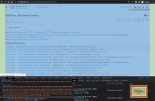
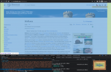
✅ AC1: Icons and buttons across the page

Screenshot 2022-11-17 at 5.18.48 PM.png (488×800 px, 106 KB)
Screenshot 2022-11-17 at 5.17.22 PM.png (490×699 px, 88 KB)
Screenshot 2022-11-17 at 5.18.01 PM.png (489×833 px, 163 KB)
Screenshot 2022-11-17 at 5.13.55 PM.png (491×1 px, 234 KB)
Screenshot 2022-11-17 at 5.18.36 PM.png (495×800 px, 103 KB)
Screenshot 2022-11-17 at 5.15.33 PM.png (495×1 px, 144 KB)
Screenshot 2022-11-17 at 5.17.42 PM.png (493×841 px, 161 KB)
Screenshot 2022-11-17 at 5.12.56 PM.png (490×1 px, 202 KB)

✅ AC2: Collapsed ToC button and contents in different locations (page title, sticky header, floating)

Screen Recording 2022-11-17 at 5.24.23 PM.mov.gif (628×796 px, 1 MB)
Screen Recording 2022-11-17 at 5.24.55 PM.mov.gif (628×1 px, 3 MB)

✅ AC3: Width toggle

Screen Recording 2022-11-17 at 5.37.30 PM.mov.gif (794×1 px, 2 MB)
Screen Recording 2022-11-17 at 5.38.56 PM.mov.gif (794×1 px, 3 MB)
Screen Recording 2022-11-17 at 5.39.51 PM.mov.gif (583×1 px, 2 MB)

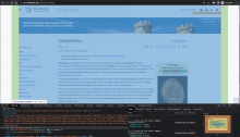
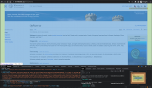
❓ AC4: Alignment of elements on the page with the padding of .mw-page-container across different viewports and layouts
@ovasileva, I'm not sure if these issues are related to the change.

Screenshot 2022-11-19 at 8.42.11 AM.png (1×500 px, 199 KB)
Screenshot 2022-11-19 at 8.36.56 AM.png (1×1 px, 362 KB)

Other than that, things look ok

Screenshot 2022-11-19 at 8.34.27 AM.png (1×1 px, 640 KB)
Screenshot 2022-11-19 at 8.37.46 AM.png (1×1 px, 323 KB)
Screenshot 2022-11-19 at 8.36.23 AM.png (1×1 px, 419 KB)
Screenshot 2022-11-19 at 8.36.07 AM.png (1×1 px, 614 KB)
Screenshot 2022-11-19 at 8.35.32 AM.png (1×1 px, 621 KB)
Screenshot 2022-11-19 at 8.35.07 AM.png (1×1 px, 621 KB)

Results looks good, alignment is tracked elsewhere. Resolving this one.