Page MenuHomePhabricator

Show categories of a page in the Android app
Closed, ResolvedPublicFeature

Assigned To
Authored By
Florian
Oct 11 2014, 11:23 PM
Referenced Files
F35008499: Screenshot_20220315_162435 copy 8.png
Mar 16 2022, 9:45 AM
F35008492: Screenshot_20220316-103946.png
Mar 16 2022, 9:45 AM
F35008482: Screenshot_20220315_162404 copy.png
Mar 16 2022, 9:45 AM
F35008487: Screenshot_20220316-103818.png
Mar 16 2022, 9:45 AM
F35008474: Screenshot_20220315_162435 copy 2.png
Mar 16 2022, 9:45 AM
F35008491: Screenshot_20220315_162404 copy 2.png
Mar 16 2022, 9:45 AM
F35008483: Screenshot_20220315_162435 copy 7.png
Mar 16 2022, 9:45 AM
F35008497: Screenshot_20220315_162404.png
Mar 16 2022, 9:45 AM
Tokens
"Like" token, awarded by Kozuch."Love" token, awarded by Liuxinyu970226."Love" token, awarded by Wizard."Love" token, awarded by Florian.

Description

Proposed in Community-Wishlist-Survey-2016. Received 45 votes, and ranked #28 out of 265 proposals. View full proposal with discussion and votes here.


Actually, in Android app you don't see, which categories the actual page is sorted in. Would be great to have this information somewhere :)

(OTRS: https://ticket.wikimedia.org/otrs/index.pl?Action=AgentTicketZoom&TicketID=7873839)


Version: Stable
Severity: enhancement
See also: T24660: Display the categories on the mobile site for everyone

APK:
https://github.com/wikimedia/apps-android-wikipedia/actions/runs/1994411300
Details

Reference
bz71966

Event Timeline

There are a very large number of changes, so older changes are hidden. Show Older Changes

Reopen, as this is not T71984: Category view shows no articles in the mobile app, this is about show in which catgeories _one: page is categorized in, the other task is about showing the list of pages, which are in _one_ category :)

Florian raised the priority of this task from Lowest to Needs Triage.Mar 1 2016, 5:45 PM
Nemo_bis triaged this task as Medium priority.Nov 23 2016, 6:48 AM

This bug is quite important. I was reminded by https://wikimediafoundation.org/wiki/Minutes/2016-09-19 , «Mobile web visitors have fewer pageviews per browsing session».

Deskana renamed this task from Show categories of a page to Show categories of a page in the Android app.Feb 18 2017, 5:07 AM
This task was proposed in the Community-Wishlist-Survey-2016 and in its current state needs owner. Wikimedia is participating in Google Summer of Code 2017 and Outreachy Round 14. To the subscribers -- would this task or a portion of it be a good fit for either of these programs? If so, would you be willing to help mentor this project? Remember, each outreach project requires a minimum of one primary mentor, and co-mentor.

@Dbrant Is your team planning on working on this project? If not would this be a good outreach/volunteer/hackathon project?

Unfortunately I don't think this would be a viable project for volunteers, because the depth of this issue is greater than might seem at first glance.
Technically it wouldn't be difficult to show the categories to which a page belongs. However, when the user actually navigates to a Category: page, it is not rendered correctly in the app, because the server doesn't actually return any content for it. This is due to numerous underlying issues in Parsoid and the Content Service (see T153980).
If there are volunteers who want to tackle the server-side issues first, that would be great. However, with regard to this task, even though it can be completed on its own by a volunteer, it wouldn't add much value to our users until the server-side issues are fixed.

Categories are page metadata, and the default desktop rendering is done by the skin. Other experiences will want to display categories in different ways, which is also facilitated by separating the category data from its formatting.

Page metadata is currently served primarily from two endpoints:

It might be worth considering adding the page's categories to one or both of those end point's responses.

Niedzielski subscribed.

This seems to be a feature for the native Android app specifically and not mobile web so I'm removing the Readers-Web-Backlog tag.

Charlotte subscribed.

A prototype of this has been tested at Wikimania 2019. We will review the results and prioritise accordingly.

Just wanted to update this task with a note. We recently received another request about this.

A temporary fix will be implemented via T274295 where non-main-namespace pages will show up as mobile-web.

We have to use the temporary fix because Parsoid does not parse Categories and we are using Parsoid for rendering pages. If there is a native presentation for this we will consider pursuing it, but for now this will have to be our stop-gate.

Thanks for everyone's patience on this topic.

JTannerWMF added a subscriber: scblr.

@Dbrant can you share a prototype link here and @schoenbaechler can provide some feedback after getting through some of the other tasks at the top of his list

@JTannerWMF @Dbrant moved this to the bottom of the 'Needs Design/Design doing) column, as it was previously at the top of the list. Feel free to rearrange @JTannerWMF.

Aklapper changed the subtype of this task from "Task" to "Feature Request".Feb 4 2022, 12:23 PM

This has been authored in 2014 and has still not been implemented in 2022 even though it would be simple to show this information at least in a simple way. I'd just like to add that one could implement this by adding a category trees browser instead of a plain list of wikilinked categories.

The app and mobile site could show categories like tags at bottom of the page and when clicking on a category its category-tree and -description could get uncollapsed within the page (embedded at the bottom) or in a separate "category-browsing" page. This is a very broad description, I'm referring to something roughly like this.

@Prototyperspective: If you'd like to see something implemented and consider it "simple", please feel very welcome to provide a patch: https://www.mediawiki.org/wiki/Wikimedia_Apps/Team/Android/App_hacking - Thanks!
Also see https://www.mediawiki.org/wiki/Bug_management/Development_prioritization as the age of a task in a task system in which anyone can request anything (while developer capacity is de facto limited) is irrelevant.

I don't consider what I proposed simple, I only consider showing links to the categories at the bottom of the page relatively simple. These are plain HTML links and can be retrieved with the API afaik,

The links are useful and in terms of developer capacity I already proposed several things to increase it, namely putting up banners to attract volunteer developers (others have too such as increasing focus and funds for development).

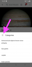
I reviewed the three screens of the current implementation @Dbrant — here are my two cents:

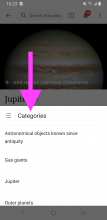
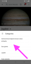
01) Change this icon to Material’s category icon

Screenshot_20220315_162435.png (2×1 px, 1 MB)

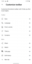
02) Add categories as an item in 'Customize toolbar' (T296087)

Screenshot_20220316-103245.png (2×1 px, 98 KB)

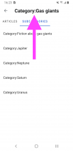
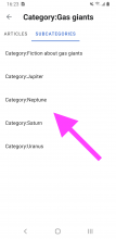
03) Should the title style correlate with the detail screen? IMO, yes — so this should read: Category:Jupiter

Screenshot_20220315_162435 copy 8.png (2×1 px, 1 MB)
Screenshot_20220315_162404.png (2×1 px, 185 KB)

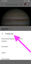
04) Change categories title style to Roboto Bold 16sp (font_group_5)

Screenshot_20220315_162435 copy 2.png (2×1 px, 1 MB)

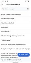
05) Apply more compact list style when there are no images, e.g. the current styling of talk pages (keep the Regular font though)

Screenshot_20220315_162404 copy.png (2×1 px, 190 KB)
Screenshot_20220315_162435 copy 7.png (2×1 px, 1 MB)
Screenshot_20220316-103818.png (2×1 px, 148 KB)

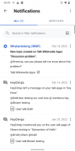
06) Apply correct style of tabs (see notifications home design)

Screenshot_20220315_162404 copy 2.png (2×1 px, 185 KB)
Screenshot_20220316-103946.png (2×1 px, 181 KB)

CC @JTannerWMF as you’ve asked me to review it 👋

Dbrant updated the task description. (Show Details)

01) Change this icon to Material’s category icon

👍

02) Add categories as an item in 'Customize toolbar' (T296087)

👍

03) Should the title style correlate with the detail screen? IMO, yes — so this should read: Category:Jupiter

👍

04) Change categories title style to Roboto Bold 16sp (font_group_5)

👍

05) Apply more compact list style when there are no images, e.g. the current styling of talk pages (keep the Regular font though)

👍

06) Apply correct style of tabs (see notifications home design)

👍

Looks great @Dbrant — I noticed that you implemented a NICE animation to switch tabs in categories (see this video). The animation isn’t applied in Notifications though. Can we unify the component to always have the animation?

Looks great @Dbrant — I noticed that you implemented a NICE animation to switch tabs in categories (see this video). The animation isn’t applied in Notifications though. Can we unify the component to always have the animation?

Unfortunately the Notifications screen is architected differently. It will behave correctly with the animation (automatically) when we take care of our Refactoring tasks in Tech Debt.

Nice! However: I can see categories of an article, pages and subcategories in a category, but I can’t see categories of a category (i.e. parent categories). It’s strange that I can navigate in the category tree only in one direction (except for pressing the back button), as the category tree is not actually a tree in graph theory sense, usually only a directed acyclic graph (but sometimes not even that, e.g. en:Category:Hidden categories is a subcategory of itself). A category usually has more than one parent categories, of which only one can be reached: the one that I’ve already seen. Is there a task to show parent categories in the category view? If there isn’t, I think one should be created.

@Tacsipacsi Thanks! Yes, please feel free to create a new task for that.
(And we welcome any other feedback you have about the presentation of categories.)