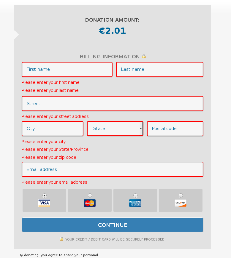
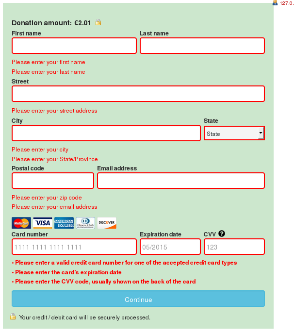
On the credit card forms, we have some errors that display in a popup and some that display with red text next to the field. There are some inconsistencies we can't avoid because of the iframe, but let's move to using only red text and no popup. This will be better for mobile especially.
Current state: personal information errors in a popup, while on both WP and GC forms the CC part shows red outline and red text.
Desired state: use same styling from WP CC portion for all errors where we would've had a popup.