Page MenuHomePhabricator

Consider changing the segmented navigation titles (visual/source)
Open, Needs TriagePublic

Description

Problem

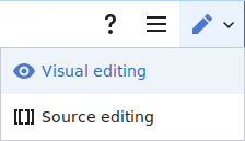
Several usability testers were confused by the terms "Visual" and "Source" - which indicates to me that the terminology is inside baseball, in that the terms might be familiar to us as product names, but not recognizable or actionable for the average user.
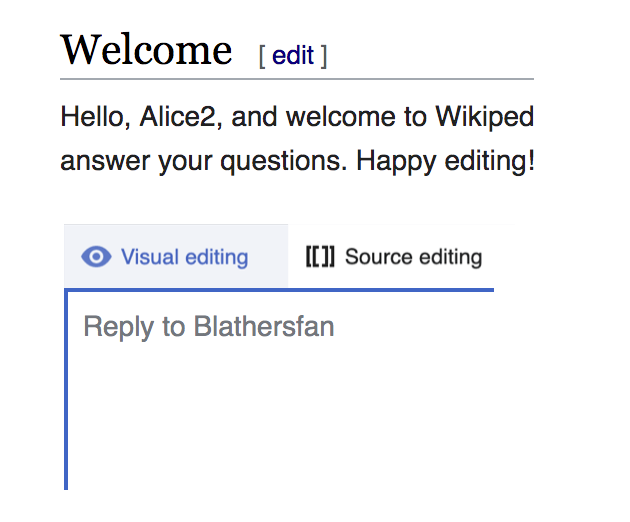
Screenshot

Screen Shot 2020-06-15 at 10.48.24 AM.png (84×304 px, 8 KB)

Possible Solutions

  • changing the terms
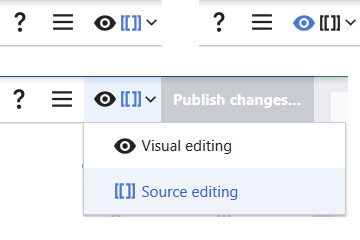
  • aligning the ui with visual editor - something like this mockup from @schoenbaechler

artboard.png (522×630 px, 64 KB)

  • moving this into a toggle to minimize source mode

Event Timeline

Isn't adding the word 'editing' just adding confusion? A new user believes that are posting a new comment, not editing anything (they are actually editing a page, but that is definitely inside baseball).

Isn't adding the word 'editing' just adding confusion? A new user believes that are posting a new comment, not editing anything (they are actually editing a page, but that is definitely inside baseball).

+1. I think [i] we should explore to the idea @Niharika and @Gnom1 suggested: changing the name of the tool's source mode to Wikitext.

This "exploration" will happen in: T256166.


i. Notes:

  • I wonder if Senior Contributors will intuitively understand the wikitext label to mean the place to write in wikitext.
  • I wonder if Junior Contributors will find the term wikitext to be more obviously "foreign" and subsequently investigate what it means. Whereas the term source could be more ambiguous and lead them to a) not investigate what it means and b) form an inaccurate understanding for what the source mode does/means.
  • Whatever names are chosen should reinforce the idea in peoples' minds that the two modes are related.

Per our recent conversations, I think some of the issue here is the prominence we are giving to this control. While that may be welcomed by senior contributors, having the word "source" or "wikitext" be one of the first things a junior contributor see is inevitably going to be confusing.

In VisualEditor, it’s far less prominent: hidden in a drop-down menu. Probably this would make sense in DT as well?

VisualEditor switch menu.png (129×224 px, 3 KB)

I have added feedback on mw.org at https://www.mediawiki.org/wiki/Topic:Vpmbb9wrfgd5e0id. I believe third alternative is missing here. You should consider showing only one editor, or give people preference to choose one and stick with it. This will align the tool with the current MediaWiki/Flow/VE standards in the sense that both buttons are not compulsorily shown unless an editor choose to see both.

It will also no longer confuses the newer editors, they don't need to hesitate on whether to click Visual or Source. Moreover you'll no longer need to go the path of further confusing editors by renaming the labels to 'Wikitext' and 'Wikicode' (T255085#6233802). I am not sure what determined that these two terms are not the same.

I think the current behavior is more aligned with what VE does currently (and exactly the same how Flow works): it loads some editor by default (with no possibility to select editor by clicking a different link, but that’s okay given how fast the switch is), and has an option to switch editors on the fly—this on-the-fly switch (pictured above) is possible in VE even when only one edit tab is visible. DT’s switch may be too prominent (not for me, but I understand junior contributors are confused by it), but completely removing the on-the-fly switch possibility would be a great feature loss.

No, that's not how VE and Flow works (at least for me). I never see any VE edit button anywhere (Except on this Reply tool). I am only seeing [edit]. If you choose to see both, that's fine. Those who don't want any switching should be given the same chance, to see the only button they need at all times.

Yes, you see one [edit] link, just like how see one [reply] link in DT. But (probably unless one temporarily disables VE), there’s an editor switch button at the right end of the WikiEditor toolbar, like the one I pictured above (that screenshot is from VE, but the only difference in the wikitext editor is that there is no help or hamburger button in the wikitext counterpart), no matter how many and which edit tabs you have. I no longer see the point in the “temporarily disable VE” option since there’s another option to show only the wikitext edit button, probably nobody thought about that. But that’s explicitly marked temporary, so I don’t think it should be reflected in any new software.

Note that people do find the pencil icon confusing. A pencil next to a section heading (mobile/Minerva) or in a page toolbar (narrow Timeless) means Edit. A pencil in an editing toolbar means switch mode. Unless it is actually a highlighter/marker, when it means syntax colouring. In a sidebar or infobox it could mean edit linked data.

You can check with teahouses and cafes on some of the large wikipedias, but I get the subjective feeling that questions around this do arise reasonably often.

It's hard to think of a more intuitive single icon for the drop-down. Perhaps it could be the eye and brackets side-by-side, with one or other coloured to show which mode is active. <o> [[ ]]

Edit mode toggle.png (240×360 px, 7 KB)

Unless it is actually a highlighter/marker, when it means syntax colouring.

You can check with teahouses and cafes on some of the large wikipedias, but I get the subjective feeling that questions around this do arise reasonably often.

It's hard to think of a more intuitive single icon for the drop-down. Perhaps it could be the eye and brackets side-by-side, with one or other coloured to show which mode is active. <o> [[ ]]

Some chatter at T174145: Our standard highlight icon (used to enable/disable CodeMirror) cdxIconHighlight looks too much like our standard edit icon, cdxIconEdit too, both about [[]] and about the highlighter in particular.

Thanks for all of your feedback (and apologies for my slow replying).

@Esanders - I agree that "visual editing and source editing" is inside baseball and just a mouthful to take in. (Nice American sportsball reference)
@ppelberg - I have the same concerns as you regarding the grok-ability of wikitext
@Ammarpad @Tacsipacsi - I agree with your gut instinct to remove source editing for chat, however, from what I understand there is still a considerable amount of community members who are using this to type their messages regularly. I would love to know for sure if this is the case (@ppelberg @Whatamidoing-WMF )
@Izno @Pelagic - +1, I think that i could potentially be extra confusing in this context where we are encouraging folks to reply or comment on Talk pages (not edit in the traditional sense)

@Ammarpad @Tacsipacsi - I agree with your gut instinct to remove source editing for chat, however, from what I understand there is still a considerable amount of community members who are using this to type their messages regularly. I would love to know for sure if this is the case (@ppelberg @Whatamidoing-WMF )

I don’t think anyone wants to remove source editing. Just the opposite: as far as I understand, @Ammarpad wants to see only source editing, no visual mode at all. I’m happy with seeing the visual tab, but hardly, if ever, do I use it, I also prefer typing wikicode (especially as long as templates are not supported in visual mode).

Ahh thanks for clarifying @Tacsipacsi - I think the fact that there are two modes in this fairly light interaction space (a reply) is something that we should continue to look into. Not suggesting removing either of the modes.