Page MenuHomePhabricator

Add a link: onboarding
Closed, ResolvedPublic

Description

After the user selects an "add links" task from the suggested edits feed, the next thing they will experience is three onboarding screens.

  • When and where
    • On mobile, onboarding will cover the whole screen. It should be the next thing the user sees after selecting a task. They should not first see the article they selected and then see the onboarding cover it up.
    • On desktop, onboarding will be in modals on top of the article they selected. We want those modals to load as soon as possible when they arrive on the article. Behind the modals, the user should see a greyed-out article.
    • Note that the copy for the mobile and desktop should be identical, even in places where the copy in the mockups differs.
  • Navigation
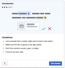
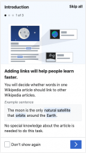
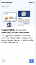
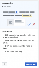
    • There will be three screens, each with a header, graphic, another header, and a body.
    • The screens do not have an "X" to close them. Rather, they have a button that reads "Skip all" in the upper right. When closed, the user should be on the article they selected, ready to do the first link suggestions.
    • On desktop, clicking outside the modal should not close it. Only selecting the "Skip all" should close it.
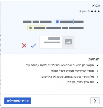
    • Navigating through the three screens will advance a "three bubbles" graphic under the header, with a bubble filled in for each screen, and saying "1 of 3", "2 of 3", "3 of 3".
    • The first screen should have a "Don't show again" checkbox in the lower left. Until the user checks this, the onboarding should show up every time they start a new "add links" task. This "don't show again" will not apply to other task types, such as "add images". Those will have their own "don't show again". The checkbox can "count" as soon as it's checked, or only if the user completes the onboarding -- that can be up to engineers.
    • In the lower right of the screens is the progressive button to advance to the next screen. On the first two screens, it will be an arrow. On the third screen, it will say "Get started".
    • In the lower left of the second and third screens is an arrow button to go back to the previous screen.
    • There should be sliding transitions as the user advances and goes back through the screens.
  • Implementation notes
    • Here are some ideas from engineers about how to make sure the users sees the onboarding before they see the article:
      • "One way we could probably mitigate this is hide/obscure the article while the page and the script load, so that the user would see a blank page (or some sort of spinner animation) while they wait for the onboarding to arrive."
      • "Another idea would be to show the onboarding dialog on Special:Homepage, and “Get started” takes you to the article opened in Edit mode. Although the default behavior in opening a page in Edit mode is to show the article then dim the background while the editor loads. But if we show the dialog on Special:Homepage then we can’t preload the editor, which causes a performance slowdown."
      • "We could top load it, but that comes with some performance sacrifice."
      • "On desktop, the onboarding is a modal over the article. So we might end up with a divergence in implementation."
    • T269654: Add a link: guidance content specifies how this same content should be made available in the help panel once the user has started the task, like how we make "quick start tips" available for classic maintenance template tasks. On mobile at least, the onboarding shows up via the help panel, the same way that quick start tips show up for maintenance template tasks, but without the image shown in the onboarding screens.
    • "Technical musing: while the user is viewing the onboarding, we should preload the VE code, the article's Parsoid HTML and the link suggestion data. That way the user won't have to wait long for the editor to load once they hit the "Get started" button."
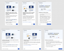
Mockups of all three screens on mobile and desktop as of 2021-03-04:
image.png (1×2 px, 491 KB)

NOTE: Refer to Figma for up-to-date detailed redline mocks and specs:
Mobile: https://www.figma.com/file/2SONd8P1tsexIB5coMOp8h/Growth-Structured-tasks?node-id=181%3A65
Desktop: https://www.figma.com/file/2SONd8P1tsexIB5coMOp8h/Growth-Structured-tasks?node-id=112%3A0

SVG Image assets
LTRRTL
updated Mar 11
Instrumentation

See T278111: Instrumentation: Onboarding

Event Timeline

@RHo -- could you please add links to the graphics for the onboarding? And do we need RTL versions of any of them?

I remember we talked in November/December about how this would be difficult to implement, but I didn't follow up on the conclusion of that discussion. Sorry about that. Anyway, my suggestion is to think about possible alternatives to this because we don't have frameworks in place to implement this either on desktop or mobile.

On mobile, onboarding will cover the whole screen. It should be the next thing the user sees after selecting a task. They should not first see the article they selected and then see the onboarding cover it up.

We can make the onboarding dialog appear on the suggested edits module screen (https://cs.m.wikipedia.org/w/index.php?title=Special:Homepage#/homepage/suggested-edits) so that after tapping on the article, the onboarding shows up. But after closing or completing the onboarding, the user would have to wait for a page load while we bring them over to the article page. There is not going to be an easy way to load the article in the background while the onboarding dialog is front-and-center.

So for mobile I would say, let's decide if it is more important for the user to see the onboarding dialog immediately after tapping an article (but then they have to wait for the article to load after completing the dialog) or if it would be better to show it after we've brought them over to the article they want to edit.

On desktop, onboarding will be in modals on top of the article they selected. Those modals should be present when they arrive on the article. They should not pop up over the article after the article loads. Behind the modals, the user should see a greyed-out article.

On desktop, we might be able to come close to what the specification is by suppressing VE dialogs, and applying some CSS and JS to make the article uninteractive. But the user would still see the article before they see the modal dialog load. I suppose an alternative would be to try to use CSS to absolutely position a box where we think the dialog will load, and swap in the JavaScript version when the JS finishes loading, that might be tricky to implement though.


For both mobile and desktop, I would propose that we show the dialog directly on Special:Homepage and then the user has to wait to get taken to the article when they finish onboarding. That's going to be a lot simpler to implement.

Hi @MMiller_WMF @RHo — I just noticed that "Get started" button is missing from the copy doc. Can this be added? Thanks!

Hi @MMiller_WMF @RHo — I just noticed that "Get started" button is missing from the copy doc. Can this be added? Thanks!

Thanks for catching that, I've added it now!

Thanks @RHo! I noticed in Figma that the link styles (on the second screen) are slightly different on desktop and on mobile. Should these be different even though the copy is identical?

Desktop: larger font size than body text, underlined, no margin

Screen Shot 2021-03-04 at 11.16.18 AM.png (198×1 px, 59 KB)

Mobile: same font size as body text, not underlined, margin

Screen Shot 2021-03-04 at 11.16.22 AM.png (306×1 px, 40 KB)

Sorry @mewoph that looks like a Figma mock-o on the Desktop one that I have now fixed. They should both use the respective OOUI UI Text style (1em, so 16px on Mobile, and 14px on Desktop)

image.png (282×1 px, 60 KB)

Thanks @RHo — to confirm, should there be a link break/margin between the body text and the link for both platforms?

Thanks @RHo — to confirm, should there be a link break/margin between the body text and the link for both platforms?

Ack, yes! I added it 😓

I remember we talked in November/December about how this would be difficult to implement, but I didn't follow up on the conclusion of that discussion. Sorry about that. Anyway, my suggestion is to think about possible alternatives to this because we don't have frameworks in place to implement this either on desktop or mobile.

On mobile, onboarding will cover the whole screen. It should be the next thing the user sees after selecting a task. They should not first see the article they selected and then see the onboarding cover it up.

We can make the onboarding dialog appear on the suggested edits module screen (https://cs.m.wikipedia.org/w/index.php?title=Special:Homepage#/homepage/suggested-edits) so that after tapping on the article, the onboarding shows up. But after closing or completing the onboarding, the user would have to wait for a page load while we bring them over to the article page. There is not going to be an easy way to load the article in the background while the onboarding dialog is front-and-center.

So for mobile I would say, let's decide if it is more important for the user to see the onboarding dialog immediately after tapping an article (but then they have to wait for the article to load after completing the dialog) or if it would be better to show it after we've brought them over to the article they want to edit.

On desktop, onboarding will be in modals on top of the article they selected. Those modals should be present when they arrive on the article. They should not pop up over the article after the article loads. Behind the modals, the user should see a greyed-out article.

On desktop, we might be able to come close to what the specification is by suppressing VE dialogs, and applying some CSS and JS to make the article uninteractive. But the user would still see the article before they see the modal dialog load. I suppose an alternative would be to try to use CSS to absolutely position a box where we think the dialog will load, and swap in the JavaScript version when the JS finishes loading, that might be tricky to implement though.


For both mobile and desktop, I would propose that we show the dialog directly on Special:Homepage and then the user has to wait to get taken to the article when they finish onboarding. That's going to be a lot simpler to implement.

Thanks @kostajh for thinking this through and these proposals that we discussed with the rest of the Growth team. The result of the discussions was that we think it's most important that the onboarding dialog appears over the article they want to edit, and with that article in the AI-suggested edit mode. If the onboarding dialog can only load after the article has loaded, then we are OK with that.

However, one change we'd like to do is to replace the LHS "x" close icon with a quiet neutral button on the RHS of the dialog header instead. Ther thinking here being that maybe people will be less likely to reflexively select the "x". The changes have been made in the figma spec file already, but here's a screenshot as well:

image.png (1×2 px, 491 KB)

Note that the button is not on the 3rd step because there is the 'Get started' button which does the same thing.

Thanks, @RHo. I updated the task description and added the new "Skip all" button to the copy doc.

Change 670620 had a related patch set uploaded (by MewOphaswongse; owner: MewOphaswongse):
[mediawiki/extensions/GrowthExperiments@master] Add a link: onboarding

https://gerrit.wikimedia.org/r/670620

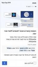
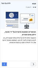
hi @mewoph - I've added the RTL versions of the onboarding graphics to the task description today, thanks for the prompt!
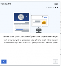
Note that I have also updated the existing onboarding 2 graphic alternating the side where the "article" illustration sits to help differentiate between images for steps 1 and 2 a little better.

Change 670620 merged by jenkins-bot:
[mediawiki/extensions/GrowthExperiments@master] Add a link: onboarding

https://gerrit.wikimedia.org/r/670620

Change 674962 had a related patch set uploaded (by MewOphaswongse; author: MewOphaswongse):
[mediawiki/extensions/GrowthExperiments@master] Add a link: fix learn more link in onboarding dialog

https://gerrit.wikimedia.org/r/674962

Change 674962 merged by jenkins-bot:
[mediawiki/extensions/GrowthExperiments@master] Add a link: fix learn more link in onboarding dialog

https://gerrit.wikimedia.org/r/674962

just noting as I review another task that the "highlight" colour should be same Accent90 colour as other guidance content and not this bright yellow currently used on the first screen;

Actual CS beta:
image.png (1×1 px, 148 KB)
Expected:
image.png (132×728 px, 11 KB)

Thanks for posting this out @RHo!

The CSS was changed in T269654: Add a link: guidance content to apply the styling to .positive instead of mark and the text for growthexperiments-addlink-onboarding-content-intro-body-example-text was updated so that guidance content and onboarding screens have exactly the same text. In particular <mark> now has positive class. This issue will be fixed when the copy is updated.

EN copy

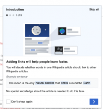
"growthexperiments-addlink-onboarding-content-intro-body-example-text": "The moon is the only <mark class=\"positive\">natural satellite</mark> that <mark class=\"positive\">orbits</mark> around the <mark class=\"positive\">Earth</mark>."

CS copy

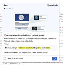
"growthexperiments-addlink-onboarding-content-intro-body-example-text": "Měsíc je jediným <mark>přirozeným satelitem</mark>, který <mark>obíhá</mark> okolo <mark>Země</mark>."

For @RHo review - no issues to report: it looks and functions according to the specs.

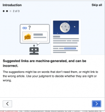
Desktop LTR

Screen Shot 2021-04-29 at 6.33.20 PM.png (606×574 px, 69 KB)
Screen Shot 2021-04-29 at 6.33.29 PM.png (581×547 px, 52 KB)
Screen Shot 2021-04-29 at 6.33.49 PM.png (581×556 px, 43 KB)
  • Desktop RTL**
Screen Shot 2021-04-29 at 6.37.44 PM.png (596×559 px, 61 KB)
Screen Shot 2021-04-29 at 6.37.56 PM.png (587×549 px, 45 KB)
Screen Shot 2021-04-29 at 6.38.04 PM.png (582×556 px, 37 KB)

Mobile LTR (640 px width)

Screen Shot 2021-04-29 at 6.45.59 PM.png (647×366 px, 58 KB)
Screen Shot 2021-04-29 at 6.48.22 PM.png (644×364 px, 45 KB)
Screen Shot 2021-04-29 at 6.48.31 PM.png (647×368 px, 39 KB)

Mobile RTL (640 px width)

Screen Shot 2021-04-29 at 6.44.16 PM.png (646×366 px, 51 KB)
Screen Shot 2021-04-29 at 6.44.24 PM.png (651×366 px, 37 KB)
Screen Shot 2021-04-29 at 6.44.33 PM.png (641×365 px, 31 KB)

*chef's kiss* thanks all, LGTM.