Page MenuHomePhabricator

Newcomer tasks: Copy and UI improvements the AND selection of interest topics
Closed, ResolvedPublic

Description

This task is about improving the understandability of the interest topics filter on newcomer tasks, which has the AND filter option.
Changes include:

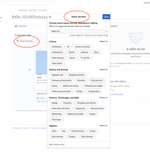
  • Change the modal title from "Select interests" to "Select topics".
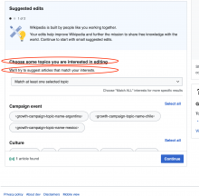
  • Simplify the introduction text to make it clearer what the user is doing and remove what "we" as the system is doing. The instructions should be for the user as they should "choose topics".
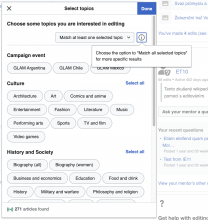
  • Use a dropdown instead of the button toggle to switch between All/Any - this reduces competition and confusion about what the user needs to do vs what is optional, and allows for more description explanation in the dropdown.
    • Revise Match ANY option text to be: Match at least one selected topic
    • Revise Match ALL option text to be: Match all selected topics

image.png (496×1 px, 132 KB)

Related Objects

Event Timeline

MMiller_WMF added subscribers: Sgs, MMiller_WMF.

@Sgs talked about how it would be good to move this feature set to all users so that they can get the benefits, and so that we can remove code that reserves it only for campaigns. Therefore, this task is now Ready for Development. We need to make these changes first, and then we can move on to T305399, in which we'll deploy to all users in our pilot wikis. Then we'll do the analysis in T305406, and then deploy to all users in all wikis.

@RHo Asking for some clarifications and feedback regarding text simplifications that could help the reading experience and reduce the engineers maintenance burden. I think it would also facilitate the translation process since less keys would need to be updated.

  • Change the modal title from "Select interests" to "Select topics".
  • The text Select interests is used in two different places: in the "filters summary header" and in the "topic filters dialog". Can we simplify these to one?

Screenshot 2022-04-06 at 17.24.25.png (2×2 px, 634 KB)

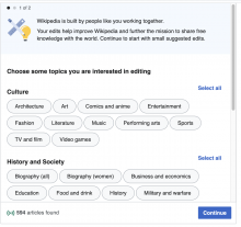
Simplify the introduction text to make it clearer what the user is doing and remove what "we" as the system is doing. The instructions should be for the user as they should "choose topics".

  • The text for the header Choose some topics you are interested in editing is used in two different places: "start editing dialog" and "topic filters dialog". Can we simplify these to one?
Screenshot 2022-04-06 at 17.34.25.png (1×1 px, 234 KB)
Screenshot 2022-04-06 at 17.42.20.png (2×1 px, 451 KB)
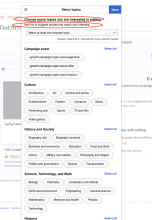
  • I see the Choose "Match ALL" interests for more specific results hint text below the selector has disappeared and an info icon is placed beside the selector. What should that icon show when clicked?
  • Another thing to mind is that a wording change from interest to topic affects the gender of adverbs and pronouns in several languages so this change may also affect other translated texts like Select all. Anyways in my opinion this is a problem we would prefer to address with a deeper revision and consolidation of the reading experience rather than in this task.

Change 777834 had a related patch set uploaded (by Sergio Gimeno; author: Sergio Gimeno):

[mediawiki/extensions/GrowthExperiments@master] [WIP] Newcomer tasks: simplify introduction text by removing the subheader

https://gerrit.wikimedia.org/r/777834

Change 777835 had a related patch set uploaded (by Sergio Gimeno; author: Sergio Gimeno):

[mediawiki/extensions/GrowthExperiments@master] [WIP] Newcomer tasks: use dropdown widget instead of button group

https://gerrit.wikimedia.org/r/777835

Thanks for bringing up these points @Sgs, please see my replies inline:

@RHo Asking for some clarifications and feedback regarding text simplifications that could help the reading experience and reduce the engineers maintenance burden. I think it would also facilitate the translation process since less keys would need to be updated.

  • Change the modal title from "Select interests" to "Select topics".
  • The text Select interests is used in two different places: in the "filters summary header" and in the "topic filters dialog". Can we simplify these to one?

Screenshot 2022-04-06 at 17.24.25.png (2×2 px, 634 KB)

Yes, please do simplify both to Select topics.

Simplify the introduction text to make it clearer what the user is doing and remove what "we" as the system is doing. The instructions should be for the user as they should "choose topics".

  • The text for the header Choose some topics you are interested in editing is used in two different places: "start editing dialog" and "topic filters dialog". Can we simplify these to one?
Screenshot 2022-04-06 at 17.34.25.png (1×1 px, 234 KB)
Screenshot 2022-04-06 at 17.42.20.png (2×1 px, 451 KB)

Yes, that would be ideal as well.

  • I see the Choose "Match ALL" interests for more specific results hint text below the selector has disappeared and an info icon is placed beside the selector. What should that icon show when clicked?

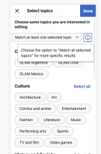
Can we move have the info icon show the following text: Choose the option to "Match all selected topics" for more specific results.

  • Another thing to mind is that a wording change from interest to topic affects the gender of adverbs and pronouns in several languages so this change may also affect other translated texts like Select all. Anyways in my opinion this is a problem we would prefer to address with a deeper revision and consolidation of the reading experience rather than in this task.

Thank you for pointing this out and I agree something to include in a more comprehensive content audit. I've added it as a bullet point in the task description in T265542: Revise all UI copy on all Growth's newcomer homepage and task features (help panel, newcomer homepage, newcomer tasks, structured tasks)

Sgs changed the task status from Open to In Progress.Apr 13 2022, 11:42 AM
Sgs moved this task from In Progress to Code Review on the Growth-Team (Sprint 0 (Growth Team)) board.

Change 777834 merged by jenkins-bot:

[mediawiki/extensions/GrowthExperiments@master] Newcomer tasks: simplify introduction text by removing the subheader

https://gerrit.wikimedia.org/r/777834

Change 777835 merged by jenkins-bot:

[mediawiki/extensions/GrowthExperiments@master] Newcomer tasks: use dropdown widget instead of button group

https://gerrit.wikimedia.org/r/777835

Sgs changed the task status from In Progress to Open.Apr 18 2022, 10:27 AM
Sgs moved this task from Code Review to QA on the Growth-Team (Sprint 0 (Growth Team)) board.

This can be tested now in Special:Homepage in beta by using the JS snippet ge.utils.enableCampaign() as it's still only enabled for GLAM users.

Change 783829 had a related patch set uploaded (by Gergő Tisza; author: Gergő Tisza):

[mediawiki/extensions/GrowthExperiments@master] MatchModeSelectWidget: Use overlay for the popup

https://gerrit.wikimedia.org/r/783829

Change 783829 merged by jenkins-bot:

[mediawiki/extensions/GrowthExperiments@master] MatchModeSelectWidget: Use overlay for the popup

https://gerrit.wikimedia.org/r/783829

Etonkovidova subscribed.

For @RHo review - if there are no follow-ups, you may close this task as Resolved.

  • Change the modal title from "Select interests" to "Select topics".
  • The text Select interests is used in two different places: in the "filters summary header" and in the "topic filters dialog". Can we simplify these to one?
BeforeNow
Screenshot 2022-04-06 at 17.24.25.png (2×2 px, 634 KB)
Screen Shot 2022-04-25 at 2.11.43 PM.png (1×1 px, 322 KB)

Simplify the introduction text to make it clearer what the user is doing and remove what "we" as the system is doing. The instructions should be for the user as they should "choose topics".

  • The text for the header Choose some topics you are interested in editing is used in two different places: "start editing dialog" and "topic filters dialog". Can we simplify these to one?
Screenshot 2022-04-06 at 17.34.25.png (1×1 px, 234 KB)
Screenshot 2022-04-06 at 17.42.20.png (2×1 px, 451 KB)

Done

Screen Shot 2022-04-25 at 1.38.31 PM.png (1×1 px, 192 KB)

  • I see the Choose "Match ALL" interests for more specific results hint text below the selector has disappeared and an info icon is placed beside the selector. What should that icon show when clicked?

Can we move have the info icon show the following text: Choose the option to "Match all selected topics" for more specific results.

Done Note (minor) - the hint is the same for both options. Users might expect to see a hint relevant to the chosen option.

Screen Shot 2022-04-25 at 1.42.20 PM.png (1×1 px, 309 KB)
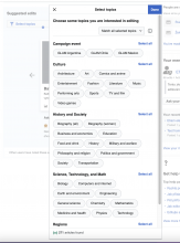
Mobile
Screen Shot 2022-04-25 at 1.43.34 PM.png (1×856 px, 177 KB)

Great, thank you!