Background
This task is not meant to serve as the final design of the image recommendations features. The designs in this task is intended to demonstrate the flow and actions that will be included in the Android team's implementation of Image Recommendations.
Task
- @scblr Create a Figma file and link it to this task with screens that show what happens when users interact with actions that align with the requirements below
- Engineer - review screens and add any questions or possible constraints to consider on the task
- Engineer- Add subtask to epic for screens that can start being built now based on wireframes
Requirements
- Entry point from Suggested Edits Screen (must be below Article Descriptions)
- Two caption variants (one as an optional screen after a user publishes an image and one as a button users can click on the preview screen to enter caption flow)
- A way for users to report the feature that sends them to the support email
- Access to the FAQ page
- A warning screen that appears when a user has spent less than 5s evaluating a task before hitting publish
- Onboarding screens or tooltips
- Ability to read the full article and go back to publish
- Inability to "skip" only options for Yes, no, not sure
- Ability to read image metadata
- Affordance for expanding an image
- Screen for users running out of tasks
- Preview the image in the context of the article before publishing (not a requirement for it to be in the editor)
- Watchlist expiry option
- Ensure that users with less than 50 edits can not see the task
Designs (Figma)
1) Discovery  | 2) Home  | 3) Onboarding  | 4) Tooltip 1/3  | 5) Tooltip 2/3  | 6) Tooltip 3/3  | 7) Feed  | 8) Rejection dialog  | 9) Warning snackbar  | 10) Overflow menu  | 11) Sheet collapsed  | 12) Image details  | 13) File page  | 14) Image detail active  | 15) Image detail filled  | 16) Preview  | 17) Edit summary  | 18) Edit summary active  | 19) Edit summary loading  | 20) Next suggestion  | 21) End of stack  |
1) Discovery: A tooltip points to the Edits tab. Shown in the next session after the "Did you know everyone can edit Wikipedia?" tooltip.
2) Home:
- The "Article Images" task is added after "Article descriptions" in "Suggested edits" home
- A "New" indicator on the first launch that the task’s been newly added
3) Onboarding: A full-screen onboarding slide informs users about the task at hand
4) - 6) Tooltips:
- Contextual tooltips onboard the user to the task
- Ideally, the suggestion at the bottom already starts loading so it’s ready to be displayed once users taps "Next" in the first tooltip
- The first to two tooltips ideally use "Next" to show the next tooltips and the last one should use "Got it" as a call to action
- A number indicator shows how many tooltips are coming at the bottom right (can be hardcoded)
7) Feed
- Design is similar to what’s been implemented for the previous "Train image algorithm" task, but uses the updated components
- Image can directly be zoomed (Instagram style)
- Tapping the card takes users to the file page (shown in 12)
- Filename, file description, and suggestion reason should all be *truncated* after two lines to not take up too much space
- "No" triggers a dialog with the same options as in the current Growth implementation (see screen 8)
8) Rejection dialog: Displayed when users tap "No"
9) Warning snackbar: A warning snackbar appears if users spend less than 5s evaluating a task before hitting publish
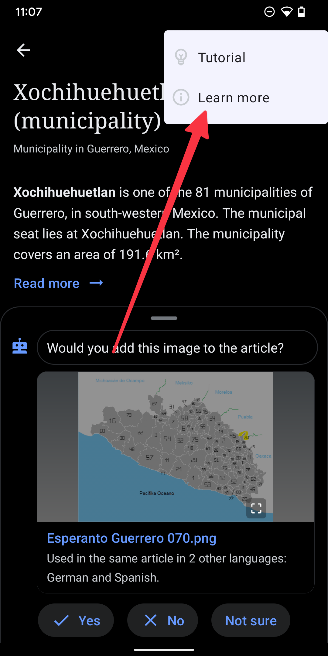
10) More menu:
- "Tutorial" triggers take users back to screen 3
- "Learn more" takes users to the Suggested edits FAQ page (which needs to be updated)
- The tooltips are triggered (4-6) within the context of the current suggestion, to make it easier for the user to understand what to do
11) Sheet collapsed: Collapsed state when the bottom sheet is pulled down (exact design can be evaluated during implementation)
12) Image details:
- This view is used to add an image via Wikitext editor. Make sure to also update the view within Wikitext editing
- It’s using new components so it looks more consistent
- Tapping the file information card at the top leads to the file page (screen 13)
- It is possible to tap "Continue" without providing an image caption and alt text (secondary call to action)
13) File page: This is the existing file page. No changes are needed currently.
14) - 15) Image details active + filled:
Once both fields are filled, the "Continue" button at the top turns into a primary call to action
16) Preview screen: Should look more or less like this. Depends on what’s possible from the engineering side.
17) - 18) Edit summary:
- Is also optional (similar to image details), but we don’t encourage empty summaries by using a secondary call to action in the empty state.
- This screen is also used already within Wikitext editing
19) Loading state: Uses the top progress indicator
20) Next suggestion:
- Shown after the previous edit is published
- Snackbar confirms that the edit is published
- View takes users to the Diff page
- Snackbar is shown above Yes, No, Not sure buttons
21) End of stack:
- Copy: Sorry, there are no more suggested images available at this time. Please explore other Suggested edits or return later.
Todos
- What happens when tapping the card in "Add image details"? [Bottom sheet vs. detail page] (RS)
- New indicator for the task (RS)
- Review Commons File Page (RS)
- "Not sure" dialog (RS)
- Create copy spreadsheet T340743 (JT, RS)
- Info to provide a caption in the context of the article [per RH’s input] (RS)
- Update FAQ page (JT, AR, RS)
- What is the article experience? (RS)
- What do we do with the structured image caption prompt in the article? (RS)
Support email Copy:
Subject:
Issue Report- Image Recommendations Feature
Body:
I’ve encountered a problem with the Image Recommendations Feature:
- [Describe specific problem]
The behavior I would like to see is:
- [Describe proposed solution]
[Screenshots or Links]


