Page MenuHomePhabricator

[Spike 3hrs] Unintended vertical spacing behaviour
Closed, ResolvedPublic

Description

Background

Changing the paragraph spacing as part of the accessibility for reading project has introduced several unintentional computed vertical spacing values in articles.

User story

As a Wikipedia reader, I want the vertical spacing between text elements in articles to follow rational information hierarchy and be consistent.

Requirements

  • Add task requirements. Requirements should be user-centric, well-defined, unambiguous, implementable, testable, consistent, and comprehensive

Design

  • Design spec needed

Acceptance criteria

Communication criteria - does this need an announcement or discussion?

  • Add communication criteria

Related Objects

Event Timeline

ovasileva set the point value for this task to 5.Mar 25 2024, 5:37 PM

Discussed in kickoff, we'll move this to sprint 1 for the time being. @JScherer-WMF and @bwang will discuss potential ways of splitting up the work in the meantime

ovasileva raised the priority of this task from Medium to High.Mar 25 2024, 5:37 PM

Following the 5W1H model that can help gather more context and understand the requirements for starting the work:

  1. What is the exact nature of the unintended vertical spacing issue? Description -> Background
  2. Why was this issue introduced, and what were the changes that led to it? https://phabricator.wikimedia.org/T313828
  3. Who is affected by this issue, and who will be working on fixing it?
    • Our Team will handle it
    • Check Description -> User story
  4. How does the team plan to address and resolve these spacing issues? TBD

I believe that in order to solve this issue in a consistent manner, padding-bottom should be dropped for paragraphs and replaced with something else: T361767: Don't use padding-bottom for paragraphs.

(Just so this is not missed: the solution for T352875, which removed the top margin from lists, just lead to more problems, as is expected when the root problem is not addressed. Lists have now become "naked", and if they happen to clash with another element that has no margins by default, like tables or divs, they will have zero space between:)

T358921 was not linked above. While doing QA for this task, please try undoing this change in https://en.wikipedia.org/wiki/Template:Quote_box/sandbox to see if the spacing at the bottom of the quote box remains the same.

Removal of this workaround will also need to be tested.

I'll be happy to help with this code change and testing if QA testers here are not able or willing to do this test.

@bwang is there a stable link to the page with all of the possible vertical spacing element interactions available? I can work on a spec with @DTorsani-WMF when we have all of those usecases listed out.

ovasileva lowered the priority of this task from High to Medium.Tue, Apr 9, 8:37 AM
ovasileva renamed this task from Unintended vertical spacing behaviour to [Spike 3hrs] Unintended vertical spacing behaviour .Tue, Apr 9, 5:00 PM
ovasileva updated the task description. (Show Details)
ovasileva removed the point value for this task.

I've just shared on a vertical spacing question for Fields in Codex, but aimed for a general approach, that might be something worth to consider here as well.

A lil story of my Dream Spacing World™:
In this perfect world, every component would not apply bottom margin and only top margin.
With adjacent selectors you could care differently for h2 + h3 or h2 + p on top of that.
Even when an element floats or includes some padding (for example on intended figcaptions with no background, thumbnail descriptive div is not as good an example) which would nullify collapsing margins, the distance is simple to describe. And again, :first-child or :first-of-type would help with the outlying exceptions.
Every element has to be taken care about it's own spacing only, but just one (top) direction. And exceptions for non-collapsed margins would only need to be initiated in homeopathic doses. Weird extra huge vertical spacing of suddenly bottom margin and top padding (think again transparent background figcaption) would not have to be either nastily tolerated or conquered with super-specific negative top margins.
And devs have to output less code, making clients happier too.

Most important is to find one way to approach this and collapsing margins could be our friends.

I explored a few of suggested options including using only margins on <p> elements (margin-top 0.5em and margin-bottom 1em) and negative margins on adjacent elements to achieve the intended design. However, i realized there is a much much simpler solution that I should have went with originally where I consistently apply 0.5em top and bottom margin to <p> elements, except i increase the top margin for “p + p” elements to 1em. i will post a POC patch soon

where I consistently apply 0.5em top and bottom padding to <p> elements, except i increase the top margin for “p + p” elements to 1em

I hope you meant top and bottom margin?

@Jack_who_built_the_house
Yes sorry, that was a mistake, ive edited the original message

Change #1021533 had a related patch set uploaded (by Bernard Wang; author: Bernard Wang):

[mediawiki/skins/Vector@master] Update <p> spacing to only use margins, update list elements to have consistent top and bottom margins

https://gerrit.wikimedia.org/r/1021533

@bwang is there a stable link to the page with all of the possible vertical spacing element interactions available? I can work on a spec with @DTorsani-WMF when we have all of those usecases listed out.

This is waht ive been using, but it doesnt have every possible element combo
https://en.wikipedia.beta.wmflabs.org/wiki/User:BWang/sandbox

@JScherer-WMF
An issue @Jdrewniak pointed out with this approach (and technically any approach that relies on sibling selectors) is that we wont have the correct spacing when elements are floated.
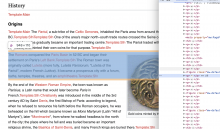
I.e. in this case, the DOM order is <p>, <figure>, <p>, but because the figure is floated, it looks like the two paragraph elements are next to each other, and they dont have the required 1em spacing.

Screenshot 2024-04-18 at 6.49.32 PM.png (1×1 px, 823 KB)

I cant think of a solution to this tbh, aside from going back to the existing hacky solution which also isnt good. My suggestion is to just document this edge case and *shrug* for now.

An issue @Jdrewniak pointed out with this approach (and technically any approach that relies on sibling selectors) is that we wont have the correct spacing when elements are floated.

Right, unfortunately p + p will immediately distort the appearance of the majority of articles, and in a noticeable way. Just to be clear: if you apply a fix only to images, something like p + figure + p, you will soon notice that there are also floating tables, floating divs, floating divs preceded by a <link> element from TemplateStyles, groups of floating images, non-floating images, etc. etc. This is volunteers' turf, not developers'; I don't think it's feasible to find any meaningful compromise here and not find yourself (and volunteers) hunting for the endless exceptions for eternity to come.

While I was developing Convenient Discussions, floating elements were a hell of a troublemaker when I was trying to figure out the visual boundaries of users' comments (so, floating elements had to be ignored). The solution I adopted eventually was to just use an algorithm that parses each and every stylesheet existing on the page and look for float set to left or right in them. But you can't do that in pure CSS.

and technically any approach that relies on sibling selectors

Yet there are cases that are clearly anomalies (e.g. p + figure + ul when the paragraph describes the content of the list that follows) and cases that are a rule rather than an exception.