Page MenuHomePhabricator

Implement navigation UI for the Advanced filters
Closed, ResolvedPublic

Description

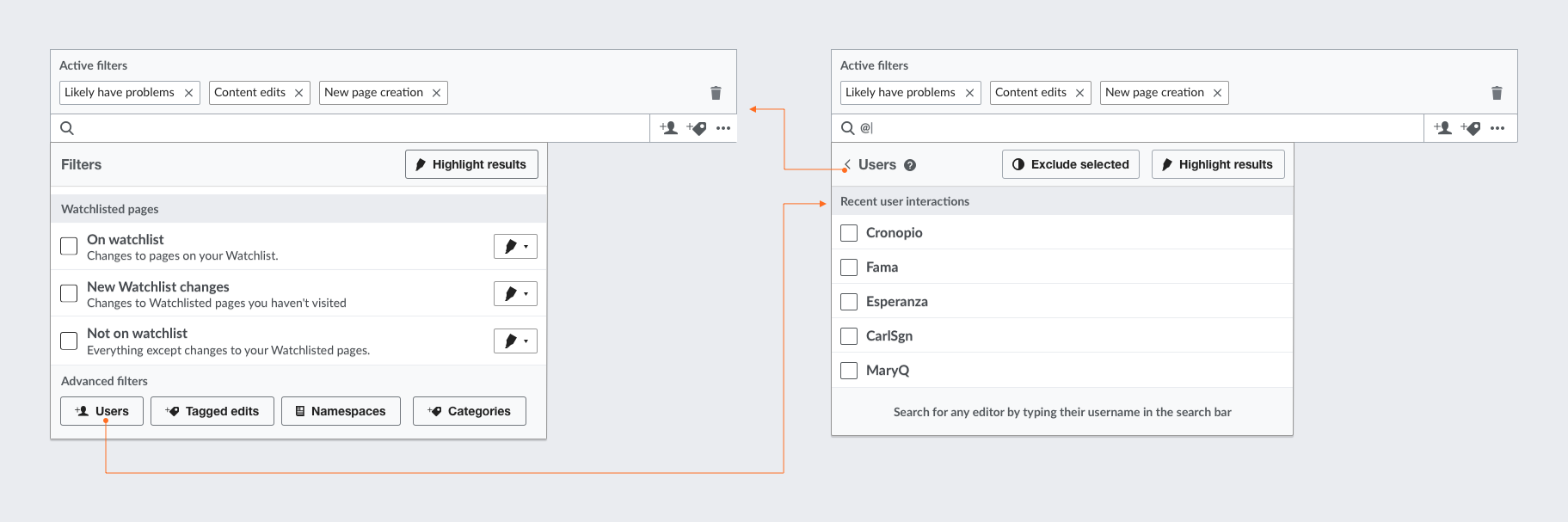
The new integrated filters include filter menus for users (T167224), tagged edits (T166914), categories (T163433) and namespaces (T166912). The UI described here provides access to these "Advanced" menus, and a way to move back and forth among these and the main filtering menu.

Quick access next to the main filter entry point

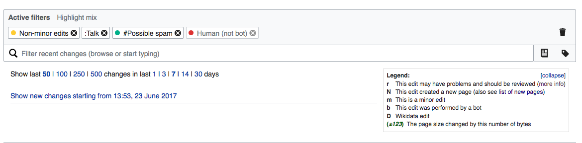
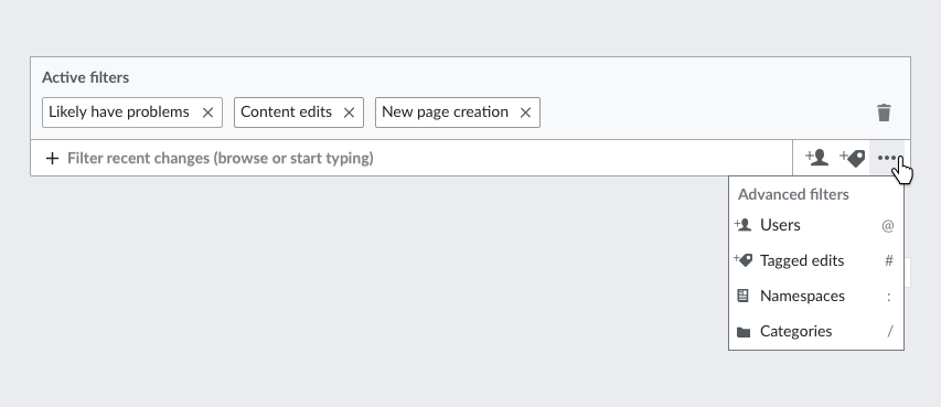
  • Next to the regular filters input box, an area is provided with access to users and tagged edits.
  • A "more" menu provides access to all integrated filters in a list. Each item includes an icon, a label and the prefix that is used for accessing them.
  • The menu icons at the top level get tooltips, like so:
    • Filter results by namespaces.
    • Filter results using edit tags.

The idea is illustrated in this prototype and the mockup below:

RC-next-integrated-filters-menu-overview.png (369×853 px, 31 KB)

Navigation between the default filter panel and the specific ones

  • The default filter panel has a section at the end of the panel to access the advanced filters.
  • By adding a < (back action) to each of the specific panels (users, tagged edits, namespaces and categories) the hierarchy can be made more clear. The back action will remove the prefix and move the user back to the default filter panel. This is illustrated below:
  • The < link (back action) has a tooltip reading: Return to main filter menu.

RC-back-navigation.png (607×1 px, 99 KB)

Related Objects

Event Timeline

jmatazzoni renamed this task from Implement an entry point for the integrated filters in the new UI to Implement an entry point for the Advanced filters in the new UI.Jun 12 2017, 9:44 PM

@Pginer-WMF, I started reviewing this to move it to RFP. But as per our discussion this morning, there is a small problem that you may wish to consider: We said this morning that the first release will include the Namespaces and Tagged edits menus. And that Categories and Users would wait, possibly for some time.

As you know, Tagged edits has a decent icon, but the Namespace icon is less than ideal, in that it the little document image could be just about anything. Also, of course, as long as we have only two options, there will be nothing to put into the "Advanced" menu that isn't already visible.

My preferred interim solution would be to just write "Advanced filters" with a down arrow. (In fact, I still feel this might be superior as a final solution.) What's your recommendation?

jmatazzoni renamed this task from Implement an entry point for the Advanced filters in the new UI to Implement navigation UI for the Advanced filters .Jun 12 2017, 9:58 PM

@Pginer-WMF, I started reviewing this to move it to RFP. But as per our discussion this morning, there is a small problem that you may wish to consider: We said this morning that the first release will include the Namespaces and Tagged edits menus. And that Categories and Users would wait, possibly for some time.

As you know, Tagged edits has a decent icon, but the Namespace icon is less than ideal, in that it the little document image could be just about anything. Also, of course, as long as we have only two options, there will be nothing to put into the "Advanced" menu that isn't already visible.

My preferred interim solution would be to just write "Advanced filters" with a down arrow. (In fact, I still feel this might be superior as a final solution.) What's your recommendation?

The icons act as shortcuts, but the advanced filters can be discovered as part of the main filter panel (which we try not to compete with). In the same way that users will discover the watchlist filter, the advanced ones are provided just below.

It is true that we have not found a a perfect icon for such an abstract concept as "namespace" but I don't think that is as much problematic if users can associate both instances (the one with a label and the shortcut one) as an interim solution:

RC-next-overview-intermediate.png (768×1 px, 207 KB)

@Pginer-WMF, so in your design, it looks like there will be no "Advanced" menu until there are more than 2 menus available? Just confirming.

@Mooeypoo, please note the most recent interchange between Pau and me, above, re. adapting his design for just the two Advanced menus we'll be launching at first. Basically, to cut to the chase, it's in this screenshot.

RC-next-overview-intermediate.png (768×1 px, 207 KB)

@Pginer-WMF, so in your design, it looks like there will be no "Advanced" menu until there are more than 2 menus available? Just confirming.

Yes, that's right. To avoid crowding this space there will be room for a maximum of 3 actions:

  • If there are just 1, 2, or 3 actions, those are exposed directly.
  • If there are more than three actions, two of them will be exposed directly, and a "..." button will provide access to all of them in a menu.

@Mooeypoo, please note the most recent interchange between Pau and me, above, re. adapting his design for just the two Advanced menus we'll be launching at first. Basically, to cut to the chase, it's in this screenshot.

I guessed that while we don't have more than 3 actions (we currently have 2 - namespaces and tags) the dotdotdot menu is hidden. I was going to verify, but thank you for beating me to it :)

@Pginer-WMF quick question -- we already have a footer in the menu right now for sending feedback about the RCFilters beta. Where do I put this footer now? Under the footers above (the text one for the tag/namespace and the button selection one for the default view) ?

I don't mind, it will just take a tad more vertical space, so just head's up.

Change 359083 had a related patch set uploaded (by Mooeypoo; owner: Mooeypoo):
[mediawiki/core@master] [wip] RCFilters: Change to the new views redesign

https://gerrit.wikimedia.org/r/359083

Implemented everything except for the message footer for namespaces and tagged edits -- after a chat with @jmatazzoni, my understanding that the extra explanation in the footer in the example above is only relevant to "Users" and "Categories" which are lookup elements, and not to Namespaces and Tagged Edits.

Change 359083 merged by jenkins-bot:
[mediawiki/core@master] RCFilters: Change to the new views redesign

https://gerrit.wikimedia.org/r/359083

Etonkovidova subscribed.

Checked in betalabs - all functionality is in place.

Summary of what is not implemented yet:

(1) The tooltips are different - although it's a minor issue, please confirm that the tooltip phrasing is acceptable.
In the specs:
-Filter results by namespaces
-Filter results using edit tags
-Return to main filter menu

Implemented:
-Named spaces
-Tagged edits
-Filters

(2) Not implemented yet:

A "more" menu provides access to all integrated filters in a list. Each item includes an icon, a label and the prefix that is used for accessing them.

@Pginer-WMF can you take a look and confirm that this is acceptable deviation from the prototype UI?

  • the background of 'Tags' and 'Namespaces' is grey:

Screen Shot 2017-06-23 at 6.23.51 PM.png (288×1 px, 71 KB)

on a hover over a filter option, it turns white
Screen Shot 2017-06-23 at 6.46.48 PM.png (206×429 px, 23 KB)

Selecting does not change the background.

  • there is a little gap between the area for Tag and Namespace filters box and general Filter search text area.

Screen Shot 2017-06-23 at 6.26.37 PM.png (136×238 px, 8 KB)

@Pginer-WMF can you take a look and confirm that this is acceptable deviation from the prototype UI?

These are worth fixing. I created a specific ticket for those (and related) details: T168845: Connect better the advanced filters with the main filter entry point on Recent Changes

(That ticket is also part of a design review where other styling issues about the filters are captured in T168826)

@Pginer-WMF quick question -- we already have a footer in the menu right now for sending feedback about the RCFilters beta. Where do I put this footer now? Under the footers above (the text one for the tag/namespace and the button selection one for the default view) ?

I don't mind, it will just take a tad more vertical space, so just head's up.

I missed this earlier. The intention was for the advanced filters to appear after the regular ones as part of the same list, not floating. I created a separate ticket for this: T168851: Don't make the advanced filters to float at the bottom of the filters panel

@Mooeypoo Tooltips will be corrected or the existing wording is the correct one?

SpecsImplemented
Filter results by namespacesNamespaces
Filter results using edit tagsTagged edits
(for <) Return to main filter menuFilters

Change 362318 had a related patch set uploaded (by Mooeypoo; owner: Mooeypoo):
[mediawiki/core@master] RCFilters: Change tooltip messages for view buttons

https://gerrit.wikimedia.org/r/362318

Change 362318 merged by jenkins-bot:
[mediawiki/core@master] RCFilters: Change tooltip messages for view buttons

https://gerrit.wikimedia.org/r/362318

  • The tooltips have been implemented.
  • The following requirement can be addressed later.

A "more" menu provides access to all integrated filters [...]

QA Recommendation: Resolve